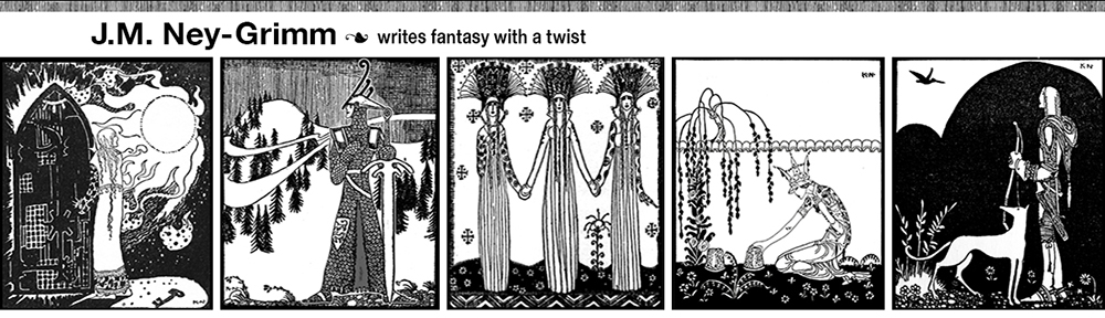
 I always have fun sharing the process of creating a book cover. My latest is the cover for Caught in Amber, a soon-to-be-released novel in my Mythic Tales series.
As always, the first step was finding images that work. My initial idea was to show my protagonist – Fae – with a fabulous castle in the background. An outside view of the castle.
In the story, the castle is located on relatively level ground amidst rolling hills. I wasn’t going to demand absolute fidelity in the landscape. Finding the right castle in terrain that wasn’t too different would be fine.
But I couldn’t find the right castle. At all.
The castle in Caught in Amber is embarrassingly similar to the Disney castle in Florida. But bigger. Much bigger. With wings constructed in all the architectural styles imaginable. And the real world doesn’t have anything like it. Or, at least, doesn’t have any photos of such a castle available.
 As is necessary in cover composition, I developed another idea. I would show Fae inside the castle. Which was probably a better idea anyway. Most of the book takes place inside the castle, not outside.
There were more interior photos of castles than I would ever need. Even if I wrote nothing but castle stories for the next ten years! I couldn’t decide amongst them. So I bookmarked several that I liked and moved on.
Time to find Fae!
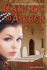
She’s a gray-eyed girl in her mid-teens with curly brown hair. Surely she wouldn’t be too difficult to match.
But she was.
The brunettes with the right face didn’t have the right hair. The brunettes with the right hair were too old. Or else they they wore big grins on their faces. Fae doesn’t do much grinning in Caught in Amber. Her situation is too scary and dangerous.
Finally I decided to combine two photos: one with the right face and one with the right hair. I did a quick mock-up using comp images, and my idea definitely worked. Both the face model and the hair model had widow’s peaks, so the two images could be combined comfortably.
Once I’d chosen Fae, it was easy to select a castle interior. There was one that complemented her particularly well. I pasted it into my mock-up. It looked good!
Then I went back to revising the manuscript. Sent it out to my second reader. Got her feedback. And revised again.
I save designing the cover as a reward for after the manuscript is complete and close to its final form. Also the blurb. I really need a treat after blurb writing, which doesn’t come easily for me.
More than a month elapsed.
As I arranged to purchase the right to use the photos I’d chosen for the cover, I had second thoughts about my choices. The model looked a little too pugnacious. She just wasn’t the right one after all.
I reviewed all the photos I’d bookmarked and discovered a model who was perfect. I’d rejected her initially, because she looked a little too cheerful. But part of her cheerful aspect was her bridal gown and her studio setting. One of the things I’d learned from my mock-up was that the castle setting caused a really serious model to look too serious. Perhaps a mildly serious model would look exactly right.
I tried the new Fae in my mock-up. She was indeed perfect. This was Fae. I would need to change her brown eyes to gray, but that was an easy fix.
However, the castle scene for the first Fae wasn’t quite right for the second Fae.
I returned to all the castles I’d bookmarked. With such a wide selection to choose from, finding the right castle interior was easy. I was ready to start!
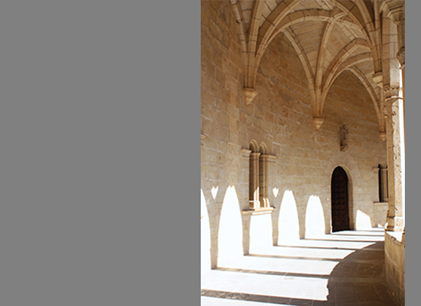
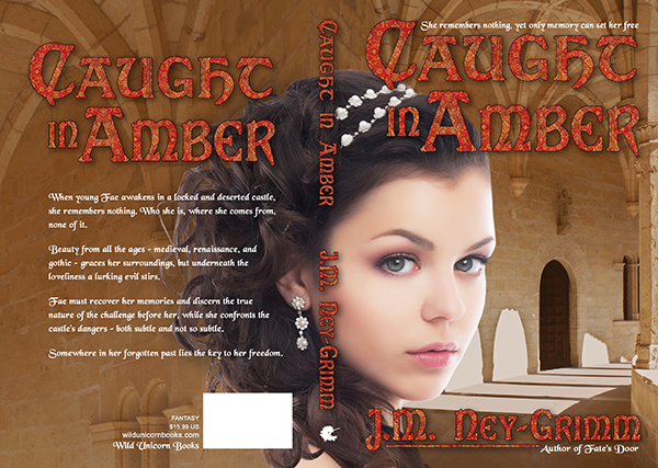
I purchased the right to use the two photos, set up my book cover file in Photoshop, and pasted in the castle photo. I extended the right side almost immediately. I knew I would need that extra for the cover bleed.
Then I looked at what I had. The photo was a little overexposed for my purpose. It would undoubtedly be fine as a framed photo on a wall. But as the backdrop on a cover, the brightest parts of the photo – where the sun shone through the arched windows – needed to be less bright.
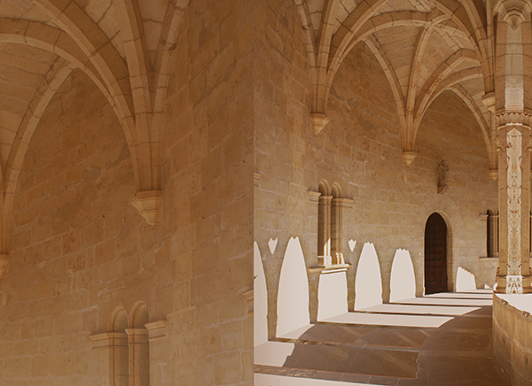
I selected a portion of the photo that would work well on the back cover (the top left) and pasted it into the file. Then I set about correcting the overexposure as well as changing the color balance to a more saturated hue that would give the castle more density.
I put a translucent screen over the back cover to make it a suitably smooth background for the back cover copy. I lightened the shadows in the wall niches on the back cover for the same reason. The image behind text musn’t vary from light to dark too much.
The odd seam between the front cover and back cover in the lower half did not need to be addressed. Fae would cover it, once she arrived.
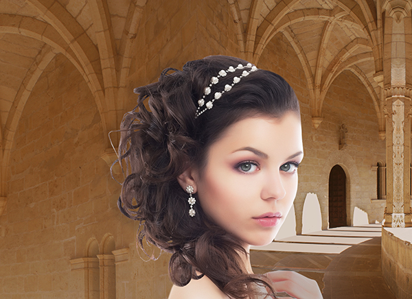
With Fae in her castle, I could see that I had a problem with her shoulder. As it wrapped across the spine of the book and then onto the back cover, it would look odd appearing in isolation as it would with all of Fae excepting her hair on the front cover. I followed a shadow line in the photo to reshape her shoulder. That was better, but not quite what I wanted.
I tried adding a few extra curls of her hair. Perfect!
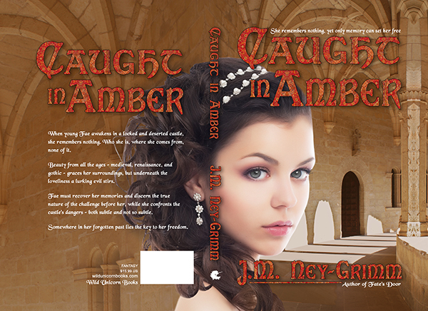
I created the title and my byline. I added the tag lines and the back cover text. It was definitely coming together nicely.
But there were two problem areas.
Fae’s pearly head dress interfered with the title on the spine, making it hard to read.
And the small strands of Fae’s hair that stood away from the main mass of her hair were too bright, making it hard to read the back cover copy.
On the spine I placed some carefully selected and feathered pieces of Fae’s hair under the spine title and over that portion of the pearl head dress. It worked beautifully. Now you could read the title without strain.
I placed a translucent and feathered shadow over the ends of Fae’s hair on the back cover and under the text. That worked well also.
My cover was finished!
I got that fun frisson of “This is real!” when I looked at the composed image. Even though I am the one who worked to put the two photos together, in my heart of hearts I believe that I am looking at Fae as she explores the deserted castle where she awakens without her memories. 😀
For more cover builds:
Building Wild’s Cover
Building Glory’s Cover
Cover Creation: Perilous Chance

I learn so much from you every time you produce one of your gorgeous covers. I so appreciate the time you take to keep track of all this, and then to write it – with photos!
And words! And all the mental process that you go through to get each little detail not just approximately right, but PERFECT.
Because every choice feeds back into every other choice – and then, there it is, and you must have known deep down somewhere that this is what you were aiming for.
Except it doesn’t work that way. So many pieces are fortuitous – but fortuitous only comes to those who do the grunt work. Time looking for the perfect image – and then discarding it when there is one that works better. Time spent finding a photo you can use to extend the back.
I know you told me to concentrate on just the ebook, which I am, sort of, but seeing you do the whole thing makes so much more sense.
And you find such beautiful women to use as cover models, with just the right expression (eventually). I really liked how you realized the model and the setting interacted and knew what to do to get the right expression.
I’m going to come back and read this one three times if I ever do the next thing: use an actual model’s face on the cover.
You set such a high standard.
I hope the model gets to see what you’ve done with her. Amazing.
Thank you for your kind words, Alicia. I am glad you find my cover building posts inspiring and helpful.
You are quite right that every design choice feeds into every other design choice.
You are also right in thinking that many elements are subject to fortune and chance.
I tend to hang onto the feeling that I want for the cover, holding each choice up to that feeling and asking myself: does this choice strengthen that feeling? or weaken it?
I rarely have a precise visual configuration in my mind when I start work. But I know the feeling tone of the story, and I’m looking for visuals that support it. As you can see, the decision tree that leads to the final image is complex and depends on what art I find and what technical challenges I encounter as I put the elements together.