I loved hearing what everyone had to say about the prospective cover for my novella Blood Silver.
You all helped me see some details that needed adjusting, as well as confirming the choice of the Sunburst version as the right art to use.
Thank you!
In the course of all our discussion, an important question was raised.
Is the title right? The mood of the words does not quite match the light, bright mood of the art. Should it?
I didn’t even begin to know how to answer that question correctly. As I’ve said before, I am no expert on marketing. I’m learning. As an indie, I must learn about marketing, if I want my audience to find my books. But there is far more that I don’t know than there is that I do.
But a lovely bit of good luck came my way.
One of the people weighing on the cover for Blood Silver just happens to be an indie whose marketing knowledge I respect a great deal. So I asked her about my title. And she was most generous in sharing her thoughts with me.
The first thing she explained is that a book cover possesses three “channels.”
1 • The art
2 • The typography (what font is chosen and how the type is placed)
3 • The title (the meaning the words convey)
You could convey the same message with each channel, but if you do you severely limit what you communicate about the book. Generally it’s best to use each channel to communicate different elements of your story.
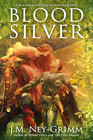
My kind adviser then proceeded to analyze the message communicated by the Sunburst cover for Blood Silver.
First we have the art, which is a bright fantasy illustration showing a knight and a lady. The subject matter tells us that the story focuses on two people. The bright, glowing treatment of the surrounding leaves indicates that magic is likely involved.

The image is appropriate for either urban fantasy, straight-up fantasy, or fairy-inflected fantasy.
So far, so good. Blood Silver involves the faie and follows the fortunes of a knight and a mortal woman.
Next we have the choice of font and how the title is placed.
The font is Trajan, which indicates epic fantasy. Apparently Trajan is the font to use, if you’re making an epic fantasy film. I did not know this. (See, I told you I was not a marketing expert!) But it’s also the right choice when kingdoms or other big things lie at stake in a book.
Since the events in Blood Silver turn on the conflict between battling kingdoms, Trajan is definitely a good choice.
Regarding placement…this happens to be something that I actually do know something about.
Most thrillers have the author’s name in big—no huge—letters at the top of the cover and the title in slightly smaller letters at the bottom.
Fantasy is usually the reverse: the title sits at the top, while the author byline rests at the bottom.
If the story is urban fantasy or horror, the title may be slanted or vertical or have some other unusual orientation. But for epic fantasy, it will be sedately positioned on the horizontal, centered.
(YA fantasy might have a small title or a flush left or flush right alignment, especially if it needs to convey edginess.)

Now that we have art and typography together, we need to consider not only what they convey separately, but what they communicate together.
In this case, we might guess that the story involves two lovers caught up in a conflict between kingdoms. Blood Silver is not going to be a quiet tale. Quite right.
When I chose Blood Silver as my title, I was thinking of the phrase “blood red,” because there is definitely blood involved in my story.
That’s a fine reference point, but my astute advisor pointed out that it’s also a play on the words “blood money.” And “blood money” makes us think of treachery, cunning, and deception. Which is perfect, because Blood Silver is all about trickery and treachery.
When you put all three channels together, you have the story of two people caught between the violent forces of large events, featuring trickery and great deeds.
If that’s what Blood Silver is about—and it is!—then I’ve got the right art, the right typography, and the right title.
The result?
Blood Silver will keep its title, Blood Silver. 😀
For more about Blood Silver, see:
Plate Armor, How It Works
Cross Strike, Squinting Strike, and Scalp Strike
The Crooked Strike
The Joust
Which Cover to Choose?
The Strike of Wrath
Rope Climbing and a Cliff
What If the Sword is Wrong?
A Song of Peace
Wielding a Long Sword
Origin of the Story (The State of This Writer)

As a reader my reaction to covers is pretty much instinctual; a cover attracts or repels me – or just fades into the background – without me really thinking about it. Almost all the times I can recall giving detailed attention to a cover are cases where I was trying to work out why it seemed bad (often when looking at collections of award winning covers).
I therefore found your explanation of the three channels through which the cover design is trying to manipulate me both interesting and enlightening. I was surprised though that you think that the art is appropriate for urban fantasy. It feels too, well, rural, to me plus not enough noir feeling, though urban fantasy is a tricky genre to pin down. To me it definitely felt like a straight (traditional?) fantasy maybe with a touch not only of faerie but also something Arthurian; plus of course some romance.
My reaction to typography tends to be very practical: can I read it on an Amazon product page or as an “also bought” recommendation. Your title passes with flying colours though the author’s name is less clear in a thumb nail sized image (which is incredibly common – and maybe unavoidable – in such small images). One of the most frequent design errors I notice – when I’m forced to actually think about this because I can’t read the title – is having far too little contrast between the text colour and the background but you clearly recognise and avoid such problems (for example in the way you switched the author’s name to a dark colour in the Faie inverted cover version).
As for the title itself, to someone like me who had a Christian upbringing, it also brings to mind the 30 pieces of silver paid to Judas which fits very well with the treachery theme.
As always, your thoughts and reactions are most interesting. The connection you make with Judas’ thirty pieces of silver especially catches my attention. Thanks for sharing, Mike.
I cannot take credit for the “3 channels” concept or for the analysis of Blood Silver’s cover. All of that came from the expert who was so generous with her insight. I now know a lot more than I did before!
I learn something new every day, and often from you.
The typography is important. Even inside the pages of the print version. But the cover typographical elements have to go together, and also convey subtext to the person who views the cover. I know I spent a lot of time on fonts, and ended carefully choosing a set I like to go together – for a combination of reasons.
I’m glad I don’t have genre to contend with, on top of that. But even mainstream literary stories have to somehow tell the reader what they are, as well as what they are not.
I can only imagine how much you have worked between your first set of beautiful covers and the new ones – I hope they pull readers in exactly as you planned.
There’s so much to learn in indie publishing, isn’t there. Cover design requires know-how about both graphics and marketing. Marketing expertise involves knowledge about branding, advertising, communications science, and outreach toward one’s audience. I adore learning new things, but I also feel frustrated that I don’t know enough to give my books their best chance. Although…it’s probably true that it’s the theoretical best chance that I’m missing. Practically speaking, I alone can give that best chance, since legacy publishing certainly would not. 😉
And as I learn, I am lucky to have excellent companions on the road such as yourself!
Just looked at the two versions side by side – the old one looked almost like historical fiction, and the new one definitely looks more fantasy.
Nice job.
Thanks for the kind words, Alicia.