I love it when one of my favorite authors releases a new book. The instant a title by Robin McKinley or Lois McMaster Bujold hits the shelves, I′m there with my wallet open!
But how do I choose a book when McKinley and Bujold are between releases? Usually the process goes like this. I′m browsing – at the library or online – and I′m looking at book covers. My reactions vary. Sometimes I say eeuw! Other times: huh. And often: oh! nice!
Cover designers know what they′re doing these days. I see a lot of attractive covers. Covers which prompt me to go to the next step: reading the cover copy. There the results are more mixed. Lots of ick! More of huh? Or huh. Very few oh, interesting! Only my interesting! responses send me inside the front cover to the first page. By then, depending on how the whole progression felt, I′m thinking either m-a-y-b-e or this is good!
The opening paragraphs then grab me. Or they don′t! If I abruptly find myself seven pages in, it′s a keeper!
That′s my experience as a reader. As a writer and publisher, my own reading experience catches my attention from a different angle.
How do I create covers and cover copy that will accurately and attractively signal the contents of my stories? That will connect the right readers – the ones with a taste for my work – to what′s inside the books?
Hoping to answer those questions more skillfully, I took two workshops this summer. I′d like to show you the results from the first one.
I knew going in that I didn′t understand how to write cover copy, but I didn′t realize just how clueless I truly was. (Utterly clueless!)
Writing superb cover copy is a skill that takes years to master, but there are two fundamental rules underlying the niceties:
• use active verbs
(avoid all forms of to be)
• convey the essence of the story
(do not describe the plot: what happens next and what happens after that)
The first of these two basics felt natural. As long as I paid attention, choosing verbs that added energy was fun.
The second basic . . . oh my! I continually descend into plot – the series of linked events – in my attempts to describe its essence.
″Pull up! Pull up!″ exhorted my teacher. Eventually I did get it. In fact, my teacher pronounced my class exceptional, because everyone got it! (Usually a few straggling students struggle.) But I discovered that the more useful instruction for me is: dive down! Go deeper! Go below the plot to theme.
So, is my cover copy better? I think so. But I′ll let you be the judge. Here′s a batch of BEFORE′s and AFTER′s. What do you think?
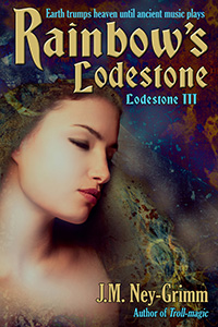
Rainbow′s Lodestone
BEFORE
″She leapt across the sky in the wake of a thunderstorm, glorying in the energy of wind and lightning, exulting in the rush of the earth beneath. Her rainbow splashed amidst mountains, and she slid down the curve of light.″
The rainbow’s child was eager to enjoy the delights of earth, but this visit to the realm below the sky might be her last. Gefnen, a cruel troll-herald, would see to it.
 AND AFTER
A lost birthright and unending agony.
On a whim, the rainbow’s child falls to earth, where a cruel adversary takes advantage of her innocence.
Can she reclaim her thunder-swept heavens? Must she dwindle and die?
This transcendent short story of J.M. Ney-Grimm’s troll-ridden North-lands explores how inner freedom creates outer opportunities.
Earth trumps heaven until ancient music plays.
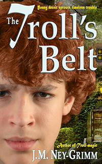
The Troll′s Belt
BEFORE
″The stranger was short, but he wasn’t a boy . . . hair grizzled gray in a wild mane around his face, beard equally wild, but thin. His voice sounded genial, almost friendly, but his pale, watery eyes held a mad glitter. Was he a troll?″
Grounded for sneaking and sassing, Brys finds a magical belt in the woods. But his good luck is about to turn bad. Trolls never mean well: this one pursues a grudge.
 AND AFTER
Young Brys Arnsson digs himself into trouble.
Bad trouble.
Tricked by a troll in J.M. Ney-Grimm’s richly imagined North-lands, Brys must dig himself and his best friend back out of danger. But that requires courage . . . and self-honesty. Traits Brys lacks at depth.
A twist on a classic, The Troll’s Belt builds from humor-threaded conflict to white-knuckle suspense.
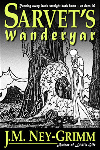
Sarvet′s Wanderyar
BEFORE
Sarvet is lame, and her culture keeps girls close to home. Worse, her mother emphasizes all the things that Sarvet can’t do. But Sarvet dreams of traveling outside her small, mountain enclave to explore the big world with all its strangeness and wonder. How can she transcend her injured leg, her confining lodge-home, and her over-protective mother?
 AND AFTER
Running away leads straight back home – or does it?
Sarvet walks with a grinding limp, and her mountain culture keeps girls close to home. Worse, her mother emphasizes all the things Sarvet can’t do. How do you escape, when you hold none of the resources you need?
Sometimes big dreams and inner certainty transform impossible barricades into a way out. J.M. Ney-Grimm’s inspiring fantasy novella explores this cusp of miracle.
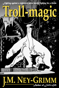
Troll-magic
BEFORE
“In short, she was the friend from his childhood . . . and yet not his old friend: taller, hints of curves. Why had he never noticed she was beautiful before? All his planned introductions slipped away.”
Kellor’s a prince in trouble. Lorelin’s a musician trapped by bucolic traditions. Both must defy a troll-witch’s curse while navigating a maze of hidden secrets.
 AND AFTER
Fighting against a nightmare pales beside fighting for a dream.
An accursed prince and her own longing for music challenge Lorelin to do both.
But tradition and a hidden foe stand squarely in her way. How do you make dreams real when vision fails, allies undermine you, and all roads toward hope twist awry?
Can courage, honor, and loyalty prevail against a troll-witch’s potent curse?
Set within her enchanted North-lands, J.M. Ney-Grimm’s new take on an old Norse folk tale pits distorted malice against inner wisdom and grit.
Better? What′s your vote?
For further discussion of cover copy, see my later post – Cover Copy Primer – on the subject.

All better except for Troll-Magic, where the first caught my interest and the second was too vague and generalized to work for me.
Interesting. Thanks for the feedback. Honest feedback is like water in the desert! I have some thinking to do!
Wonderful and useful article for all writers and publishers, J.M.! This should be required reading for anyone who has published a book or is getting ready to.
This is something I haven’t read a whole lot about online, so I’m glad to find it here. It’s nice that you can boil writing copy down to two important points: it makes it seem easy and approachable. Still takes practice, but it’s not impossible.
Pingback: Self-Publishing: Carnival of the Indies Issue #29
Pingback: Friday Features #46 - YESENIA VARGAS
Oh, goody. I had this one bookmarked from way back – to be used at this stage for the WIP – and now I’m looking at it with even more interest.
The part I see here in your revised description/blurb is the headline: a quick way to drag an emotional response from someone wondering if they will like it.
I read somewhere – and verified by looking – that, although you have about 400 characters for an Amazon description, only the first 130 or so will show up without the potential buyer having to click Show More – so that is the primer real estate, and the place where the hook has to be, because most people will not click on Show More unless they’re already intrigued (and then you’re getting them to go down the chute of clicking on your calls to action), which is what you want.
I’m going to check later whether the formatting (Author Central page) that lets you put in HTML for such as bold, header, or italics ALSO loses you part of that essential real estate.
If so, the punch needs to be even closer to the beginning – which is what you have with a good hook/headline.
Now to see if I can DO this.
But it isn’t magic – it’s data and experiments and control. Learnable.
Thanks for showing before and after – it makes it much easier to see what you mean.
Alicia
“…although you have about 400 characters for an Amazon description, only the first 130 or so will show up without the potential buyer having to click Show More…”
Excellent point, Alicia. Although it’s 400 words and 130 words, not characters.
Something else to keep in mind: Smashwords requires a super short blurb of only 300 characters – characters, not words – in addition to the full (longer) blurb.
Some publishers use the same short blurb in both boxes.
I think that is wasted opportunity.
I craft a 300-character blurb from the longer full blurb to use in the box for the short blurb. But I use the full blurb in that second blurb box.
Often, in the labor of crafting that short blurb, I discover places I can (and should) tighten the long blurb.
My long blurb gets better when forced by tight constraints. But it usually remains longer than the short blurb. Only rarely do I discover that the short blurb is the blurb, and I should (and do) axe the long one.
Oops. Meant words, not characters.
I copied some of the descriptions, just the part that was showing, into my examples file in Scrivener, and the word counts for those first six lines were instructive: 64, 76, 111, and 132 (a packed Nicholas Sparks description).
Formatting may take more space – haven’t checked yet.
Gotcha.
It had never occurred to me that the formatting might cause fewer words to be be visible. Probably because my natural reaction to all-things-computer is bewilderment. Great effort occupies the gulf between untutored-me and know-some-computerese-me.
I’ll be interested to learn your final verdict on this.