New Design for My Landing Page

I’ve felt a growing unease about the content of the landing page for my website. Something just wasn’t right.

What is a landing page?

It’s the page where weary wanderers of the web arrive after a search yields up jmney-grimm.com as the answer to their question. 😀

And my landing page felt static, maybe even dull. It seemed to conceal, rather than reveal, all the riches I’ve gathered here over the years.

What to do?

For a while, I was really enamored of putting a slider on my landing page.

What is a slider? It’s a slideshow that plays automatically.

I love the slider on the BundleRabbit site. It’s so clean, so big, and features some eye-catching images. I went so far as to ask Chuck Heintzelman, the proprietor of BundleRabbit, if his slider was generated by a plug-in, and if so which one. He answered me most kindly, and if I were to use a slider, I’d use that one (the Revolution Slider).

But in my search to identify the best slider, I encountered several articles about the pros and cons of using them at all.

Some situations are clearly tailor-made for a slider. I think the BundleRabbit site is one of them. It’s got a ton of great bundles available for purchase, and the slider gives the browsing reader a fun taste of what’s on offer.

You can check out the BundleRabbit slider here.

But many people use sliders because they lack a sense of the priorities for the content on their site. They just can’t decide, so they throw a little bit of everything into a slider, and then they don’t have to decide.

I suspected my desire for a slider might well be due to my own confusion. Not good.

Even more pertinent: there’s a fair bit of data indicating that visitors to a site rarely click on any of the images served up by a slider.

That decided me. My idea for a slider on my landing page was that visitors would be intrigued by the images and want to go check them out. If that was unlikely to happen, there was no point in having a slider.

So I did some thinking about what I really wanted for my landing page.

1I’m in a lot of bundles, and some of them are pretty cool. I’d like my visitors to know that these bundles are available.

2When I release a new book, I definitely want to shout from the rooftops about it. That’s an exciting moment for me, and I want to tell everyone. 😀

3But I have a lot of books out at this stage in my career, and I think my backlist tends to get buried on my website. Few people go digging through all 20 book pages. So I’d like to draw attention to my backlist.

4Speaking of backlist, I also have a lot of “backlist” posts on my blog, and most of them are of the evergreen variety. They’re not news posts that go stale. They’re maps and lore from my book worlds. They’re book recs. They’re health tips, design tips, and favorite recipes.

But there are 346 of them as I write this post, which will be number 347. How would a visitor ever find any one post among so many?

My landing page felt like an opportunity to address all of that.

Nor did I have to devise how I would go about it from scratch. In my own browsing of the web, I’ve seen plenty of landing pages. And amongst them all, there was one design that consistently pleased me. It featured four images arranged in a foursquare.

That was just enough to give a good sense of what was on the site, just enough to intrigue me, but not so much that I felt overwhelmed. I tended to then happily explore. Perfect!

So I’ve adopted the foursquare presentation for my own website, and I’ll change its individual components every week or so, showcasing different elements from my site over time.

Go check out what I’ve got there now! Here’s the link.

I’ll show you what is there (below) as I write this post. But by next week, the array will already have changed! (Plus the images on my landing page are clickable, while the copy below isn’t.)

I’m happy and excited about this ever-changing array. I think I’m going to have some fun with it. And I hope that my visitors will find it fun, too. 😀

For more about websites and blogging, see:
Slow Blogging and Other Variations
Why Create a Site Map?
SPAM Deluge
Copyright Statement for My Website
Your Data Is Protected


Share

Books2Read and “Universal” Links

I’ve blogged about global or “universal” links twice before: here and here.

Now I’m visiting the subject again. What prompted me? My new use of Draft2Digital.

Draft2Digital distributes ebooks to 8 e-tailers who feature ebooks among their offerings: Apple, Barnes & Noble, Kobo, Inktera, Scribd, Tolino, 24 Symbols, and the newly added Playster. Draft2Digital provides a smooth interface for the authors they serve, along with some excellent online tools.

Amongst those tools is access to their sister site Books2Read.

Books2Read creates and sustains a “universal” link for each book distributed through Draft2Digital, allowing authors, reviewers, fans, – or, really, anyone who wants to talk about that great book she just read – to share one URL for the book that connects to nearly every store where that book is sold.

I’ve really liked having one Amazon link that directs each reader to the Amazon store serving his area, and one Kobo link that does the same for the Kobo store fronts.

But the Books2Read link will direct the prospective ebook purchaser to the right Amazon store, the right Kobo store, the right B&N store, or even to stores that I’ve never heard of (but that do carry my books!).

How It Works

Now, the first time a reader clicks on a Books2Read link, she will need to choose her preferred store from an array of icons. But ever after, any Books2Read link will take her directly to the book on her preferred e-tailer site.

Try it for yourself.

No, really! Click on the cover of Caught in Amber. The window will open in a new tab, and you can see exactly what any first-time clicker will see when he clicks a universal Books2Read link.

(Unless you’ve already selected your preferred store for Books2Read. Then clicking will take you to Amber at that store.)

Do it now. I’ll wait! 😉

Before those of you who don’t distribute through D2D – but who do have books on offer with more than one e-tailer, skip this post…catch this!

Universal Links for Everyone

Books2Read will create and sustain universal links even for books that are not distributed through Draft2Digital. All you have to do is create an account with Books2Read, and you can start creating universal links for your books. Cool, don’t you think?

Now, Books2Read links aren’t truly universal. They may be universal for ebooks (I have no way of testing that – too many e-tailers for me to know about them all), but they don’t include stores that carry only paperbacks and hardbacks. I wish they did. That would be…incredible! But Books2Read does have 38 e-tailers (plus several subscription services) on their roster, many that I’ve never even heard of.

They divide their roster into “fully supported” stores and “partially supported” stores.

An Automated Search
(plus add-ons)

The fully supported stores are accessed by the author creating universal links automatically. That is, when the author pastes the link to one store into the box on the Books2Read site, an automatic search finds that book on the sites of 10 e-tailers and includes them in the book’s universal link.

These 10 fully supported stores are: Amazon, Apple, Barnes&Noble, Kobo, Google Play, Scribd, 24 Symbols, Thalia, Inktera, and Smashwords.

For the partially supported stores, the author must paste in the link for each store himself, and then those links are included in the universal link.

There are 28 partially supported stores. I’m not going to list them all. You can see the list on Books2Read, if you want the full roster, here. I’ll name a few to give you some sense of them: Blio, Indigo, Libris, WHSmith, OverDrive. But there are many more.

Universal Links Plus?

So, why, you may be asking, does my own site still include individual links to Amazon, B&N, Kobo, and others?

This is my thinking:

First of all, global links are a new thing. Readers are not accustomed to them. If I weren’t an author, I would not be accustomed to them. In fact, when I first encountered them as a reader on another author’s blog, I felt confused that there was only one link. Where’s the Amazon link? I wondered. And…I did not click on that one link. I worried about where it would take me. I certainly didn’t trust it to take me to Amazon. Instead, I went to Amazon myself and searched on the book title.

Well, I don’t want to risk that an interested reader on my site might avoid clicking on one of the links to my books! What if she didn’t follow up by going to Amazon (or Kobo, or Apple) herself? What if she simply bailed altogether? Not good!

And, secondly, using the universal link does require a second click the first time a reader clicks on it. Each extra click is an invitation to the clicker to bail. My direct links don’t require that second click. They take the reader directly to the store front and my book.

So, for now, I’m keeping the individual links to the most popular e-tailers.

But I am using the universal links.

My Universal Links

“Where?” you ask. “I don’t see them.”

Indeed, right now it’s not obvious, because the universal links are connected to the book cover images in the sidebar of my site. With a little more work, I will have all the book cover images serving as links. Right now, most are static images with no links at all, and that’s a waste. People are accustomed to images that are links, images that lead somewhere when you click on them.

I’ve avoided making my book cover images into links, because I would have had to choose which store to favor. And my readers who prefer Kobo (or Apple, or B&N, etc.) would have been super annoyed to click and find themselves arriving on Amazon instead.

Recently, I did make the sidebar images go to Amazon, because I couldn’t bear the wasted opportunity. But now I don’t have to choose! The images can be universal links. 😀

Your Thoughts?

So…now I have questions for you!

What do you think of all of the above? Do you think I am wise to preserve the individual links for now? Do you think I am mistaken to convert the book cover images into links? Or to have them go anywhere but Amazon? (Most – but not all – of my sales occur at Amazon.) Do you find the links as they are currently configured to be convenient for you?

I’d love to hear about your experiences with links and what you think of the issue.

For more about links, see:
A Question for International Visitors
Kobo Knows How to Do Ebook Links Right!


Share

How to Create a Progress Bar

I remember the first time I encountered a progress bar on a writer’s website. I thought, “Oh, cool!”

sample progress bar
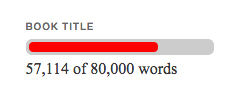
I’m visually oriented, so that visual representation of the writer’s progress on his or her current work gave me a much better feel for how near (or far away) the point of completion stood.

I wondered if I would ever add a progress bar to my website, but not seriously, more as a piece of fiction about myself. 😀

Most writers didn’t (and don’t) have such bars on their websites, but every now and then I would see another. I assumed there was a “widget” or a plug-in that produced the bar, but I didn’t think about it too hard.

And then I realized last April that I wanted a progress bar for my work in progress.

I thought about searching among the WordPress plug-ins for one that creates a progress bar, but…

I feel a little embarrassed to admit it, but I’ve forgotten how one does this! The last time I was mucking about with plug-ins was when I set up this website in February 2012, more than 4 years ago. I remember none of the details. I’m sure I could figure it out again. At some point, I’ll probably have to. There will be something I decide I want for my site that cannot be done in any other way.

But I decided to try Google first for the progress bar.

Almost immediately, the results turned up someone’s blog post with the HTML code that would do the job. It seemed very straight forward, so I dove in.

The blogger’s example progress bar was orange on black, and the code looked like –

Before I show you, let me say, “Don’t panic!” I’m going to explain each piece. And the HTML is quite a short string. 😀


The HTML

<div id=”progressbar” style=”background-color:#000000;
border-radius:6px;padding:3px;”>
<div style=”background-color:#f96604;width:75%;height:10px;
border-radius:4px;”>
</div></div>

This is the visual that the HTML produces:

 
Now, you’ll notice that this black and orange bar is a lot longer than the blue bar in my sidebar. That’s because the HTML code does not specify the length, so it simply extends to the edges of the text window.

The text window for the blog post is much wider than the text window for the sidebar, so we get a longer bar.

I don’t like the l-o-n-g progress bar, so if I had been planning to use it in a blog post pinned to the top of my blog, I would have searched for a way to control the length of the progress bar. Because I was planning on putting it in the sidebar, I didn’t need that. So I didn’t go searching. 😀

Now, let’s look at the different pieces of that HTML string.


Two Pieces of HTML

It is basically two pieces. The beginning of the first piece is <div. The beginning of the second piece is indicated by that same little bit: <div.

In HTML, every piece has to have the beginning indicated and the end indicated.

So the end of each of these pieces is indicated as </div>

Here’s the code with those beginnings and endings highlighted.

<div id=”progressbar” style=”background-color:#000000;
border-radius:6px;padding:3px;”>
<div style=”background-color:#f96604;width:75%;height:10px;
border-radius:4px;”>
</div></div>

So what about those two pieces? What’s in them?


THE FIRST PIECE

This is the first piece:

<div id=”progressbar” style=”background-color:#000000;
border-radius:6px;padding:3px;”>

The first piece gives the black background for the progress bar.

Now I am notnot – well versed in using HTML. I’ve picked up what I need to know by looking at the HTML windows of my blog posts. And that’s it. I’ve never taken a class. I’ve never even read a book on the subject!

Which means I won’t be able to explain the way a more informed HTML-user would. But I can explain enough so that you should be able to get your own progress bar in your own sidebar to look the way you want it to.


The Identifier

So, in the first piece, the id=”progressbar” is probably simply an identifier, telling the computer, “Hey! This piece here is the progress bar.” Or, it might also tell the computer something about the basic shape of the element – long and thin and straight.

Those of you who do understand HTML are probably laughing right now and thinking, “Does she really think that? Could anybody possibly be so ignorant?”

Well, yes. Someone could, and I am. But, never mind. 😀


The Color

Next comes style=”background-color:#000000;

Now I do know what this does. It controls the color of the the background of the bar. #000000 is black.

Next bit, please!


The Shape of the Corners

border-radius:6px;

This controls the corners of the bar. My bar has rounded corners. But if you wanted square corners, you get them by changing 6px (6 pixels) to 0px (0 pixels).

Let’s see what that looks like.

 
Here it is with 3 pixel corners.

 
And with 6 pixel corners:


The Thickness

padding:3px; controls how much of the background shows around the edges of the ever-changing orange part of the progress bar. Change that 3px (3 pixels) to 0px (0 pixels) and the border goes away altogether.

 
Change the 3px to 6px (6 pixels), and the border gets very thick.

 
I like the 3 pixel border.


That’s the whole of the first piece.


A List of the Code

Indicator of the beginning <div
Identifier id=”progressbar”
Background color style=”background-color:#000000;
Corner shape border-radius:6px;
Border thickness padding:3px;
The end of the beginning (a greater-than sign) >

A space separates the beginning indicator <div and the identifier id=”progressbar”

Semi-colons ; separate the three pieces of the “style”: color, corner shape, and border thickness.

And a greater-than sign > caps off the whole description.

I always reproduce those separators exactly! If you accidentally omit one, the HTML won’t work the way it is supposed to, and the image on your website won’t be what you intend.

<div id=”progressbar” style=”background-color:#000000;
border-radius:6px;padding:3px;”>

There’s the first piece as a whole.


THE SECOND PIECE

Now let’s look at the second piece.

The second piece is the ever-changing orange that grows longer as you write more words or shorter when you cut a few out.

<div style=”background-color:#f96604;width:75%;height:10px;
border-radius:4px;”>

<div indicates the beginning. Or more accurately, the beginning of the beginning!


Color, Take 2

Next!

style=”background-color:#f96604;

That’s the color. #f96604 is orange.

And next!


The Width

width:75%;

Ah! That’s the bit that controls how much of the black background is covered by the orange. Each time I updated my progress bar, I had to do a bit of math.

When I first put up the bar, I’d written 4,000 words. And I estimated that the book would be 160,000 words long.

4,000 ÷ 160,000 = .025

.025 x 100 = 2.5%

So, instead of width:75%; I needed width:2.5%;

 
It was exciting when I changed that width:2.5%; to width:5%; at the end of the week!


The Height

Next bit!

height:10px;

It controls how thick the overall progress bar is. If you change height:10px; to height:4px;, it gets very thin.


If you change height:10px; to height:20px;, it gets very thick.


I like height:10px; (10 pixels) best.


The Shape of the Corners, Take 2

Next bit!

border-radius:4px;

This controls the shape of the corners of the orange bar.

Change border-radius:4px; to border-radius:0px; and the corners become square.

 
Let’s try border-radius:3px;


Hmm. I think I like 3 pixels better than 4 pixels. I didn’t tinker this much with the code when I was setting up my own progress bar. I’m going to try 3 pixels when I finish writing this blog post. 😀

And that was the last bit of the second piece.


A List of the Code, Take 2

Here are all the bits that make up the second piece.

Indicator of the beginning of the second piece <div
Background color style=”background-color:#f96604;
Width width:75%;
Corner shape border-radius:4px;
The end of the beginning of the second piece (a greater-than sign) >

However, it’s not quite the end of the HTML code.


Putting It All Together

We have the first piece.

<div id=”progressbar” style=”background-color:#000000;
border-radius:6px;padding:3px;”>

We have the second piece.

<div style=”background-color:#f96604;width:75%;height:10px;
border-radius:4px;”>

But each of those only just describes the start of each piece. We must also tell the computer, “Okay, that’s enough. End it here.

And each piece needs its very own “End it here.” They can’t and won’t share! 😀

</div></div>

That gives us the whole thing, if we’re okay with orange on black. I wasn’t.

I wanted something that would blend better with the other colors on my website. I liked the idea of dark blue on pale blue. Since #000000 was black, and #f96604 was orange, what numbers would yield the blues that I wanted?


CONTROLLING THE COLORS

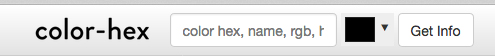
I did some searching and discovered that the whole rainbow of web colors is described by numbers called “color hex codes.” Each is composed of a combination of letters and numbers, six of them. And there are web sites were you can match up the color and the number.

I googled and found one of these sites: http://www.color-hex.com/.
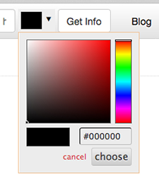
Navigation bar for color-hex.com


The Color Picker

The top navigation bar at http://www.color-hex.com has something labeled “get info.” I clicked the triangle next to that label, and a color picker appeared.

color picker at color-hex.com


Choosing a Pale Blue

I clicked around on it until I arrived at a light blue that looked good. The hex code for it #dff0fd appeared in the little info box. I copied it and pasted it into the HTML piece that controlled the background of my own progress bar.

Light blue on the color picker

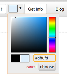
<div id=”progressbar” style=”background-color:#dff0fd;
border-radius:6px;padding:3px;”>


The orange on the light blue background does not look good to my eye! Of course, we’re only halfway to what I want.


Choosing a Darker Blue

I clicked around on the color picker some more, until I arrived at a darker blue that looked good. Then I copied and pasted that number #1b8be0 into the HTML piece that controlled the “orange” part of my progress bar.

Dark blue on the color picker

<div style=”background-color::#f96604;width:75%;height:10px;
border-radius:4px;”>


YIPPEE!

I finished the first draft of my WIP and sent it off to my first reader this week!

I feel a little lost. It’s time to start work on the cover – and I’ve been searching for the right images for it – but I’m already missing the writing.

I think I’m going to treat myself to writing the short story that’s tugging at my inner artist while I work on the cover.

Let’s see that progress bar with 100%.

140,712 of 140,712 words

And there you have it! More than you ever wanted to know about HTML and progress bars! 😀


HTML to Copy and Paste

On the chance that you want a blue-on-blue progress bar for your website, here’s the complete HTML. Feel free to copy and paste. Remember to change the 75% to the percentage for your WIP!

<div id="progressbar" style="background-color:#dff0fd;
border-radius:6px; padding:3px;">
<div style="background-color:#1b8be0; width:75%; height:10px;
border-radius:4px;">
</div></div>

For more about blogging:
Why I Wanted a Progress Bar
Why Create a Site Map?
Slow Blogging and Other Variations
SPAM Deluge


Share

Copyright Statement for My Website

United States ConstitutionFrom the moment I click the “publish” button, the posts and pages on this website are protected by copyright law. Which means that limited excerpts of the contents may be quoted by others under the fair use doctrine. But any more extensive reproduction of my words, and any use at all of my photos or drawings, may only occur when my permission is sought and granted.

However, many blog owners put a copyright statement on their websites. It serves as a reminder that the content of the site does belong to the site owner, a fact that is sometimes forgotten online.

The crafting of a copyright statement has been on my to-do list for quite some time. Today, I finally tackled the task.

Many sites have only the most basic of statements.

Copyright © Siteowner.

There were two reasons that would not not work for me.

The most obvious one is that my site contains some content that does not belong to me. I love old paintings and old book illustrations, and many of them are in the public domain. Which means I am permitted to place images of these old works on my website.

I also include images that their creators allow to be used under Creative Commons licenses.

So a blanket statement of copyright would be grossly inaccurate. Most of the contents of my website belong to me, but not all of it.

The other reason I prefer not to use a blanket statement, is that I want to encourage people who like my books to tell others. While one friend talking to another has no need any special permissions, a blogger – writing a blog post about one of my books – who wants to use my cover images or marketing copy, does need permission. A very limited copyright statement might discourage these folks!

With all these parameters to keep in mind, developing my copyright statement took some thought.

Article 1, Section 8, Clause 8 of the United States Constitution

This is what I came up with:

You have my permission and encouragement
to reproduce my book covers and cover copy
for the purpose of telling others about my books.
Please do!

(That purpose only, of course.)
 
Public domain images that appear on this website,
images used under a Creative Commons license,
and excerpts from book reviews
possess links to their sources and credit to their creators.
 
All other content,
images, and text
copyright © 2011-2016
J.M. Ney-Grimm.

The first paragraph lets bloggers, reviewers, and others who want to talk up my books know that it’s fine for them to copy my book cover images and my cover copy on their own websites. I retain my copyright to those things, but I grant permission for them to be used.

The parenthetical remark that follows is probably not necessary, but I wanted to be clear, lest an ill-informed or muddled hobbyist think it would be okay to simply “borrow” one of my book covers to slap onto one of their own books. It wouldn’t! 😀

Next comes the statement about the elements appearing on my site that do not belong to me.

If you hover your cursor over the image of a public domain painting or a photo used under a Creative Commons license, you’ll see a little text box that displays the title its creator gave it (if it has one; not all do), the creator’s name, whether the image is in the public domain or is being used under a Creative Commons license, and the website where I found the image – usually Wikipedia, Wikimedia, or Flickr.

If you click on the image, a new tab will open on the page of the website where the original image rests.

When I quote from a review of one of my books, I include the name of the reviewer, and I link to the website where the review originally appeared.

Excerpt of a review by James J. Parsons of Perilous Chance

The final paragraph of my copyright statement is where I state my ownership. I created this website in early 2012, so you would think that the years specified would include 2012 – 2016. But I published The Troll’s Belt and Troll-magic in December 2011.

The marketing copy for those two books has changed many times, and the covers have been revised, too. However, the old covers and the old copy appear in some of my posts about cover design and copy writing. Therefore, I use the time span of 2011 – 2016. Of course, I’ll have to update that interval every year on January 1.

I placed my statement in both the sidebar and the footer of my site, because I want it easily found. If I put it in the footer only – well, I allow seven posts to appear on my blog page. It’s a l-o-o-o-n-g way down to that footer. Might as well be hidden behind blackout curtains! The statement in the sidebar is much more accessible.

But if you click on an individual post, the sidebar disappears. And the footer at the bottom of that one post (or the bottom of a page lacking a sidebar) is not far away at all.

So I’ve got both bases covered.

I am not a lawyer, so none of the above is legal advice. But I thought my thinking and my process might be of interest to some of you! 😀

For more about blogging:
Why Create a Site Map?
Slow Blogging and Other Variations
SPAM Deluge
New Home Page


Share

Why Create a Site Map?

Just 5 years ago, I’d occasionally stumble upon websites possessing a page called “site map” or “sitemap.” That page presented a long list of the entire contents of the site. I found such lists very useful. I could skim them quickly to locate exactly what I hoped to find. Or to determine that the information I wanted was not present. Often I’d discover hidden gems I hadn’t been seeking, but that I was glad to acquire.

I liked site maps. I wished that every website possessed one.

angled metal tracks on an electronic circuit board

Unfortunately the trend was moving away from my preference. Somehow it was decided that the sole purpose of a site map was to ensure that Google’s crawlers – and those of other search engines – could locate each web page efficiently, so that the page could be listed by the search company in their search results.

Now, I like relevant search. Very much. When I google something, I want the best result to appear on the first page. And perhaps site maps were always geared to ensure that this happens. Perhaps they were never intended to help human visitors. But these days, the site maps are all actively hidden from human browsers, tucked away where only crawler bots can see them. I think that’s a shame.

I’ve tried using the search boxes available on most websites. I’ve tried clicking on the by-the-month archive links. And the category links. But not only do these methods often fail to deliver what I seek, but they have little chance of turning up the hidden gems that I don’t know are present.

It’s a shame. Totally a shame.

However, there’s no reason my own site must participate in this great omission. I’ve had creating a site map on my to-do list for a long time.

It didn’t seem urgent at first, because my site didn’t have much content. In the summer of 2012, I had only 3 books published – each of which possessed its own web page – and I’d written a mere dozen or so blog posts. No doubt most visitors absorbed it all in under 10 minutes and then moved on, unimpressed. “Huh. There wasn’t much to that.”

Today it’s a very different site! This is my 238th post. I have 19 books published – each with its own web page. I’ve created 15 “lore” pages for readers who want to know more about the North-lands and the other worlds in which my stories take place. Plus there are the miscellaneous pages such as my bio, a sign-up for my newsletter, a landing page, and so on.

There’s a lot of content present. And since I don’t tend to write many ephemeral newsy posts, the material retains its interest for quite a long time.

But if no one can find my post on the limits of obtaining vitamin D from sunlight or my explanation of how magic works in my North-lands, then the posts may as well not exist.

I decided this week that it was time to tackle my site map. One intended for humans!

Multitasking, photo by Jenn Vargas

The task took longer than I thought it would. I suspect that is often the case with such projects. There is software to automate the process. But it seemed likely that it would take me just as long to learn the software as it would to create my site map by hand. And I believe the software tends to generate the proverbial wall of text.

Admittedly, all the site maps I’ve ever seen were walls of text. They were useful in that format, and I could have settled for such a basic list.

But I knew that if I grouped the list into related categories, it would be a lot more accessible and thus a lot more useful.

So I’ve done just that. Check it out! 😀

Site Map

I’ll lay you a wager that you’ll find something I wrote back in 2012 or 2013 or 2014 that tickles your fancy. Am I right? Tell me what post or page it was in the comments! 😀

For more about blogging:
Copyright Statement for My Website
Slow Blogging and Other Variations
SPAM Deluge
New Home Page


Share