This summer I attended a publishing workshop. Cover design formed part of the conversation, and I learned some critical details about it. My architecture background and my previous publishing experience meant I was doing a lot right, but I could do better. Not surprising! Architectural design classes don’t include typography and other elements of graphic design.
When I returned home from the workshop, I dove into tweaking all the covers for my stories. I’ll show the before and after versions. I find it fascinating that such small adjustments make such a big difference. But first I want to share a few basics from the workshop. (C’mon! It’ll be fun!)
First, type fonts.
There are six main categories of fonts.
Old Style – Traditional serif fonts that have been used for centuries. They are easy for the eye to follow, guided horizontally by the bottom serifs. They feature gentle transitions between the thick and thin strokes forming the letters.
Goudy, Baskerville, Garamond, and Palatino are examples of old style fonts.

Modern – Bold and eye-catching with extreme transitions between thick and thin. They have a cold, elegant look that works well on movie posters and some book covers (but not in the interior of a book).
Braggadocio and Engravers MT are both modern fonts.

Slab Serif – These fonts make all the strokes thick, abandoning thin altogether, even in the serifs. Slab serifs have impact, but it’s easy to overuse them, even on a cover. (They are not suitable for book interiors!)
Blackoak, Cooper Black, Rockwell Extra Bold, and Wide Latin are slab serif fonts.

Sans Serif – These fonts also have no thick-thin variation. They are monoweight. And they have no serifs. They are easy to read from a distance and respond well to variations in absolute size.
Helvetica, Charcoal, Skia, and Impact are sans serif fonts.

Script – Script fonts resemble cursive handwriting. Use them like chocolate torte. Very sparingly!
Apple Chancery, Brush Script, Gabriola, and Lucida Handwriting are all script fonts.

Decorative – These fonts are so decorative they almost become illustration. One letter might be enough!
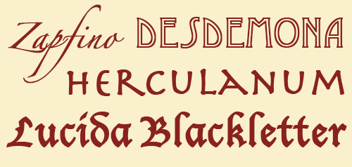
Zapfino, Desdemona, Herculanum, and Lucida Blackletter are decorative fonts.
Three rules for choosing fonts for a book cover:
• Never use more than one font from each category.
That is, Braggadocio (modern) and Helvetica (sans serif) might work well together, but Skia and Charcoal (both sans serif) will not.
Why?
Because the human eye likes patterns to be either exactly alike or clearly different. Similar, but not the same, makes the human eye struggle.
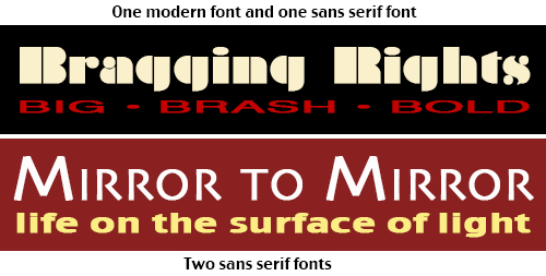
• Do use two different fonts.
One font – say all Palatino – is overly calm, sedate, even boring.
Two fonts is interesting, but doesn’t overwhelm the eye.
Three fonts (each from a different category, of course) starts to be cluttered and busy.
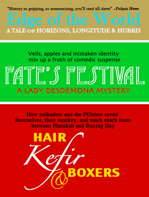
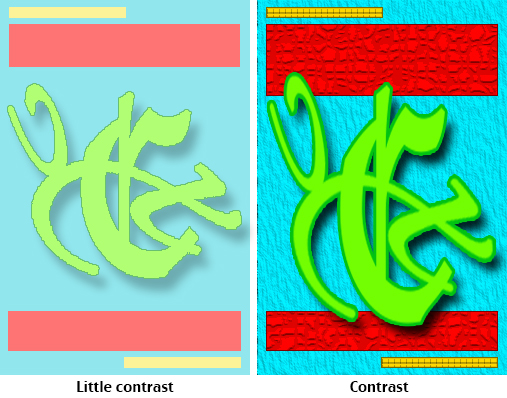
• Use contrast to draw the eye.
Contrasting sizes, contrasting colors, contrasting fonts. You do want to catch the attention of potential readers, right? Compare the examples below.

Can you break these rules? Certainly. The instant I learned them I thought of exceptions that work beautifully. But the vast majority of covers that appeal to readers follow them.
 Is there more to typography? Of course. But these foundation concepts are enough to produce surprisingly good design results when choosing fonts. Let’s move on to the overall composition of a cover.
English speakers looking at a page visually enter it at the top left, glide along the elements on the page, and exit at the bottom right. All our years of reading train us thusly, and the design of a cover should support this natural movement of the eye.
Four rules for composition:
Proximity – Group related items. Place author and a quote about the author together. Or put a tag line about the book right above or below the title. Don’t dot bits and pieces all over the place.
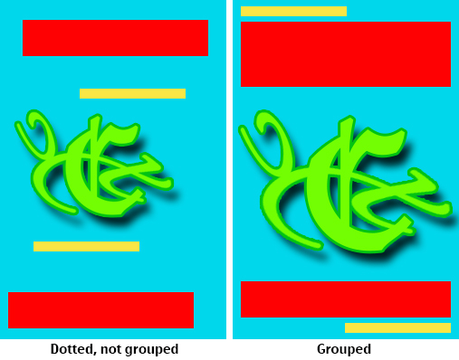
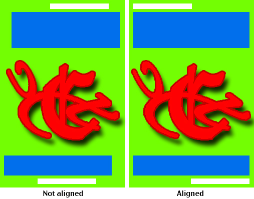
Alignment – Every element should have a visual connection to every other element.
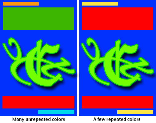
Repetition – Repeat visual elements to create cohesion. Color, shapes, line thickness, and font should all be chosen repetitively.
Contrast – Be bold, avoid the similar, make elements either the same or very different. I know. I listed this under the rules for font choice. It also goes for design in general.
But that’s enough lessons. (Do I hear you saying, “More than enough”? Yes, I think I do.)
What did all this instruction do for my own covers? Let’s take a look.
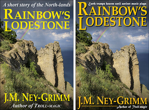
Here are the before and after versions for Rainbow’s Lodestone. The old cover used only one font and a center alignment. It was attractive, but overly sedate, bland.
The new cover adds the font Matura, a script font with a fantasy feel. It abandons the center alignment for an edge-to-edge arrangement that anchors the bottom and “caps” the top. The capital R in the title stretches up dynamically to frame the tag line. And the color of the title and author byline was deepened to better complement the photograph.
What about the new The Troll’s Belt cover?
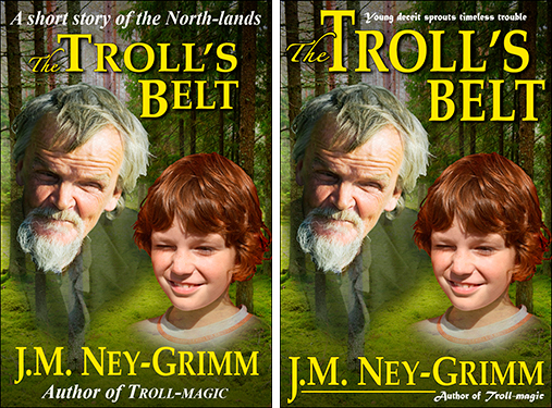
It’s wise to create a visual brand for one’s books, so the fonts Palatino and Matura appear here also. However, the composition of the art requires something other than a straight top cap, although the edge-to-edge reach is maintained. Thus the title frames the faces of the troll and the boy. The author and author tag line are nearly identical in treatment to Rainbow. That’s my author brand.
And the new Sarvet’s Wanderyar cover?
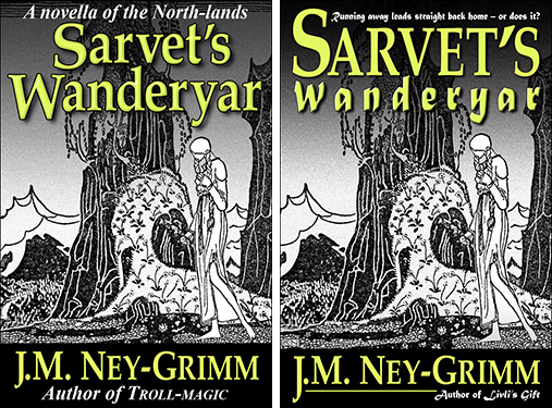
My teacher’s exhortation to be bold rang in my ears. I pulled Matura into the title, which allowed me to:
• add some energy to the word Wanderyar
• create an edge-to-edge top cap that flattered the art
• and maintain the legibility of the type.
Troll-magic received the fewest alterations: just the new branding elements of tag lines in Matura plus, in the author byline, the dipping J and the underline.
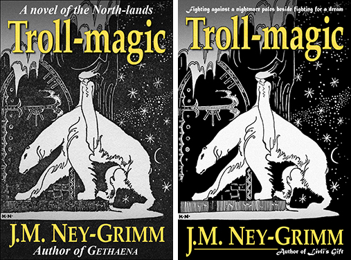
What do you think?
For further examples of the design process in action, check these posts: Cover Makeovers, Serpent’s Foe, Hunting Wild, Winter Glory, and Choosing a Tagline Font.
For discussions of cover copy, check Eyes Glaze Over? Never! and Cover Copy Primer.
For how-to pointers on story openings, see The First Lines.

What are some of the different options for textual elements hanging around the author and title?
I call them tag lines. I use the author tag line to point out another book I’ve written, as in “Author of Livli’s Gift” or “Author of Troll-magic.” If you have a book that’s been included on a bestseller list, you might put “Bestselling author of Booktitle” or “New York Times bestselling author of Booktitle.” If you’ve won a prestigious award, you might have “Award-winning author of Booktitle.”
I use the tag line near the title to present an image (image in words) or an idea about the story. In order to develop one, I think about the underlying themes in the story and how they are expressed in the plot. I try to find some element of “either-or” that is essential, because I want the tag line to have punch.
Michael, I wrote a shorter post about cover copy that you might find interesting. You can find it here.
Thanks; that’s just what I’m looking for.
Update: I’ve written a longer, more detailed post about cover copy since this. Not for the faint of heart, I suspect, since it delves into the gritty details. Useful, if you’re in the throes of wrestling with cover copy yourself. Too-much-information with a vengeance, if you’re not! Here is the link for my Cover Copy Primer.
It took a second in your first example – but then the subtlety spoke volumes.
It helps that you have a series of covers, and made changes to the whole bunch: there is definitely a feeling of ‘set’ to the collection.
You have a brand! The difference is ‘generic’ vs. ‘professional.’ I like that you made each element visual – and that you made such a clean list of the six rules you were applying – and that you didn’t really change anything (old fans will like that) because your original choice of cover illustrations was already good.
From good enough to very good.
Your covers also look as if they would reduce well to the thumbnail size – not much unnecessary clutter, the amount of text beyond Title and Author is minimal (and yes, it IS noticeable that you changed the content of several of these – subtitles?), and the fonts should remain legible. The smaller text bits might not be legible in the thumbnail size, but then it will still display Title and Author VERY clearly.
In these color covers the contrast is well done – no red letters on black background. I can’t see what would happen if one is viewing thumbnail AND b/w version (as on a Kindle without color). I presume you have looked at that somewhere along the way.
Thanks for sharing – this information will definitely kick up my cover design) the stuff running around in my head).
Thank you, ABE. I’m glad you find the information useful.
Thanks so much for this, J.N.! I’m not good with visual arts, but your examples really helped!
I’m so glad. I look forward to seeing your book covers!
Suzan, I just looked at the covers for your Bloodlines series and . . . wow! Looks to me like you are good with the visual arts! I’m impressed.
great post, very interesting. thanks for the primer!
Thanks for the useful tips. Your updated covers look great.
Wow, what a difference fonts make! I’ve been playing with the fonts on my second cover, so I match the feel on Botanicaust, and it’s not as easy as it looks! For one thing, I’m going from a single word title, to a three word title. I really appreciated seeing the way you handled yours. And I love the way your author name with the tagline looks. Very professional.
I find the longer the title, the more challenging the design process! The Troll’s Belt wasn’t too difficult – all short words, and one of them ‘the’ – but it did take some work. Sarvet’s Wanderyar was a doozie. I did 5 or 6 versions and still was not satisfied. The one I settled on (the others were prior to publication) was the best I could achieve at the time. I really love the current (new) version. The typography tools I learned at the publishing workshop were key.
This is very helpful … thank you! The simple visual representations of the principles you’re presenting are especially effective.
Thanks, all of you, for your comments and kind words.
Sorry, I can’t get excited about the Matura font. It’s scarcely legible at this size, and some of the caps are exercises in frustration, not purveyors of information. I don’t expect to be able to read tag lines at thumbnail, but at 200×300 I don’t want to have to work this hard, and frankly, I won’t.
The general layout does brand the stories nicely.
Excellent!
PD, you raise a very pertinent point: legibility of tag lines.
The topic was discussed specifically in the workshop I attended.
I remember dithering about the issue when I designed my very first cover. I noticed that all of the covers I looked at on Smashwords either had no tag lines or had illegible ones. The same seemed to be true on Amazon as well. What to do? I decided to buck the trend and make mine large enough to be legible at small size. As time went by, I became uneasy with that choice. My covers just didn’t look quite right.
And that, it seems, is the key.
My teacher explained that at the smaller sizes, the tag lines are present simply to make the cover look right. Readers expect them to be present. But the tag line for the story should be present in the cover copy which is displayed on the book’s web page. It doesn’t need to be legible. My teacher’s thinking, together with my increasing unease about my own covers, persuaded me. As you see.
The place where the tag lines are really important is on the print edition. Readers encountering my book in a store on Main Street have no web page to read!
Thank you for bringing up this topic!
On another note . . . I understand there are entire web sites devoted to the hatred of the font Comic Sans. I wonder if Matura might be similarly reviled? Now I’m curious!
(I do like Matura.)
Great post! Glad to see you got busy after the workshop! The new versions look AWESOME!!
Cheers!
-Lisa
Lisa!!!
Fabulous to hear from you! (And thank you.)
Yes, I’ve been busy. I have my next novel almost ready to go. I hope to hit the publish button this week. And I have a short story complete (but still need feedback from first readers) that I will package with Rainbow’s Lodestone (from the workshop) to make a “Unicorn Double” (a la Ace Double).
In general I avoid system fonts (and yes, that includes Matura). That aside, wow! What a fantastic article full of easy-to-grasp and easy-to-follow principles of design. Thanks so much for sharing!
My first time here, but am extremely impressed by your show-and-tell covers. What a difference a bit of tweaking makes; so professional! I’ve struggled with my cover for my self-pubbed “A Sea Change”; although I really like it, I know there much be a way to make it better and I’m going to start fiddling with it again. My question: once you’ve got your books up and selling, how difficult is it to re-do the cover and upload again?
Reloading the cover is one of the simplest changes to make. I simply save my Photoshop file as a JPEG and then upload the JPEG. It usually takes about 12 hours before the new cover shows on the product page at Amazon or B&N. It shows immediately at Smashwords, but takes 2 weeks or more to get to the e-tailers where they distribute. Good luck with your cover tweaking, Annette!
Excellent advice, thanks. Your revised covers do look more professional, appealing, and have a linked feel (theme?). I see quite a few ebooks that have text that runs off the edge of the image, or is too small to read. Are there any guidelines for point sizes?
Cheers!
Thank you for this easy to understand blog!
I have looking to understand fonts and how to use them for months. But when I searched on Google, or read other peoples blogs, they all start with the history of how fonts were invented and everything that has happened since. They then throw a lot of technical detail at me, till me head starts spinning. But they completely fail to answer the simple question: How do I use this to design my cover?
This must be the 1st blog I read that explains how to use fonts in practice, for people who don’t want to get a Phd in Font creation. So thank you, and keep up the good work 🙂
This post is just what I needed–some excellent information! I’ve been agonizing over how to make my covers “pop,” and although I’ve managed to teach myself some things that (I think) work, your advice here will put it in another ballpark entirely.
I particularly like what you say about your Brand. It’s something I’ve been considering, especially with a planned series in the works–a brand will help it seem unified. Altering the brand slightly could help define one genre from another (I write in both fantasy and horror), while if I keep it similar enough, people would hopefully still see that it’s me.
I did have one question: what about fonts and licensing? I’ve found a lot of fonts online that require money up front, but several that were free as well. Because these are unique fonts people have prepared, I always wonder about having to pay royalties or something. How are the “default” fonts installed on your computer licensed?
I’m a sister traveler in this world of indie publishing, not an expert. My understanding about system fonts is that the software company has negotiated a license with the font designer/owner that permits the software users unlimited use. That is, you and I don’t need to worry about using system fonts in our books and on their covers. Additional fonts purchased online should have a use policy somewhere on the web site where you acquire them. Some state that they are for personal use only (and thus cannot appear in or on one’s books). Others permit commercial use. Glad you found my post helpful.
Pingback: Indie Review: Star Drake « Speaking to the Eyes
Pingback: Cover Copy Primer | The Passive Voice
Pingback: Hodgepodge for the New Year! « KD DID IT Takes on Books
Pingback: Rewview Rewind: Star Drake « Speaking to the Eyes
So I’m a couple years late to this one, I wanted to say thank you for the informative post. J.A. Marlow pointed me in this direction recently during a discussion on cover art and workshops. I’m in the process of revamping ALL my covers LOL (don’t look, they’re…. **cough** yeah XD)
Out of curiosity, what workshop was it you took? I’ve been eyeing Dean Wesley Smith’s Cover design workshop. Anywho, the cover changes you shared and practical information on fonts in this post is very much appreciated.
Necia, this is one of the posts on my website that gets visitors nearly every day, so I suspect you have plenty of company. I’m glad you found the information helpful.
I took Dean’s cover design workshop when it was still just part of an on-site Coast workshop entitled “Think Like a Publisher.” The fundamentals presented there, combined with personal feedback on my covers, were very helpful. I learned a lot of essential information.
Since then, I’ve taken several of Dean’s online workshops and found them every bit as informative and helpful as the Coast workshop. My writing and indie pubbing career is light years ahead of where it would be without them. I can’t speak highly enough of Dean as a teacher.
Pingback: Monday Mentions: Maggots, Plague & Good Times! | AMY SHOJAI'S Bling, Bitches & Blood