As I gain experience with building covers for my books, I find the process growing more and more like painting with Photoshop. All of my covers, even the earliest ones, required some manipulation in Photoshop. Darkening the blacks. Balancing the colors. Adding to the edges of the art when those edges were ragged or simply didn’t give me enough extra for the trimming that occurs when paperback books are made.
But the cover for Hunting Wild required the most “painting” of any cover yet!
I found the process of transformation – from photos purchased on Dreamstime.com to finished cover – fascinating. Naturally I want to share the journey with you. 😀
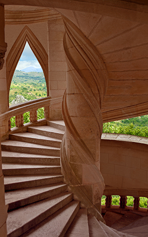
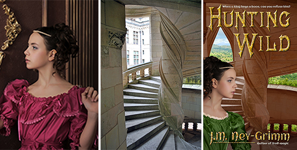
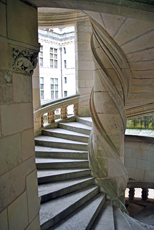 The original photo of the interior of a palace tower depicted one of the stair towers from Chambord, an incredible chateau in the Loire valley of France. The tower was perfect as a rendition of my own Baloron, the castle in which Hunting Wild takes place, except for two things.
One: Baloron is made of reddish stone, not white. And two: the landscape visible through the tower windows should be a dry plain studded with olive trees, not a palace courtyard. Luckily, both were problems I felt confidant I could correct.
 My first step was to cut away the courtyard seen through the openings of the Chambord stair tower. Then I turned the tower stone red. This image shows the arched fill-in I created for the square window at the upper left. In the process of building the cover, the window change came later, when I was trying to fit my title over the art. It was not working well – the title didn’t pop enough where it crossed the open window. I added the arched fill-in to give a better background for the title.
As I worked on the title, I also found I needed a little more tower at the right edge, so I “painted” that in.
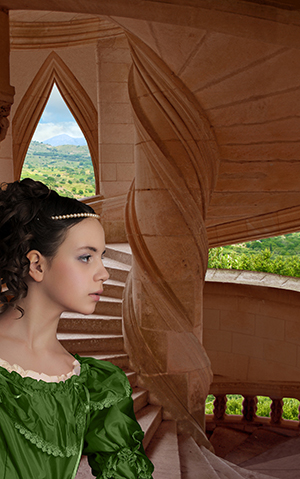
I purchased a landscape of olive groves to use for the landscape around Baloron.
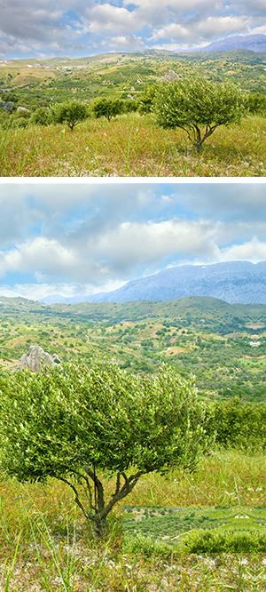 If I were being absolutely strict about Baloron’s landscape, I would have insisted on a grassy plain, perhaps with a lake in the background. I did look for such an image, but couldn’t find anything suitable. Since the region around Baloron includes olive groves (and cork trees), even though its immediate acreage does not, it seemed reasonable to compromise.
I didn’t use the entire photo that I purchased the rights to, just a portion of it. If you look closely at the right edge, you’ll see that I used the mirror image of a portion of the photo to extend the edge with the textures that my “painting” required. It creates a funny Rorshach-like pattern that isn’t visible in the final cover image, but that would be problematic if it were.
There’s another anomaly in the lower right portion of the photo. I pasted a portion of the tree tops into the area behind the right balustrade to achieve a more pleasing effect than what was there without editing. I find it interesting that the backside of this “tapestry” is so messy. 😀
 When I pasted the landscape into my painting, I initially used the photo in its original state. I needed to see what exactly showed through the tower window and the tower balustrade. I moved the landscape around to get the view through the window right. Then I started copying and pasting different pieces of the photo into the landscape that showed through the balustrade. There was a lot of trial and error.
Nope. Nope! No, not that either!
Eventually I achieved a result that I liked. Yay!
Then I noticed that the landscape looked a little too dark for the composition. The landscape photo was taken out of doors, of course. But when you look out at a landscape from indoors, your eyes are adjusted to the light levels indoors, which are much dimmer than outdoors. This makes the outdoors look brighter in comparison. So I adjusted the brightness of the landscape layer in my cover file. Another “yay!” when I nailed it.
 Now my setting was ready for my heroine! I purchased all three of the photos at the same time. I’d looked at hundreds, and only made my final choices when I was sure they would work well together. Even then, I did not purchase the right to use the photos until I’d downloaded low-resolution (and watermarked) comp images and put them together in a test cover to make sure they would work.
Each of the three photos cost $15 for the right to use it on my cover. Plus there was a fourth $15 image that I’d need for the back cover. I didn’t want to spend $60 until I was sure my selections would go together the way I envisioned them. I have planned compositions that simply didn’t work. This one, I am happy to report, did.
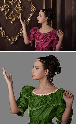
 Finding a young woman gowned in garb suitable to a medieval setting who also looked like my heroine was hard. I searched and searched and searched. Finally I settled on a photo in which the model was perfect, although her clothing was not. There wouldn’t be much of her gown showing, so the style (which is Victorian) was not critical. But the fuchsia color would simply not work in my “painting.” I would need to change it to green. Also, she really needed to have the ruffles of a chemise (an undergarment) showing at the neckline.
Even more difficult, the position of her arms would not work. I felt confidant I could change fuchsia to green. I even felt confidant I could create the chemise ruffle. I’d copy the neckline of her dress and paste it onto another layer of my file. Then turn it to a creamy white. Then set the translucency to 50% or so. As I’d envisioned, those changes were fairly straight forward. But the arms?
In my mock-up test cover, the arms proved to be no trouble. Only her shoulders were showing. Plus I’d tipped her forward to have her gazing out over the tower balustrade (rather than staring at the tower wall). I simply removed her arms from the image! (Ew! Sounds gory, doesn’t it?) In the final draft, I found I needed more room for my author byline, which meant I needed to show more of her upper torso. I had to do a lot of copy-and-paste “painting” to lenghthen her sleeves. But I was pleased with the result.
Next came the title, author byline, and taglines. I’d say this part was easy – and it was, compared to the work required for my heroine – except you know from my account above that I had a lot of trouble placing the title. I found a gorgeous font for the title: Mephisto And I discovered that the font Aclonica – for the tag lines and back cover copy – complemented Mephisto perfectly.
But I had to reposition the tower, which involved extending it at the top and right side. I had to create an arched fill-in for the square window. And I had to reposition my heroine, which involved lengthening her sleeves. Yikes! But I did it!
Then I decided that I wasn’t satisfied with how the author byline looked in the Mephisto font. It just didn’t look right to me. (You can see that version in my earlier post: Cover Preview: Hunting Wild.) Plus the points of the letters extended so far down that I couldn’t make my trademark byline work – underline connecting the “J” and the “Author of Troll-magic.”
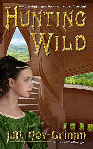 I fretted about the situation for several weeks. I created a cover for another book, on which my trademark author byline worked beautifully. I growled to myself about Hunting Wild. Finally, it occurred to me that I could use Aclonica – the font in the taglines – for my byline as well. I couldn’t just type it in, however. Small caps looked weird. Upper/lower case didn’t match my branding. So I customized: upper/lower for most of it, stretched lower case “M” and “N,” and an upper case “Y.”
There! Finally! I liked it! 😀
Let’s take a quick look at the finished cover side by side with two of the photos that went into creating it. Do you see why I call it “painting” in Photoshop? The transformation is rather dramatic. At least – I think so. 😉
For more cover builds:
Cover Creation: Perilous Chance
Building Star-drake’s Cover
Creating Livli’s Cover
For the principles of cover design:
Cover Design Primer

Very cool. Thanks for sharing. I’m thinking of getting photoshop, so it’s nice to know what can be done.
I love Photoshop! I think the only limit with it is your imagination and your skill. Both can grow over time.
That is an amazing journey – it is like science, though. You make it seem a lot cleaner than the process must have been, because in describing the process, you don’t go through all the dead ends. Thanks!
It is a gorgeous cover.
Thanks, Alicia! I’m glad you enjoyed the journey. I’m an artist who wants my work (stories and covers) to be seen, who wants to delight my audience. So your praise delights me. 😀
This cover didn’t have many dead ends. Crossing the Naiad…that cover had me tearing out my hair! I did two entire detailed mockups – involving ancient bridges, cloudy skies, and beautiful young women – and they didn’t work. Neither of them! Gah! I had to go back to Dreamstime and do yet more searching for the right photos.
But you are right that I make it look easier than it truly is. Some of that is that I’ve been working with Photoshop since 1995. Nineteen years of using the program…well, I’ve never taken any classes. I learned on the job. There are definitely many designers who are more facile with it than I am. But I do have a lot of experience behind me.
The other element that is critical is picking the right photos to work with. I don’t have nearly as much experience with that, but I’m getting better all the time.
The hardest part of this cover was finding the right photos. With some covers, I stumble upon those photos right away. Yay! With Hunting Wild I had to search for three days.
(With Crossing the Naiad, I searched three days and did a mock-up that didn’t work. Then I searched three days and did another mock-up that didn’t work. And then I searched one more time and found the right photo in about 30 minutes. 😀 )
The chief difficulties for the Hunting Wild cover I mentioned above: the title-over-window problem, the “painting” to extend the right side of the tower photo, “painting” my heroine’s sleeves to make them longer, and redoing my byline.
But you are also correct that I didn’t mention every last detail, because that would have made the post too long. For example: softening the puff on my heroine’s shoulder, adding an extra layer of red on the rightmost tower wall, and color balancing my heroine so that her skin tones look right for the light conditions inside the tower.
The other thing that makes it look easier is that I didn’t describe how and exactly what Photoshop tools I used to achieve my effects. Anyone watching me “paint” those sleeves for 2 hours would have been bored to tears! Even the simpler task of clipping my heroine out of her original background took quite a bit of time.
Thanks for taking a tour of my cover with me, Alicia. Much appreciated! 😀
I am going to teach myself Pixelmator if it kills me. So far it’s winning, but each time I go in there, I learn a bit more. Mainly, lack of time to watch all the Youtube videos, no single person to ask when I get stuck, and ya know, having to finish the BOOK first which chews up my ‘good time.’
I also have a typography problem: I get lost very quickly. I find something I like – and by the time I’ve finished modifying it, it doesn’t work any more.
I’ll get there; I think there’s a minimum set of skills after which you have something to add to.
And I have little natural ability, so I will at best be reasonably competent. What I do have is a finely-honed sense of what I don’t like – which unfortunately seems to kick in late in the process. I just tried my first attempt at working with a designer – and it’s been a dismal failure of communication thus far – and she was lovely enough to read the short story Too Late that the cover is for. How the two of us can have such different views of the same thing…
So I drank in all your little tips and comments, and bookmarked this post – it is one of the better ones – and I squirrel it away in my mind.
I know what I want for the novel, but I am not capable of producing it – yet.
I’m not familiar with Pixelmator, but graphics programs tend to be BIG programs, with lots to learn. You can do it, but be patient with yourself!
I don’t think you are unusual for realizing you don’t like a cover image rather late in the process. Until all of the elements are present, it is hard to assess how they will work together. An element that seems out of balance at first, may be perfect once the other element that balances it is in place. And vice versa.
I’m glad you found my post helpful, Alicia. I love it when something I’ve done helps another writer. 😀