This summer I attended a publishing workshop. Cover design formed part of the conversation, and I learned some critical details about it. My architecture background and my previous publishing experience meant I was doing a lot right, but I could do better. Not surprising! Architectural design classes don’t include typography and other elements of graphic design.
When I returned home from the workshop, I dove into tweaking all the covers for my stories. I’ll show the before and after versions. I find it fascinating that such small adjustments make such a big difference. But first I want to share a few basics from the workshop. (C’mon! It’ll be fun!)
First, type fonts.
There are six main categories of fonts.
Old Style – Traditional serif fonts that have been used for centuries. They are easy for the eye to follow, guided horizontally by the bottom serifs. They feature gentle transitions between the thick and thin strokes forming the letters.
Goudy, Baskerville, Garamond, and Palatino are examples of old style fonts.

Modern – Bold and eye-catching with extreme transitions between thick and thin. They have a cold, elegant look that works well on movie posters and some book covers (but not in the interior of a book).
Braggadocio and Engravers MT are both modern fonts.

Slab Serif – These fonts make all the strokes thick, abandoning thin altogether, even in the serifs. Slab serifs have impact, but it’s easy to overuse them, even on a cover. (They are not suitable for book interiors!)
Blackoak, Cooper Black, Rockwell Extra Bold, and Wide Latin are slab serif fonts.

Sans Serif – These fonts also have no thick-thin variation. They are monoweight. And they have no serifs. They are easy to read from a distance and respond well to variations in absolute size.
Helvetica, Charcoal, Skia, and Impact are sans serif fonts.

Script – Script fonts resemble cursive handwriting. Use them like chocolate torte. Very sparingly!
Apple Chancery, Brush Script, Gabriola, and Lucida Handwriting are all script fonts.

Decorative – These fonts are so decorative they almost become illustration. One letter might be enough!
Zapfino, Desdemona, Herculanum, and Lucida Blackletter are decorative fonts.

Three rules for choosing fonts for a book cover:
• Never use more than one font from each category.
That is, Braggadocio (modern) and Helvetica (sans serif) might work well together, but Skia and Charcoal (both sans serif) will not.
Why?
Because the human eye likes patterns to be either exactly alike or clearly different. Similar, but not the same, makes the human eye struggle.

• Do use two different fonts.
One font – say all Palatino – is overly calm, sedate, even boring.
Two fonts is interesting, but doesn’t overwhelm the eye.
Three fonts (each from a different category, of course) starts to be cluttered and busy.

• Use contrast to draw the eye.
Contrasting sizes, contrasting colors, contrasting fonts. You do want to catch the attention of potential readers, right? Compare the examples below.

Can you break these rules? Certainly. The instant I learned them I thought of exceptions that work beautifully. But the vast majority of covers that appeal to readers follow them.
 Is there more to typography? Of course. But these foundation concepts are enough to produce surprisingly good design results when choosing fonts. Let’s move on to the overall composition of a cover.
English speakers looking at a page visually enter it at the top left, glide along the elements on the page, and exit at the bottom right. All our years of reading train us thusly, and the design of a cover should support this natural movement of the eye.
Four rules for composition:
Proximity – Group related items. Place author and a quote about the author together. Or put a tag line about the book right above or below the title. Don’t dot bits and pieces all over the place.

Alignment – Every element should have a visual connection to every other element.

Repetition – Repeat visual elements to create cohesion. Color, shapes, line thickness, and font should all be chosen repetitively.

Contrast – Be bold, avoid the similar, make elements either the same or very different. I know. I listed this under the rules for font choice. It also goes for design in general.

But that’s enough lessons. (Do I hear you saying, “More than enough”? Yes, I think I do.)
What did all this instruction do for my own covers? Let’s take a look.

Here are the before and after versions for Rainbow’s Lodestone. The old cover used only one font and a center alignment. It was attractive, but overly sedate, bland.
The new cover adds the font Matura, a script font with a fantasy feel. It abandons the center alignment for an edge-to-edge arrangement that anchors the bottom and “caps” the top. The capital R in the title stretches up dynamically to frame the tag line. And the color of the title and author byline was deepened to better complement the photograph.
What about the new The Troll’s Belt cover?

It’s wise to create a visual brand for one’s books, so the fonts Palatino and Matura appear here also. However, the composition of the art requires something other than a straight top cap, although the edge-to-edge reach is maintained. Thus the title frames the faces of the troll and the boy. The author and author tag line are nearly identical in treatment to Rainbow. That’s my author brand.
And the new Sarvet’s Wanderyar cover?

My teacher’s exhortation to be bold rang in my ears. I pulled Matura into the title, which allowed me to:
• add some energy to the word Wanderyar
• create an edge-to-edge top cap that flattered the art
• and maintain the legibility of the type.
Troll-magic received the fewest alterations: just the new branding elements of tag lines in Matura plus, in the author byline, the dipping J and the underline.

What do you think?
For further examples of the design process in action, check these posts: Cover Makeovers, Serpent’s Foe, Hunting Wild, Winter Glory, and Choosing a Tagline Font.
For discussions of cover copy, check Eyes Glaze Over? Never! and Cover Copy Primer.
For how-to pointers on story openings, see The First Lines.
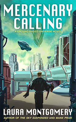 Exoplanets. Terrorists. Lawyers…
 FAA attorney Terrence Rogers dreams of space, but he spends his days on informed consent for space tourists.

