A Boatload of Covers

My participation in more than half a dozen story bundles brought a lot of cover design my way.

The More than Human bundle in August 2017 kicked off my journey, which wended through seven bundles (and counting) and on to a few covers for individual stories, some within bundles and some entirely independent of them.

I thought it would be fun to see the round dozen all in one place, so I’ve collected them into a sort of bulletin board below. Check it out!

Kinda cool, don’t ya think? 😀

Remembering Warriors I Immortals I Spring Surprise
Here Be Dragons I The Kitchen Imps I The Warrior’s Curse
Early Spaceports I Of Blood and Scales I Tales of Erana

For 2019’s bulletin boards of covers, see:
Covers, and More Covers
Covers from the Ney-Grimm Catalog


Share

A New Cover for Fate’s Door

water spirit under water
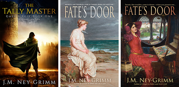
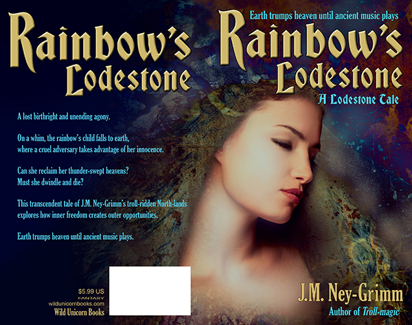
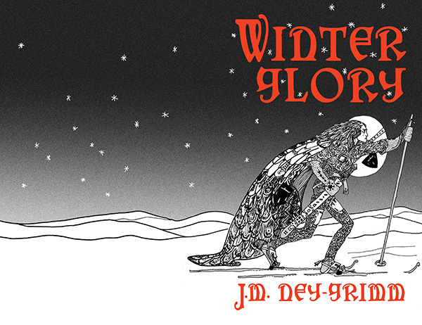
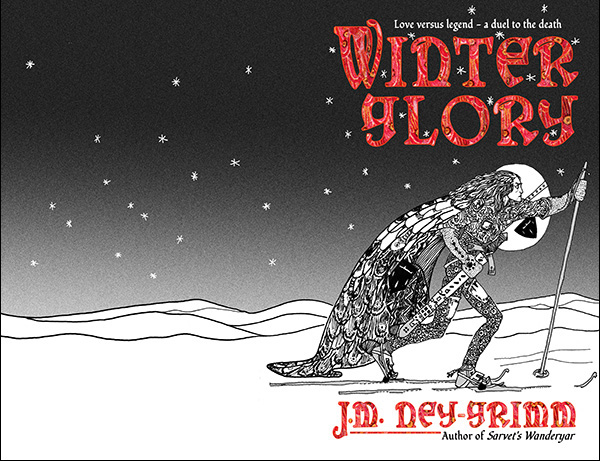
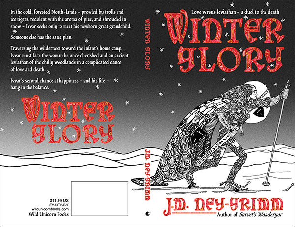
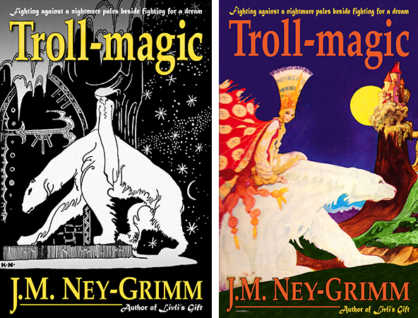
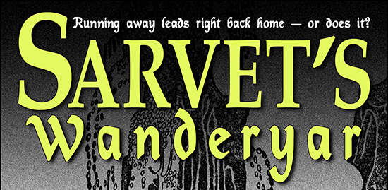
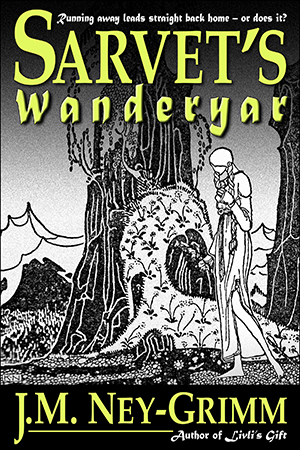
I remember how nervous I was when I commissioned the cover for The Tally Master from Deranged Doctor Design. Their portfolio of work looked wonderful. But would my cover match that excellence? Would they be able to find compelling images that worked with my Bronze Age setting? Would they really be able to compose art for a story that they’d never read?

I could make a long list of my worries. But I won’t. Suffice it to say that I had them. Plenty of them.

Then the day arrived when the preliminary draft landed in my inbox, and I loved it. In the words of a fellow author, it was magnificent!

And now, nearly 4 months after the book’s release, I can report that the book sold more copies at its debut than any of my other titles and continues to sell well. Clearly that sublime cover is having an effect.

It also got me thinking about all the covers on my backlist. I suspect all those books would sell more copies if only they possessed covers by DDD. I’d love to replace them. But in order to do so, I’d need to accumulate some big piles of cash. And cash is v-e-r-y tight at Casa Ney-Grimm, with some big medical bills to pay and two high schoolers approaching college. Yikes!

Which means that if my backlist is going to get “new clothes” any time in the next decade…well, let’s just say I’m not going to be shelling out $4,300 to re-cover 18 books! It would undoubtedly be worth the investment, if I had the money. But I don’t.

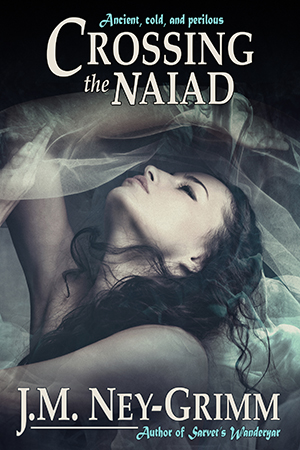
Now clearly some of my old covers are fine. Crossing the Naiad sells as though it were a novel, even though it is a short story, and that is probably due to the cover. I probably shouldn’t replace that cover at all, because…why monkey with success?

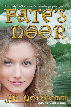
On the other hand, my novel Fate’s Door sells as though it were a short story, and that really bugs me, because I think it is a very fine work. If I could replace only one cover from my backlist, it would be Fate’s Door.

I’ll admit that I’ve been tempted. But I am determined that all new releases get DDD covers. And if I buy a DDD cover for Fate’s Door, then I won’t be able to provide WIP with a DDD cover when it releases. That’s not a good trade off.

But…I don’t think I must relegate Fate’s Door to a cover that isn’t speaking to my readers.

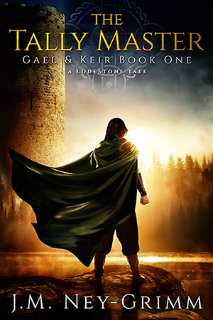
I’ve been thinking about the elements in the cover for The Tally Master and comparing them to existing cover for Fate’s Door. They are really almost visual opposites.

Tally has great depth of field. Fate’s depth of field is compressed, creating almost a flat effect.

The art for Tally dominates the image, with the title and byline playing a complementary role. Whereas the title and byline for Fate are ornate and large, forming an important element in the image as a whole.

Tally’s art is painterly, moody, and evocative. Fate’s art is photographic and straight forward.

Now Fate’s Door and The Tally Master are very different stories. Fate’s Door is brighter, about a young sea nymph growing up and confronting a challenge that is in part self-made, while Tally transpires in a darker milieu. The covers on the books shouldn’t have identical values.

But although the stories are different, they’re both what I would call “typical Ney-Grimm”: lush, exotic settings; depthful characters; flashes of insight into the human experience; and paeans to the strength of hope. The feeling conveyed by their covers should be more similar than not. And I think the cover for Tally got it mostly right, while the cover for Fate gets it mostly wrong.

So my idea…you knew I had an idea, right?

Actually I had several. You probably knew that, too. 😀

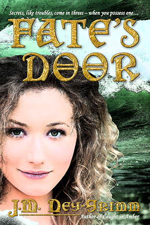
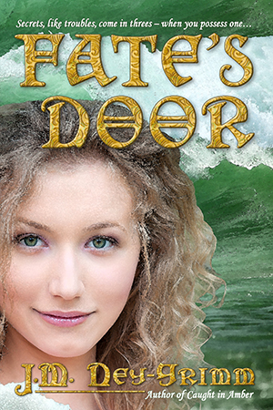
My first idea was that I could try to give my existing Fate cover a more painterly effect. I could try running the image through the watercolor filter in Photoshop. Or the oil painting filter. Or even try the software FilterForge, of which I’ve heard good things.

Well, that first idea didn’t work out very well. The watercolor filter is attractive (right), but it doesn’t really make the image look like a painting. To my eye, it’s really not all that different from the unfiltered version. I couldn’t imagine that the watercolor version would appeal to my readers any more than the original image.

Time for a plan B.

I tried the oil painting filter. The pastel filter. The sponge filter. In fact, I tried nearly every filter that yielded a result in color, even the plastic wrap filter! (Which really does make Nerine look like she has plastic wrap over her face. Ugh!)

Just to give you some idea of how wrong those filters can go, I’m showing you the result of the fresco filter. It looks like something from the mod-70s to me, as did many of the other filters.

I had to conclude that running the existing image through a filter simply wasn’t going to generate the painterly effect I could see in my mind’s eye.

By now, I had the bit between my teeth. Time for a plan C. 😀

With my mind on painterly effects, I contemplated a trip into the past to solve my cover puzzle. Art by Kay Neilsen graces the covers of 4 of my books. His work fits with my North-lands, but wouldn’t be so suitable for a story set in our own Mediterranean (with some divergences north) in the Hellenistic period.

What about the works of other artists from the past?

It turns out that featuring art from the past on a cover is not quite so simple as I’d imagined. The key question is whether or not the art has been published. If it ever appeared on a postcard, a poster, in a book, or in some other way reproduced for public distribution, then it has been published.

Appearing at a public exhibition to be viewed by thousands does not constitute publication. That’s where things get dicey.

If it was created before 1923, published before 1978, and its creator died more than 70 years ago, then the image is in the public domain and I am free to use it.

If the art was created before 1923, published after 2002, and it’s creator died more than 70 years ago, it is in the public domain.

BUT if that old painting from the 1500s was first published between 1978 and 2002, then there is a chance that the publisher may own the copyright, as crazy as that seems.

I love the artwork of the nineteenth-century Pre-Raphaelites, and I had in mind specifically the work of John William Waterhouse, not a Pre-Raphaelit himself, but strongly influenced by them. He lived from 1849 to 1917, and his paintings were created between the 1870s and 1916. They were certainly candidates for the public domain. But it took me 9 hours of research to determine that they truly are in the public domain.

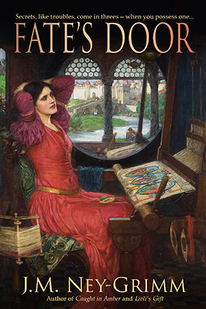
I wrote a blog post about Mother Holle (a goddess figure with roots in the Bronze Age) that featured Waterhouse art, and one of those paintings depicted Tennyson’s Lady of Shalott at her loom.

Because my heroine, the sea nymph Nerine, serves as a handmaiden to the three fates who weave the life of the world on their great loom, a beautiful painting focusing on a weaver seemed ideal.

Now Nerine is blonde and slightly younger than the weaver in the painting, but covers don’t always depict the protagonist of the story. I viewed the weaver as Mother Holle herself, in whose footsteps Nerine is following. And the mood of the painting is rich and lush. It has the right feeling for Fate’s Door, especially when compared to the cover on the first edition.

It was fun working with the painting, to create my cover. I used a more subdued treatment for the title and byline, following the trail blazed by The Tally Master. I’ll admit that I love what I developed.

But, but, but!

Of course, there’s a but!

I think the story of the cover for this book is nothing but a big long series of buts! (You may recall that I waged a heroic struggle with the color and texture of the title and byline when I was approaching the release of the paperback. I blogged about it here.)

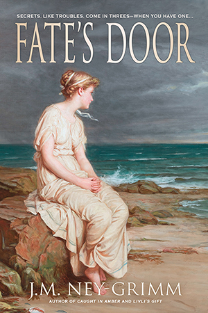
When I showed the new cover with the loom to a friend, she said, “But what about the painting of Miranda?”

I didn’t immediately know what she was talking about. When I returned to the Wikipedia gallery of Waterhouse works, the painting in question jumped out at me as being perfect: a blond in Grecian garb gazing out at the sea. Nerine’s hair has greeny-gold highlights, but aside from that “Miranda” could be Nerine.

I was so utterly beguiled by the image that I just had to work with it.

So I did!

But now I’m in a quandary, because I love both versions. Which one should I use?

That is my decision to make, of course, but I’d love to know what you think. Loom? Sea?

Believe it or not, I’m considering making two versions of a new paperback, one with the loom image, one with the sea image. I can do that with paper. But I’ll have to chose one or the other for the ebook. 😀

Your opinion, s’il vous plaît?


Share

Building Rainbow’s Cover

art for Rainbow's Lodestone

The first time I created a book cover for Rainbow’s Lodestone, I couldn’t find any art that looked like my spirit of the rainbow. So I settled for a landscape. It was a dramatic landscape – beautiful – and it had a rainbow against a looming cloudy sky. But I didn’t think it conveyed the essence of my story well.

art for original Rainbow's Lodestone coverSo, when I was ready to create the paperback edition of Rainbow’s Lodestone, I went looking for more suitable art. And I found exactly what I was looking for. The instant I set eyes on the image, I said to myself, “That’s her!”

It was exciting. I purchased the right to use the image on my cover.

The first thing to do was flip the image. I wanted the spirit of light looking to the right, supporting the eye’s natural tendency to move from the top left corner of an image to the bottom right.

The next adjustment needed was creating room for a title. As you can see (above), the art didn’t have room at the top. Nor did it have much room at the bottom for my author byline. I had some work to do. I started to “paint” the extra margins I needed.

I’ve talked before about this “painting” I do in Photoshop. You might be wondering what I mean since that’s not very specific.

This is what I do to extend the background: I take the “lasso” tool and draw a rough shape around a suitable piece of the background. Then I “feather” the edge of my selection, essentially creating a fuzzy edge instead of a crisp one. Next I copy my selection and paste it on a new layer in my file. I move it around until it looks good. Then I merge it back onto the main layer.

That’s it in a nutshell.

But I do it over and over again to fill in the area I need.

modified art for Rainbow's Lodetone

The next steps were less time intensive.

I assessed the back cover area to discern whether type would be easily read atop it. Rarely is it just fine as is. Usually I must either lighten it to receive dark type or darken it to receive light type. Additionally, if there is a lot of variation in lightness and darkness, I must even it out.

Type needs a fairly bland background behind it in order to be easy on the reading eyes.

The art for Rainbow’s Lodestone didn’t extend far enough to the left after I’d added to the top. I could have “painted” yet more background, but I had a better plan in mind.

I sampled three colors from the back ground: a dark blue, a dark aqua, and a black. I selected large irregular triangles in the area that needed to be filled – feathered the edges a lot – and filled them with these three colors. The result was a varying wash of color that blended with the art and also yielded a good background for the back cover text.

Rainbow art with title

The Lodestone Tales follow the lodestones created by Zandro Mytris through the history of my North-lands. Which means I want the covers for all of the stories to look like they belong together.

I’d already chosen the font Bradley Gratis for the titles of the books and the font Gloucester for the tag lines and the back cover text. Working with those choices, I placed the title on the front cover so that it lined up with one edge of the cover and framed the art. Adding my byline and the tag lines was a straight forward matter.

Rainbow’s Lodestone is a short story, which means that its “blurb” is fairly short. I wouldn’t want to plump up the blurb with a lot of spoilers! I had to play with the best size for the text and line spacing, as well as seeking the best way to break the text into paragraphs. It was a matter of trying different arrangements until I got one that looked good.

I submitted this cover to a design contest held every month by Joel Friedlander. He’s a publishing and design professional active in the indie publishing world, and his good opinion is very worth having. I was delighted when Rainbow’s Lodestone won a rare and coveted gold star award!

(Rainbow’s Lodestone is the 30th in the long column of covers shown. Joel doesn’t list them by rank, but randomly.)

Paperback cover for Rainbow's Lodestone

To see more cover builds:
Building Star-drake’s Cover
Building Wild’s Cover
Cover Creation: Perilous Chance

For the basic principles of cover design:
Cover Design Primer


Share

Building Glory’s Cover

y Magnus Sjöberg (Larsson), photo used under a Creative Commons license, FlickrI was so lucky finding images that were perfect for the covers of Fate’s Door and Caught in Amber, I hoped I might be equally lucky with photos for Winter Glory.

I found a gorgeous northern landscape: a snow-covered pine forest with the sun setting through the tree trunks. (Similar to the photo at left.) But I couldn’t find anyone who looked like Ivvar.

This didn’t truly surprise me. Ivvar’s a tall fellow with shoulder-length gray dreadlocks and tan skin. Not tanned by sunlight, but naturally tan, the way my Hammarleedings are.

I searched for a photo of Ivvar last October when I finished writing Winter Glory. I searched in November when I got feedback from my first reader and started revisions. I searched in January when I received feedback from my second reader and made more revisions. I searched in February when the file came back from my proofreader with typos corrected.

I searched one last time when it was time to create the cover.

illustration for East of the Sun and West of the MoonThen I had to face the fact that I simply was not going to find Ivvar photographed by chance by a modern photographer. 😀

I wasn’t panicked. I had a plan B. I would use the illustration by Kay Nielsen for “So the man gave him a pair of snow-shoes” in East of the Sun and West of the Moon. It’s a gorgeous piece of art. It was probably for the best that I’d failed to find a good photo.

As I scanned the Nielsen art, I talked with my husband about my plan for the cover. He was in the other room, so he was not looking at the piece of art concerned. He said: “Oh, yeah! You’ll make one of those black & white covers, like the ones for Troll-magic and Sarvet’s Wanderyar. Great! They’re really your trademark look.”

Right then and there I had an epiphany.

The art showing a man on skies is a color piece. But in the time it took my husband to speak, I’d envisioned it rendered in black & white, and I loved it.

Plus my husband’s suggestion made so much sense. A color painting would be a whole new look for one of my books. But a black & white Kay Nielsen piece would fit right in with the other North-lands and Hammarleeding books.

And I was sure I could do it. The print quality on the black & white illustrations of my 1914 edition of East of the Sun and West of the Moon is very poor. In order to get a clean image for my covers with Kay Nielsen art – crisp lines without inkblots, black blacks, and white whites – I’d always placed the art on a light table and traced it.

I was certain I could do the same for a color illustration. It would be trickier. I’d be making value judgements all the way through about how to render shades of color as either shades of gray or patterns of black & white lines. But Nielsen’s work lends itself to black & white interpretation. Even his color work has interesting line and texture present.

I scrutinized the piece of art depicting the skier. Yes! I could see in my mind’s eye exactly how I would do it.

So I set to work.

black & white sketch for Winter Glory

I was nervous at first. So nervous that my hand kept shaking. I had to talk myself down. “Jessica, any small mistakes can be corrected in Photoshop. And if you make a big mistake, it won’t be the worst thing if you have to start over. Relax. Relax. Relax.”

My hand was still not steady with that first line of ink on paper. I got a fresh sheet of paper. And started on the skier’s hair, which was supposed to be squiggley. By the time I finished the hair, my hand was steady. I’d forgotten my nerves and was enjoying the drawing.

I was almost sad when I finished, except that there was more fun ahead.

I scanned my black & white drawing into my computer and started building the cover for Winter Glory.

The first step was to select the stars and turn them from black to white. Then I put a gradient screen from the top of the cover to the bottom, thus creating the sky. I loved how that made the skier pop!

Adding the sky to the cover for Winter Glory

Next step? The title.

I already knew I wanted to use the cloak texture from the original color illustration, but I wanted to get the title’s size and placement settled using Photoshop’s type managing tools. I would turn the layer from a type layer to an image layer after I got the type exactly the way I wanted it. So I used a bright red to help me visualize the final result.

Adding title and byline to the cover for Winter Glory

The cloak in the original illustration was a lovely patch of color. It was big enough that I could have just selected it and “pasted it inside” of the letters of the title and my author byline. But it would have been a lot of pasting.

cloak textureSo I made a square of the texture first – pasting and pasting and pasting that cloak patch into a separate file. I increased the saturation, and heightened the reds and yellows to achieve the effect I wanted.

Once the cloak texture file was ready, I selected the whole square and pasted that inside the letters of my cover file. It took four pastes to fill them all. Instead of ten or more!

The textured title softened the overall effect of the art. The black & white art with the solid red title has a crisp and definite look that I like. But it’s a little too hard-edged for the story, which blends life-threatening action with romance.

Winter Glory cover with textured title

Then I was closing in on the finish line.

I added the tag lines – one above the title, one below my author byline. And my trademark line, connecting the big “J” to “Author of Sarvet’s Wanderyar.”

I placed the back cover copy. I placed the title on the back cover. Next came the spine: title, byline, and Wild Unicorn logo.

And finally the publisher info and the box for the barcode.

I was done! It’s ready to be placed in an InDesign file for the paperback cover, and to be windowed for the ebook cover. 😀

Glory cov build 7

For more cover builds:
Cover Creation: Perilous Chance
Building Star-drake’s Cover
Creating Livli’s Cover

For the principles of cover design:
Cover Design Primer


Share

Color Is the New Black

The interior walls of my home are white. By choice.

Too many of the clothes in my wardrobe are black & white. With touches of blue. Again: my choice.

I love black & white photos. I adore black & white line art.

Is there something a little off with me? What is this black & white fetish?

I’m guessing you can see where this is going! When it came time to design my book covers, I chose the ravishingly beautiful black & white illustrations by Kay Nielsen for the art. Unfortunately for me, not everyone shares my predilection for black & white. More specifically, readers often prefer images with more color.

“The art is so dark!” says one. “Almost dingy.”

“I couldn’t tell what it was, really,” says another. “It’s incomprehensible!”

“But your stories are so vivid, and your landscapes so stunning. The black & white covers don’t do justice to either.”

They made excellent points. Enough so, that I opened up Photoshop for another try at the cover for Troll-magic.

Two covers for Troll-magic

What do you think?

I continue to be entranced by the black & white one, but I like the colorful one (art by Victor Candell) as well. Yet I remain on the fence. B&W? Color? B&W? Color?

I’ve uploaded the colorful one to Amazon to appear as the cover for the ebook. Changing the print edition would be a much larger project, so it remains black & white (with a touch of gold) for now. I’m curious to see what will happen. Will more readers decide Troll-magic is for them? Fewer? The same number? I’ll let you know some time in August. Grin!

In the meantime, I’m very interested in your opinion. Please leave your vote in the comments!

Update: Thank you so much to each of you who shared in the comments. I have a better understanding of how my covers strike readers, because of you! “What was my decision?” you wonder. Black & white. It is unique. I’ll stand out in a crowd. 😀

For more about my book covers:
Cover Creation: Perilous Chance
Building Star-drake’s Cover
Creating Livli’s Cover

For more about how to design book covers:
Cover Design Primer


Share

Choosing a Tagline Font

Sarvet's WanderyarThe print edition for Sarvet’s Wanderyar was so close to release. Just one more proof cycle, click the “approve” button, and there she was – on the bookstore shelf, ready for readers to enjoy!

But!

You knew there was a “but,” didn’t you? After all, as I write this post, the print edition of Sarvet’s Wanderyar is definitively not on any bookshelves. What happened?

I learned a bit of history, which I’m going to share with you!

In the 1800’s and on into the early 1900’s, many authors self-published, including greats – such as Mark Twain – who gave us our classics. Then times changed and for decades self-publishing was not a viable option. In 2009, with the advent of Amazon’s Kindle Direct Publishing program, indie publishing became viable again. Writers with a pioneering spirit jumped in. Many of them wrote fantasy, and all of them were creating their own covers, whether they had design expertise or not.

Right now, in 2013, there are plenty of graphic designers available to create covers for e-books. In 2009? Not so much. So the indies gave it their best shot, producing covers that were glorious by accident, mediocre by default, or (alas) atrocious. Writers write. But only a few of them wrestle Photoshop and win!

Most of the writers used the fonts that came on their computers, and the fantasy authors were no different. What was there among those scant 200 typefaces that would work well for titles? Quite a few sans serif fonts for thrillers, a scattering of script fonts for romances, and many traditional fonts for mainstream fiction. For the fantasy novels? Matura.

So Matura showed up again and again and again on fantasy covers. Matura used well. Matura used poorly. Matura, Matura, Matura. Writers making covers and readers buying e-books grew sick of it!

I entered the indie pub world late in 2011. Indies had moved on from their early efforts. Some hired designers for their covers, others upgraded their skills. Nobody limited themselves to the fonts that came with their computer. There were a million and one fonts available online for a modest price. Result: nobody used Matura anymore! In fact, Matura wasn’t even listed among the fonts on my own computer.

I knew right away that I wanted to use Palatino for my titles. It’s a traditional font with an extra share of grace, featuring elongated ascenders and descenders (the lines rising from b’s and d’s, or heading down from g’s and q’s) and delicate curves. That grace seems to express the essence of my North-lands, but is easier to read than a decorative “fantasy” font. It also enlarges well to the size necessary for titles. So: Palatino. Yes.

At first I intended to use Palatino for my taglines as well as my titles. Fortunately I took a workshop! It taught me that a) taglines need not be visible in thumbnail-sized images (my first covers had them too big); and b) using only one font on a cover is sedate. Did I want my stories to be perceived as sedate. No!

Time to do a font search.

First, let’s review the rules for choosing fonts.

1) Do use two different fonts.

Check. I was using Palatino for the title and the author byline. I was seeking a different font to use on the taglines – one above the title, one below the author byline.

2) Never use more than one font from any one category of fonts.

Right. Palatino is an old style serif font. My second font would ideally be a sans serif font, a script font, or a decorative font. If I chose a decorative font, it should be a simple one, not ornate. Modern fonts and slab serif fonts don’t go very well with the fantasy feel of my stories. (For a review of the six font categories see my Cover Copy Primer.)

3) Use fonts that are very different in their characteristics, that contrast with one another.

Palatino has a very calm, vertical, linear feel to it. A contrasting font should be curvier, perhaps possess more horizontal energy, and have more variation between its thickest and thinnest strokes. Let’s see what I found.

I searched and I searched and I searched. The right font was not jumping out at me. At last, I chose … Matura! Knowing nothing of its 2009 history, I took joy in my find. (Dear me!)

Last fall, I learned that some people hate Matura. Hmm. Should I change it? Maybe. I was still on the fence when I learned the full story this spring. Should I change it? Probably. So I went looking again.

Before I show you what I found, here’s the top portion of Sarvet’s Wanderyar with the Matura font appearing both in the word “Wanderyar” and in the tagline “Running away leads straight back home – or does it?”

Matura tagline

It still looks good to me. But let’s follow my search and see what some of the other possibilities look like.

I liked Matura for the boldness of its line. It’s easier to read than more spidery decorative fonts. And it contrasts nicely with the delicacy of Palatino. It is sans serif, while Palatino is a serif font. The points at the ends at each stroke contrast with the strict horizontal nature of Palatino’s serifs. Bottom line: it’s got a lot going for it.

Seeking Matura’s replacement, I looked at calligraphy fonts, Celtic fonts, Gothic fonts, Old English fonts, and sans serif fonts. Nothing really grabbed me, but I saw some possibilities. In fact, I saw thirty-plus possibilities. I downloaded them all! And started trying them in Word. Hmm. In Word, none of them won my regard when they went head-to-head with Matura. So I chose the best of the lot and tried them in Photoshop, with a full cover treatment.

Here’s the font Paladin.

Paladin font

It’s got a calligraphy style to it, much like Matura. Its curves contrast nicely with Palatino. But Paladin is much harder to read than Matura. And the extreme variation in its line weight – from broad and thick to spidery thin – is not to my taste. Let’s look at something else!

Here’s Mysticor.

Mysticor font

Much better! But it’s a little too curvy. Kind of like the curly writing of young girls who dot their i’s with hearts. Yikes! In the d and the y, even the straight strokes are curved. Plus Mysticor’s line weight is too close to that of Palatino. So … no.

Next!

Here’s Devinne.

Devinne font

Now, I like Devinne. I’d considered it during my first search for a tagline font. I voted against it, because it was less legible than Matura. But what about it? Maybe I should reconsider.

Devinne has a nice blend of thick and thin, as well as a balanced movement between straight and curved. In fact, it’s almost perfect in its contrast with the Palatino. Except for one thing. I’d not considered Devinne a serif font. Mostly, it isn’t. But look at that W and that n and that r. Serifs. One of the rules of font selection is that you don’t place two different serif fonts together on a cover. Can you break the rule? In a heartbeat, if it works. But it doesn’t work here. The serifs, especially on that W, fight for dominance with the serifs on the Palatino Sarvet. Plus … Devinne is so dang hard to read. So, no.

Here’s something simpler, a sans serif named Fondamento.

Fondamento font

Pleasing, but really just a slightly straighter version of Mysticor above. Let’s move on!

What about Black Chancery?

I like it. I like it a lot. And I almost chose it for my tagline font. Except I hate the exaggerated tails on the d and the y. The serifs on the W clash with the Palatino serifs on Sarvet. The W does not cradle the S the way the Matura W does. And the font as a whole is less legible.

Black Chancery font

The five fonts I’ve shown you here were the best of the lot. All the other twenty-plus were less successful variants on these final contenders (the way Mysticor and Fondamento are variants of one another).

So, what am I doing? I’m keeping Matura.

This is my thinking:

Sarvet's WanderyarI’m writing to please my readers. Some of my readers will be indies who published their own books in 2009. But that’s a pretty select crew! The vast majority of my readers never cracked an e-book until much later. Most of my readers never suffered through the overuse and abuse of Matura. To most of my readers, the Matura in my taglines will look as fresh and appealing as it does to me.

Will I always stick with Matura? That’s a whole ‘nother question. Every publisher updates her covers as the years pass. Culture changes, and images that seemed appropriate and attractive in one decade look dated and awkward in the next. So my covers will change. But not this month!

Time to push that last revision cycle on Sarvet’s Wanderyar along and release the print edition!

Update: Sarvet’s Wanderyar is now in print! See the announcement here.

For more about book covers:
Cover Design Primer, the fundamentals of cover design.
Cover Makeovers, a series of before’s and after’s.
Perilous Chance, Star-drake, and Livli’s Gift, the design process in action.

Share

Building Star-drake’s Cover

Profile of a star-drake against a starry skyI adore the black and white line art drawn by Kay Nielsen in 1914. You can undoubtedly tell that from the images at the top of my blog. All gorgeous illustrations by Nielsen.


But Nielsen art can be difficult to track down. And I’m not sure he ever did any dragons. If he did, I haven’t seen them.


So when it was time to create a cover for Star-drake, I needed another solution. And I found a fabulous winged-and-clawed beast by Netfalls on the Dreamstime web site. Except . . . it was golden, not black. And flew through an inferno, not a star-spangled night sky. But the basic form was perfect . . . and some Photoshop work could fix the rest.


I purchased the right to use the art, turned it black and white, clipped away the inferno, and placed the creature in my cover file. The highlights were too bright, so I toned them down. The middle grays weren’t dark enough, so I deepened them. And the drake needed a little more vertical reach, so I lengthened his neck. There! The hard part was done.


Next came the night sky: another Dreamstime find, this one by Silvertiger. I tried popping the image straight into my file, but the brightest stars were unfortunately placed. I flipped the image, nudged it up and to one side, and that did it. But what about the drake’s eye? It alone should gleam, not with fire – this is an archetypal leviathan of darkness and mystery – but with intensity. I selected the eye and made it citron, glowing like a jewel.


I added a translucent shadow at the very top and the very bottom of the art, to give a nice dark field for my title and byline. I placed these as pale gray type, then ran them through Photoshp’s chrome filter to generate the wavy pattern within the letters. The tag lines called for the color of the drake’s eye. Who can resist that eye? Not me!

And there you have it: the cover for Star-drake.

But, wait, that’s not all! I have plans for this story that one reviewer was gracious enough to call wonderful. It is destined for a collection of six stories – ranging from short to novella – all featuring trolls among their casts of characters. The collection will release some time next year as both an e-book and a print edition. In the meantime, Star-drake is bundled with a bonus story (Rainbow’s Lodestone) as an e-book in all the usual places.

Amazon I B&N I Diesel I iTunes I Kobo I Smashwords

More posts about book covers:
Eyes Glaze Over? Never!
Cover Creation: Perilous Chance
Cover Makeovers


Share

Creating Livli’s Cover

I want to take you with me as I build a book cover. It’ll be fun and interesting, so let’s go! My second novel, Livli’s Gift, will be released soon; watch as I put together its cover.

from art to complete coverThe first step is selecting art. I could commission an artist to create something new. But my North-lands were inspired by the folk tales in the collection East of the Sun and West of the Moon, and I adore the work of Kay Nielsen (who illustrated the stories). So I choose one of his pieces. It was published in 1914 and is in the public domain. It depicts a queen tending two magical plants under cloches in her garden and fits well with the events in Livli’s Gift, as you’ll see when you read it.

I’m not expert at working the scanner, so the color balance of the scanned art is wrong. Luckily I know my way around Photoshop well enough to fix the problem. I bring the art back to black and white, then drop the image into my cover file.


I leave room under the art for my name and an author tagline, but the area needs to be something other than a rectangle of paleness. This piece of art calls for a dark foundation, so I fill it with black. I also remove the black frame line at the top of the art, creating a smooth expanse for the title.


I know I want the color of the title to match the color of the author name: a bright blue. I’ll need a dark ground for the title to show well, so I create a translucent shadow at the top of the cover.


I type in the the title and the author. The J.M. Ney-Grimm looks great (grin!), but the title is not “popping” enough.


I add a drop shadow behind the letters of the title. That’s better! All that remains to be done is type in the title tagline and the author tagline.


:: Typing, typing, typing ::


And there we have it: Livli’s Gift.

 
Note: The design shown here was created for the first edition of Livli’s Gift. The second edition possesses a different cover.

More posts about book covers:
Eyes Glaze Over? Never!
Building Star-drake’s Cover
Choosing a Tagline Font


Share