Tag Archives: John William Waterhouse

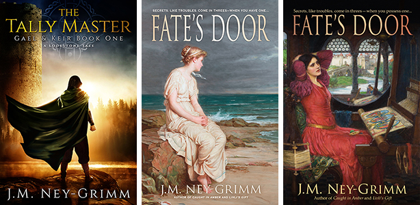
A New Cover for Troll-magic
I’ve been replacing all my covers featuring the back & white illustrations by Kay Nielsen.
I loved those old covers, but the odd thing is that I find I’m loving the new ones every bit as much. I suspect it’s because I’ve loved the works by John William Waterhouse for almost as long as I’ve loved Kay Nielsen’s illustrations.
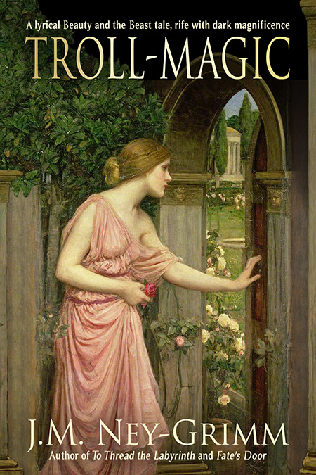
I’m particularly delighted with the art I found for Troll-magic.
There’s a story behind that, which I’m gong to share. 😉
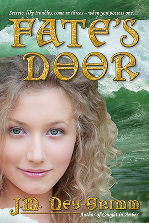
You may recall that when I searched the portfolio of John William Waterhouse for art that would fit Fate’s Door, I initially missed the painting titled Miranda, even though it is perfect, depicting a young blond woman in Grecian robes who could be Nerine, the sea nymph protagonist of my book.
 Luckily my friend Laura found what I had missed.
The same thing happened with Livli’s Gift, although I self-corrected there. After doing a mock-up based on Waterhouse’s The Annunciation, I noticed The Crystal Ball, which was (again) perfect.
Well, guess what? You know what comes next, right?
When I looked for art that would fit Troll-magic, I didn’t see anything.
It was only when I was searching on behalf of Livli’s Gift that I found myself doing a double take.
“Wait a minute!” I said to myself. “Psyche has blond hair like Lorelin. It’s too bad that the scene in which Psyche opens Aphrodite’s forbidden gift doesn’t fit anything in Troll-magic. I sat back, staring at the painting, feeling something niggle at my backbrain.
“What, what, what?” I wondered silently.
Then I had it! Waterhouse had painted more than one scene from the Psyche and Cupid myth.
 His work depicting Psyche opening the door into Cupid’s garden is perfect on so many levels.
The Psyche and Cupid myth (or, in a more Jungian vein, Psyche and Amor) is the root from which the fairy tale Beauty and the Beast grew.
East of the Sun and West of the Moon (the inspiration for my own Troll-magic) is the Nordic version of Beauty and the Beast. An illustration from the Psyche and Cupid myth felt heart-deep right.
On a more superficial level, it was right also. The motif of an unexpected side door, opening onto wonders, occurs several times in Troll-magic, starting with Lorelin discovering such a door in the gardens outside the palace of my Beast.
Psyche Entering Cupd’s Garden by John William Waterhouse was the right art for Troll-magic!
Prince Kellor, cursed by the troll-witch Mandine to live as a north-bear, wrestles with the challenges of his beast form. Pain wracks his body. Unpredictable rages blur his mind. And straight thinking proves elusive, confusing his search for the loopholes that every curse possesses.
His curse turns on the choices of his childhood friend Elle. She once shared Kellor’s idyllic rambles through the wilderlands. She now loves all things musical. Might Kellor persuade her to neglect her own dreams to confront his lethal nightmare? Should he?
But no troll-witch permits her prey to escape with ease. The illusory loopholes in Mandine’s curse all twist back to its entombing heart.
Troll-magic tells a lyrical Beauty and the Beast tale, rife with moments of shining glory, dark magnificence, and unexpected significance. The fate of an empire, a people, and a world unfurls from Kellor’s deeds and Elle’s choices.
The new cover for Troll-magic has made it through the distribution chain to all of the online stores reached by these links.
Amazon I B&N I Inktera I iTunes I Kobo I OverDrive I Scribd I Smashwords I 24Symbols
(I ordered a proof copy of the trade paperback today! It will be ready soon.)
PRAISE FOR TROLL-MAGIC
“…her writing style is unique and engrossing… There’s a light and lilting tone to the prose… Troll-magic is a book to be savoured and enjoyed.” – James J. Parsons, Speaking to the Eyes
“This is the kind of book that you keep thinking about… All through the day you will find yourself hoping for just a few minutes to pick it up again. Loosely based on a familiar folk tale, the world depicted is magical, but the people are very real.” – Smashwords review
“Troll-magic was a fun read… This story mixes adventure, romance, life lessons and, of course, magic. J.M. Ney-Grimm has created a fascinating new world. Her detailed descriptions and colourful writing style bring the world of Silmaren and the Norse-lands right off the page and into life.” – Amazon review
“Her work compares favorably with Robin McKinley and Patricia McKillip… if you’re looking for an intelligent, fun and interesting read, I highly recommend this book.” – Amazon review
EXCERPT FROM TROLL-MAGIC
Surely there had been words when she cursed him. He could hear the scream of her rage and despair. He could see her contorted face, the splintering acidic light. But words? Even a verse? Something about a maiden who would freely chose?
That hardly made sense. He was alone here.
A maiden who would share his bed? How was that possible? And who would want to?
He wore some terrible shape. He had not yet worked out what it was. His eyes in that shape did not work the way he was used to as a man. And he couldn’t make out his reflection in the mirrors . . .
But worse than his fearful shape, he was half mad as a beast. His curse-twisted mind was incoherent, the thoughts spinning out of all sense. Rage would shake his entire monstrous being without any warning.
He was not fit to live with.
Amazon I B&N I Inktera I iTunes I Kobo I OverDrive I Scribd I Smashwords I 24Symbols
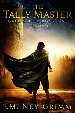
A New Cover for Fate’s Door
 I remember how nervous I was when I commissioned the cover for The Tally Master from Deranged Doctor Design. Their portfolio of work looked wonderful. But would my cover match that excellence? Would they be able to find compelling images that worked with my Bronze Age setting? Would they really be able to compose art for a story that they’d never read?
I could make a long list of my worries. But I won’t. Suffice it to say that I had them. Plenty of them.
Then the day arrived when the preliminary draft landed in my inbox, and I loved it. In the words of a fellow author, it was magnificent!
And now, nearly 4 months after the book’s release, I can report that the book sold more copies at its debut than any of my other titles and continues to sell well. Clearly that sublime cover is having an effect.
It also got me thinking about all the covers on my backlist. I suspect all those books would sell more copies if only they possessed covers by DDD. I’d love to replace them. But in order to do so, I’d need to accumulate some big piles of cash. And cash is v-e-r-y tight at Casa Ney-Grimm, with some big medical bills to pay and two high schoolers approaching college. Yikes!
Which means that if my backlist is going to get “new clothes” any time in the next decade…well, let’s just say I’m not going to be shelling out $4,300 to re-cover 18 books! It would undoubtedly be worth the investment, if I had the money. But I don’t.
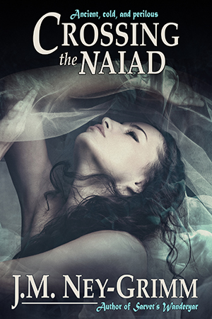
 Now clearly some of my old covers are fine. Crossing the Naiad sells as though it were a novel, even though it is a short story, and that is probably due to the cover. I probably shouldn’t replace that cover at all, because…why monkey with success?
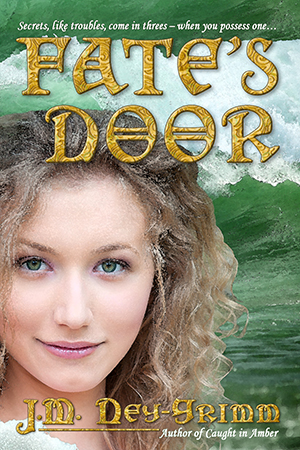
On the other hand, my novel Fate’s Door sells as though it were a short story, and that really bugs me, because I think it is a very fine work. If I could replace only one cover from my backlist, it would be Fate’s Door.
I’ll admit that I’ve been tempted. But I am determined that all new releases get DDD covers. And if I buy a DDD cover for Fate’s Door, then I won’t be able to provide WIP with a DDD cover when it releases. That’s not a good trade off.
But…I don’t think I must relegate Fate’s Door to a cover that isn’t speaking to my readers.
 I’ve been thinking about the elements in the cover for The Tally Master and comparing them to existing cover for Fate’s Door. They are really almost visual opposites.
Tally has great depth of field. Fate’s depth of field is compressed, creating almost a flat effect.
The art for Tally dominates the image, with the title and byline playing a complementary role. Whereas the title and byline for Fate are ornate and large, forming an important element in the image as a whole.
Tally’s art is painterly, moody, and evocative. Fate’s art is photographic and straight forward.
Now Fate’s Door and The Tally Master are very different stories. Fate’s Door is brighter, about a young sea nymph growing up and confronting a challenge that is in part self-made, while Tally transpires in a darker milieu. The covers on the books shouldn’t have identical values.
But although the stories are different, they’re both what I would call “typical Ney-Grimm”: lush, exotic settings; depthful characters; flashes of insight into the human experience; and paeans to the strength of hope. The feeling conveyed by their covers should be more similar than not. And I think the cover for Tally got it mostly right, while the cover for Fate gets it mostly wrong.
So my idea…you knew I had an idea, right?
Actually I had several. You probably knew that, too. 😀
 My first idea was that I could try to give my existing Fate cover a more painterly effect. I could try running the image through the watercolor filter in Photoshop. Or the oil painting filter. Or even try the software FilterForge, of which I’ve heard good things.
Well, that first idea didn’t work out very well. The watercolor filter is attractive (right), but it doesn’t really make the image look like a painting. To my eye, it’s really not all that different from the unfiltered version. I couldn’t imagine that the watercolor version would appeal to my readers any more than the original image.
Time for a plan B.
I tried the oil painting filter. The pastel filter. The sponge filter. In fact, I tried nearly every filter that yielded a result in color, even the plastic wrap filter! (Which really does make Nerine look like she has plastic wrap over her face. Ugh!)
 Just to give you some idea of how wrong those filters can go, I’m showing you the result of the fresco filter. It looks like something from the mod-70s to me, as did many of the other filters.
I had to conclude that running the existing image through a filter simply wasn’t going to generate the painterly effect I could see in my mind’s eye.
By now, I had the bit between my teeth. Time for a plan C. 😀
With my mind on painterly effects, I contemplated a trip into the past to solve my cover puzzle. Art by Kay Neilsen graces the covers of 4 of my books. His work fits with my North-lands, but wouldn’t be so suitable for a story set in our own Mediterranean (with some divergences north) in the Hellenistic period.
What about the works of other artists from the past?
It turns out that featuring art from the past on a cover is not quite so simple as I’d imagined. The key question is whether or not the art has been published. If it ever appeared on a postcard, a poster, in a book, or in some other way reproduced for public distribution, then it has been published.
Appearing at a public exhibition to be viewed by thousands does not constitute publication. That’s where things get dicey.
If it was created before 1923, published before 1978, and its creator died more than 70 years ago, then the image is in the public domain and I am free to use it.
If the art was created before 1923, published after 2002, and it’s creator died more than 70 years ago, it is in the public domain.
BUT if that old painting from the 1500s was first published between 1978 and 2002, then there is a chance that the publisher may own the copyright, as crazy as that seems.
I love the artwork of the nineteenth-century Pre-Raphaelites, and I had in mind specifically the work of John William Waterhouse, not a Pre-Raphaelit himself, but strongly influenced by them. He lived from 1849 to 1917, and his paintings were created between the 1870s and 1916. They were certainly candidates for the public domain. But it took me 9 hours of research to determine that they truly are in the public domain.
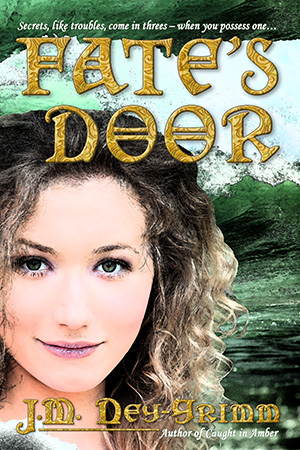
 I wrote a blog post about Mother Holle (a goddess figure with roots in the Bronze Age) that featured Waterhouse art, and one of those paintings depicted Tennyson’s Lady of Shalott at her loom.
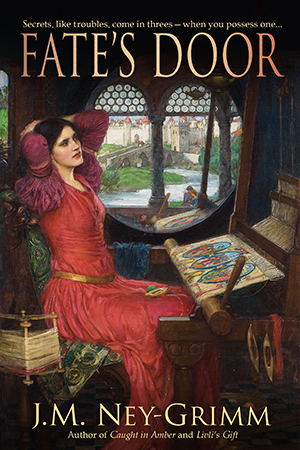
Because my heroine, the sea nymph Nerine, serves as a handmaiden to the three fates who weave the life of the world on their great loom, a beautiful painting focusing on a weaver seemed ideal.
Now Nerine is blonde and slightly younger than the weaver in the painting, but covers don’t always depict the protagonist of the story. I viewed the weaver as Mother Holle herself, in whose footsteps Nerine is following. And the mood of the painting is rich and lush. It has the right feeling for Fate’s Door, especially when compared to the cover on the first edition.
It was fun working with the painting, to create my cover. I used a more subdued treatment for the title and byline, following the trail blazed by The Tally Master. I’ll admit that I love what I developed.
But, but, but!
Of course, there’s a but!
I think the story of the cover for this book is nothing but a big long series of buts! (You may recall that I waged a heroic struggle with the color and texture of the title and byline when I was approaching the release of the paperback. I blogged about it here.)
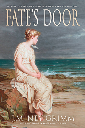 When I showed the new cover with the loom to a friend, she said, “But what about the painting of Miranda?”
I didn’t immediately know what she was talking about. When I returned to the Wikipedia gallery of Waterhouse works, the painting in question jumped out at me as being perfect: a blond in Grecian garb gazing out at the sea. Nerine’s hair has greeny-gold highlights, but aside from that “Miranda” could be Nerine.
I was so utterly beguiled by the image that I just had to work with it.
So I did!
But now I’m in a quandary, because I love both versions. Which one should I use?
That is my decision to make, of course, but I’d love to know what you think. Loom? Sea?
Believe it or not, I’m considering making two versions of a new paperback, one with the loom image, one with the sea image. I can do that with paper. But I’ll have to chose one or the other for the ebook. 😀
Your opinion, s’il vous plaît?