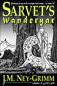
 The print edition for Sarvet’s Wanderyar was so close to release. Just one more proof cycle, click the “approve” button, and there she was – on the bookstore shelf, ready for readers to enjoy!
But!
You knew there was a “but,” didn’t you? After all, as I write this post, the print edition of Sarvet’s Wanderyar is definitively not on any bookshelves. What happened?
I learned a bit of history, which I’m going to share with you!
In the 1800’s and on into the early 1900’s, many authors self-published, including greats – such as Mark Twain – who gave us our classics. Then times changed and for decades self-publishing was not a viable option. In 2009, with the advent of Amazon’s Kindle Direct Publishing program, indie publishing became viable again. Writers with a pioneering spirit jumped in. Many of them wrote fantasy, and all of them were creating their own covers, whether they had design expertise or not.
Right now, in 2013, there are plenty of graphic designers available to create covers for e-books. In 2009? Not so much. So the indies gave it their best shot, producing covers that were glorious by accident, mediocre by default, or (alas) atrocious. Writers write. But only a few of them wrestle Photoshop and win!
Most of the writers used the fonts that came on their computers, and the fantasy authors were no different. What was there among those scant 200 typefaces that would work well for titles? Quite a few sans serif fonts for thrillers, a scattering of script fonts for romances, and many traditional fonts for mainstream fiction. For the fantasy novels? Matura.
So Matura showed up again and again and again on fantasy covers. Matura used well. Matura used poorly. Matura, Matura, Matura. Writers making covers and readers buying e-books grew sick of it!
I entered the indie pub world late in 2011. Indies had moved on from their early efforts. Some hired designers for their covers, others upgraded their skills. Nobody limited themselves to the fonts that came with their computer. There were a million and one fonts available online for a modest price. Result: nobody used Matura anymore! In fact, Matura wasn’t even listed among the fonts on my own computer.
I knew right away that I wanted to use Palatino for my titles. It’s a traditional font with an extra share of grace, featuring elongated ascenders and descenders (the lines rising from b’s and d’s, or heading down from g’s and q’s) and delicate curves. That grace seems to express the essence of my North-lands, but is easier to read than a decorative “fantasy” font. It also enlarges well to the size necessary for titles. So: Palatino. Yes.
At first I intended to use Palatino for my taglines as well as my titles. Fortunately I took a workshop! It taught me that a) taglines need not be visible in thumbnail-sized images (my first covers had them too big); and b) using only one font on a cover is sedate. Did I want my stories to be perceived as sedate. No!
Time to do a font search.
First, let’s review the rules for choosing fonts.
1) Do use two different fonts.
Check. I was using Palatino for the title and the author byline. I was seeking a different font to use on the taglines – one above the title, one below the author byline.
2) Never use more than one font from any one category of fonts.
Right. Palatino is an old style serif font. My second font would ideally be a sans serif font, a script font, or a decorative font. If I chose a decorative font, it should be a simple one, not ornate. Modern fonts and slab serif fonts don’t go very well with the fantasy feel of my stories. (For a review of the six font categories see my Cover Copy Primer.)
3) Use fonts that are very different in their characteristics, that contrast with one another.
Palatino has a very calm, vertical, linear feel to it. A contrasting font should be curvier, perhaps possess more horizontal energy, and have more variation between its thickest and thinnest strokes. Let’s see what I found.
I searched and I searched and I searched. The right font was not jumping out at me. At last, I chose … Matura! Knowing nothing of its 2009 history, I took joy in my find. (Dear me!)
Last fall, I learned that some people hate Matura. Hmm. Should I change it? Maybe. I was still on the fence when I learned the full story this spring. Should I change it? Probably. So I went looking again.
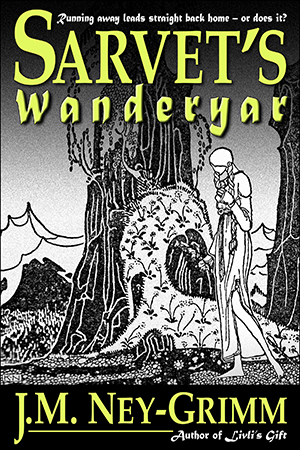
Before I show you what I found, here’s the top portion of Sarvet’s Wanderyar with the Matura font appearing both in the word “Wanderyar” and in the tagline “Running away leads straight back home – or does it?”
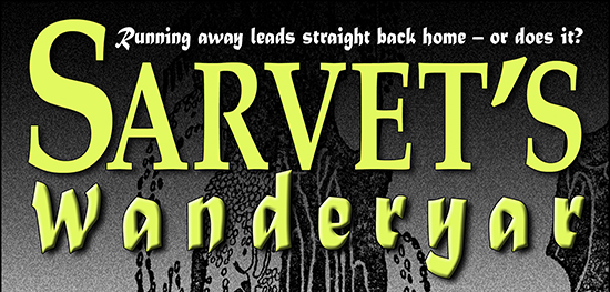
It still looks good to me. But let’s follow my search and see what some of the other possibilities look like.
I liked Matura for the boldness of its line. It’s easier to read than more spidery decorative fonts. And it contrasts nicely with the delicacy of Palatino. It is sans serif, while Palatino is a serif font. The points at the ends at each stroke contrast with the strict horizontal nature of Palatino’s serifs. Bottom line: it’s got a lot going for it.
Seeking Matura’s replacement, I looked at calligraphy fonts, Celtic fonts, Gothic fonts, Old English fonts, and sans serif fonts. Nothing really grabbed me, but I saw some possibilities. In fact, I saw thirty-plus possibilities. I downloaded them all! And started trying them in Word. Hmm. In Word, none of them won my regard when they went head-to-head with Matura. So I chose the best of the lot and tried them in Photoshop, with a full cover treatment.
Here’s the font Paladin.
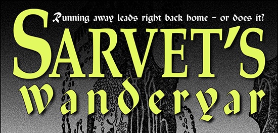
It’s got a calligraphy style to it, much like Matura. Its curves contrast nicely with Palatino. But Paladin is much harder to read than Matura. And the extreme variation in its line weight – from broad and thick to spidery thin – is not to my taste. Let’s look at something else!
Here’s Mysticor.
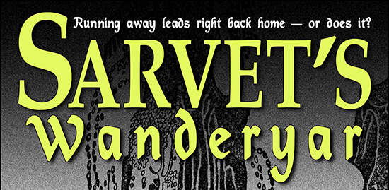
Much better! But it’s a little too curvy. Kind of like the curly writing of young girls who dot their i’s with hearts. Yikes! In the d and the y, even the straight strokes are curved. Plus Mysticor’s line weight is too close to that of Palatino. So … no.
Next!
Here’s Devinne.
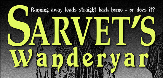
Now, I like Devinne. I’d considered it during my first search for a tagline font. I voted against it, because it was less legible than Matura. But what about it? Maybe I should reconsider.
Devinne has a nice blend of thick and thin, as well as a balanced movement between straight and curved. In fact, it’s almost perfect in its contrast with the Palatino. Except for one thing. I’d not considered Devinne a serif font. Mostly, it isn’t. But look at that W and that n and that r. Serifs. One of the rules of font selection is that you don’t place two different serif fonts together on a cover. Can you break the rule? In a heartbeat, if it works. But it doesn’t work here. The serifs, especially on that W, fight for dominance with the serifs on the Palatino Sarvet. Plus … Devinne is so dang hard to read. So, no.
Here’s something simpler, a sans serif named Fondamento.
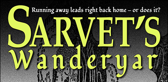
Pleasing, but really just a slightly straighter version of Mysticor above. Let’s move on!
What about Black Chancery?
I like it. I like it a lot. And I almost chose it for my tagline font. Except I hate the exaggerated tails on the d and the y. The serifs on the W clash with the Palatino serifs on Sarvet. The W does not cradle the S the way the Matura W does. And the font as a whole is less legible.
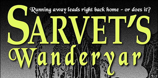
The five fonts I’ve shown you here were the best of the lot. All the other twenty-plus were less successful variants on these final contenders (the way Mysticor and Fondamento are variants of one another).
So, what am I doing? I’m keeping Matura.
This is my thinking:
 I’m writing to please my readers. Some of my readers will be indies who published their own books in 2009. But that’s a pretty select crew! The vast majority of my readers never cracked an e-book until much later. Most of my readers never suffered through the overuse and abuse of Matura. To most of my readers, the Matura in my taglines will look as fresh and appealing as it does to me.
Will I always stick with Matura? That’s a whole ‘nother question. Every publisher updates her covers as the years pass. Culture changes, and images that seemed appropriate and attractive in one decade look dated and awkward in the next. So my covers will change. But not this month!
Time to push that last revision cycle on Sarvet’s Wanderyar along and release the print edition!
Update: Sarvet’s Wanderyar is now in print! See the announcement here.
For more about book covers:
Cover Design Primer, the fundamentals of cover design.
Cover Makeovers, a series of before’s and after’s.
Perilous Chance, Star-drake, and Livli’s Gift, the design process in action.

Wow, this is great information. I have to admit, fonts leave me a little dizzy. So, when I need a font, I’m probably just going to ask you, J.M. You really know what you’re talking about. 🙂
Grin! I’m no font expert, but my architecture training and my love of design make me sensitive to visual details. And fonts are all about details!
Legibility first, style second.
My old typography teacher would approve.
Thanks for the guided comparison tour. When it comes down to which fonts complement each other, I.e. work together, and which don’t, it’s always in the details.
I came over from Joel’s blog. 🙂
I’m in the process of redoing the cover of the first in a new series, so this came at a good time. The first cover I did is okay, but I never completely liked it. I found what I think is a better cover (tweaked using Photoshop) but didn’t like the font choices for the main title. Matura looks like it might fit the bill – and I wasn’t aware it was so popular for a while? I think Papyrus is the new Matura. 😉
Thanks for a great post. I’ll have to look at some more of your posts and of course buy a couple of your books (I love Norse mythology!), says the woman whose TBR virtual pile grows and grows and grows. 🙂
Hi, Nancy! I’ve seen you on The Passive Voice (I think), and I’m delighted to see you here! I can relate about revamping covers. 😀 I just completed a whole new cover for Rainbow’s Lodestone. The old one was attractive, but wrong for the fantasy genre. It conveyed very little of the essence of the story. I published the title a year ago, and kept looking – but not finding – more suitable art. Last week, my ongoing search struck gold. I’m really happy with my new version!
I wish you the best of luck with your cover re-do. (And am delighted that my stories catch your interest. Thank you!) I’ve got quite a few posts here on my blog about cover design. I hope you find them helpful!