I’ve felt a growing unease about the content of the landing page for my website. Something just wasn’t right.
What is a landing page?
It’s the page where weary wanderers of the web arrive after a search yields up jmney-grimm.com as the answer to their question. 😀
And my landing page felt static, maybe even dull. It seemed to conceal, rather than reveal, all the riches I’ve gathered here over the years.
What to do?

For a while, I was really enamored of putting a slider on my landing page.
What is a slider? It’s a slideshow that plays automatically.
I love the slider on the BundleRabbit site. It’s so clean, so big, and features some eye-catching images. I went so far as to ask Chuck Heintzelman, the proprietor of BundleRabbit, if his slider was generated by a plug-in, and if so which one. He answered me most kindly, and if I were to use a slider, I’d use that one (the Revolution Slider).
But in my search to identify the best slider, I encountered several articles about the pros and cons of using them at all.
Some situations are clearly tailor-made for a slider. I think the BundleRabbit site is one of them. It’s got a ton of great bundles available for purchase, and the slider gives the browsing reader a fun taste of what’s on offer.
You can check out the BundleRabbit slider here.

But many people use sliders because they lack a sense of the priorities for the content on their site. They just can’t decide, so they throw a little bit of everything into a slider, and then they don’t have to decide.
I suspected my desire for a slider might well be due to my own confusion. Not good.
Even more pertinent: there’s a fair bit of data indicating that visitors to a site rarely click on any of the images served up by a slider.
That decided me. My idea for a slider on my landing page was that visitors would be intrigued by the images and want to go check them out. If that was unlikely to happen, there was no point in having a slider.
So I did some thinking about what I really wanted for my landing page.

1 • I’m in a lot of bundles, and some of them are pretty cool. I’d like my visitors to know that these bundles are available.
2 • When I release a new book, I definitely want to shout from the rooftops about it. That’s an exciting moment for me, and I want to tell everyone. 😀
3 • But I have a lot of books out at this stage in my career, and I think my backlist tends to get buried on my website. Few people go digging through all 20 book pages. So I’d like to draw attention to my backlist.
4 • Speaking of backlist, I also have a lot of “backlist” posts on my blog, and most of them are of the evergreen variety. They’re not news posts that go stale. They’re maps and lore from my book worlds. They’re book recs. They’re health tips, design tips, and favorite recipes.
But there are 346 of them as I write this post, which will be number 347. How would a visitor ever find any one post among so many?

My landing page felt like an opportunity to address all of that.
Nor did I have to devise how I would go about it from scratch. In my own browsing of the web, I’ve seen plenty of landing pages. And amongst them all, there was one design that consistently pleased me. It featured four images arranged in a foursquare.
That was just enough to give a good sense of what was on the site, just enough to intrigue me, but not so much that I felt overwhelmed. I tended to then happily explore. Perfect!
So I’ve adopted the foursquare presentation for my own website, and I’ll change its individual components every week or so, showcasing different elements from my site over time.
Go check out what I’ve got there now! Here’s the link.
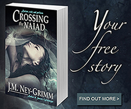
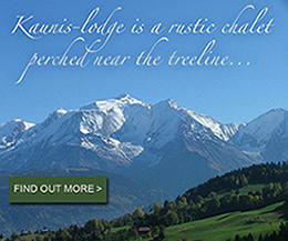
I’ll show you what is there (below) as I write this post. But by next week, the array will already have changed! (Plus the images on my landing page are clickable, while the copy below isn’t.)
I’m happy and excited about this ever-changing array. I think I’m going to have some fun with it. And I hope that my visitors will find it fun, too. 😀
For more about websites and blogging, see:
Slow Blogging and Other Variations
Why Create a Site Map?
SPAM Deluge
Copyright Statement for My Website
Your Data Is Protected


