Extra-virgin olive oil, white wine vinegar, Celtic sea salt, Dijon mustard, and . . . shake!
It spreads very nicely over romaine lettuce and thin slices of cucumber. Yum!
But although I include recipes on my blog, this is not a cooking post.
(Sorry! Didn’t mean to mislead you!)
Continuing my metaphor, let’s take a different recipe. Water, oil, and a ton of shaking . . . will just tire your arm!
So why am I talking about emulsifying and non-emulsifying substances?
Because I need to mention a certain non-item: me and campy literature. We are not an item. We are the oil and the water. No matter how much you shake us, we just don’t mix. It’s a failing, I know. But . . . I am what I am.
On the other hand, me and campy images? Yes, yes, YES! Those are tremendous fun. And I just received the privilege of playing in exactly that garden. Shantnu Tiwari, writer of campy satire, sought my feedback on his cover designs. I haven’t read his stories (although I’m tempted), but his cover concepts drew me in like a rose draws the bee. Wow! I couldn’t wait to get my Photoshopping fingers in that pie.
Here are the BEFORE’s:

Now, fingertips dripping blueberry juice and scattering the odd pecan (all these mixed metaphors are making me hungry), my cover tweaks are done, and I want to share the AFTER’s with you, along with some commentary.
It’s a fun way to learn more about cover design and serves as a nice sequel to my earlier Cover Design Primer.
Here’s the first problem child, chock full of potential, quirky and unusual, but not quite there.
 So what’s wrong with it? The biggest problem is alignment. It doesn’t have any. The title has a left alignment with a ragged right, while the author byline has a center alignment, except it’s not centered on the cover, but in the space between the unravelling TP and the tile wall. And neither relates well to the photo art, exacerbated by haphazard grouping. The second line in the title floats away from the first line, while crowding the gun-toting TP saboteur. The author byline floats unconnected and unanchored in its space.
Lack of contrast provides the final straw. All the colors are mild and bland. The image lacks punch.
Despite these issues, the concept is fabulous. Money unspooling as TP, supervised by a bathroom imp? Wow! All of the alignment and grouping issues are simple fixes. The contrast (since we’re keeping the same photo art) is harder, but it can certainly be improved. Here’s the after.
 Terrorists have decided to hit the West where it will hurt the most: their bowels. Now two super spies will teach the terrorists a lesson they will never forget: nobody touches our toilet paper and lives to tell the tale. Starring Jack, an evil space monkey aficionado, and Shakespeare, an imposter importer of burkhas (this time).
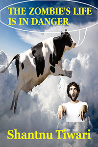
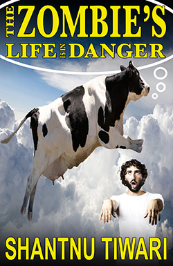
Cover number two suffers from similar problems: lack of alignment and ineffective grouping. The black and white hide of the cow, together with the dark hair of the zombie, provide better contrast, but the yellow title fades against the blue sky.
Additionally, aside from the quirky imagery, the cover possesses no visual branding. The author byline is handled differently than it was in the previous book (much smaller point size and different font) and placed erratically. Ditto for the title (all CAPS instead of upper/lower, but with no real reason for the change).
 There is a further problem with the colors chosen for the title and the author byline. They are two shades of yellow. They need to be either the exact same shade of yellow or completely different colors. Similar, but not the same, is . . . not good!
But, again, the concept is marvelous. This cow might be a relative to the moon-jumping bovine of the nursery rhyme; however, her concern is not jigging to a fiddle tune, but the fate of a threatened zombie. Ridiculously cool!
And – also again – the fixes are easy. Tidy up the alignment and grouping issues. Chose one yellow for the title and author byline. Place a shadow behind them to pop the yellow. Use the same font and placement for the author byline from The Toilet Paper Conspiracy to develop an author brand. Change the haphazard talking bubble with a more carefully drawn thought bubble. And there you have it!
 A secret society is planning to destroy humanity. Only one person can stop them. Unfortunately, she’s out of town. Now it’s up to the other guys – a potato farmer, two beer addicted spies, and the super hero Cow Man (bitten by a radioactive cow) – to save the day. But are the heroes up to the task? Will they survive? Is the world safe? (If you don’t want to read the book, the answers are: Yes, Yes, and Yes!)
 Now we’re getting to some art with visual punch. The dark-suited shark contrasts well with the pale beach sand and the jewel-toned tropical water. And the concept continues superb. Toothy grin, exec case, and island paradise. What could be better?!
But the type wanders, weakening the otherwise strong image, which it crowds. Branding elements are absent. The title is too small. All easily fixed.
 Tired of living in your mother’s basement? Tired of not having a girlfriend? Why not become a Super Villain? Earn the respect of peers and the admiration of all the hot girls! We teach you, step by step, how easy it is:
• Take over the world using time traveling cows and zombie chickens.
• Capture heroes using ice cream and bananas
• Negotiate over Twitter!
Quote: Taking over the world is no more dangerous than driving to work everyday (in Afghanistan, while wearing a miniskirt and push-up bra, while singing “Oh America you’re so fine, you’re so fine you blow my mind”). The book is dedicated to Pinky and the Brain. You inspired us man. Totally inspired us.
 I love this cover, even with its misalignments and hesitant title. It’s got so many things done right: the charm of the Santa image and the holiday background juxtaposed with the black-garbed paramilitary; the harmony of the blue/green/red color palette given brightness by the yellow author byline and punch by the dark jackets; the appealing simplicity of the font in the author byline. Huge thumb’s up!
And yet . . . giving the title more umph and pizzaz (to mirror the piquancy of the art) and correcting the misalignments could give it even more visual clout. This was the lure that first attracted me to this entertainment. I couldn’t wait to dive in!
 Santa comes down the chimney and finds a dead body. The police bust in and arrest him. A little girl has all her gifts confiscated as evidence. North Pole sends its Reindeer Regiment to bomb the city of Loondumb to the ground. Before war destroys the country, someone must answer the question: who framed Santa Claus?
I hope you’ve enjoyed my tour of covers BEFORE and AFTER. What do you think? Did I succeed in retaining their quirky charm while adding to their impact? Metaphorical penny for your thoughts!
Shantnu Tiwari says this about himself: “Fighting for the rights of zombies since 1936. If you want books with sophistication and elegance, whose words move you and touch your heart, whose literary eloquence will impress critics and professors alike, don’t read my books. Cause I don’t write stuff like that. If you think the world ending because toilet paper ran out, or fat and hairy terrorists dressing up as women to seduce policemen is funny, then you will love my books.”

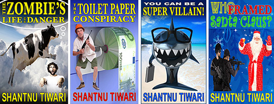
The Zombie’s Life is in Danger, The Toilet Paper Conspiracy, You Can Be a Super Villain!, and Who Framed Santa Claus? are all available as ebooks and paperbacks at Amazon. The author also urges his readers to come say hello at http://shantnutiwari.com.
After word of mouth, book covers, cover copy, and story openings connect books with readers. My Cover Design Primer, Cover Copy Primer, Eyes Glaze Over? Never!, and The First Lines present basic concepts for how to do these well.

Jessica, these are brilliant.
You are right, the contrast in your work just jumps out, it makes the image alive, while the original ones were a bit dull.
I also love how you made small touches here and there, and it completely changed the look of the photo. Sort of like the movies, where the ugly girl takes off her glasses and becomes a supermodel. Except, in this case, there was a bit more work than just removing the ugly glasses 🙂
You probably don’t know this, but it was your blog that got me started on designing my own covers in the first place. So we can say it has come to a full circle.
So yeah, I’m well impressed. Well done again 🙂
Thank you, Shantnu. I’m glad they please you! I had a marvelous time working with the images. What fun to learn that my blog sparked your first cover design efforts – you have a real gift for visual concepts – and now we get to see your further development.
I agree. Totally awesome job, Jessica! You’re very talented! The covers look great!
Thank you, Mira.