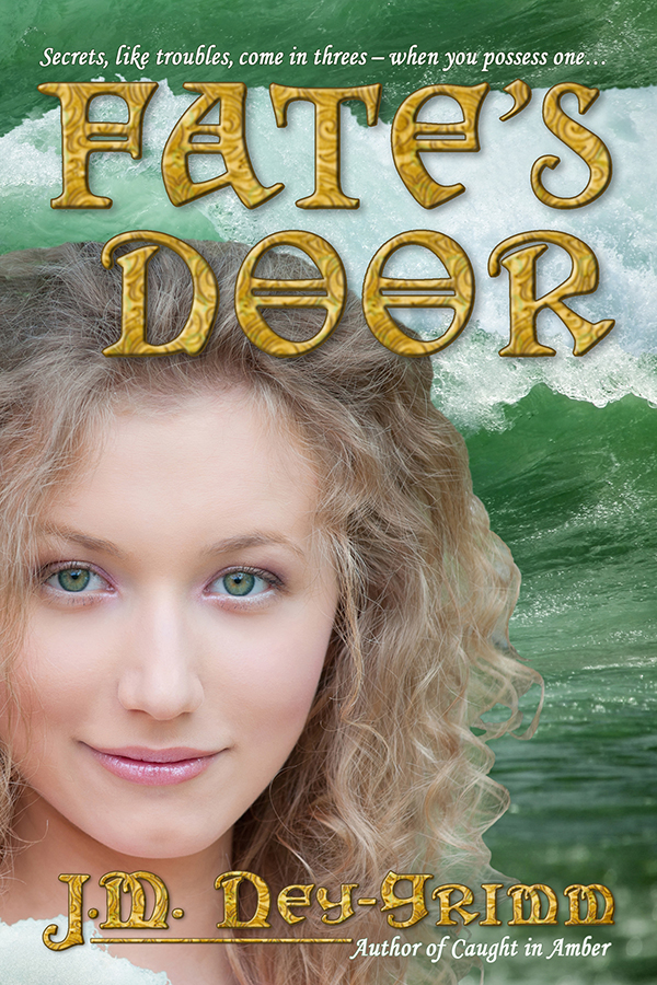
Last month, when I shared my step-by-step process for creating the book cover for my novel Fate’s Door, I concluded by saying that I was not quite satisfied with the gold texture that appeared in the title and byline.
Since that post, I’ve found a texture I love. Take a look!

If you’d like to see the full account of my search for the right gold, read the Edited to Add section at the very bottom of the post: Building Fate’s Cover.
Fate’s Door is available as an ebook. Amazon
Fate’s Door is available as trade paperback.
Amazon I B&N I Fishpond I Mysterious Galaxy Books

I like that. 🙂
Thank you!
It turned out lovely!
I took it down as small as my screen/browser allows, and it still looked good.
Congratulations on another problem solved – and thanks for sharing.
Standards are good; you found a way to keep yours, and still accommodate what you needed to do.
Thank you! I love hearing that!
This feels like the cover that has given me the most difficulty yet, but I’m not sure it is true. Like any creative endeavor, designing covers possesses immense variability. The cover for Hunting Wild probably required the most woman hours, but it came together fairly smoothly. The cover for Resonant Bronze was both quick and easy to create. The cover for The Troll’s Belt required that I throw away my first attempt entirely and start fresh with new images.
I never know at the outset how the design experience will go, but it is immensely satisfying to arrive at the finish with a cover that feels right for the book and that I find beautiful. 😀