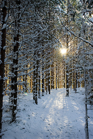
 I was so lucky finding images that were perfect for the covers of Fate’s Door and Caught in Amber, I hoped I might be equally lucky with photos for Winter Glory.
I found a gorgeous northern landscape: a snow-covered pine forest with the sun setting through the tree trunks. (Similar to the photo at left.) But I couldn’t find anyone who looked like Ivvar.
This didn’t truly surprise me. Ivvar’s a tall fellow with shoulder-length gray dreadlocks and tan skin. Not tanned by sunlight, but naturally tan, the way my Hammarleedings are.
I searched for a photo of Ivvar last October when I finished writing Winter Glory. I searched in November when I got feedback from my first reader and started revisions. I searched in January when I received feedback from my second reader and made more revisions. I searched in February when the file came back from my proofreader with typos corrected.
I searched one last time when it was time to create the cover.
 Then I had to face the fact that I simply was not going to find Ivvar photographed by chance by a modern photographer. 😀
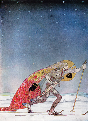
I wasn’t panicked. I had a plan B. I would use the illustration by Kay Nielsen for “So the man gave him a pair of snow-shoes” in East of the Sun and West of the Moon. It’s a gorgeous piece of art. It was probably for the best that I’d failed to find a good photo.
As I scanned the Nielsen art, I talked with my husband about my plan for the cover. He was in the other room, so he was not looking at the piece of art concerned. He said: “Oh, yeah! You’ll make one of those black & white covers, like the ones for Troll-magic and Sarvet’s Wanderyar. Great! They’re really your trademark look.”
Right then and there I had an epiphany.
The art showing a man on skies is a color piece. But in the time it took my husband to speak, I’d envisioned it rendered in black & white, and I loved it.
Plus my husband’s suggestion made so much sense. A color painting would be a whole new look for one of my books. But a black & white Kay Nielsen piece would fit right in with the other North-lands and Hammarleeding books.
And I was sure I could do it. The print quality on the black & white illustrations of my 1914 edition of East of the Sun and West of the Moon is very poor. In order to get a clean image for my covers with Kay Nielsen art – crisp lines without inkblots, black blacks, and white whites – I’d always placed the art on a light table and traced it.
I was certain I could do the same for a color illustration. It would be trickier. I’d be making value judgements all the way through about how to render shades of color as either shades of gray or patterns of black & white lines. But Nielsen’s work lends itself to black & white interpretation. Even his color work has interesting line and texture present.
I scrutinized the piece of art depicting the skier. Yes! I could see in my mind’s eye exactly how I would do it.
So I set to work.
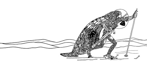
I was nervous at first. So nervous that my hand kept shaking. I had to talk myself down. “Jessica, any small mistakes can be corrected in Photoshop. And if you make a big mistake, it won’t be the worst thing if you have to start over. Relax. Relax. Relax.”
My hand was still not steady with that first line of ink on paper. I got a fresh sheet of paper. And started on the skier’s hair, which was supposed to be squiggley. By the time I finished the hair, my hand was steady. I’d forgotten my nerves and was enjoying the drawing.
I was almost sad when I finished, except that there was more fun ahead.
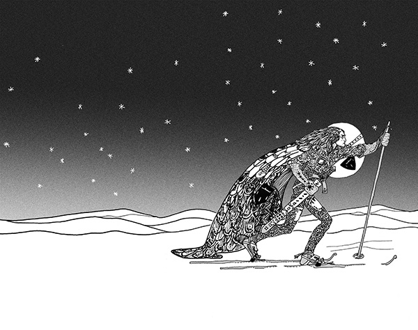
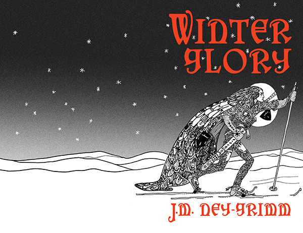
I scanned my black & white drawing into my computer and started building the cover for Winter Glory.
The first step was to select the stars and turn them from black to white. Then I put a gradient screen from the top of the cover to the bottom, thus creating the sky. I loved how that made the skier pop!
Next step? The title.
I already knew I wanted to use the cloak texture from the original color illustration, but I wanted to get the title’s size and placement settled using Photoshop’s type managing tools. I would turn the layer from a type layer to an image layer after I got the type exactly the way I wanted it. So I used a bright red to help me visualize the final result.
The cloak in the original illustration was a lovely patch of color. It was big enough that I could have just selected it and “pasted it inside” of the letters of the title and my author byline. But it would have been a lot of pasting.
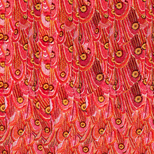 So I made a square of the texture first – pasting and pasting and pasting that cloak patch into a separate file. I increased the saturation, and heightened the reds and yellows to achieve the effect I wanted.
Once the cloak texture file was ready, I selected the whole square and pasted that inside the letters of my cover file. It took four pastes to fill them all. Instead of ten or more!
The textured title softened the overall effect of the art. The black & white art with the solid red title has a crisp and definite look that I like. But it’s a little too hard-edged for the story, which blends life-threatening action with romance.
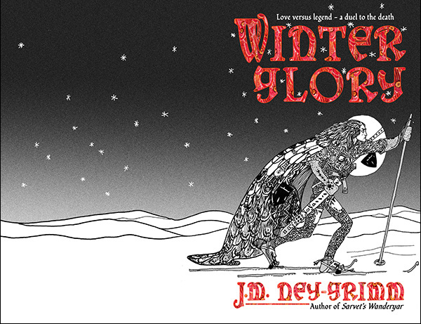
Then I was closing in on the finish line.
I added the tag lines – one above the title, one below my author byline. And my trademark line, connecting the big “J” to “Author of Sarvet’s Wanderyar.”
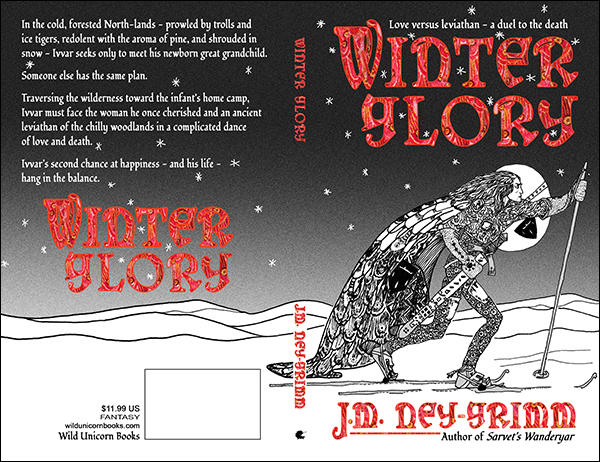
I placed the back cover copy. I placed the title on the back cover. Next came the spine: title, byline, and Wild Unicorn logo.
And finally the publisher info and the box for the barcode.
I was done! It’s ready to be placed in an InDesign file for the paperback cover, and to be windowed for the ebook cover. 😀
For more cover builds:
Cover Creation: Perilous Chance
Building Star-drake’s Cover
Creating Livli’s Cover
For the principles of cover design:
Cover Design Primer
