It’s that time in the publishing schedule. I must decide on a cover for my novella Blood Silver. Longtime readers of my blog will be familiar with this phase, since I usually share my process with you.
Sometimes I am inspired and my cover design comes together swiftly. Other times, it’s a struggle. I remember wrestling for months with the color and texture of the title for Fate’s Door. (And then, after all that, I decided a year later that Fate’s Door needed a completely new cover!)
This time I have an entirely new wrinkle.
Blood Silver clocks in a 39,300 words.
The official definition for a novel is a story that is 40,000 words or more. Blood Silver is currently with my second reader. If her feedback prompts revisions which add 700 words to the manuscript, Blood Silver will graduate from the category of novella to that of novel. And I purchase covers for novels from Deranged Doctor Design.
(They created such a magnificent cover for The Tally Master that I want all my novels going forward to receive covers of that caliber. But I’m not yet able to shell out the bucks for shorter works.)
So what do I do?
There’s really only one practical answer. I create a cover, knowing that it will not be used if Blood Silver gains 700 words. That might not work for someone else, but playing in Photoshop really is play for me. So even if the cover I create is never used, I’ll have enjoyed myself making it. (And, really, the likelihood of non-use is slender. The revisions I make after my first reader’s feedback can add hundreds of words. After my second reader? Not so much.)
With that decision behind me, I searched the paintings of the Pre-Raphaelites (and other artists influenced by them) from the nineteenth century. I wanted an image featuring a knight in full armor, because the protagonist of Blood Silver is just such a knight. (Although he is faie, not mortal man.)
I found quite a few paintings to choose from.
And, oh, it was hard to choose! I must have mocked up a dozen covers while I debated with myself, trying out which image would work best. Sometime down the road I’ll show you those “just to see” covers. But that’s a different post.
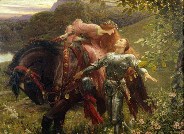
In this post I’ll focus on the four different covers I devised from Frank Dicksee’s “La Belle Dame sans Merci.” And I want your opinions on them. Which one do you like best? Which one would make you click the “Look Inside” button on Amazon to check out the beginning pages of the story?
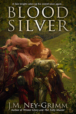
I really love the painting by Dicksee, so my first version uses his work nearly straight up. I chose a window from the image that focuses on the knight and the lady. I intensified the colors, since the scan seems to have washed them out a bit. And I liked what I had. I was ready to declare it The One.
Until a friend whose judgment I trust weighed in.
She pointed out that it looked like a cover from times past and that I needed to bring it into the modern age.
Hmm. I wasn’t sure that was really a problem. Maybe it was a feature, not a bug. I’ve haunted many a used bookstore, delighting in the older books and enjoying their vintage look. I suspect a goodly number of my readers may be the same. But what about the readers who would be more drawn to a fresher, more modern look?
Plus my friend had another point.
The dark, slightly gloomy tone of the painting doesn’t fit with my story at all.
Oh, there is danger and even gloom in Blood Silver. But the overall mood of the book springs from the sun-dazzled wonder that my protagonist feels when he first emerges into the bright world from under the knowe. My cover needs to convey that.
Back to the drawing board.
My own inclination was to seek out a fresh painting, but my friend suggested that I run “La Belle Dame” through a few filters to see what might be done.
I can be a stick-in-the-mud about filters. I mistrust them, and I dug in my heels.
Thank goodness for good friends! This one offered to (insisted on?) running the painting through various filters herself. Oh, my! I liked what she showed me. (And I’ll be less resistant the next time the possibility of filters come up.)
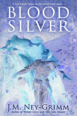
I loved the “inverted” filter. It generated an image which had a true faie feel to it, along with a sense of the explosion that my hero felt when he first encountered the bright world, and again when he set eyes on a mortal for the first time. Yes! This might be The One!
But, but, but! (You suspected there might be a but, didn’t you?)
My friend and my husband both agreed with my sole concern. As cool as this inverted mage is, it is also confusing. The human eye does not parse it easily. The human brain says, “What is it that I am seeing? I don’t quite get it.”
And confusion is bad. Confusion results in the browsing reader clicking away from Blood Silver to a web page with some other book. That is not what I want my book cover to accomplish!
I was feeling a bit stymied at this point.
Once more, thank goodness for good friends! Mine suggested that I look through the dozen filtered possibilities that she had generated for me. And she drew my attention to the one that went through a blue filter, which had lightened and brightened the overall color balance of the painting. “What about that one?” she said.
And she was right about it giving a more modern, lighter feel. What about that one?
The main problem is the cool hue that results from a blue filter. It works well for the horror genre and sometimes for thrillers. It can be appropriate for certain types of fantasy. But Blood Silver has a very warm feeling to the story, and the coolness of this image stands in direct opposition to that.
Back to the drawing board once again.
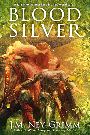
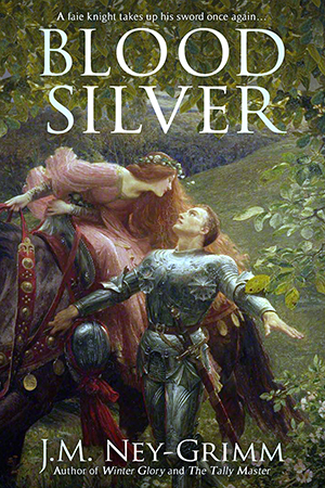
This is the one that I currently hope is The One.
It is warm and bright. It’s not dark or heavy. The sunburst effect gives an otherworldly feel to the image and brings out the “blown away” reaction that my knight feels upon encountering the bright world. Surely this is The One!
But here’s the thing about covers: no matter how much an author likes the cover for her book, what really matters is how the prospective readers feel about it. If it makes readers flee, then it is the wrong cover.
Which cover would prompt you to click “Look Inside” or “Add to Cart”?
I’d love it if you’d vote in the comments.
To keep things straight:
Painterly (the first option shown)
Faie inverted (the next one shown)
Cool blue (the next)
Sunburst (the one immediately above)
Cast your vote! 😀
For more about Blood Silver, see:
Plate Armor, How It Works
Cross Strike, Squinting Strike, and Scalp Strike
The Book Title
The Crooked Strike
The Joust
The Strike of Wrath
Rope Climbing and a Cliff
What If the Sword is Wrong?
A Song of Peace
Wielding a Long Sword
Origin of the Story (The State of This Writer)

I would chose Sunburst. I like the warm feeling of this one. It looks like a feel good book, a fairy-tale romance, a safe read with a happily ever after at the end. So I would chose this one if the story coincides. If it doesn’t, then I would chose a darker cover.
I also really like the Faie inverted from an artistic point of view. But definitely not for a cover. For a cover you need something that’s understandable for the reader, not something where you ask yourself “what the heck is that?” It might catch the eye, but probably not in a good way. It looks too artsy, too difficult to understand. So as a reader I might think it’s some sort of literary fiction, something really strange, not a safe entertaining story.
In any case, all the best with the publishing process!
I’ll confess that I myself like Sunburst a lot. And it looks like I’m not the only one. There seem to be a lot of votes for it.
However, I’m glad I’m not the only one to think that Faie Inverted is cool.
Thanks for your feedback and best wishes, Céline. Much appreciated!
I would click on Sunburst. It’s warm and filled somehow with magic, like there’s a bright world ready to explode on us. In fact, I cast three votes in its favor.
Just how many votes do you plan to cast, Laura?
I think I hear you answering: “As many as it takes!” 😉
But it looks like there’s no need to press your thumb on the scale. Sunburst seems to have a strong majority.
Cool blue:
1. The knight’s armor is the most silver, illustrating the word “silver” in the title.
2. The knight’s face is the most illuminated. In the others, it is not at all clear that he is the protagonist, rather than the red-haired woman. (The inverted image also achieves this goal).
I vote against the sunny image because it does not match the book title. The title is dark in meaning. Not having read the book yet, I find myself puzzled by the discrepancy in the two tones.
My main observation is that the knight himself needs to be focused upon, since he is the protagonist. My eye naturally goes to the woman, thus I would assume she is the main character. He needs to be more in the foreground, no matter which image you choose. The main attraction of the inverted image is that the woman fades into the background.
I like the colors of the sunburst image best, but I don’t understand how the “blood” and the “silver” of the title ties in. Also, I don’t identify the protagonist.
Thanks for giving this so much careful thought, Olivia. Your points are good ones, and I see that someone further down in the comments has echoed your concern about the mismatch between the title and the sunburst version. On top of that, another reader emailed me privately suggesting that I intensify the colors of the knight’s face to emphasize him.
Excellent catches all. You’ve got an eye!
Sunburst and then Faie Inverted would be my choices. I would look just because of the art too because I love that artist and style.
That’s lovely to hear, CLM. I must confess that I have a strong liking for Pre-Raphaelte art; I love its emotion, beauty, and the sense of wonder it conveys.
I like the contrast on Cool Blue.
Good point. That one really is the easiest on the eye, isn’t it. You know what you’re looking at without any confusion.
Personally I’d avoid Faie inverted like the plague, and cool blue isn’t going to grab my attention either. Painterly really is a bit dark (unless you can just lighten up the background) but Sunburst is my preference. In fact I’d be inclined to change the book’s title to Sunburst and work that word into the story as well.
LOL! Yeah, I really like it, but it just isn’t going to work as a cover.
You’ve got my attention with your observation concerning the title. Olivia, upthread, remarked on it as well. And another reader emailed me about it.
Sunburst Bright. Fall into Brightness. Bright World. Sunburst Exile.
I’ll have to think about this.
Sunburst. It avoids painterly’s effect of “it came from Gutenberg” while still preserving its excellent qualities.
Oh, wow! You put your finger on it exactly, Sarah. That is what my friend meant when she urged me to bring the cover into the modern age. Yes.
Thanks so much for your feedback!
I’m getting in this a bit late so I’ll not say much other than that I concur with the majority view that Sunburst is best. I particularly like the way that it brings out the detail in the leg armour though I think it would be improved if red cast was removed from the upper part of the breastplate and replaced by that from Cool Blue or, perhaps better, from the left thigh defence of Sunburst. If the lower part of the breastplate could be lightened (silver rather than shadow) it might help concentrate attention on the knight as protagonist.
Oh, I’m so glad you jumped in, Mike. I think you are exactly right about what is drawing attention away from the knight’s face. I’d been mulling over ways I could adjust the face, but I think the key is actually the treatment of the armor below his face. Now I know exactly what to do and how I’ll do it. Thank you! That was some brilliant observation on your part.
Was going to congratulate you on getting real painters to create cover images for you!
My only contribution would be to ask if you’ve tried moving the focus around (easy to do with a rectangle). I’d like the knight a bit higher, and either more centered or more to the right if he’s the protagonist. Thirds on the framing rectangle in vertical and horizontal directions would let you see where the knight’s face and upper body lie within the grid.
If you’re wedded to title on top, name on bottom, that limits you some (though it also brands your covers), but something about the centering caught my eye in the wrong way, and would be exceedingly easy to change.
That – or the size of the part of the image you use – would be something I’d play with a tiny bit.
Just my .02 worth.
Can you envision being able to travel back in time so as to commission Frank Dicksee (or another Pre-Raphaelite painter) to create a painting for one’s modern fantasy novel? Wow!
I’d not imagined that until reading your comment, but I sure am now. 😀
I see what you’re saying about the centering, especially if the lady were peripheral to the story. It’s true she’s not a point-of-view character—we’re always in Tahaern’s point of view as the story unfolds—but the lady plays an integral role in the way events transpire.
Nonetheless, I trust your eye. You did an awesome job on the cover for Pride’s Children: Purgatory. So I will tinker a bit with the positioning of the image and see what turns up.
Thanks for putting in your 2 cents. Much appreciated!
If you figure out how to go back in time, you could alter a few small details – hair color, maybe clothing, choice of armour or mounts…
Every time I changed something on that cover, it affected the focus – and I had to go back and ask myself where I wanted what again. Kind of stuck in my mind. Next time I think I’ll work on a bigger canvas longer, trim with a frame until closer to the end, and not have to redo so many things.
You taught me how to think graphically – I just played with it.
Your other comments are so good and useful that I was wondering how you will go about and decide!
I’m working on the next cover in the back of my mind. There will be a blonde woman in a sari at the edge of the Ganges. Or its tributary. The Taj Mahal is iconic – but too well known? Details come later.
Oh, my! The idea of art directing the greats of history completely intimidates me. Can you imagine telling Leonardo da Vinci or Michelangelo what to do? I could not do it!
I’ll admit that the many excellent observations upthread initially confused me. How would I decide?
Fortunately, sleeping on it all helped. Consulting with someone whose marketing expertise I respect helped even more. (There’s a blog post scheduled for next Friday on the latter.)
I had a lot of fun peeking over your shoulder when you were working on the cover for Pride’s Children. I like your idea for the next book. I’m hoping you’ll let me look over you shoulder for that one, too. 😀