It’s that time in the publishing schedule. I must decide on a cover for my novella Blood Silver. Longtime readers of my blog will be familiar with this phase, since I usually share my process with you.
Sometimes I am inspired and my cover design comes together swiftly. Other times, it’s a struggle. I remember wrestling for months with the color and texture of the title for Fate’s Door. (And then, after all that, I decided a year later that Fate’s Door needed a completely new cover!)
This time I have an entirely new wrinkle.
Blood Silver clocks in a 39,300 words.
The official definition for a novel is a story that is 40,000 words or more. Blood Silver is currently with my second reader. If her feedback prompts revisions which add 700 words to the manuscript, Blood Silver will graduate from the category of novella to that of novel. And I purchase covers for novels from Deranged Doctor Design.
(They created such a magnificent cover for The Tally Master that I want all my novels going forward to receive covers of that caliber. But I’m not yet able to shell out the bucks for shorter works.)
So what do I do?
There’s really only one practical answer. I create a cover, knowing that it will not be used if Blood Silver gains 700 words. That might not work for someone else, but playing in Photoshop really is play for me. So even if the cover I create is never used, I’ll have enjoyed myself making it. (And, really, the likelihood of non-use is slender. The revisions I make after my first reader’s feedback can add hundreds of words. After my second reader? Not so much.)
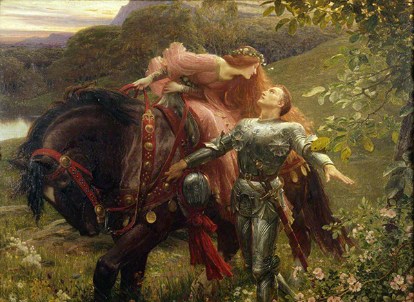
With that decision behind me, I searched the paintings of the Pre-Raphaelites (and other artists influenced by them) from the nineteenth century. I wanted an image featuring a knight in full armor, because the protagonist of Blood Silver is just such a knight. (Although he is faie, not mortal man.)
I found quite a few paintings to choose from.
And, oh, it was hard to choose! I must have mocked up a dozen covers while I debated with myself, trying out which image would work best. Sometime down the road I’ll show you those “just to see” covers. But that’s a different post.
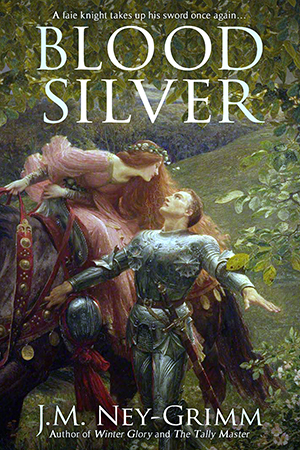
In this post I’ll focus on the four different covers I devised from Frank Dicksee’s “La Belle Dame sans Merci.” And I want your opinions on them. Which one do you like best? Which one would make you click the “Look Inside” button on Amazon to check out the beginning pages of the story?
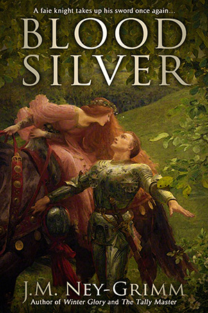
I really love the painting by Dicksee, so my first version uses his work nearly straight up. I chose a window from the image that focuses on the knight and the lady. I intensified the colors, since the scan seems to have washed them out a bit. And I liked what I had. I was ready to declare it The One.
Until a friend whose judgment I trust weighed in.
She pointed out that it looked like a cover from times past and that I needed to bring it into the modern age.
Hmm. I wasn’t sure that was really a problem. Maybe it was a feature, not a bug. I’ve haunted many a used bookstore, delighting in the older books and enjoying their vintage look. I suspect a goodly number of my readers may be the same. But what about the readers who would be more drawn to a fresher, more modern look?
Plus my friend had another point.
The dark, slightly gloomy tone of the painting doesn’t fit with my story at all.
Oh, there is danger and even gloom in Blood Silver. But the overall mood of the book springs from the sun-dazzled wonder that my protagonist feels when he first emerges into the bright world from under the knowe. My cover needs to convey that.
Back to the drawing board.
My own inclination was to seek out a fresh painting, but my friend suggested that I run “La Belle Dame” through a few filters to see what might be done.
I can be a stick-in-the-mud about filters. I mistrust them, and I dug in my heels.
Thank goodness for good friends! This one offered to (insisted on?) running the painting through various filters herself. Oh, my! I liked what she showed me. (And I’ll be less resistant the next time the possibility of filters come up.)
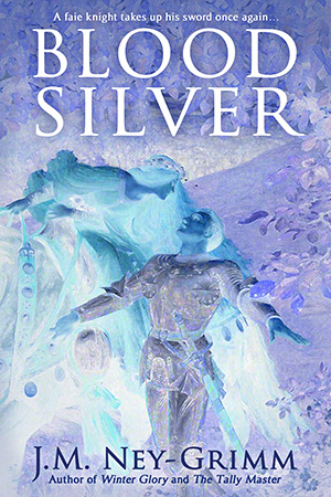
I loved the “inverted” filter. It generated an image which had a true faie feel to it, along with a sense of the explosion that my hero felt when he first encountered the bright world, and again when he set eyes on a mortal for the first time. Yes! This might be The One!
But, but, but! (You suspected there might be a but, didn’t you?)
My friend and my husband both agreed with my sole concern. As cool as this inverted mage is, it is also confusing. The human eye does not parse it easily. The human brain says, “What is it that I am seeing? I don’t quite get it.”
And confusion is bad. Confusion results in the browsing reader clicking away from Blood Silver to a web page with some other book. That is not what I want my book cover to accomplish!
I was feeling a bit stymied at this point.
Once more, thank goodness for good friends! Mine suggested that I look through the dozen filtered possibilities that she had generated for me. And she drew my attention to the one that went through a blue filter, which had lightened and brightened the overall color balance of the painting. “What about that one?” she said.
And she was right about it giving a more modern, lighter feel. What about that one?
The main problem is the cool hue that results from a blue filter. It works well for the horror genre and sometimes for thrillers. It can be appropriate for certain types of fantasy. But Blood Silver has a very warm feeling to the story, and the coolness of this image stands in direct opposition to that.
Back to the drawing board once again.
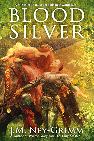
This is the one that I currently hope is The One.
It is warm and bright. It’s not dark or heavy. The sunburst effect gives an otherworldly feel to the image and brings out the “blown away” reaction that my knight feels upon encountering the bright world. Surely this is The One!
But here’s the thing about covers: no matter how much an author likes the cover for her book, what really matters is how the prospective readers feel about it. If it makes readers flee, then it is the wrong cover.
Which cover would prompt you to click “Look Inside” or “Add to Cart”?
I’d love it if you’d vote in the comments.
To keep things straight:
Painterly (the first option shown)
Faie inverted (the next one shown)
Cool blue (the next)
Sunburst (the one immediately above)
Cast your vote! 😀
For more about Blood Silver, see:
Plate Armor, How It Works
Cross Strike, Squinting Strike, and Scalp Strike
The Book Title
The Crooked Strike
The Joust
The Strike of Wrath
Rope Climbing and a Cliff
What If the Sword is Wrong?
A Song of Peace
Wielding a Long Sword
Origin of the Story (The State of This Writer)
