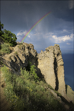
The first time I created a book cover for Rainbow’s Lodestone, I couldn’t find any art that looked like my spirit of the rainbow. So I settled for a landscape. It was a dramatic landscape – beautiful – and it had a rainbow against a looming cloudy sky. But I didn’t think it conveyed the essence of my story well.
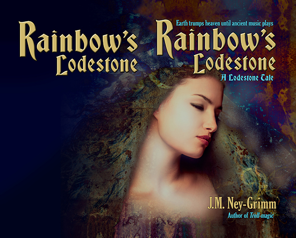
 So, when I was ready to create the paperback edition of Rainbow’s Lodestone, I went looking for more suitable art. And I found exactly what I was looking for. The instant I set eyes on the image, I said to myself, “That’s her!”
It was exciting. I purchased the right to use the image on my cover.
The first thing to do was flip the image. I wanted the spirit of light looking to the right, supporting the eye’s natural tendency to move from the top left corner of an image to the bottom right.
The next adjustment needed was creating room for a title. As you can see (above), the art didn’t have room at the top. Nor did it have much room at the bottom for my author byline. I had some work to do. I started to “paint” the extra margins I needed.
I’ve talked before about this “painting” I do in Photoshop. You might be wondering what I mean since that’s not very specific.
This is what I do to extend the background: I take the “lasso” tool and draw a rough shape around a suitable piece of the background. Then I “feather” the edge of my selection, essentially creating a fuzzy edge instead of a crisp one. Next I copy my selection and paste it on a new layer in my file. I move it around until it looks good. Then I merge it back onto the main layer.
That’s it in a nutshell.
But I do it over and over again to fill in the area I need.

The next steps were less time intensive.
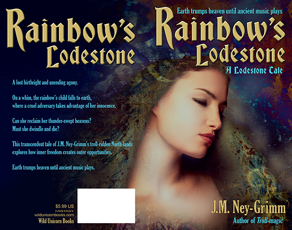
I assessed the back cover area to discern whether type would be easily read atop it. Rarely is it just fine as is. Usually I must either lighten it to receive dark type or darken it to receive light type. Additionally, if there is a lot of variation in lightness and darkness, I must even it out.
Type needs a fairly bland background behind it in order to be easy on the reading eyes.
The art for Rainbow’s Lodestone didn’t extend far enough to the left after I’d added to the top. I could have “painted” yet more background, but I had a better plan in mind.
I sampled three colors from the back ground: a dark blue, a dark aqua, and a black. I selected large irregular triangles in the area that needed to be filled – feathered the edges a lot – and filled them with these three colors. The result was a varying wash of color that blended with the art and also yielded a good background for the back cover text.

The Lodestone Tales follow the lodestones created by Zandro Mytris through the history of my North-lands. Which means I want the covers for all of the stories to look like they belong together.
I’d already chosen the font Bradley Gratis for the titles of the books and the font Gloucester for the tag lines and the back cover text. Working with those choices, I placed the title on the front cover so that it lined up with one edge of the cover and framed the art. Adding my byline and the tag lines was a straight forward matter.
Rainbow’s Lodestone is a short story, which means that its “blurb” is fairly short. I wouldn’t want to plump up the blurb with a lot of spoilers! I had to play with the best size for the text and line spacing, as well as seeking the best way to break the text into paragraphs. It was a matter of trying different arrangements until I got one that looked good.
I submitted this cover to a design contest held every month by Joel Friedlander. He’s a publishing and design professional active in the indie publishing world, and his good opinion is very worth having. I was delighted when Rainbow’s Lodestone won a rare and coveted gold star award!
(Rainbow’s Lodestone is the 30th in the long column of covers shown. Joel doesn’t list them by rank, but randomly.)

To see more cover builds:
Building Star-drake’s Cover
Building Wild’s Cover
Cover Creation: Perilous Chance
For the basic principles of cover design:
Cover Design Primer


It’s a gorgeous cover! Rich and textured and appropriate.
Congratulations on getting a Gold Star – Joel is picky – and this one sure deserves it. I think you have a winner.
Alicia
PS Love to watch your construction process, too.
Thank you!
I’m finding I really enjoy sharing my design process, so I’ll assuredly be writing more “how I created it” posts. 😉
This was an amazing walk-through with great results. I haunt Joel Friedlander’s site, especially the covers, because my inner frustrated artist really wants to do my own, but I really want it to look professional. I have a good design sense, but sadly lacking Photoshop skills, so your specifics were really helpful.
You did an amazing job in this — never would have thought this DIY! Thank your for sharing your process and I plan to absorb the rest of your site immediately!
Thanks, Nicole. I’m glad you found my walk-through helpful. Feel free to ask questions as you peruse my other posts. I love talking about design!