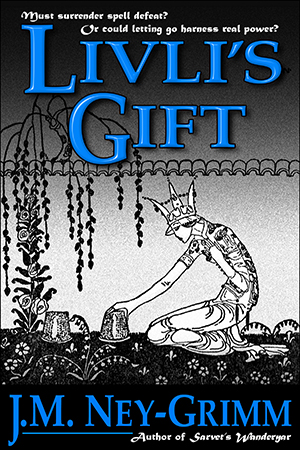
 I love the illustrations done by Kay Nielsen for the collection of Norse folk tales East of the Sun and West of the Moon. His work inspired the North-lands in which so many of my stories take place. And his drawings appear on the covers of several of my books.
The cover for Livli’s Gift features an illustration of the gardening queen in the folk tale “Prince Lindworm,” a story that is mentioned as part of the folk lore in my novel.
I still love the cover I originally created, but I felt some qualms about it after I submitted it to Joel Friedlander’s monthly cover design contest in March 2014. Joel found the design depressing. I didn’t agree with him at the time, but his opinion introduced a sliver of doubt into my awareness.
What if he were right? Was my cover causing readers who might love the story to click away from the book’s Amazon page without ever checking the “Look Inside”?
 That doubt niggled and niggled inside me. Finally I realized what bothered me. At full size, on the paperback or on a Kindle Fire, the cover still looks great to me. But at thumbnail size – the way you initially see it online – it does look gloomy. Or at least somber. Which is all wrong. Livli”s Gift is not a gloomy tale. Honestly, none of my stories are. I infinitely prefer hope and redemption!
I decided my cover needed revision. After all, every indie publisher should revisit the covers of her backlist every 3 to 5 years. Times change, cover styles change, but stories can be forever. Every good story deserves a cover that isn’t dated or stale. And Livli’s Gift deserved a cover that didn’t give a false impression.
But I didn’t want to change the art. I love the line drawing of the queen bending over her cherished plants. Could I achieve my goal by changing the title and byline treatment? That’s what I decided to attempt.
Some thinking was required.
 What sort of a title treatment should I attempt? Livli is a healer who works with magic, a magical hot spring, massage, and herbal treatments to cure her patients. Perhaps I could give the title a leafy texture to reflect this?
The cover for Quantum Zoo came to mind. I’d given its title a watery texture. Perhaps the same font, Orial, might even work well for Livli’s Gift. The curling ornaments of Orial had the right feeling for Livli, and the broader letters would provide a little more space to give the plant texture visibility.
I put all those elements together.
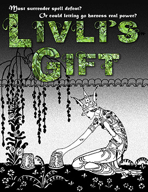 And I didn’t like it. The colors were dull. The letters were too blocky. They’d looked graceful on the Quantum Zoo cover, but they seemed clunky on the Livli cover. I didn’t even bother to test the byline with the Orial-leaf treatment.
I was going to have to try something else.
But I still liked the idea of a leafy texture. Maybe I just needed to find leaves with a brighter green. I remembered a walk I’d taken through my neighborhood, photographing spring flowers and bright green foliage. I checked my files of photos and found the very thing!
But what font should I use?
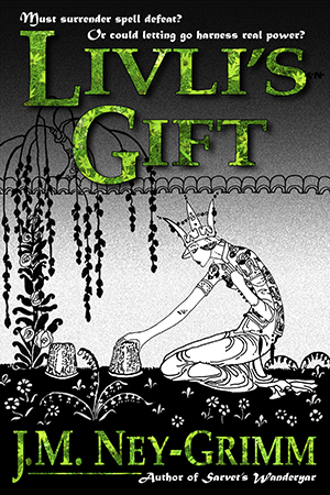 Maybe I didn’t need to change the original font. Maybe the Palatino on the original cover would work just fine when a texture was added to it. Excited, I put all of these elements together.
Okay!
Now I felt like I was getting somewhere. I liked the brightness and the warmth of the green. I liked the allusion to life and growing things. It still wasn’t quite right, but I could work with this. Where would I go with it next? How might I manipulate it to make it fully right?
I looked at what I had, and looked at it some more. And then one of those inspirations that every artist loves struck me. What if I gave the Palatino font some of the curlicues that were part of the Orial font?
Perfect! It would be perfect!
I set to work again, slicing and dicing, moving this piece here, that piece there. I was knitting or crocheting with Photoshop, and it was fun!
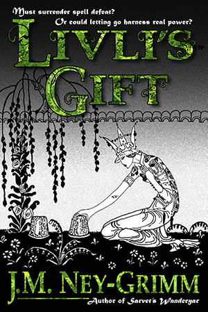 Would this be it? Would this be the cover I was longing for?
Yes! It totally rocked! I was so excited. I’d done it!
With the peak so high, you know the fall would be low. And it was. As I looked at my work, I realized that despite the bright warmth of the green, combining it with black yielded the feel of the horror genre.
Oh, no!
Livli’s Gift hasn’t even one speck of horror. Readers who like horror would purchase the book and be disappointed and feel cheated. Readers who like warm and human fantasy with streamers of hope and joy – the perfect audience for Livli’s Gift – would never give it a chance.
Gloom buried me.
I recovered, naturally. But I let the whole project rest. I’d reached the “I got nothing” stage.
So Livli’s Gift kept its old cover for another year.
Then, just last week, I had another idea. The lacy version of Palatino I’d created really was perfect for Livli’s Gift. What if I filled it with a different texture? What if I filled it with a water texture? Livli worked with water far more extenisvely than she did with plants anyway!
With trepidation, I opened that year-old file to see what I could do.
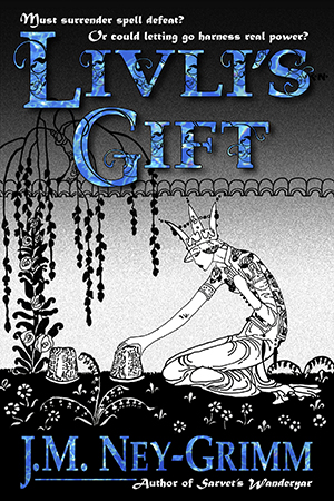 Filling the title with water was actually quite easy. The challenging work of creating a lacy Palatino was already done. I pasted in the water texture and looked at what I had.
Hmm. It was a nice idea, but it just wasn’t working. For whatever reason, the green leafy texture held together and didn’t confuse the eye. But the water texture didn’t behave similarly. It was too variegated, acting almost as a camouflage pattern, breaking up the edges of the letters and making the title hard to read.
I decided I would search for a better water texture.
After a night of sleep.
When I awoke in the morning, I had another idea. The original blue in the original cover had the bright, warm hue that I wanted. What if I simply used that, instead of pouring in a texture on the already complex lace of the altered font?
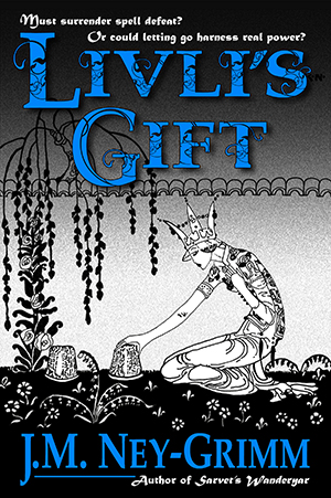 I selected the title, filled it with blue, deselected it, and took a look.
I noticed the byline was wider than the title. For no good reason. I modified it, so that the edges of the byline on the right and the left matched up precisely with the edges of the title. Much better!
I liked it.
The lacy Palatino has a pleasant liveliness to it. That particular hue of blue is indeed warm and bright. I hadn’t realized how much the unmodified Palatino creates a somber mood. Somber enough to overpower even the brightness of the warm blue.
Had I achieved my aim?
 I reduced the cover down to the tiny size of a thumbnail and studied the result.
Well, first off, on my computer screen, looking at the image in Photoshop, and looking at it on my own website, the original cover looks much more cheerful than it did on either Joel’s website or the Amazon site. That’s because both the other sites don’t render the blue accurately. Different sites really do render colors differently, unfortunately.
On the Kobo site, the cover for Perilous Chance suffers the most of all my covers. Instead of a clear and luminous indigo for the sky, it becomes a dingy purple. Ugh!
And even beyond the alterations caused by the hosting website, there are also all the variations caused by how each individual computer monitor is set. Each reader browsing online will see a slightly different view of each book cover in existence.
In fact, if we want to be through and precise, each reader’s brain and eyes will be calibrated slightly differently from every other reader’s. That way – considering every individual viewer – lies madness.
So, back to Livli’s Gift and how the thumbnail looks on my computer through my eyes. And it looks good. Not quite as nice as at the larger size, but still more cheerful than the original.
I double checked my assessment after I uploaded the new cover file on Amazon. There, the improvement was marked. At both the thumbnail size (which turns up in searches) and the slightly larger size that appears on the product page, the new version is much better than the old one. I’d say it’s a keeper.
Until I decide – in 5 years or so – that it’s time to revise the covers on my backlist again. 😀
To see the original building process for Livli’s cover:
Creating Livli’s Cover
For more about Kay Nielsen:
Kay Nielsen
And for more cover builds:
Building Star-drake’s Cover
Building Glory’s Cover
Building Wild’s Cover

I know you prefer the black and white look of the drawings, but I had just one thought (and yes, the new one is lovely): have you ever thought of those black lines as the spaces between the colored glass pieces in stained glass windows?
Some night when you’re playing around with Photoshop, and other people might be coloring adult coloring books, try a bit of color in the spaces – I have no idea what it would look like, but the thought DID seem worth a quick check. There are SO many colors possible.
It could look like colorizing old movies – some people like it, others find it horrifying.
I never saw the BW Gone With the Wind – so had nothing to compare it to when the version I saw as a teen came out. But Scarlett’s dresses were in many colors, and that would have been lost without colorizing.
As in many things – YMMV.
A character I dreamed up long ago (in the 1980s) loved to create art that was a blend of watercolor and pen-and-ink line drawings, like stained glass, but done with different media. Orias, he was named. Your suggestion to consider that for this cover reminded me of him, although I doubt I have the skill to pull off such a composition. 😀
I love the pen and ink illustrations, but the first thing I thought of was to add a bit of color to the plants. Not to color in the entire thing, but just in a few places. The weeping tree for instance. Make the leaves a light spring green. And then add color to some of the flowers. Keep most of it black and white. It wouldn’t have to be much.
Oooooh! Interesting idea, Lydia. Now that might be within my skill range. And I really like your limiting parameter of using only a few touches of color, and thus keeping the feeling of a largely black & white palette. This has my inner artist singing – very worth further thought.
My thanks to Alicia for sharing the initial idea, and my thanks to Lydia for running further with it! 😀
I love pen & ink images, because I have created them, along with oil, water colour, etc for many years. I took the DWS cover workshop to learn how to create covers for USA readers, and was surprised to learn different colours have many different meanings for USA readers. You can Google search for colour meanings then pick the most appropriate colour and adjust the font, to see if it improves or not the over all cover.
However, I loved the original cover, and all colour selections you have done so far, but being Australian, that is no help for you. 🙂
As a side note, I am not attracted to most of the covers on Joel’s site that he said are good, so look for USA reader comments over my comments. 🙂
The cover design principles I learned from Dean were presented in his on-the-coast workshop “Think Like a Publisher” before he and Kris created their online workshops. I learned many critically important things there in Oregon, but it sounds like the later online “Cover Design” workshop went into even more depth. Lucky you!
Thanks for your kind words about all of Livli’s cover manifestations. Just as I write stories of the heart, so do I create covers of the heart. 😉
I’m going to try googling color meanings. I’m curious what I’ll turn up for different cultures.
Hell of an evolution, eh? 😀
Too true! The creative process is endlessly varied.
I’m currently in the middle of designing a tower citadel – a veritable dark tower – for WIP. And – hoo boy! – talk about an evolving process! Although, I’m nearing the end of the floor plans now, and it is a pretty cool fortress. Worth it!