Every reader is different. Some passionately love short stories. Some wish there were more novellas being written. Others enjoy the full immersion that a novel provides.
Trad pub long ago abandoned the novella length, but it’s coming back with indies and ebooks.
I like all three lengths, both reading them and writing them.
Be that as it may, the varying lengths of story don’t sell at the same rate.
Short stories sell the fewest number of copies, novellas next, and novels best of all. My own books follow this curve fairly closely, with a few exceptions.
 Crossing the Naiad (a short story) sells like a novella, while Sarvet’s Wanderyar (a novella) sells like a novel.
Naturally I’m not complaining when a book sells better than one would expect! But I don’t like it when a novella sells like a short story, and that is what has been happening with Skies of Navarys.
The readers who read Navarys seem to really enjoy it. But too many are clicking away from its web page on Amazon, probably without even “looking inside.”
Why?
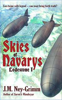
My theory is that it’s the cover.
Now I liked the original cover, and still do. It was a painterly rendition of three airships over a rural landscape. But I’ve had potential readers say that it looked military to them. Additionally, it’s the only one of my books with a cover that didn’t include a person in the image. I believe that cover was giving readers a false impression.
So I’ve created a new one! Check it out.

How does that strike you?
The ebook with the new cover is available at all the usual places. Or it will be shortly! I’ve uploaded it to Amazon, Kobo, and Smashwords. (Smashwords distributes my books to Apple and B&N.)
The paperback with the new cover is in progress, but not quite finished yet. Soon! 😀

I like that! 😀
… a minor quibble … The airship/balloons and sea tell a story, but what does the woman represent?
Thank you!
I think the young woman looks somewhat like Liliyah, one of the main characters.
The airships look like SF to me (never connected the thought in my brain until you mentioned it).
I’ve always loved the Quantum Zoo cover.
But you’re probably branding your other covers – and this one didn’t quite fit the composite idea of what people expect – so they put it off for later or maybe.
That’s what they say to do (may do it myself some day): if the book isn’t doing as well as you expect, try changing the cover.
You have experience.
😀 Change the cover, change the cover copy, change the keywords. Not being a marketing guru, I’m liable to make mistakes in any and all of those. But I do think the cover art needed to change in this case, and your point about branding for the Lodestone Tales is good. The old art with airships really didn’t fit with the other three.