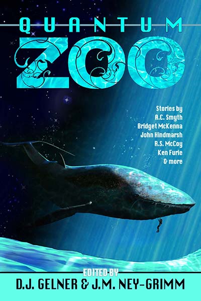
Some of you may remember that last December I teamed up with fellow writer D.J. Gelner to create an anthology with the theme of ZOO. I blogged about it here.
That was 5 months ago, and the creative stew pot has been cooking!
We received a bunch of stellar stories. We put them through a rigorous editorial process. The writers delivered top-notch revision drafts. Now we’re getting close to release!
Here’s a preview of the anthology cover. 😀
I’m thrilled! What do you think?
Quantum Zoo Amazon.com I Amazon UK I Amazon DE I Amazon ES
To read excerpts from Quantum Zoo:
Serpent’s Foe
Demon Rising
Skipdrive
Echoes of Earth
A King in Exile
For a list of the 12 stories in Quantum Zoo, click here.


That’s a really strong cover! I love the organic look of the lettering on “ZOO”, and that photo of the whale on the space background is really cool. Well done!
I popped over from Joel Friedlander’s e-Book cover design page for March 2014 to tell you I like the black-and-white art on your other covers, no matter what Joel might say.
But…
I really, really don’t get the font. I’ve seen a similar font on Dean Wesley Smith’s books and TBH it reminds me of a magazine. Maybe it’s meant to? It doesn’t make me think of a novel, that’s all.
But I struggle with fonts too, even after I read your posts on fonts & covers (which were really clear and useful, BTW).
Regards
Lee
Lee, thank you! Both for your kind words about Quantum Zoo and for adding your vote to those of the folks who like my black & white covers. I must say, there doesn’t seem to be any neutral ground on the black & white issue. People either hate them – find them dingy or dark and depressing, like Joel – or love them – thinking they’re unique and eye-catching and classy.
Interesting to learn that you dislike the Palatino font in the titles. It’s an old style classic, easy on the eyes, suitable for both interior text and titles, with a graceful quality that pleases me. Because I was pushing the envelope with the black & white, art nouveau images, I wanted something less edgy for the title font. But I enjoy hearing from people who disagree with my choices, especially when they can articulate why. I learn that way. So, much appreciated.
I test covers by making them very tiny – thumbnail size – on my screen. Quantum Zoo holds up well – your names vanish at the smallest reasonable size.
The included authors – and the fact that it’s an anthology – also disappear at the smallest size, but the description should cover that.
I often dislike Joel’s choices – for this exact reason. I reduce covers instinctively to the small size, and half the ones he likes fail the test miserably – either Title or Author or both disappear – and the art is unintelligible.
I don’t know if he’s biased to book-size – and sees them only that way – or if I’m missing something (highly probable). I’m not finished with my first cover – but my most recent draft has the basics right, and can be read at thumbnail size (but I don’t care for one of the essential letters, so will have to find a different font for my name).
The photographer who gave me the cover photo – an amazing sunset in my three chosen colors (I have subtle connections for each color to one of the main characters) – liked it ( I suppose he would 🙂 ). I have small lettering, and some graphic elements to add.
Yours reduce well in b/w – I do happen to like the effect.
I think it’s possible to market with two covers – call them version 1 and version 2, or put one of the covers inside. If your target audiences don’t overlap…
Alicia, I test my covers at the thumbnail size also. Most covers – even really good ones – suffer to some degree when they’re really small. I aim for a title that can be read and an image that is legible enough to be appealing. Glad you agree that Quantum Zoo passes the thumbnail test.
I’ve learned a lot from Joel’s monthly cover contests. Many of his comments – about surrounding white covers with a thin border, the fact that red on black rarely works, and approval of examples of strong typography, etc. – teach design fundamentals worth knowing and following. I’m realizing that his opinions about cover art are less useful, because art is more subjective than design. Nature of the beast. 😉
The cover is fantastic! And I was very happy with the title – wasn’t sure where you were going to go with it. (I’m just thrilled to be in the project…)
Glad you like both cover and title, Scott. D.J. and I wanted something that conveyed both SF and the zoo theme of the stories. We think Quantum Zoo does it well.