The interior walls of my home are white. By choice.
Too many of the clothes in my wardrobe are black & white. With touches of blue. Again: my choice.
I love black & white photos. I adore black & white line art.
Is there something a little off with me? What is this black & white fetish?
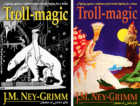
I’m guessing you can see where this is going! When it came time to design my book covers, I chose the ravishingly beautiful black & white illustrations by Kay Nielsen for the art. Unfortunately for me, not everyone shares my predilection for black & white. More specifically, readers often prefer images with more color.
“The art is so dark!” says one. “Almost dingy.”
“I couldn’t tell what it was, really,” says another. “It’s incomprehensible!”
“But your stories are so vivid, and your landscapes so stunning. The black & white covers don’t do justice to either.”
They made excellent points. Enough so, that I opened up Photoshop for another try at the cover for Troll-magic.

What do you think?
I continue to be entranced by the black & white one, but I like the colorful one (art by Victor Candell) as well. Yet I remain on the fence. B&W? Color? B&W? Color?
I’ve uploaded the colorful one to Amazon to appear as the cover for the ebook. Changing the print edition would be a much larger project, so it remains black & white (with a touch of gold) for now. I’m curious to see what will happen. Will more readers decide Troll-magic is for them? Fewer? The same number? I’ll let you know some time in August. Grin!
In the meantime, I’m very interested in your opinion. Please leave your vote in the comments!
Update: Thank you so much to each of you who shared in the comments. I have a better understanding of how my covers strike readers, because of you! “What was my decision?” you wonder. Black & white. It is unique. I’ll stand out in a crowd. 😀
For more about my book covers:
Cover Creation: Perilous Chance
Building Star-drake’s Cover
Creating Livli’s Cover
For more about how to design book covers:
Cover Design Primer
