Building Rainbow’s Cover

art for Rainbow's Lodestone

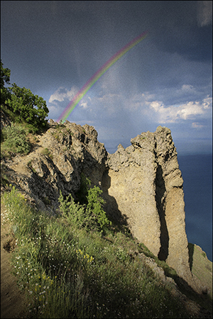
The first time I created a book cover for Rainbow’s Lodestone, I couldn’t find any art that looked like my spirit of the rainbow. So I settled for a landscape. It was a dramatic landscape – beautiful – and it had a rainbow against a looming cloudy sky. But I didn’t think it conveyed the essence of my story well.

art for original Rainbow's Lodestone cover
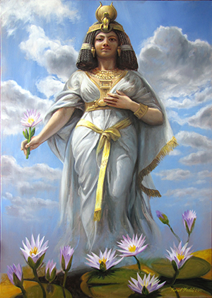
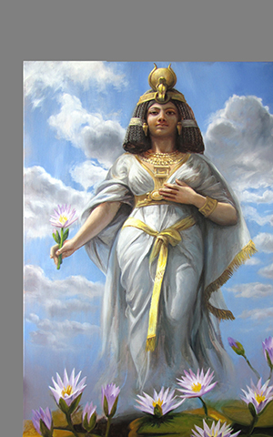
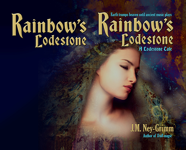
So, when I was ready to create the paperback edition of Rainbow’s Lodestone, I went looking for more suitable art. And I found exactly what I was looking for. The instant I set eyes on the image, I said to myself, “That’s her!”

It was exciting. I purchased the right to use the image on my cover.

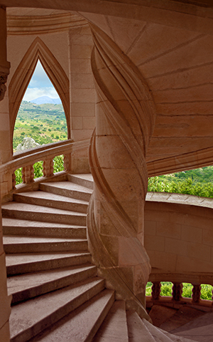
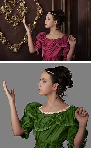
The first thing to do was flip the image. I wanted the spirit of light looking to the right, supporting the eye’s natural tendency to move from the top left corner of an image to the bottom right.

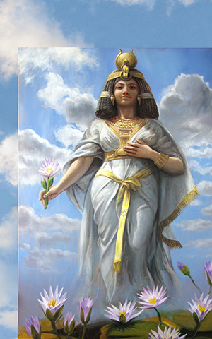
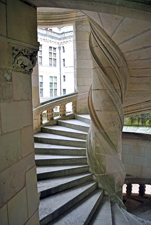
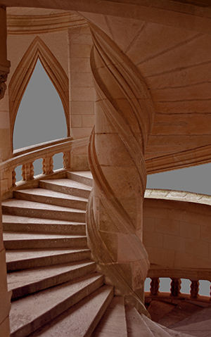
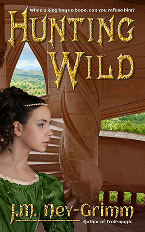
The next adjustment needed was creating room for a title. As you can see (above), the art didn’t have room at the top. Nor did it have much room at the bottom for my author byline. I had some work to do. I started to “paint” the extra margins I needed.

I’ve talked before about this “painting” I do in Photoshop. You might be wondering what I mean since that’s not very specific.

This is what I do to extend the background: I take the “lasso” tool and draw a rough shape around a suitable piece of the background. Then I “feather” the edge of my selection, essentially creating a fuzzy edge instead of a crisp one. Next I copy my selection and paste it on a new layer in my file. I move it around until it looks good. Then I merge it back onto the main layer.

That’s it in a nutshell.

But I do it over and over again to fill in the area I need.

modified art for Rainbow's Lodetone

The next steps were less time intensive.

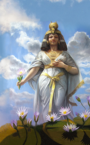
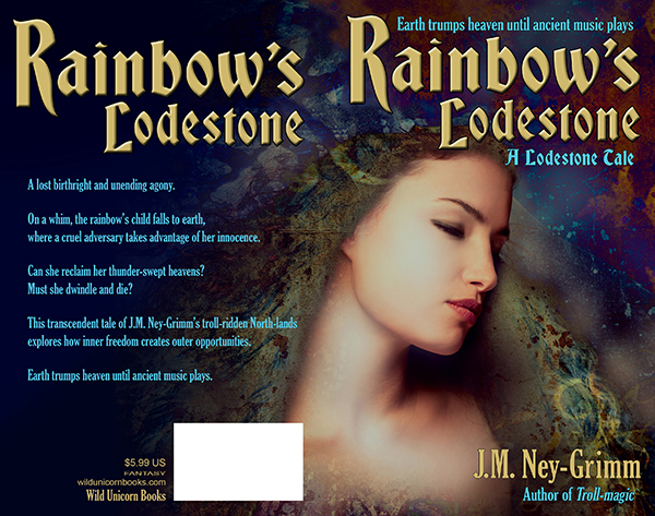
I assessed the back cover area to discern whether type would be easily read atop it. Rarely is it just fine as is. Usually I must either lighten it to receive dark type or darken it to receive light type. Additionally, if there is a lot of variation in lightness and darkness, I must even it out.

Type needs a fairly bland background behind it in order to be easy on the reading eyes.

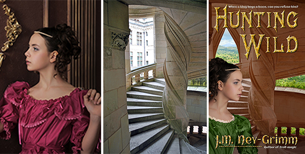
The art for Rainbow’s Lodestone didn’t extend far enough to the left after I’d added to the top. I could have “painted” yet more background, but I had a better plan in mind.

I sampled three colors from the back ground: a dark blue, a dark aqua, and a black. I selected large irregular triangles in the area that needed to be filled – feathered the edges a lot – and filled them with these three colors. The result was a varying wash of color that blended with the art and also yielded a good background for the back cover text.

Rainbow art with title

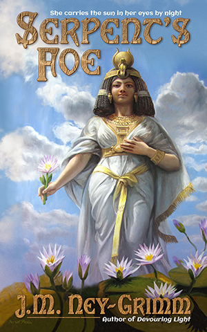
The Lodestone Tales follow the lodestones created by Zandro Mytris through the history of my North-lands. Which means I want the covers for all of the stories to look like they belong together.

I’d already chosen the font Bradley Gratis for the titles of the books and the font Gloucester for the tag lines and the back cover text. Working with those choices, I placed the title on the front cover so that it lined up with one edge of the cover and framed the art. Adding my byline and the tag lines was a straight forward matter.

Rainbow’s Lodestone is a short story, which means that its “blurb” is fairly short. I wouldn’t want to plump up the blurb with a lot of spoilers! I had to play with the best size for the text and line spacing, as well as seeking the best way to break the text into paragraphs. It was a matter of trying different arrangements until I got one that looked good.

I submitted this cover to a design contest held every month by Joel Friedlander. He’s a publishing and design professional active in the indie publishing world, and his good opinion is very worth having. I was delighted when Rainbow’s Lodestone won a rare and coveted gold star award!

(Rainbow’s Lodestone is the 30th in the long column of covers shown. Joel doesn’t list them by rank, but randomly.)

Paperback cover for Rainbow's Lodestone

To see more cover builds:
Building Star-drake’s Cover
Building Wild’s Cover
Cover Creation: Perilous Chance

For the basic principles of cover design:
Cover Design Primer


Share

Back Cover Design: Hunting Wild

Hunting Wild back coverThe front cover gets all the love!

I’ve seen a lot of information about designing the front cover for a book, but only a little about the back cover. There’s a reason for that, of course. The front cover sells the book. It catches the eye of a prospective reader and encourages him or her to look inside.

Ebooks don’t even have back covers. And, until recently, none of the online bookstores ever showed the back cover of a paper book. If you wanted to see the back cover, you had to walk into a brick and mortar store. (Or wait until your purchased paperback arrived on your doorstep.)

But any book that has a paper edition needs a back cover for it. That back cover must be attractive and harmonize with the front cover. It needs to have sizzle, as well as the “steak” of the back cover copy. And it needs to have certain information, such as the bar code, the publisher, maybe the price.

I thought it might be interesting if I shared some of my experiences with back covers.

The first thing I learned was that when I create the front cover for the ebook and wait until I start building the paperback to design the back cover, it’s much harder! I did the covers for Troll-magic and Sarvet’s Wanderyar in this piecemeal way. I got them to work, but…hoo boy!

All the books that came after, I created the paperback cover first and simply used the right half for the front cover of the ebook.

Let me show what the paperback cover of Hunting Wild looked like when I was ready to start finalizing the back cover.

Hunting Wild back cover

One of the things that you’ll notice in the image above is that it’s a whole lot bigger than it needs to be. There are two reasons for that.

1) It has an extra half inch all the way around the edge. That’s because I’ve learned from experience that it is infinitely easier to chop off unneeded edges than it is to add more later if it turns out you miscalculated and need the art a little taller or a little wider. I give myself plenty of wiggle room.

You need only a one-eighth inch bleed when you upload the cover file to CreateSpace. But I have found that when I paste my TIFF file into my InDesign file – I do covers in InDesign – the margins sometime get funky and weird. There have been several times I’ve been very glad of my extra margin.

2) Because I am creating the paperback cover before I create the paperback interior, I don’t know exactly how many pages the book will be. Which means I cannot calculate the precise width of the spine. So I allow an extra inch on the far left of my image, in order to have enough image to go from the bleed on the far right all the way across the front, then around the spine, then across the back, and finish beyond the leftmost bleed.

For Hunting Wild, I had planned to purchase a photo of a stone wall to use as a continuation of the wall coming off the stair tower on the front. However, when I tried a mock-up using a watermarked comp image, I didn’t like the result.

So I decided to “paint” that wall extension by copying and pasting the stone blocks (and smoothing the joins) from the left edge of the stair tower photo. I was very pleased with how that worked. It looks natural to my eye, and it makes a good, even background for the back cover text.

Hunting Wild back with text

I’ve cropped the cover image above, to the approximate size it will be on the paperback, using an estimate of the spine width. It is easy to move the text and the title on the back cover from side to side. So I will place it more exactly when I know the precise spine width.

My second reader is still reading and generating feedback for Hunting Wild, so I have another round of revisions on the book before I can send it to my proofreader. When I get it back from my proofreader, I will start formatting it for both the ebook edition and the paperback edition.

Only when I have the precise spine width will I place the white box needed for the bar code, as well as placing text indicating my publishing imprint (Wild Unicorn Books), the genre (fantasy), and the price (which is determined by the page count).

I’ll also wait to place the title and my byline on the spine.

There are a lot of elements that must go on the back cover, and it’s important to use some of the same design principles that go into designing the front cover: alignment, grouping, and type fonts that match those used on the front.

I’ll be posting more about back covers. Until then, here’s the link to my Cover Design Primer, so you can bone up on those design principles. 😉

And, if you missed it, here’s the post about designing the front cover for Hunting Wild.


Share

Building Foe’s Cover

Egypt 300 pxI’m imagining that some of you might say: “That J.M. Ney-Grimm! She has too much fun creating the covers for her books.” And you’d be quite right. It even seems a trifle unreasonable to me that I enjoy cover design as much as I do.

Not only do I love designing covers, I also like showing you how I did it. Today I’m going to pull back the curtain on the creation of the cover for Serpent’s Foe.

I found art that I adored long before I needed it, so I posted the art on the story’s “coming soon” page on my website. I wasn’t sure I’d be able to make it work on a cover, because the art has no space for the book title near the top. And the image at the bottom is too variegated for my byline to show well there.

sky 300 pxWhen it was time for me to decide what I would do, I searched for another alternative. One that wouldn’t require as much Photoshop “painting” as I guessed this image would need. But I couldn’t find anything I liked better. Probably because I liked this image so very much.

So I committed to the painting “Egypt Personified” by Farid Fidel and started thinking about how I could make it work. The first thing to do was find a photo of clouds and sky that matched the clouds and sky in the painting. There must be a bajillion such photos, and with so many to choose from, I was able to find one that looked really close.

a lot of empty spaceTo begin, I placed “Egypt Personified” into my file. As you can see, when room is made for a title, there’s a lot of space that needs art behind it and doesn’t have it. The next step was to place the clouds-and-sky photo behind the painting. The edge between the photo and the painting was very sharp, as I expected. I had a lot of Photoshop work to do, so I dove into it.

The sky in the photo is a more yellow blue than the sky in the painting, and it’s a harder, more saturated hue. The clouds in the photo are also yellower than the clouds in the painting.

I color corrected the photo’s sky, shifting the blue away from yellow and toward magenta, also desaturating it to get a softer blue. That helped the clouds match better as well, but I needed to pump up the brightness to get the clouds fully white.

Egypt w-rough skyOnce the colors matched fairly well, I stretched the photo to get its clouds close to where there were clouds in the painting.

Then I put copies of both stretched photo and painting on the same layer in my Photoshop file, so that I could start obscuring that edge by “painting” over it and blending the areas of the two images that were close to one another.

I’ve gotten a lot of practice at this sort of “painting” lately. (Yes, I’m grinning and thinking of the cover for Hunting Wild.) Because of all that practice, this sky “painting” felt fairly straight forward.

I’d paint a bit with the screen magnifying that portion so I could see exactly what I was doing. Then I’d zoom out to see what the whole looked like. And then I’d zoom in to do some more. Back and forth until, several hours later, I’d gotten it all done, and I was satisfied with the result.

Egypt art readyThe sky wasn’t the only item that needed adjustment. I tried my byline against the bottom of the painting, hoping it might work. Not only was it impossible to read, but it was hard on the eyes.

Potential readers would be clicking away from the web page with my book on it just to save their eyes from the “ouch” that my byline generated – half on the water lilies and half on Egypt’s gown.

Once more I set to work. This time I selected the lilies and pasted them into another layer where I could expand them. Egypt would be up to her knees in lilies, rather than just ankle deep.

I created a lavender mist to match the one rising off the Nile River in the painting. And I added a translucent shadow across the lily leaves to make a better background for my byline.

Since I’d already created the byline, and seen that it needed a different background than the one originally there, I made it invisible while I “painted,” but clicked it visible to check my progress.

Had I placed the higher lilies in the right place? Was the translucent shadow in the right place? Was it deep enough? Again, there was a lot of back and forth, zoom in, zoom out.

Serpent feature cover 300Finally, the blended images blended well enough to seem all of one piece. And then I was nearly done.

When I first placed the painting in my file, I’d done a mock-up of the title to be sure Egypt was standing in the right place. But now it was time to finalize the title.

I wanted it to pick up the different shades of gold in the painting and to harmonize with Egypt’s skin, so I color corrected the title, deepening its hue, saturating it, and reducing its brightness.

It still didn’t pop as much as I wanted it to, so I painted over one of the clouds (in the photo part of the image) with blue sky. That was much better, but still not quite there. I added a translucent blue shadow behind the title, and then I was satisfied. The cover for Serpent’s Foe was complete!

For more cover builds:
Cover Creation: Perilous Chance
Building Star-drake’s Cover
Cover Makeovers

For the principles of cover design:
Cover Design Primer


Share

Building Wild’s Cover

As I gain experience with building covers for my books, I find the process growing more and more like painting with Photoshop. All of my covers, even the earliest ones, required some manipulation in Photoshop. Darkening the blacks. Balancing the colors. Adding to the edges of the art when those edges were ragged or simply didn’t give me enough extra for the trimming that occurs when paperback books are made.

But the cover for Hunting Wild required the most “painting” of any cover yet!

I found the process of transformation – from photos purchased on Dreamstime.com to finished cover – fascinating. Naturally I want to share the journey with you. 😀

purchased Dreamstimes photo of Chambord The original photo of the interior of a palace tower depicted one of the stair towers from Chambord, an incredible chateau in the Loire valley of France. The tower was perfect as a rendition of my own Baloron, the castle in which Hunting Wild takes place, except for two things.

One: Baloron is made of reddish stone, not white. And two: the landscape visible through the tower windows should be a dry plain studded with olive trees, not a palace courtyard. Luckily, both were problems I felt confidant I could correct.


H Wild red towerMy first step was to cut away the courtyard seen through the openings of the Chambord stair tower. Then I turned the tower stone red. This image shows the arched fill-in I created for the square window at the upper left. In the process of building the cover, the window change came later, when I was trying to fit my title over the art. It was not working well – the title didn’t pop enough where it crossed the open window. I added the arched fill-in to give a better background for the title.

As I worked on the title, I also found I needed a little more tower at the right edge, so I “painted” that in.

I purchased a landscape of olive groves to use for the landscape around Baloron.

olice grove landscape photo purchased from DreamstimeIf I were being absolutely strict about Baloron’s landscape, I would have insisted on a grassy plain, perhaps with a lake in the background. I did look for such an image, but couldn’t find anything suitable. Since the region around Baloron includes olive groves (and cork trees), even though its immediate acreage does not, it seemed reasonable to compromise.

I didn’t use the entire photo that I purchased the rights to, just a portion of it. If you look closely at the right edge, you’ll see that I used the mirror image of a portion of the photo to extend the edge with the textures that my “painting” required. It creates a funny Rorshach-like pattern that isn’t visible in the final cover image, but that would be problematic if it were.

There’s another anomaly in the lower right portion of the photo. I pasted a portion of the tree tops into the area behind the right balustrade to achieve a more pleasing effect than what was there without editing. I find it interesting that the backside of this “tapestry” is so messy. 😀

H Wild tower wLandscapeWhen I pasted the landscape into my painting, I initially used the photo in its original state. I needed to see what exactly showed through the tower window and the tower balustrade. I moved the landscape around to get the view through the window right. Then I started copying and pasting different pieces of the photo into the landscape that showed through the balustrade. There was a lot of trial and error.

Nope. Nope! No, not that either!

Eventually I achieved a result that I liked. Yay!

Then I noticed that the landscape looked a little too dark for the composition. The landscape photo was taken out of doors, of course. But when you look out at a landscape from indoors, your eyes are adjusted to the light levels indoors, which are much dimmer than outdoors. This makes the outdoors look brighter in comparison. So I adjusted the brightness of the landscape layer in my cover file. Another “yay!” when I nailed it.

H Wild both girlsNow my setting was ready for my heroine! I purchased all three of the photos at the same time. I’d looked at hundreds, and only made my final choices when I was sure they would work well together. Even then, I did not purchase the right to use the photos until I’d downloaded low-resolution (and watermarked) comp images and put them together in a test cover to make sure they would work.

Each of the three photos cost $15 for the right to use it on my cover. Plus there was a fourth $15 image that I’d need for the back cover. I didn’t want to spend $60 until I was sure my selections would go together the way I envisioned them. I have planned compositions that simply didn’t work. This one, I am happy to report, did.

H Wild tower wGirlFinding a young woman gowned in garb suitable to a medieval setting who also looked like my heroine was hard. I searched and searched and searched. Finally I settled on a photo in which the model was perfect, although her clothing was not. There wouldn’t be much of her gown showing, so the style (which is Victorian) was not critical. But the fuchsia color would simply not work in my “painting.” I would need to change it to green. Also, she really needed to have the ruffles of a chemise (an undergarment) showing at the neckline.

Even more difficult, the position of her arms would not work. I felt confidant I could change fuchsia to green. I even felt confidant I could create the chemise ruffle. I’d copy the neckline of her dress and paste it onto another layer of my file. Then turn it to a creamy white. Then set the translucency to 50% or so. As I’d envisioned, those changes were fairly straight forward. But the arms?

In my mock-up test cover, the arms proved to be no trouble. Only her shoulders were showing. Plus I’d tipped her forward to have her gazing out over the tower balustrade (rather than staring at the tower wall). I simply removed her arms from the image! (Ew! Sounds gory, doesn’t it?) In the final draft, I found I needed more room for my author byline, which meant I needed to show more of her upper torso. I had to do a lot of copy-and-paste “painting” to lenghthen her sleeves. But I was pleased with the result.

Next came the title, author byline, and taglines. I’d say this part was easy – and it was, compared to the work required for my heroine – except you know from my account above that I had a lot of trouble placing the title. I found a gorgeous font for the title: Mephisto And I discovered that the font Aclonica – for the tag lines and back cover copy – complemented Mephisto perfectly.

But I had to reposition the tower, which involved extending it at the top and right side. I had to create an arched fill-in for the square window. And I had to reposition my heroine, which involved lengthening her sleeves. Yikes! But I did it!

Then I decided that I wasn’t satisfied with how the author byline looked in the Mephisto font. It just didn’t look right to me. (You can see that version in my earlier post: Cover Preview: Hunting Wild.) Plus the points of the letters extended so far down that I couldn’t make my trademark byline work – underline connecting the “J” and the “Author of Troll-magic.”

H Wild wTitleI fretted about the situation for several weeks. I created a cover for another book, on which my trademark author byline worked beautifully. I growled to myself about Hunting Wild. Finally, it occurred to me that I could use Aclonica – the font in the taglines – for my byline as well. I couldn’t just type it in, however. Small caps looked weird. Upper/lower case didn’t match my branding. So I customized: upper/lower for most of it, stretched lower case “M” and “N,” and an upper case “Y.”

There! Finally! I liked it! 😀


Let’s take a quick look at the finished cover side by side with two of the photos that went into creating it. Do you see why I call it “painting” in Photoshop? The transformation is rather dramatic. At least – I think so. 😉

H Wild triptych

For more cover builds:
Cover Creation: Perilous Chance
Building Star-drake’s Cover
Creating Livli’s Cover

For the principles of cover design:
Cover Design Primer


Share

Cover Makeovers

Extra-virgin olive oil, white wine vinegar, Celtic sea salt, Dijon mustard, and . . . shake!
It spreads very nicely over romaine lettuce and thin slices of cucumber. Yum!

But although I include recipes on my blog, this is not a cooking post.

(Sorry! Didn’t mean to mislead you!)

Continuing my metaphor, let’s take a different recipe. Water, oil, and a ton of shaking . . . will just tire your arm!

So why am I talking about emulsifying and non-emulsifying substances?

Because I need to mention a certain non-item: me and campy literature. We are not an item. We are the oil and the water. No matter how much you shake us, we just don’t mix. It’s a failing, I know. But . . . I am what I am.

On the other hand, me and campy images? Yes, yes, YES! Those are tremendous fun. And I just received the privilege of playing in exactly that garden. Shantnu Tiwari, writer of campy satire, sought my feedback on his cover designs. I haven’t read his stories (although I’m tempted), but his cover concepts drew me in like a rose draws the bee. Wow! I couldn’t wait to get my Photoshopping fingers in that pie.

Here are the BEFORE’s:

Shantnu Tiwari's cover designs


Now, fingertips dripping blueberry juice and scattering the odd pecan (all these mixed metaphors are making me hungry), my cover tweaks are done, and I want to share the AFTER’s with you, along with some commentary.

It’s a fun way to learn more about cover design and serves as a nice sequel to my earlier Cover Design Primer.

Here’s the first problem child, chock full of potential, quirky and unusual, but not quite there.

Bathroom imp guards unspooling money TPSo what’s wrong with it? The biggest problem is alignment. It doesn’t have any. The title has a left alignment with a ragged right, while the author byline has a center alignment, except it’s not centered on the cover, but in the space between the unravelling TP and the tile wall. And neither relates well to the photo art, exacerbated by haphazard grouping. The second line in the title floats away from the first line, while crowding the gun-toting TP saboteur. The author byline floats unconnected and unanchored in its space.

Lack of contrast provides the final straw. All the colors are mild and bland. The image lacks punch.

Despite these issues, the concept is fabulous. Money unspooling as TP, supervised by a bathroom imp? Wow! All of the alignment and grouping issues are simple fixes. The contrast (since we’re keeping the same photo art) is harder, but it can certainly be improved. Here’s the after.

Bathroom imp guards unspooling money TPTerrorists have decided to hit the West where it will hurt the most: their bowels. Now two super spies will teach the terrorists a lesson they will never forget: nobody touches our toilet paper and lives to tell the tale. Starring Jack, an evil space monkey aficionado, and Shakespeare, an imposter importer of burkhas (this time).


Cover number two suffers from similar problems: lack of alignment and ineffective grouping. The black and white hide of the cow, together with the dark hair of the zombie, provide better contrast, but the yellow title fades against the blue sky.

Additionally, aside from the quirky imagery, the cover possesses no visual branding. The author byline is handled differently than it was in the previous book (much smaller point size and different font) and placed erratically. Ditto for the title (all CAPS instead of upper/lower, but with no real reason for the change).

Soaring cow worries about threatened zombieThere is a further problem with the colors chosen for the title and the author byline. They are two shades of yellow. They need to be either the exact same shade of yellow or completely different colors. Similar, but not the same, is . . . not good!

But, again, the concept is marvelous. This cow might be a relative to the moon-jumping bovine of the nursery rhyme; however, her concern is not jigging to a fiddle tune, but the fate of a threatened zombie. Ridiculously cool!

And – also again – the fixes are easy. Tidy up the alignment and grouping issues. Chose one yellow for the title and author byline. Place a shadow behind them to pop the yellow. Use the same font and placement for the author byline from The Toilet Paper Conspiracy to develop an author brand. Change the haphazard talking bubble with a more carefully drawn thought bubble. And there you have it!

Soaring cow worries about threatened zombieA secret society is planning to destroy humanity. Only one person can stop them. Unfortunately, she’s out of town. Now it’s up to the other guys – a potato farmer, two beer addicted spies, and the super hero Cow Man (bitten by a radioactive cow) – to save the day. But are the heroes up to the task? Will they survive? Is the world safe? (If you don’t want to read the book, the answers are: Yes, Yes, and Yes!)


Grinning shark with exec case and tropical paradiseNow we’re getting to some art with visual punch. The dark-suited shark contrasts well with the pale beach sand and the jewel-toned tropical water. And the concept continues superb. Toothy grin, exec case, and island paradise. What could be better?!

But the type wanders, weakening the otherwise strong image, which it crowds. Branding elements are absent. The title is too small. All easily fixed.


Toothy grinning shark with exec case and tropical islandTired of living in your mother’s basement? Tired of not having a girlfriend? Why not become a Super Villain? Earn the respect of peers and the admiration of all the hot girls! We teach you, step by step, how easy it is:
• Take over the world using time traveling cows and zombie chickens.
• Capture heroes using ice cream and bananas
• Negotiate over Twitter!
Quote: Taking over the world is no more dangerous than driving to work everyday (in Afghanistan, while wearing a miniskirt and push-up bra, while singing “Oh America you’re so fine, you’re so fine you blow my mind”). The book is dedicated to Pinky and the Brain. You inspired us man. Totally inspired us.


Santa versus paramilitary at ChristmasI love this cover, even with its misalignments and hesitant title. It’s got so many things done right: the charm of the Santa image and the holiday background juxtaposed with the black-garbed paramilitary; the harmony of the blue/green/red color palette given brightness by the yellow author byline and punch by the dark jackets; the appealing simplicity of the font in the author byline. Huge thumb’s up!

And yet . . . giving the title more umph and pizzaz (to mirror the piquancy of the art) and correcting the misalignments could give it even more visual clout. This was the lure that first attracted me to this entertainment. I couldn’t wait to dive in!

Paramilitary arrest SantaSanta comes down the chimney and finds a dead body. The police bust in and arrest him. A little girl has all her gifts confiscated as evidence. North Pole sends its Reindeer Regiment to bomb the city of Loondumb to the ground. Before war destroys the country, someone must answer the question: who framed Santa Claus?


I hope you’ve enjoyed my tour of covers BEFORE and AFTER. What do you think? Did I succeed in retaining their quirky charm while adding to their impact? Metaphorical penny for your thoughts!


* * *

Shantnu Tiwari says this about himself: “Fighting for the rights of zombies since 1936. If you want books with sophistication and elegance, whose words move you and touch your heart, whose literary eloquence will impress critics and professors alike, don’t read my books. Cause I don’t write stuff like that. If you think the world ending because toilet paper ran out, or fat and hairy terrorists dressing up as women to seduce policemen is funny, then you will love my books.”

Shantnu Tiwari's new covers

The Zombie’s Life is in Danger, The Toilet Paper Conspiracy, You Can Be a Super Villain!, and Who Framed Santa Claus? are all available as ebooks and paperbacks at Amazon. The author also urges his readers to come say hello at http://shantnutiwari.com.

* * *

After word of mouth, book covers, cover copy, and story openings connect books with readers. My Cover Design Primer, Cover Copy Primer, Eyes Glaze Over? Never!, and The First Lines present basic concepts for how to do these well.


Share