5 Titles Aimed for September

When I visit the blogs of my favorite living authors – Lois McMaster Bujold and Robin McKinley – the number one thing I’m looking for is news of their next books.

Is she working on one? What is it about? When will it be in stores so that I can buy it? And read it!

5 new titles banner with Fate's Door

I don’t know if any of my readers feel as passionately about my stories as I do about Bujold’s stories and McKinley’s. Comparing feelings doesn’t really lead far, does it?

It’s sort of like the children’s book Guess How Much I Love You.

I love this book more than the distance to the moon. I love it more than the distance to the moon . . . and back! No, Pluto! Alpha Centauri! And so on.

But I know I do have a few fans who are probably wondering when my next title will appear. It’s been nearly a year since I’ve released anything new.

To those of you wondering and waiting, rest assured that I have been writing. A lot! And all this writing has been piling up into books.

Where are the books?

I have two that are ready to release. I always intended to release Serpent’s Foe, which appeared in Quantum Zoo, solo – for readers who don’t care for anthologies.

Serpent’s Foe is ready for release: cover complete, story file formatted.

Winter Glory is also ready for release: cover complete and story file formatted for upload.

In fact, not only are the ebook editions ready, but the trade paperback editions are also ready.

What am I waiting for?

I’d really like to increase my visibility. A number of readers have contacted me or written reviews saying they were delighted to have found my books. A recurring phrase is: “hidden gem.”

Naturally I love the idea that my books are gems. But I’m not so keen about the “hidden” part. I’d like to have more readers.

Almost a year ago, I read about something called the “Liliana Nirvana technique” on a blog written by SF author Hugh Howey.

The technique is simple: release five books on the same day.

Why? Because your visibility will soar. With five titles appearing on the “New Releases” lists, browsing readers will see your name more than once and be more likely to remember you, to check out your books, and to consider reading them.

If this were just a theory, I’d be skeptical. But quite a few writers have tried the technique with excellent results.

Honestly, I’m still skeptical.

But I’ve not gotten to where I am by staying with the tried and true. New ideas and new ways – and sometimes old ways that are so old they’re new – have always attracted me.

So I’m going to give the Liliana Nirvana technique a try.

Sept 2015However, the wait for my five new titles shouldn’t be much longer. September is looking good for their publication.

Hunting Wild is with my proofreader. When it comes back from her, I’ll correct the typos and format the file. It’s a few hours work at most. And the cover is already complete.

Caught in Amber is with my third beta reader. Normally, my books go through only two beta readers, but I made so many revisions to Amber I wanted a third reader’s eyes on it to be sure I got it right. The cover for Caught in Amber is already complete.

I’m still writing the fifth book – Fate’s Door – but I’m closing in on the end. The last fifth of the novel, in fact. The word count currently stands at 80,000!

I’m a writer who picks up steam through a book. I start out slow, achieve a respectable speed through the middle, and then barrel through the end like an express train.

I expect to finish Fate’s Door by the end of May. Then the manuscript goes to my first reader, then my second reader, and then (after my revisions) to my proofreader.

So what exactly will come your way in September? Here’s the list:

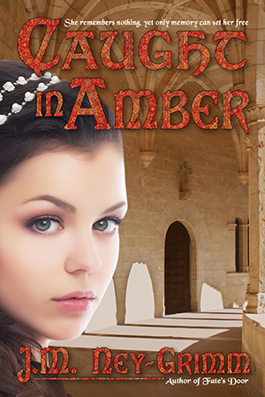
Amber web cov 200Caught in Amber • When young Fae awakens in a locked and deserted castle, she remembers nothing. Who she is, where she comes from, none of it.

Beauty from all the ages – medieval, renaissance, and gothic – graces her surroundings, but underneath the loveliness a lurking evil stirs.

Fae must recover her memories and discern the true nature of the challenge before her, while she confronts the castle’s dangers – both subtle and not so subtle.

Somewhere in her forgotten past lies the key to her freedom.
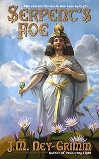
 

Serpent’s Foe • Bastet, divine protectress of the gods themselves, lies defeated in a cage.

Trapped in beast form, imprisoned behind bars, and confused by nightmares, she struggles to regain her sanity.

Yet clarity of mind is only the beginning of her fight for freedom. In the dimness of the ancient Egyptian duat – where Ra journeys from sundown to sunup – a potent enemy lurks.

When strength battles compassion, what guise must victory assume?
 

Fate's Door, web cover 200Fate’s Door • Secrets, like troubles, come in threes. When you possess one of either, two more arrive to keep it company. Nerine, a sea nymph of the ancient world, knows too much about both.

Each morning, in the chill before the sun’s rising, Nerine and the three Fates stand under the mighty branches of the World Tree, gazing into the depths of the root-girdled Well of Destiny, watching the dooms that must come to pass that day.

But when the dawn’s visions show Nerine’s lover, shipwrecked and drowning, all her renounced yearning for him rises anew.

Somehow – this day, this morning, this time – Nerine must subvert destiny or lose the companion of her heart forever.
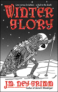
 

Glory web cover 200Winter Glory • In the cold, forested North-lands – prowled by trolls and ice tigers, redolent with the aroma of pine, and shrouded in snow – Ivvar seeks only to meet his newborn great granddaughter.

Someone else has the same plan.

Traversing the wilderness toward the infant’s home camp, Ivvar must face the woman he once cherished and an ancient leviathan of the chilly woodlands in a complicated dance of love and death.

Ivvar’s second chance at happiness – and his life – hang in the balance.
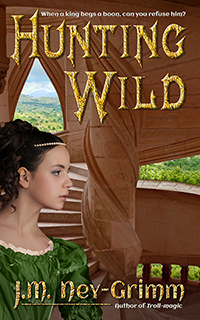
 

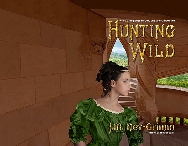
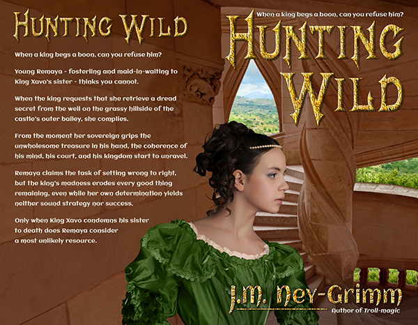
Hunting Wild200 pxHunting Wild • When a king begs a boon, can you refuse him? Young Remeya – fosterling and maid-in-waiting to King Xavo’s sister – thinks you cannot.

Her king requests that she retrieve a dread secret from the well on the grassy hillside of his castle’s outer bailey, and she complies. From the moment her sovereign grips the unwholesome treasure in his hand, the coherence of his mind, his court, and his kingdom start to unravel.


* * *

So…get ready to binge on a handful of new stories in the fall! 😀


Share

Building Amber

Amber web cov 200I always have fun sharing the process of creating a book cover. My latest is the cover for Caught in Amber, a soon-to-be-released novel in my Mythic Tales series.

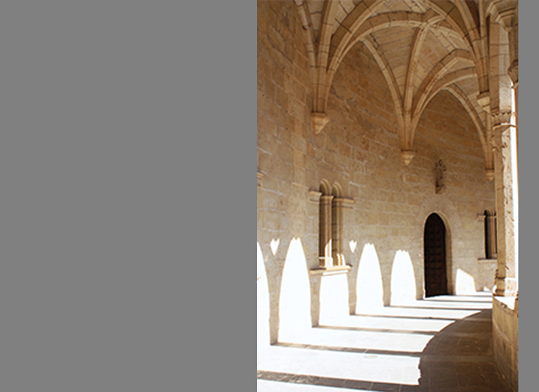
As always, the first step was finding images that work. My initial idea was to show my protagonist – Fae – with a fabulous castle in the background. An outside view of the castle.

In the story, the castle is located on relatively level ground amidst rolling hills. I wasn’t going to demand absolute fidelity in the landscape. Finding the right castle in terrain that wasn’t too different would be fine.

But I couldn’t find the right castle. At all.

The castle in Caught in Amber is embarrassingly similar to the Disney castle in Florida. But bigger. Much bigger. With wings constructed in all the architectural styles imaginable. And the real world doesn’t have anything like it. Or, at least, doesn’t have any photos of such a castle available.

Caught in Amber, build 1As is necessary in cover composition, I developed another idea. I would show Fae inside the castle. Which was probably a better idea anyway. Most of the book takes place inside the castle, not outside.

There were more interior photos of castles than I would ever need. Even if I wrote nothing but castle stories for the next ten years! I couldn’t decide amongst them. So I bookmarked several that I liked and moved on.

Time to find Fae!

She’s a gray-eyed girl in her mid-teens with curly brown hair. Surely she wouldn’t be too difficult to match.

But she was.

The brunettes with the right face didn’t have the right hair. The brunettes with the right hair were too old. Or else they they wore big grins on their faces. Fae doesn’t do much grinning in Caught in Amber. Her situation is too scary and dangerous.

Finally I decided to combine two photos: one with the right face and one with the right hair. I did a quick mock-up using comp images, and my idea definitely worked. Both the face model and the hair model had widow’s peaks, so the two images could be combined comfortably.

Once I’d chosen Fae, it was easy to select a castle interior. There was one that complemented her particularly well. I pasted it into my mock-up. It looked good!

Then I went back to revising the manuscript. Sent it out to my second reader. Got her feedback. And revised again.

I save designing the cover as a reward for after the manuscript is complete and close to its final form. Also the blurb. I really need a treat after blurb writing, which doesn’t come easily for me.

More than a month elapsed.

As I arranged to purchase the right to use the photos I’d chosen for the cover, I had second thoughts about my choices. The model looked a little too pugnacious. She just wasn’t the right one after all.

I reviewed all the photos I’d bookmarked and discovered a model who was perfect. I’d rejected her initially, because she looked a little too cheerful. But part of her cheerful aspect was her bridal gown and her studio setting. One of the things I’d learned from my mock-up was that the castle setting caused a really serious model to look too serious. Perhaps a mildly serious model would look exactly right.

I tried the new Fae in my mock-up. She was indeed perfect. This was Fae. I would need to change her brown eyes to gray, but that was an easy fix.

However, the castle scene for the first Fae wasn’t quite right for the second Fae.

I returned to all the castles I’d bookmarked. With such a wide selection to choose from, finding the right castle interior was easy. I was ready to start!

Caught in Amber, cover build 2

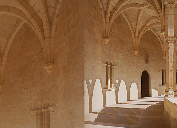
I purchased the right to use the two photos, set up my book cover file in Photoshop, and pasted in the castle photo. I extended the right side almost immediately. I knew I would need that extra for the cover bleed.

Then I looked at what I had. The photo was a little overexposed for my purpose. It would undoubtedly be fine as a framed photo on a wall. But as the backdrop on a cover, the brightest parts of the photo – where the sun shone through the arched windows – needed to be less bright.

Caught in Amber, build 3

I selected a portion of the photo that would work well on the back cover (the top left) and pasted it into the file. Then I set about correcting the overexposure as well as changing the color balance to a more saturated hue that would give the castle more density.

I put a translucent screen over the back cover to make it a suitably smooth background for the back cover copy. I lightened the shadows in the wall niches on the back cover for the same reason. The image behind text musn’t vary from light to dark too much.

The odd seam between the front cover and back cover in the lower half did not need to be addressed. Fae would cover it, once she arrived.

Caught in Amber, build 4

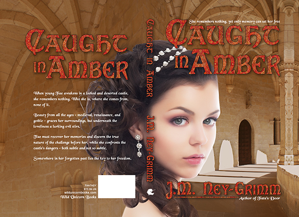
With Fae in her castle, I could see that I had a problem with her shoulder. As it wrapped across the spine of the book and then onto the back cover, it would look odd appearing in isolation as it would with all of Fae excepting her hair on the front cover. I followed a shadow line in the photo to reshape her shoulder. That was better, but not quite what I wanted.

I tried adding a few extra curls of her hair. Perfect!

Amber build 5-1

I created the title and my byline. I added the tag lines and the back cover text. It was definitely coming together nicely.

But there were two problem areas.

Fae’s pearly head dress interfered with the title on the spine, making it hard to read.

And the small strands of Fae’s hair that stood away from the main mass of her hair were too bright, making it hard to read the back cover copy.

On the spine I placed some carefully selected and feathered pieces of Fae’s hair under the spine title and over that portion of the pearl head dress. It worked beautifully. Now you could read the title without strain.

I placed a translucent and feathered shadow over the ends of Fae’s hair on the back cover and under the text. That worked well also.

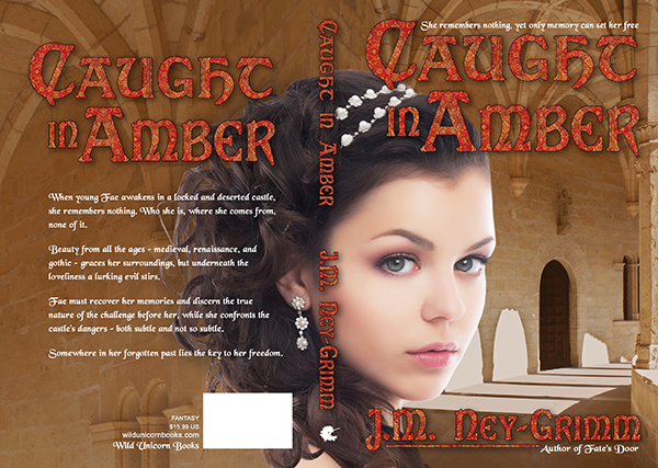
My cover was finished!

I got that fun frisson of “This is real!” when I looked at the composed image. Even though I am the one who worked to put the two photos together, in my heart of hearts I believe that I am looking at Fae as she explores the deserted castle where she awakens without her memories. 😀

Amber build 6-1

For more cover builds:
Building Wild’s Cover
Building Glory’s Cover
Cover Creation: Perilous Chance


Share

What is the Worst Thing?

One of the writers I respect most – and whose stories I love the most – asks herself this question: what is the worst thing I can do to my protagonist?

She poses that question, answers it, and then does that very thing in her story.

Shark by Umair Mohsin

She’s not the only writer who uses that question to guide her stories. Many do.

But it never worked for me. When I asked myself, “What is the worst thing that might happen to my heroine?” the answers were distinctly not helpful.

Answer the first: kill her off. In which case, there is no story.

Answer the second: take away the thing that makes life worth living, with no hope of replacement or redemption. In which case, I’m writing a tragedy, and I don’t want to write a tragedy.

Many of my stories are born from a setting that has inherent problems.

For example, Livli’s Gift was sparked from an incident that happens in Troll-magic.

When Lorelin travels north on skis, she encounters a Hammarleeding woman in the woodland edging the tundra. We learn that the woman is returning from a journey to visit her new grandchild, and that her daughter had left the Hammarleeding enclaves entirely, because she wouldn’t be allowed to keep her young son if she stayed. Hammarleeding boy children go to live in the father-lodge, apart from their mothers, when they are two-and-a-half years old.

My story question was: how would a woman who couldn’t bear to follow that societal norm manage when she gave birth to a boy?

Livli’s Gift explored that question, starting with pregnant Livli worrying that her baby might be a boy.

Knife-weilding ElfI’ve generally relied on the inherent dangers and risks in my story setting to drive the story forward.

But, in one of my recently written novels, that method wasn’t working. At least, it seemed not to be working. Both of my first readers told me that the first third of my story wasn’t holding their interest. Both loved the middle and the end. But not the beginning.

So I had some thinking to do. Where exactly had I gone wrong?

The situation my protagonist found herself in was dangerous and scary. If I were in that situation – utterly alone, trapped in a deserted castle with no food or water and no way to get out – I’d be pretty scared.

So why were my readers not gripped by it?

The answer, when I discovered it, was quite obvious. (Although it took me two hours of discussion before I stumbled on it. 😉 )

My protagonist dove into solving her problems too quickly. No sooner did we realize that there was no water than she scrounged up water. Same with the food. That took all the tension out of the story.

I needed to let her encounter the full dangers of her situation before I allowed her to devise solutions.

Epiphany!

Tiger Face Portrait by Gavin BellUnconsciously, I’d followed that guideline – show the dangers fully – in most of my stories.

In Livli’s Gift, Livli arrives on the scene worrying about being forced to give up her baby, if he is a boy.

In Perilous Chance, young Clary immediately must cope with her wailing baby brother, because her father is absent and her mother incapacitated.

In Troll-magic, Kellor struggles with the throes of troll-disease: its physical discomfort and its mental confusion.

In the novel where I failed to follow that excellent precept – allow your protagonist to wrestle with the difficulties inherent in the situation – why had I failed?

It was because I, the writer, was too scared!

I was writing my personal nightmare, and I couldn’t bear to experience it in all its horror. I needed those solutions. With the result that I let my heroine have it too easy.

But don’t worry, she now has a perfectly dreadful time!

That’s why most writers have trusted first readers: to find the places where the story isn’t working so that the writer can fix any writing mistakes and make the story work.

Not only have I fixed the mistake in this particular story, but I now have my own question to ensure I don’t make the same mistake in future stories.

Colorado National Monument

“What is dangerous and risky about this situation? How can I present those dangers most powerfully to the reader?”

It was exciting to develop my own twist on, “What is the worst that can happen?”

I was in the middle of writing a novel at the time, but I can’t wait to see how my touchstone question guides me at the start of my next story. 😀

More writing tips:
The First Lines
Where Should a Paragraph End?


Share

Cover Reveal: Caught in Amber

Caught in Amber is getting ever closer to its release!

Amber feature cov 300When young Fae awakens in a locked and deserted castle, she remembers nothing. Who she is, where she comes from, none of it.

Beauty from all the ages – medieval, renaissance, and gothic – graces her surroundings, but underneath the loveliness a lurking evil stirs.

Fae must recover her memories and discern the true nature of the challenge before her, while she confronts the castle’s dangers – both subtle and not so subtle.

Somewhere in her forgotten past lies the key to her freedom.

Coming soon!

Share

What Happens After the Manuscript is Complete?

Once you have a complete manuscript – ready for publication, ready for readers to enjoy – what happens next?

workflow ms

Several of you have asked me this question, and it is well worth considering.

Writing has a natural flow. When you finish one scene, you write the next. When you complete the first draft, you send the story to your trusted first reader. When you’ve fixed the errors pointed out by your first reader (or readers), you send the manuscript to your proofreader. Step three cannot be performed until steps one and two are complete.

workflow: too muchBut once the manuscript is completely finished, the next step is less obvious. Especially if you prefer to do the work yourself, as I do.

Do you create the cover?

Do you write the cover copy? (Sometimes called a “blurb,” just because “blurb” is one syllable, while “cover copy” is four!)

Or do you format the file for uploading to the different etailer sites?

It can feel like all of these tasks are rushing you in a group. But they aren’t. You pick one and work on it. Then you pick another and work on that one.

I have published fourteen ebooks so far, and I have another five underway. Somewhere between the first book and the fourteenth, I arrived at a workflow that feels comfortable for me and that allows me to do my best work.

I’ll outline it below.

workflow: early blurbThe Blurb

I always tackle the cover copy (or blurb) first, because I find it to be the most challenging piece of publishing a book. I have to take multiple passes at it to get it right.

How I feel about my first attempt at a blurb varies wildly!

Sometimes I’ll write it and think: I nailed it! This is it! Woot, woot!

More often, I’ll struggle and groan and feel as though someone is driving spikes through my head, and think that whatever I’ve created for cover copy is awful! Blurb writing does not come easily to me.

But once I’ve put in solid, committed effort and have a complete blurb, I move on.

If you’d like to see the principles I follow when writing blurbs, I have two posts about blurbs on my website: one here and one here.

workflow: cover artCover Design

I tackle the cover design next. Finding the right art for the cover can be very challenging, but usually I’ve started looking for art while my first reader is reading my story. Often I’ve found the art and purchased the right to use it before the manuscript is back from my proofreader.

For me, cover creation is like playing. All my stress melts away, and I’m just having fun creating a beautiful and compelling visual that fits my story. It’s a good chaser to the agony of blurb writing. 😉

For guidelines on cover design, see my Cover Design Primer.

workflow: second blurbBlurb, Round 2

Then I look at the blurb again.

Inevitably – whether I loved my blurb or hated it – I see that it’s not good enough. It conveys a false idea of the story or it fails to ground the reader in the setting or it doesn’t include any hint of the lyricism that is part of my writing.

A blurb can fail in so many ways, and I think I am slowly discovering them all. 😉

But usually there is some portion (or portions) of my blurb that is useable. I build on that for another draft. And see what my husband thinks about it. And then use his feedback to create yet another draft.

Then I return to my cover.

workflow: tweaking the cover design

Cover Design, Round 2

When I create my covers, I start with the cover for the paperback. I’ve learned that it is much harder to add a spine and back cover to an ebook cover than it is to extract the front cover from a paperback cover and use it for the ebook.

So I pour the blurb into my paperback cover file.

When I do so, I inevitably see that the cover needs some adjustment.

Maybe the font I chose requires that the tail of the “J” in my byline be a little longer. Or a little shorter. Maybe the position of the skier’s cloak (in the art) is too close to the spine. There is always something.

So I tweak the cover.

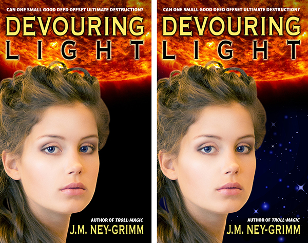
(The left version of Devouring Light above shows only the harsh black of outer space behind the goddess. It directly contradicted the playful undercurrent of my story. The right tweaked version of the cover has a soft starfield in the background.)

workflow: third blurbBlurb, Round 3

Pouring the blurb into my cover file helps me to see the blurb as a reader, rather than as a writer. That fresh perspective often clarifies where to go next with the blurb. By this time, my blurb should be approaching its final form. A little more massaging will get it to where I am satisfied.

Now, don’t get me wrong. I am far from a master blurb writer. Marketing gurus have many years of schooling in the discipline behind them plus years of experience. That’s not me! I suspect I will continue to learn about blurbs and how to write them for as long as I’m publishing books. But I am better at it than I used to be.

Format the Ebook File

I leave formatting the file for last.

I believe that ebook files need to be as simply formatted as is possible. You never know what kind of a device your reader will be reading on. It could be a Kindle or a Nook or a Kobo. More likely, he or she will be using a smartphone and some sort of ereading app.

The more bells and whistles you include, the more likely that something will go wrong. And then your reader won’t be reading at all. Or, if she is, it won’t be your book.

So I make the formatting very, very minimal.

Which means that it doesn’t take me much time. Half an hour at most.

workflow: keywords

Keywords

Not all etailers allow the publisher to attach keywords to a book. But Amazon and Nook Press do. You want to choose your keywords carefully. I choose mine to position my book in as many of the suitable categories as possible.

I use Amazon’s keyword guide for fantasy and science fiction to help me choose. I only aim for categories where my book genuinely belongs. But often there are quite a few that fit. I want my book to appear in as many of those as I can manage. 😀

I make a list of the keywords for this book and keep a record of them in my computer folder for that title.

workflow: final blurbBlurb, Round 4

Sometimes I don’t need this final stab at the blurb. But, often I do.

Just before I upload the ebook file and the cover file, I look at the blurb again. And tweak it just a little more.

Uploading

I double check to be sure I have everything I need. Is the file formatted and ready to upload? Check.

Is the cover file correctly formatted and correctly sized for uploading? Check.

Is the blurb ready to copy-and-paste into the blurb box on the etailer site? Check.

Do I have my keywords chosen and ready? Check.

I log into my account, type in the requisite information, upload the files, type in my price in US dollars, and round the international prices so that they are not a weird number like £3.16.

Then I wait the 12 hours it takes (sometimes less on Amazon, usually more on the other sites) to go live.

Author Central

Once the book is live on Amazon, I visit my Author Central account and “claim” the book as mine.

This will cause the book to appear on my author page on the Amazon site. Whenever a reader clicks my name on the book’s page, he or she will arrive at my author page. I want all my books to appear on that page. I want it to be easy for a reader who loved one of my books to find another.

The other benefit of my Author Central account is that I can format the blurb.

The KDP desktop where you upload the book does not permit any formating. No italics. No bolding. Nothing. The result can look unprofessional and messy. The desktop at Author Central lets me make my blurb look nice.

And – guess what? – when I see the blurb correctly formatted, I often make yet one more tweak! That final blurb often has ten or more drafts that preceded it!

workflow: Author Central blurb

Quality Assurance

When I upload a book, Smashwords and Amazon both have a step that allows me to preview the ebook. I look through every page of it to be sure that a glitch has not crept in unbeknownst to me. I don’t read. What I’m primarily checking for are: odd page breaks, weird formatting, or formatting that appears as text instead of invisibly guiding the text of the story.

My workflow tends to generate odd page breaks from time to time. Not always. Not often. But sometimes. If I find any, then I have to fix the problem and re-upload the file before I click the publish button.

But I like to take one final QA step on Amazon after the ebook is available for purchase. I buy the ebook and look at it on my Kindle. And give a huge sigh of relief when I see that the formatting is indeed fine.

Devouring Light on the Amazon siteDone!

Writing out my entire process makes it sound like a lot. But I move through it fairly quickly these days. Practice!

Of course, this is the workflow for an ebook. Paperbacks use some of the same elements – but they have their own unique workflow. Perhaps, if I hear interest, I’ll blog about it sometime.

Edited to Add

All of the above could be summarized much more tidily.

1 – The blurb: write it.
2 – The cover: create it.
3 – Format the ebook file.
4 – Choose your keywords.
5 – Review steps 1 and 2, repeatedly, and tweak both, repeatedly. 😉
6 – Upload the files.
7 – Visit Author Central and format the blurb.
8 – Buy a copy of the ebook and look at it on your Kindle.
9 – Done!

My hope is that the more detailed narrative will be useful to those who are actually in the throes of the work between completed manuscript and published ebook.

The middle of the real process is a lot messier than nice, neat check lists. Many of us (myself included) find value in an accurate (if complex) roadmap. 😀

The links mentioned above:
Cover Copy Primer
Eyes Glaze Over? Never!
Cover Design Primer
Amazon’s Keyword Guide
Amazon’s SFF Keyword List


Share

Building Rainbow’s Cover

art for Rainbow's Lodestone

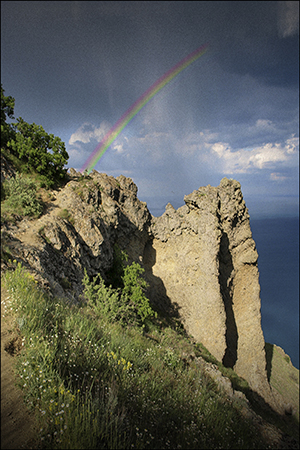
The first time I created a book cover for Rainbow’s Lodestone, I couldn’t find any art that looked like my spirit of the rainbow. So I settled for a landscape. It was a dramatic landscape – beautiful – and it had a rainbow against a looming cloudy sky. But I didn’t think it conveyed the essence of my story well.

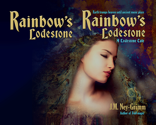
art for original Rainbow's Lodestone coverSo, when I was ready to create the paperback edition of Rainbow’s Lodestone, I went looking for more suitable art. And I found exactly what I was looking for. The instant I set eyes on the image, I said to myself, “That’s her!”

It was exciting. I purchased the right to use the image on my cover.

The first thing to do was flip the image. I wanted the spirit of light looking to the right, supporting the eye’s natural tendency to move from the top left corner of an image to the bottom right.

The next adjustment needed was creating room for a title. As you can see (above), the art didn’t have room at the top. Nor did it have much room at the bottom for my author byline. I had some work to do. I started to “paint” the extra margins I needed.

I’ve talked before about this “painting” I do in Photoshop. You might be wondering what I mean since that’s not very specific.

This is what I do to extend the background: I take the “lasso” tool and draw a rough shape around a suitable piece of the background. Then I “feather” the edge of my selection, essentially creating a fuzzy edge instead of a crisp one. Next I copy my selection and paste it on a new layer in my file. I move it around until it looks good. Then I merge it back onto the main layer.

That’s it in a nutshell.

But I do it over and over again to fill in the area I need.

modified art for Rainbow's Lodetone

The next steps were less time intensive.

I assessed the back cover area to discern whether type would be easily read atop it. Rarely is it just fine as is. Usually I must either lighten it to receive dark type or darken it to receive light type. Additionally, if there is a lot of variation in lightness and darkness, I must even it out.

Type needs a fairly bland background behind it in order to be easy on the reading eyes.

The art for Rainbow’s Lodestone didn’t extend far enough to the left after I’d added to the top. I could have “painted” yet more background, but I had a better plan in mind.

I sampled three colors from the back ground: a dark blue, a dark aqua, and a black. I selected large irregular triangles in the area that needed to be filled – feathered the edges a lot – and filled them with these three colors. The result was a varying wash of color that blended with the art and also yielded a good background for the back cover text.

Rainbow art with title

The Lodestone Tales follow the lodestones created by Zandro Mytris through the history of my North-lands. Which means I want the covers for all of the stories to look like they belong together.

I’d already chosen the font Bradley Gratis for the titles of the books and the font Gloucester for the tag lines and the back cover text. Working with those choices, I placed the title on the front cover so that it lined up with one edge of the cover and framed the art. Adding my byline and the tag lines was a straight forward matter.

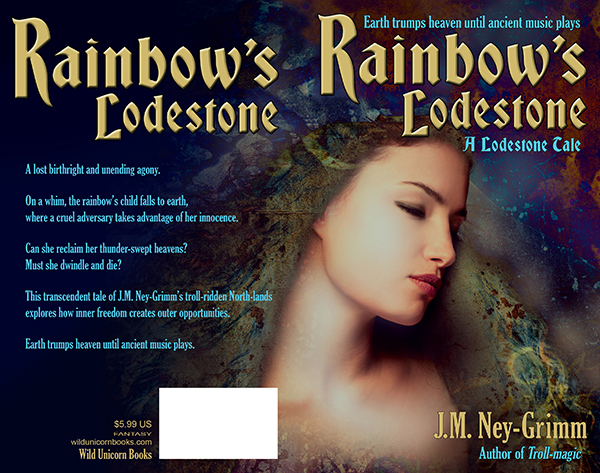
Rainbow’s Lodestone is a short story, which means that its “blurb” is fairly short. I wouldn’t want to plump up the blurb with a lot of spoilers! I had to play with the best size for the text and line spacing, as well as seeking the best way to break the text into paragraphs. It was a matter of trying different arrangements until I got one that looked good.

I submitted this cover to a design contest held every month by Joel Friedlander. He’s a publishing and design professional active in the indie publishing world, and his good opinion is very worth having. I was delighted when Rainbow’s Lodestone won a rare and coveted gold star award!

(Rainbow’s Lodestone is the 30th in the long column of covers shown. Joel doesn’t list them by rank, but randomly.)

Paperback cover for Rainbow's Lodestone

To see more cover builds:
Building Star-drake’s Cover
Building Wild’s Cover
Cover Creation: Perilous Chance

For the basic principles of cover design:
Cover Design Primer


Share

Building Glory’s Cover

y Magnus Sjöberg (Larsson), photo used under a Creative Commons license, FlickrI was so lucky finding images that were perfect for the covers of Fate’s Door and Caught in Amber, I hoped I might be equally lucky with photos for Winter Glory.

I found a gorgeous northern landscape: a snow-covered pine forest with the sun setting through the tree trunks. (Similar to the photo at left.) But I couldn’t find anyone who looked like Ivvar.

This didn’t truly surprise me. Ivvar’s a tall fellow with shoulder-length gray dreadlocks and tan skin. Not tanned by sunlight, but naturally tan, the way my Hammarleedings are.

I searched for a photo of Ivvar last October when I finished writing Winter Glory. I searched in November when I got feedback from my first reader and started revisions. I searched in January when I received feedback from my second reader and made more revisions. I searched in February when the file came back from my proofreader with typos corrected.

I searched one last time when it was time to create the cover.

illustration for East of the Sun and West of the MoonThen I had to face the fact that I simply was not going to find Ivvar photographed by chance by a modern photographer. 😀

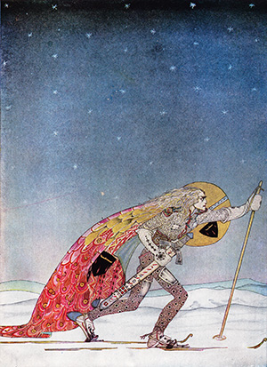
I wasn’t panicked. I had a plan B. I would use the illustration by Kay Nielsen for “So the man gave him a pair of snow-shoes” in East of the Sun and West of the Moon. It’s a gorgeous piece of art. It was probably for the best that I’d failed to find a good photo.

As I scanned the Nielsen art, I talked with my husband about my plan for the cover. He was in the other room, so he was not looking at the piece of art concerned. He said: “Oh, yeah! You’ll make one of those black & white covers, like the ones for Troll-magic and Sarvet’s Wanderyar. Great! They’re really your trademark look.”

Right then and there I had an epiphany.

The art showing a man on skies is a color piece. But in the time it took my husband to speak, I’d envisioned it rendered in black & white, and I loved it.

Plus my husband’s suggestion made so much sense. A color painting would be a whole new look for one of my books. But a black & white Kay Nielsen piece would fit right in with the other North-lands and Hammarleeding books.

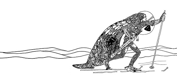
And I was sure I could do it. The print quality on the black & white illustrations of my 1914 edition of East of the Sun and West of the Moon is very poor. In order to get a clean image for my covers with Kay Nielsen art – crisp lines without inkblots, black blacks, and white whites – I’d always placed the art on a light table and traced it.

I was certain I could do the same for a color illustration. It would be trickier. I’d be making value judgements all the way through about how to render shades of color as either shades of gray or patterns of black & white lines. But Nielsen’s work lends itself to black & white interpretation. Even his color work has interesting line and texture present.

I scrutinized the piece of art depicting the skier. Yes! I could see in my mind’s eye exactly how I would do it.

So I set to work.

black & white sketch for Winter Glory

I was nervous at first. So nervous that my hand kept shaking. I had to talk myself down. “Jessica, any small mistakes can be corrected in Photoshop. And if you make a big mistake, it won’t be the worst thing if you have to start over. Relax. Relax. Relax.”

My hand was still not steady with that first line of ink on paper. I got a fresh sheet of paper. And started on the skier’s hair, which was supposed to be squiggley. By the time I finished the hair, my hand was steady. I’d forgotten my nerves and was enjoying the drawing.

I was almost sad when I finished, except that there was more fun ahead.

I scanned my black & white drawing into my computer and started building the cover for Winter Glory.

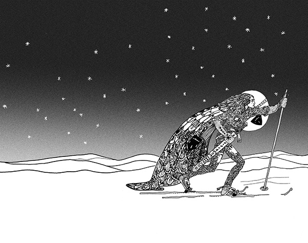
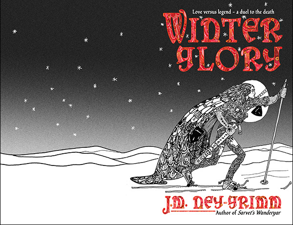
The first step was to select the stars and turn them from black to white. Then I put a gradient screen from the top of the cover to the bottom, thus creating the sky. I loved how that made the skier pop!

Adding the sky to the cover for Winter Glory

Next step? The title.

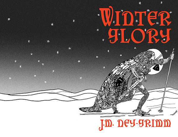
I already knew I wanted to use the cloak texture from the original color illustration, but I wanted to get the title’s size and placement settled using Photoshop’s type managing tools. I would turn the layer from a type layer to an image layer after I got the type exactly the way I wanted it. So I used a bright red to help me visualize the final result.

Adding title and byline to the cover for Winter Glory

The cloak in the original illustration was a lovely patch of color. It was big enough that I could have just selected it and “pasted it inside” of the letters of the title and my author byline. But it would have been a lot of pasting.

cloak textureSo I made a square of the texture first – pasting and pasting and pasting that cloak patch into a separate file. I increased the saturation, and heightened the reds and yellows to achieve the effect I wanted.

Once the cloak texture file was ready, I selected the whole square and pasted that inside the letters of my cover file. It took four pastes to fill them all. Instead of ten or more!

The textured title softened the overall effect of the art. The black & white art with the solid red title has a crisp and definite look that I like. But it’s a little too hard-edged for the story, which blends life-threatening action with romance.

Winter Glory cover with textured title

Then I was closing in on the finish line.

I added the tag lines – one above the title, one below my author byline. And my trademark line, connecting the big “J” to “Author of Sarvet’s Wanderyar.”

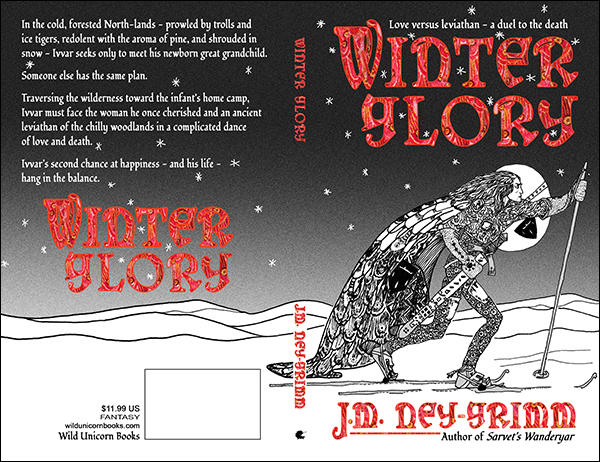
I placed the back cover copy. I placed the title on the back cover. Next came the spine: title, byline, and Wild Unicorn logo.

And finally the publisher info and the box for the barcode.

I was done! It’s ready to be placed in an InDesign file for the paperback cover, and to be windowed for the ebook cover. 😀

Glory cov build 7

For more cover builds:
Cover Creation: Perilous Chance
Building Star-drake’s Cover
Creating Livli’s Cover

For the principles of cover design:
Cover Design Primer


Share

Cover Preview: Winter Glory

I’m writing a lot, and exciting things are happening with my work in progress, Fate’s Door. I can’t wait to share the story with you. I’m hoping for a May release – fingers crossed – but I won’t rush the story telling. If it takes me longer to finish, that release may slide to June. 😉

I’ve also been working on book covers for the stories that are complete and approaching release to my readers.

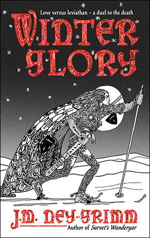
Winter Glory came back from my proofreader (thank you, Wendy, fantastic work!) about a week ago. The interior of the book is now all ready, and today I finished the cover! Naturally, I want to show you what it looks like.

I’m really pleased with how it turned out, and I’ll share how I built it in a future post.

Glory feature cover 300

In the cold, forested North-lands – prowled by trolls and ice tigers, redolent with the aroma of pine, and shrouded in snow – Ivvar seeks only to meet his newborn great granddaughter.

Someone else has the same plan.

Traversing the wilderness toward the infant’s home camp, Ivvar must face the woman he once cherished and an ancient leviathan of the chilly woodlands in a complicated dance of love and death.

Ivvar’s second chance at happiness – and his life – hang in the balance.

Coming soon!


Share

Knossos, Center of Minoan Culture

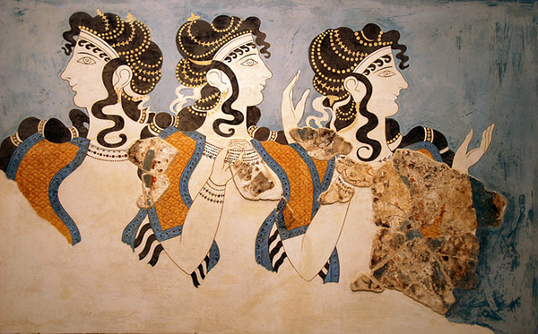
Fresco from the palace of Knossos, ladies of the courtI’m currently writing a story about a sea nymph of ancient times who becomes handmaiden to the three fates.

The story keeps growing on me. When I first wrote the opening for it in 2013, I thought it would be a short story. When I decided to go beyond the opening and complete the work, I thought it was more likely a novella, perhaps 20,000 words.

After I started writing it this January, I realized it would be a longish novella, perhaps 35,000 words.

Floorplan of KnossosAnd once I was well into the project, and had expanded the outline, I knew it would be a novel. Anywhere between 50,000 and 80,000 words. Yikes!

But I want to tell this story right, which means I can’t skip those middle scenes that hadn’t seemed necessary when the idea for it first sprang. One of the advantages of the indie world is that the writer can allow the story to go to the length it needs.

So I’ve been writing Fate’s Door for 5 weeks now, and I’ve discovered another element that makes this a challenging project. It’s the most research-intense book I’ve written yet.

Scale Model of KnossosWhen the scope of the narrative was confined to the northern cottage of the three fates, I had to research looms and spinning and other details about textiles. But that was all.

Now that I’m including events from my protagonist’s life before she came north, I’m needing to research much, much more. Coral reefs, fossilized coral reefs, marine life, islands in the Mediterranean, history of the ancient world, and so on.

I find it all fascinating. (You knew I would!) But wow! Every time I start a new scene I realize I need to know some additional tidbit in order to write it properly.

My latest foray into research concerned Knossos, the palace on Crete built in 1950 BCE. My heroine grew up in a fringe reef off the coast of a Mediterranean island near Tunisia. She soon goes ashore and encounters the land folk who live there. Which meant I needed to know more about them.

I had already decided that even though the time frame of my story is more eternal than chronological – because it’s about the numina of the ancient world, gods and goddesses of the waters and the archetypes – it still takes place within the framework of history, during the time of Alexander the Great.

But the island where my heroine goes ashore is far from the battles of Alexander’s great conquest.

I decided to model my Zakynthians after the Minoans of Crete. Perhaps they were a remnant of Minoan civilization that had survived the downfall of Knossos on Crete. Like the earlier Minoans, they were seafarers and a power on the water. They built fleets of warships to protect their realm. They built another fleet of trading vessels. And they grew rich.

Artist's Rendering of Knossos

Their palace would be modeled on ancient Knossos, one of the most magnificent buildings of the older world.

So I researched Knossos. It was, indeed, impressive.

The palace took up 6 acres, with many corridors and small inner courts all arranged around one great central court. An aqueduct from springs on a mountaintop 6 miles away supplied it with water and actually ran fountains with the water pressure. Pipes from the aqueduct brought running water right into the palace.

Reconstructed Facade of Knossos

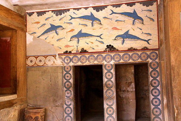
The palace was constructed of limestone using a post-and-lintel system. Tree trunks formed decorative pillars. Squared off wooden beams created decorative elements within the stone walls, as well as outlining doors and some windows. Light shafts brought light and ventilation to interior rooms.

A red wash colored the stone floors, and frescoes adorned the interior walls. The queen’s chambers included a toilet that was flushed by pouring a pitcher of water which cleared the basin and ran out into a separate sewer system. The Minoans of Knossos had advanced water handling skills!

Dolphin Room at Knossos

The palace was much more than a royal residence. It did house the royal family, but it also served as the seat of government for the adjacent city, the center of commerce, and the hub of religious life. The complex included a theater.

Extensive food storage and processing workrooms made up a large portion of Knossos. There were grain mills, olive oil presses, and wine presses on the premises. And a multitude of storage “magazines” held massive urns (or pithoi) in pits, so that the opening was at floor level. Olives, olive oil, dried figs and dates, honey, grain, wine, and dried beans are some of the staples stored in these urns. When they were full, they weighed tons.

Pithoi of Knossos

I sometimes wish I could visit the past to experience places like Knossos. No doubt that’s part of the charm of time travel novels for me. 😀

If you could visit a time and place out of history, what time and what place would it be?

For more about the world of Fate’s Door, see:
Horse Sandals and the 4th Century BC
Measurement in Ancient Greece
Garb of the Sea People


Share

Back Cover Design: Hunting Wild

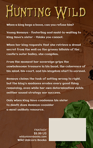
Hunting Wild back coverThe front cover gets all the love!

I’ve seen a lot of information about designing the front cover for a book, but only a little about the back cover. There’s a reason for that, of course. The front cover sells the book. It catches the eye of a prospective reader and encourages him or her to look inside.

Ebooks don’t even have back covers. And, until recently, none of the online bookstores ever showed the back cover of a paper book. If you wanted to see the back cover, you had to walk into a brick and mortar store. (Or wait until your purchased paperback arrived on your doorstep.)

But any book that has a paper edition needs a back cover for it. That back cover must be attractive and harmonize with the front cover. It needs to have sizzle, as well as the “steak” of the back cover copy. And it needs to have certain information, such as the bar code, the publisher, maybe the price.

I thought it might be interesting if I shared some of my experiences with back covers.

The first thing I learned was that when I create the front cover for the ebook and wait until I start building the paperback to design the back cover, it’s much harder! I did the covers for Troll-magic and Sarvet’s Wanderyar in this piecemeal way. I got them to work, but…hoo boy!

All the books that came after, I created the paperback cover first and simply used the right half for the front cover of the ebook.

Let me show what the paperback cover of Hunting Wild looked like when I was ready to start finalizing the back cover.

Hunting Wild back cover

One of the things that you’ll notice in the image above is that it’s a whole lot bigger than it needs to be. There are two reasons for that.

1) It has an extra half inch all the way around the edge. That’s because I’ve learned from experience that it is infinitely easier to chop off unneeded edges than it is to add more later if it turns out you miscalculated and need the art a little taller or a little wider. I give myself plenty of wiggle room.

You need only a one-eighth inch bleed when you upload the cover file to CreateSpace. But I have found that when I paste my TIFF file into my InDesign file – I do covers in InDesign – the margins sometime get funky and weird. There have been several times I’ve been very glad of my extra margin.

2) Because I am creating the paperback cover before I create the paperback interior, I don’t know exactly how many pages the book will be. Which means I cannot calculate the precise width of the spine. So I allow an extra inch on the far left of my image, in order to have enough image to go from the bleed on the far right all the way across the front, then around the spine, then across the back, and finish beyond the leftmost bleed.

For Hunting Wild, I had planned to purchase a photo of a stone wall to use as a continuation of the wall coming off the stair tower on the front. However, when I tried a mock-up using a watermarked comp image, I didn’t like the result.

So I decided to “paint” that wall extension by copying and pasting the stone blocks (and smoothing the joins) from the left edge of the stair tower photo. I was very pleased with how that worked. It looks natural to my eye, and it makes a good, even background for the back cover text.

Hunting Wild back with text

I’ve cropped the cover image above, to the approximate size it will be on the paperback, using an estimate of the spine width. It is easy to move the text and the title on the back cover from side to side. So I will place it more exactly when I know the precise spine width.

My second reader is still reading and generating feedback for Hunting Wild, so I have another round of revisions on the book before I can send it to my proofreader. When I get it back from my proofreader, I will start formatting it for both the ebook edition and the paperback edition.

Only when I have the precise spine width will I place the white box needed for the bar code, as well as placing text indicating my publishing imprint (Wild Unicorn Books), the genre (fantasy), and the price (which is determined by the page count).

I’ll also wait to place the title and my byline on the spine.

There are a lot of elements that must go on the back cover, and it’s important to use some of the same design principles that go into designing the front cover: alignment, grouping, and type fonts that match those used on the front.

I’ll be posting more about back covers. Until then, here’s the link to my Cover Design Primer, so you can bone up on those design principles. 😉

And, if you missed it, here’s the post about designing the front cover for Hunting Wild.


Share