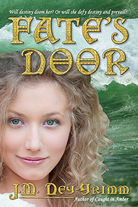
 Usually I don’t think about a book’s cover until I’m close to completing the manuscript, but the cover concept for Fate’s Door leaped into my mind fully formed as soon as I started writing of Nerine in the Mediterranean Sea.
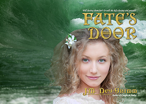
I could see her so clearly on my mind’s eye, emerging from the water, with her blond hair and hazel green eyes, and a wave crashing behind her. That vision stayed with me all through the writing of the novel, and I began the search for the right photographs much earlier than usual.
After several separate tours through the Dreamstime site, I thought I’d found the right model. She looked like a sea nymph to me. Finding the right wave was even easier. I wanted one that was still rolling along part of its length, while crashing into white foam on another part.
I downloaded comp copies of both photos to see if they would work together the way I thought they would. And they did! I was pleased.
However, I did not immediately purchase the files and set to work on building the cover. I was still in the middle of writing the book, and it was important that I not distract myself from that task. It’s a good thing I made the prudent decision.
I remember Lois McMaster Bujold mentioning on her blog, some years ago, that a certain novel of hers remained just three chapters from the end for a good half of the book.
(Unless my memory is utterly wrong. Which it could be. I have a terrible memory.)
But Fate’s Door was like that book of Bujold’s. Once I’d written 100,000 words (roughly 300 pages), I was just 15,000 words from the end. For the next two months! At 160,000 words (roughly 400 pages), Fate’s Door had finally reached “The End.”
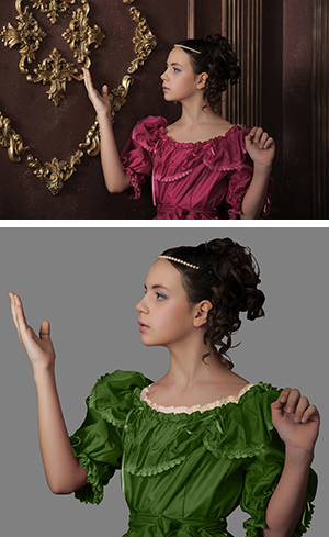
After I readied the manuscript for my first reader and sent it to her, I turned my attention to the cover. And decided that I didn’t like my choice of photo representing my heroine. She was too serious. Just as important, she simply wasn’t Nerine.
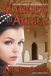
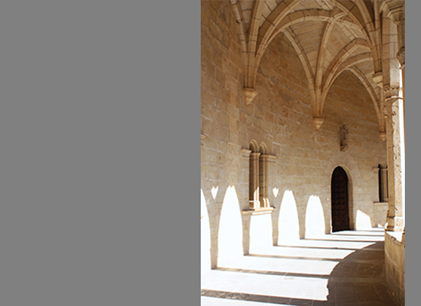
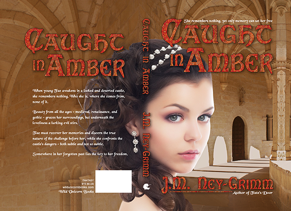
This same thing had happened to me when I designed the cover for Caught in Amber. I had to go photo-hunting again, and discovered exactly what I wanted among the dozen or more models I’d originally considered. That was Nerine!

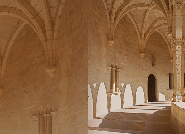
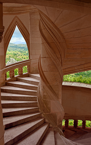
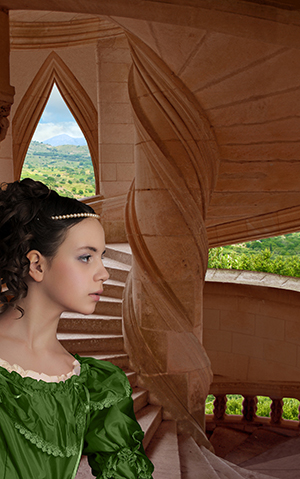
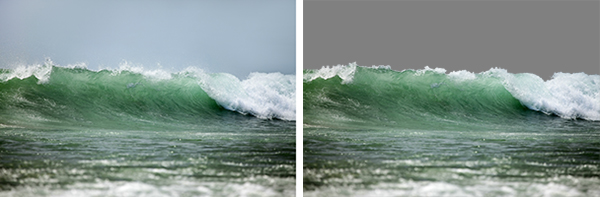
Once I’d purchased the right to use the photos on my cover, I downloaded the files. Then I isolated the wave from the sky over it, and clipped Nerine out from her background of tree leaves. I’ve shown the clipping required in the images above.
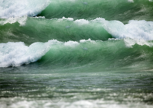 The next step was building the progression of waves in my cover file. I’d already done this in the test comp file, so I followed it as a guide. The waves flowed together very nicely, creating a marvelous sense of the sea’s power. I was pleased.
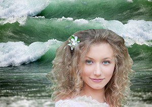
The next step was to place Nerine. Again, I followed what I’d done in the comp cover, but using the newly chosen photo of a different model. I discovered that the green of the tree leaves shining through her hair was very close to the green of the sea. A stroke of pure luck!
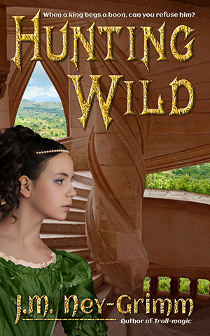
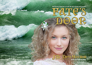
 I carried on with placing the title and the tagline that goes above it. Next came my byline and the tagline that goes below it, as well as the underline that visually connects the descending letter “J” to the tagline “Author of Caught in Amber.”
At this stage in building a cover, I can see whether or not the design is coming together. The design for Fate’s Door was definitely coming together, but like every other cover I’ve created, some problem areas remained which would require tweaking.
The first correction I made was to place a translucent green screen over all of the water. It’s fully 70% opacity, but with the light quality set for “soft light” rather than the more usual “normal.” I did this, because I really liked the color quality of the water in my test comp, and the full resolution photograph had a darker, more blue quality. My green screen gave the water a more inviting hue and restored it to that of the comp image.
 However, the most obvious problem area was the back cover. While I really liked the scene I’d created – Nerine rising from ocean waves – the back cover was not going to provide the even color tone required for cover copy. In fact, the alternating white of sea foam and dark green of the waves would provide the very worst possible background for text.
The dark green would call for white text, while the white foam would need black text. And alternating black and white text would look awful, as well as being hard on a reader’s eyes. Something would need to be done. That something felt rather obvious to me. I’d had doubts about the layers of waves from the beginning, but been beguiled by the scene I was “painting.”
 The solution was to stretch the dark green portion of the wave to cover the entire back cover and feather it to gently transition into the foaming wave on the front cover.
Fixing the most egregious problem caused the next worst one to leap to my eye. The title was hard to read, because its first word – Fate’s – was neatly bisected by where the white foam of the frontmost wave gives way to the green of the next wave rolling in. I tried moving the frontmost wave down, so that the color change occurred between the two words of the title. The golden color showed up equally well on the two colors – white and green – so it worked, in that sense. But I didn’t like it.
I didn’t like splitting the title. And I didn’t like how the overall composition looked with the white sea foam positioned at that lower level. I decided to try something else. What if I left the sea foam essentially in place, but stretched it vertically, so that the upper edge fell near the top of the first word?
I tried it.
And I liked it. Very much.
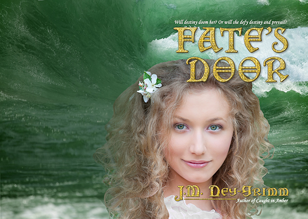
I considered Nerine’s dress. I’d already changed it from pale pink to white. I’d hoped it might look like sea foam, but it didn’t. And Nerine doesn’t wear dresses in the sea. But I had a plan. I selected a section of sea foam with the right shape, copied it, and placed it over her dress.
It needed a little stretching to make it right, but Photoshop’s warp tool is a handy thing for just these situations. The foam was a little too white, as well, since it was out from behind that “soft light” green screen that I’d placed over all the water. Another easy fix: place a similar screen over just this front portion of sea foam.
Next I poured in the back cover copy.
Still looking very good.
Now it was time for the final tweaks, mainly placing translucent screens with softly feathered edges behind some of the text. The tagline above the title got a 20% screen of wave green behind it. My byline received two screens, a hair-colored one at 30% behind “Ney-G” and a 20% wave screen behind “rimm.” I made both large enough to also fall behind “Author of Caught in Amber.”
A few more similar screens went on the back cover behind “Wild Unicorn Books” and the price and genre. I decided to remove a small awkward piece of Nerine’s hair, where it protruded from behind the ISBN box and simply looked odd, separated from Nerine herself as it was.
My cover was nearly finished. The spine needed all three of the usual elements: title, byline, and Wild Unicorn logo. The elements themselves are simple, but I expected to have trouble with them because of the pesky flower in Nerine’s hair.
Now, I love the flower. I can just imagine it plucked from a blooming tree by a lover, and cast on the waves as a wish, to alight in Nerine’s hair as she surfaces. But its location on the spine is problematic, because it might all-to-easily interfere with the title – either crowding the title or making it hard to read by peering out from behind the letters.
This proved to be the case when I first placed the title. The flower was located behind it. Not good.
However, I usually start with the title larger than I need it, because making it smaller is always an option. Whereas, if I decide I need it larger, I must start over with the larger image again. Each time I shrink an image, some of the data is discarded. Taking the small image and enlarging it does not restore the lost data.
As I made the title smaller and smaller, I could see that it would probably fit very nicely between the top of the spine and the flower. There is even a little room (considering aesthetics) to make it smaller yet, if required. But I’ll need to see an actual physical book – the proof copy – before I decide. On my computer screen, the title looks a little crowded by the flower.
But the only place the spine will be seen is when a reader holds the trade paperback in his or her hands. And I’ve learned that the size of type on a screen appears very different from its appearance on a physical book. This post will likely go live on my blog before I’m working on the paper edition, but I’ll add a note to tell you how the title issue turns out.
Once I placed my byline on the spine, I saw that the flower was not the only constraint. The title has essentially 9 “letters” in it, when you include the space between the two words. My byline has 12 “letters.” I like the letters of title and byline to be the same size on the spine. Which meant, in this case, that the letters had to be small enough for both title and byline to fit, along with the unicorn profile which is my imprint’s logo.
All of the elements required translucent screens behind them to make them easily readable – hair-colored for most of the type and the logo, water-colored for the “E” and the “S” in “Fate’s.”
And here it is, with the spine complete. For now. 😀
My first reader gave me excellent feedback on Fate’s Door. I made revisions to correct the issues she found, and then sent the manuscript off to my second reader. My second reader gave me equally good feedback, and I made yet more revisions.
All in all, three-and-a-half months passed while my readers read and while I wrote revisions.
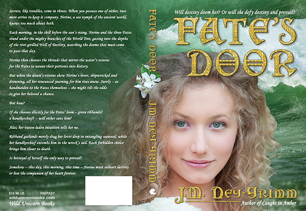
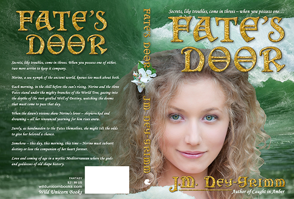
During that time, I also revised the copy that appears on the back cover of the paperback. Below is the corrected version of the cover.

Given that the cover for the paperback is complete, where – you may be wondering – is said paperback? Why can it not be ordered on Amazon or anywhere else?
Here’s my problem: the metallic gold title looks good at full size on the paperback. But it’s not quite right at thumbnail size on a website page. I’ve tried many variations to see if I could improve it: metallic brass, jade green, copper orange, and more. All of the variants looked worse than the metallic gold. Much worse.
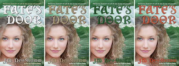
I’m not quite ready to throw in the towel and go with the gold filigree.
And thus the paperback still waits on my hope that I can figure out a solution to my title quandary. Cross your fingers for me – and for my readers who prefer paper to digital – that I dream up my solution soon! 😀
In the comments below, my friend Alicia suggested that I try a different gold texture for the title treatment. Her suggestion stuck with me all week after I read it. I’d already tried five alternate gold textures, and none of them worked. But I had a feeling she was onto something.
I searched for yet more gold patterns and found half a dozen possibilities. None of them worked either, but I still felt that Alicia was right. I took a week’s break and then searched again. This time I found one, but I hoped it just might be the one.
When I tried it…I liked it! A lot! Alicia was right when she said, “You’ll know the minute you find the right combination…”
Thank you, Alicia! I doubt I would have persevered so long and so successfully without your suggestion and your encouragement.
I saw one more problem after I created the new title treatment. It’s a little crazy that I hadn’t noticed it sooner. I did my first work on the cover when I was still writing the book’s manuscript draft, and when I returned to the cover (many months later) I’d forgotten that the tag line above the title was originally a placeholder.
I’m still shaking my head at myself. Really, J.M.? Really?!
Alas, really. It’s fixed now. 😀
Secrets, like troubles, come in threes – when you possess one…
Fate’s Door is available as an ebook. Amazon
Fate’s Door is available as trade paperback.
Amazon I B&N I Fishpond I Mysterious Galaxy Books
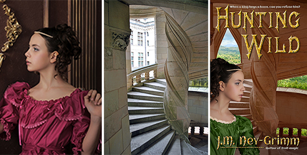
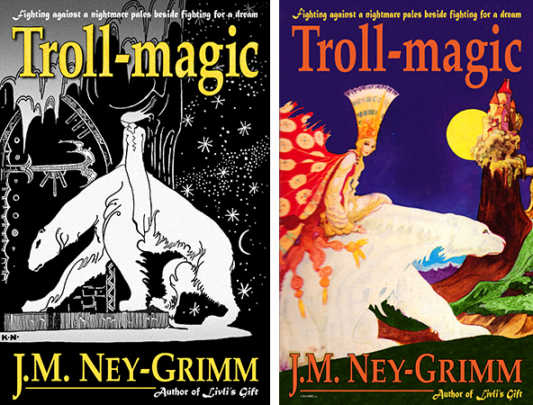
For more cover builds, see:
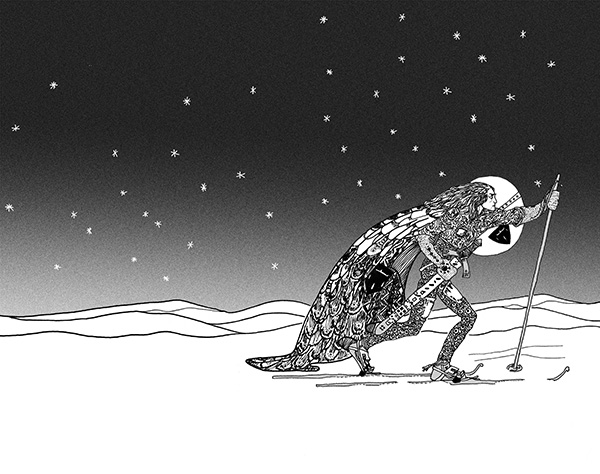
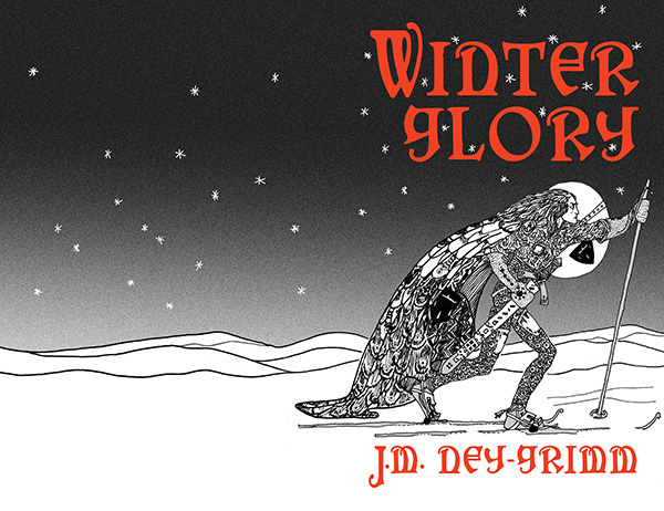
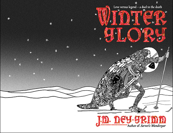
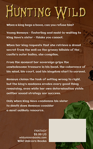
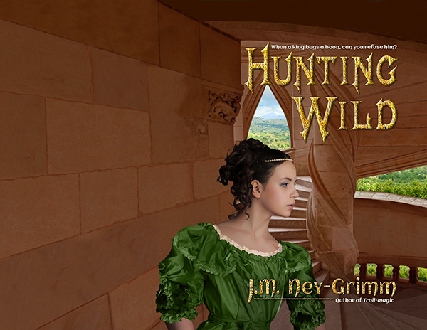
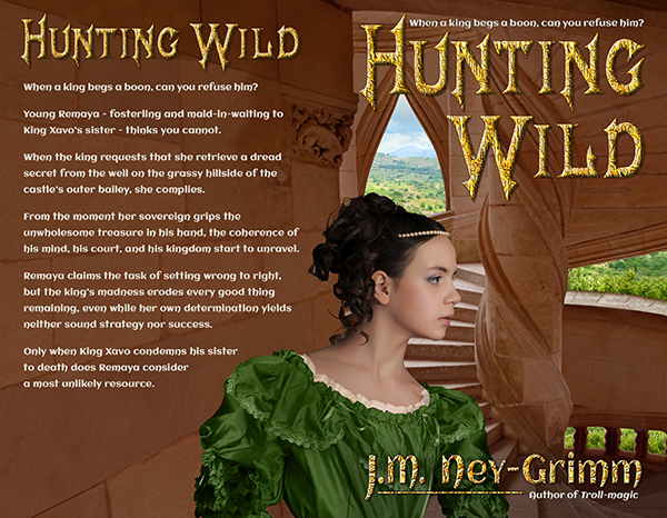
Building Wild’s Cover
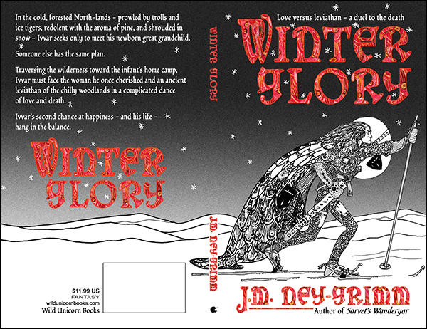
Building Glory’s Cover
Cover Creation: Perilous Chance