Choosing a Tagline Font

Sarvet's Wanderyar
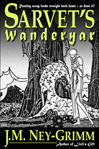
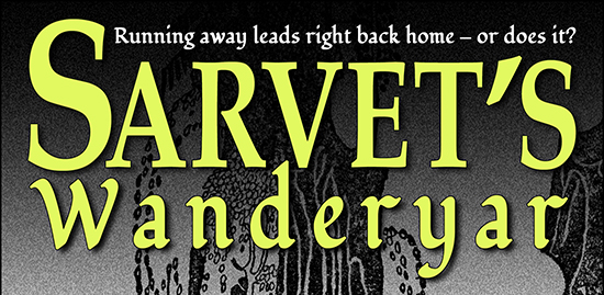
The print edition for Sarvet’s Wanderyar was so close to release. Just one more proof cycle, click the “approve” button, and there she was – on the bookstore shelf, ready for readers to enjoy!

But!

You knew there was a “but,” didn’t you? After all, as I write this post, the print edition of Sarvet’s Wanderyar is definitively not on any bookshelves. What happened?

I learned a bit of history, which I’m going to share with you!

In the 1800’s and on into the early 1900’s, many authors self-published, including greats – such as Mark Twain – who gave us our classics. Then times changed and for decades self-publishing was not a viable option. In 2009, with the advent of Amazon’s Kindle Direct Publishing program, indie publishing became viable again. Writers with a pioneering spirit jumped in. Many of them wrote fantasy, and all of them were creating their own covers, whether they had design expertise or not.

Right now, in 2013, there are plenty of graphic designers available to create covers for e-books. In 2009? Not so much. So the indies gave it their best shot, producing covers that were glorious by accident, mediocre by default, or (alas) atrocious. Writers write. But only a few of them wrestle Photoshop and win!

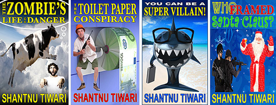
Most of the writers used the fonts that came on their computers, and the fantasy authors were no different. What was there among those scant 200 typefaces that would work well for titles? Quite a few sans serif fonts for thrillers, a scattering of script fonts for romances, and many traditional fonts for mainstream fiction. For the fantasy novels? Matura.

So Matura showed up again and again and again on fantasy covers. Matura used well. Matura used poorly. Matura, Matura, Matura. Writers making covers and readers buying e-books grew sick of it!

I entered the indie pub world late in 2011. Indies had moved on from their early efforts. Some hired designers for their covers, others upgraded their skills. Nobody limited themselves to the fonts that came with their computer. There were a million and one fonts available online for a modest price. Result: nobody used Matura anymore! In fact, Matura wasn’t even listed among the fonts on my own computer.

I knew right away that I wanted to use Palatino for my titles. It’s a traditional font with an extra share of grace, featuring elongated ascenders and descenders (the lines rising from b’s and d’s, or heading down from g’s and q’s) and delicate curves. That grace seems to express the essence of my North-lands, but is easier to read than a decorative “fantasy” font. It also enlarges well to the size necessary for titles. So: Palatino. Yes.

At first I intended to use Palatino for my taglines as well as my titles. Fortunately I took a workshop! It taught me that a) taglines need not be visible in thumbnail-sized images (my first covers had them too big); and b) using only one font on a cover is sedate. Did I want my stories to be perceived as sedate. No!

Time to do a font search.

First, let’s review the rules for choosing fonts.

1) Do use two different fonts.

Check. I was using Palatino for the title and the author byline. I was seeking a different font to use on the taglines – one above the title, one below the author byline.

2) Never use more than one font from any one category of fonts.

Right. Palatino is an old style serif font. My second font would ideally be a sans serif font, a script font, or a decorative font. If I chose a decorative font, it should be a simple one, not ornate. Modern fonts and slab serif fonts don’t go very well with the fantasy feel of my stories. (For a review of the six font categories see my Cover Copy Primer.)

3) Use fonts that are very different in their characteristics, that contrast with one another.

Palatino has a very calm, vertical, linear feel to it. A contrasting font should be curvier, perhaps possess more horizontal energy, and have more variation between its thickest and thinnest strokes. Let’s see what I found.

I searched and I searched and I searched. The right font was not jumping out at me. At last, I chose … Matura! Knowing nothing of its 2009 history, I took joy in my find. (Dear me!)

Last fall, I learned that some people hate Matura. Hmm. Should I change it? Maybe. I was still on the fence when I learned the full story this spring. Should I change it? Probably. So I went looking again.

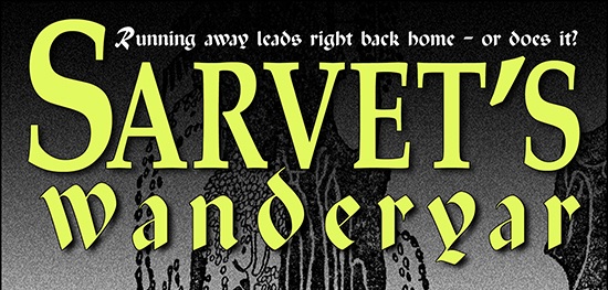
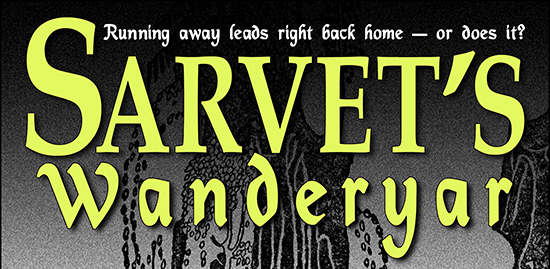
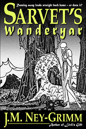
Before I show you what I found, here’s the top portion of Sarvet’s Wanderyar with the Matura font appearing both in the word “Wanderyar” and in the tagline “Running away leads straight back home – or does it?”

Matura tagline

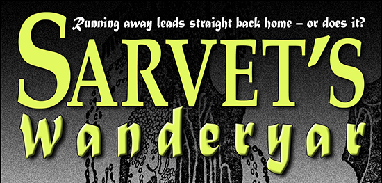
It still looks good to me. But let’s follow my search and see what some of the other possibilities look like.

I liked Matura for the boldness of its line. It’s easier to read than more spidery decorative fonts. And it contrasts nicely with the delicacy of Palatino. It is sans serif, while Palatino is a serif font. The points at the ends at each stroke contrast with the strict horizontal nature of Palatino’s serifs. Bottom line: it’s got a lot going for it.

Seeking Matura’s replacement, I looked at calligraphy fonts, Celtic fonts, Gothic fonts, Old English fonts, and sans serif fonts. Nothing really grabbed me, but I saw some possibilities. In fact, I saw thirty-plus possibilities. I downloaded them all! And started trying them in Word. Hmm. In Word, none of them won my regard when they went head-to-head with Matura. So I chose the best of the lot and tried them in Photoshop, with a full cover treatment.

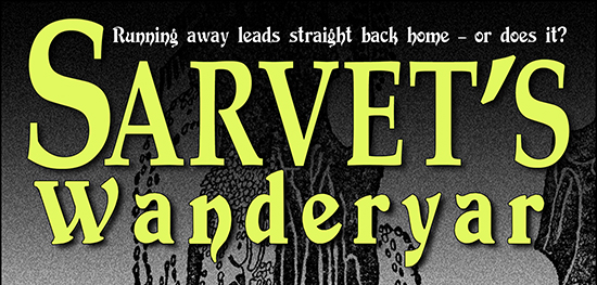
Here’s the font Paladin.

Paladin font

It’s got a calligraphy style to it, much like Matura. Its curves contrast nicely with Palatino. But Paladin is much harder to read than Matura. And the extreme variation in its line weight – from broad and thick to spidery thin – is not to my taste. Let’s look at something else!

Here’s Mysticor.

Mysticor font

Much better! But it’s a little too curvy. Kind of like the curly writing of young girls who dot their i’s with hearts. Yikes! In the d and the y, even the straight strokes are curved. Plus Mysticor’s line weight is too close to that of Palatino. So … no.

Next!

Here’s Devinne.

Devinne font

Now, I like Devinne. I’d considered it during my first search for a tagline font. I voted against it, because it was less legible than Matura. But what about it? Maybe I should reconsider.

Devinne has a nice blend of thick and thin, as well as a balanced movement between straight and curved. In fact, it’s almost perfect in its contrast with the Palatino. Except for one thing. I’d not considered Devinne a serif font. Mostly, it isn’t. But look at that W and that n and that r. Serifs. One of the rules of font selection is that you don’t place two different serif fonts together on a cover. Can you break the rule? In a heartbeat, if it works. But it doesn’t work here. The serifs, especially on that W, fight for dominance with the serifs on the Palatino Sarvet. Plus … Devinne is so dang hard to read. So, no.

Here’s something simpler, a sans serif named Fondamento.

Fondamento font

Pleasing, but really just a slightly straighter version of Mysticor above. Let’s move on!

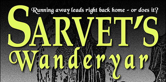
What about Black Chancery?

I like it. I like it a lot. And I almost chose it for my tagline font. Except I hate the exaggerated tails on the d and the y. The serifs on the W clash with the Palatino serifs on Sarvet. The W does not cradle the S the way the Matura W does. And the font as a whole is less legible.

Black Chancery font

The five fonts I’ve shown you here were the best of the lot. All the other twenty-plus were less successful variants on these final contenders (the way Mysticor and Fondamento are variants of one another).

So, what am I doing? I’m keeping Matura.

This is my thinking:

Sarvet's WanderyarI’m writing to please my readers. Some of my readers will be indies who published their own books in 2009. But that’s a pretty select crew! The vast majority of my readers never cracked an e-book until much later. Most of my readers never suffered through the overuse and abuse of Matura. To most of my readers, the Matura in my taglines will look as fresh and appealing as it does to me.

Will I always stick with Matura? That’s a whole ‘nother question. Every publisher updates her covers as the years pass. Culture changes, and images that seemed appropriate and attractive in one decade look dated and awkward in the next. So my covers will change. But not this month!

Time to push that last revision cycle on Sarvet’s Wanderyar along and release the print edition!

Update: Sarvet’s Wanderyar is now in print! See the announcement here.

For more about book covers:
Cover Design Primer, the fundamentals of cover design.
Cover Makeovers, a series of before’s and after’s.
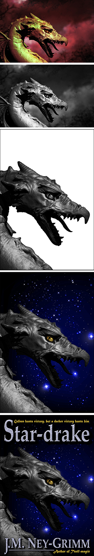
Perilous Chance, Star-drake, and Livli’s Gift, the design process in action.

Share

Cover Makeovers

Extra-virgin olive oil, white wine vinegar, Celtic sea salt, Dijon mustard, and . . . shake!
It spreads very nicely over romaine lettuce and thin slices of cucumber. Yum!

But although I include recipes on my blog, this is not a cooking post.

(Sorry! Didn’t mean to mislead you!)

Continuing my metaphor, let’s take a different recipe. Water, oil, and a ton of shaking . . . will just tire your arm!

So why am I talking about emulsifying and non-emulsifying substances?

Because I need to mention a certain non-item: me and campy literature. We are not an item. We are the oil and the water. No matter how much you shake us, we just don’t mix. It’s a failing, I know. But . . . I am what I am.

On the other hand, me and campy images? Yes, yes, YES! Those are tremendous fun. And I just received the privilege of playing in exactly that garden. Shantnu Tiwari, writer of campy satire, sought my feedback on his cover designs. I haven’t read his stories (although I’m tempted), but his cover concepts drew me in like a rose draws the bee. Wow! I couldn’t wait to get my Photoshopping fingers in that pie.

Here are the BEFORE’s:

Shantnu Tiwari's cover designs


Now, fingertips dripping blueberry juice and scattering the odd pecan (all these mixed metaphors are making me hungry), my cover tweaks are done, and I want to share the AFTER’s with you, along with some commentary.

It’s a fun way to learn more about cover design and serves as a nice sequel to my earlier Cover Design Primer.

Here’s the first problem child, chock full of potential, quirky and unusual, but not quite there.

Bathroom imp guards unspooling money TPSo what’s wrong with it? The biggest problem is alignment. It doesn’t have any. The title has a left alignment with a ragged right, while the author byline has a center alignment, except it’s not centered on the cover, but in the space between the unravelling TP and the tile wall. And neither relates well to the photo art, exacerbated by haphazard grouping. The second line in the title floats away from the first line, while crowding the gun-toting TP saboteur. The author byline floats unconnected and unanchored in its space.

Lack of contrast provides the final straw. All the colors are mild and bland. The image lacks punch.

Despite these issues, the concept is fabulous. Money unspooling as TP, supervised by a bathroom imp? Wow! All of the alignment and grouping issues are simple fixes. The contrast (since we’re keeping the same photo art) is harder, but it can certainly be improved. Here’s the after.

Bathroom imp guards unspooling money TPTerrorists have decided to hit the West where it will hurt the most: their bowels. Now two super spies will teach the terrorists a lesson they will never forget: nobody touches our toilet paper and lives to tell the tale. Starring Jack, an evil space monkey aficionado, and Shakespeare, an imposter importer of burkhas (this time).


Cover number two suffers from similar problems: lack of alignment and ineffective grouping. The black and white hide of the cow, together with the dark hair of the zombie, provide better contrast, but the yellow title fades against the blue sky.

Additionally, aside from the quirky imagery, the cover possesses no visual branding. The author byline is handled differently than it was in the previous book (much smaller point size and different font) and placed erratically. Ditto for the title (all CAPS instead of upper/lower, but with no real reason for the change).

Soaring cow worries about threatened zombieThere is a further problem with the colors chosen for the title and the author byline. They are two shades of yellow. They need to be either the exact same shade of yellow or completely different colors. Similar, but not the same, is . . . not good!

But, again, the concept is marvelous. This cow might be a relative to the moon-jumping bovine of the nursery rhyme; however, her concern is not jigging to a fiddle tune, but the fate of a threatened zombie. Ridiculously cool!

And – also again – the fixes are easy. Tidy up the alignment and grouping issues. Chose one yellow for the title and author byline. Place a shadow behind them to pop the yellow. Use the same font and placement for the author byline from The Toilet Paper Conspiracy to develop an author brand. Change the haphazard talking bubble with a more carefully drawn thought bubble. And there you have it!

Soaring cow worries about threatened zombieA secret society is planning to destroy humanity. Only one person can stop them. Unfortunately, she’s out of town. Now it’s up to the other guys – a potato farmer, two beer addicted spies, and the super hero Cow Man (bitten by a radioactive cow) – to save the day. But are the heroes up to the task? Will they survive? Is the world safe? (If you don’t want to read the book, the answers are: Yes, Yes, and Yes!)


Grinning shark with exec case and tropical paradiseNow we’re getting to some art with visual punch. The dark-suited shark contrasts well with the pale beach sand and the jewel-toned tropical water. And the concept continues superb. Toothy grin, exec case, and island paradise. What could be better?!

But the type wanders, weakening the otherwise strong image, which it crowds. Branding elements are absent. The title is too small. All easily fixed.


Toothy grinning shark with exec case and tropical islandTired of living in your mother’s basement? Tired of not having a girlfriend? Why not become a Super Villain? Earn the respect of peers and the admiration of all the hot girls! We teach you, step by step, how easy it is:
• Take over the world using time traveling cows and zombie chickens.
• Capture heroes using ice cream and bananas
• Negotiate over Twitter!
Quote: Taking over the world is no more dangerous than driving to work everyday (in Afghanistan, while wearing a miniskirt and push-up bra, while singing “Oh America you’re so fine, you’re so fine you blow my mind”). The book is dedicated to Pinky and the Brain. You inspired us man. Totally inspired us.


Santa versus paramilitary at ChristmasI love this cover, even with its misalignments and hesitant title. It’s got so many things done right: the charm of the Santa image and the holiday background juxtaposed with the black-garbed paramilitary; the harmony of the blue/green/red color palette given brightness by the yellow author byline and punch by the dark jackets; the appealing simplicity of the font in the author byline. Huge thumb’s up!

And yet . . . giving the title more umph and pizzaz (to mirror the piquancy of the art) and correcting the misalignments could give it even more visual clout. This was the lure that first attracted me to this entertainment. I couldn’t wait to dive in!

Paramilitary arrest SantaSanta comes down the chimney and finds a dead body. The police bust in and arrest him. A little girl has all her gifts confiscated as evidence. North Pole sends its Reindeer Regiment to bomb the city of Loondumb to the ground. Before war destroys the country, someone must answer the question: who framed Santa Claus?


I hope you’ve enjoyed my tour of covers BEFORE and AFTER. What do you think? Did I succeed in retaining their quirky charm while adding to their impact? Metaphorical penny for your thoughts!


* * *

Shantnu Tiwari says this about himself: “Fighting for the rights of zombies since 1936. If you want books with sophistication and elegance, whose words move you and touch your heart, whose literary eloquence will impress critics and professors alike, don’t read my books. Cause I don’t write stuff like that. If you think the world ending because toilet paper ran out, or fat and hairy terrorists dressing up as women to seduce policemen is funny, then you will love my books.”

Shantnu Tiwari's new covers

The Zombie’s Life is in Danger, The Toilet Paper Conspiracy, You Can Be a Super Villain!, and Who Framed Santa Claus? are all available as ebooks and paperbacks at Amazon. The author also urges his readers to come say hello at http://shantnutiwari.com.

* * *

After word of mouth, book covers, cover copy, and story openings connect books with readers. My Cover Design Primer, Cover Copy Primer, Eyes Glaze Over? Never!, and The First Lines present basic concepts for how to do these well.


Share

Cover Creation: Perilous Chance

Clary is the great grand-daughter of a rofane of Auberon, and her papa is a renowned sculptor. The family could live more ostentatiously than they do, but their values are bohemian rather than those of status. Their cottage is merely roomy and comfortable. In my mind’s eye, I envision it looking a little like the photo below.

photo of thatched cottage


I found images that reminded me a little of Clary and her sister Elspeth, and I initially envisioned creating a cover featuring the girls and their home. (If the girl in the garden were Clary, her hair would need to be worn loose, and she’d soften her still “posing for a portrait” stance. But Elspeth’s double is very like her.)

vintage photo of flower girl

vintage postcard of little girl

Intuition counseled me to try a different tack. The magnificent and dangerous creature that is the heart of Perilous Chance summoned my focus, and I searched for images of fierce, winged, fantastical beasts.


The Dreamstime web site of stock photography features some amazing art (drawings and photos) available for very reasonable prices. I’ve used them to supply works for many of my covers, and they came through again this time.

Bas relief gryphon with background

I’d love to know the location where “Griffon 01” by Henner Damke was photographed. Is it beside the formidable gate to a medieval castle? Or gracing the edge of a Renaissance fresco? Damke does not say, and I can only guess. It’s described as a “reconstructed relief” and listed under the category of arts & architecture.


For my cover, I clipped the gryphon out from its plain backdrop.


Then I thought about suitable backgrounds. Roiling water? Stormy sky? Hmmm. What about a flower-strewn tapestry? The people of Auberon in my North-lands use tapestries The hunt of the unicorn, tapestry #6extensively in the interiors of their homes. Something resembling the real world Hunt of the Unicorn would be perfect. I found something very nice, although I cannot place here the exact image I selected, because I did not (in the end) buy it and use it. Instead I’ll feature the Hunt of the Unicorn, which is similar.


As I hoped, the bas relief gryphon looked very nice against the dark tapestry. I flipped the image to follow the natural path of the human eye from left to right. After experimenting with title placement, I extended the gryphon’s top wing feather. And I turned the beast gold. Looking good!


I placed translucent shadows at the very top and bottom of the art to spotlight the gryphon and serve as a dark ground for the cover text elements. Then I typed in my title, the title tag line (something wondrous this way comes), my byline, and the author tag line. I liked it. But, but, but. Something wasn’t quite right. The cover was beautiful and evoked the right feeling, but it implied that the story was historical fiction, not fantasy. Perilous Chance is fantasy, and I needed a cover that read as fantasy.


Maybe white water would be more suitable. Or . . . no! My winged beast is a creature of the sky. The middle part of my brainstorming had generated the right choice. photo of orange cloudsTime to go sky-hunting! A lightning bolt slicing orange clouds caught my attention, and I tried it. (Again, I can’t show you the cover with that precise image, but I can depict something very similar.)


Chance_cover_lrg_webBut – yet again! – but, but, but!

That still was not right. Back to the search for the right image. This time I found it: lightning sizzling through a cobalt sky. Perfect! Especially since the cobalt-white streak of electrical energy mirrors the magical powers wielded by my fabulous creature. I hope you agree!

For readers whose interest was piqued by this sneak preview of Clary, Elspeth, and the magnificent creature they confront, Perilous Chance is available in electronic bookstores.

Amazon I B&N I Diesel I iTunes
Kobo I Smashwords

More posts about book covers:
Cover Copy Primer
Building Star-drake’s Cover
Choosing a Tagline Font

More about Perilous Chance:
Justice in Auberon
Clary’s Cottage
Notes on Chance
Not Monday, But Lundy


Share

Building Star-drake’s Cover

Profile of a star-drake against a starry skyI adore the black and white line art drawn by Kay Nielsen in 1914. You can undoubtedly tell that from the images at the top of my blog. All gorgeous illustrations by Nielsen.


But Nielsen art can be difficult to track down. And I’m not sure he ever did any dragons. If he did, I haven’t seen them.


So when it was time to create a cover for Star-drake, I needed another solution. And I found a fabulous winged-and-clawed beast by Netfalls on the Dreamstime web site. Except . . . it was golden, not black. And flew through an inferno, not a star-spangled night sky. But the basic form was perfect . . . and some Photoshop work could fix the rest.


I purchased the right to use the art, turned it black and white, clipped away the inferno, and placed the creature in my cover file. The highlights were too bright, so I toned them down. The middle grays weren’t dark enough, so I deepened them. And the drake needed a little more vertical reach, so I lengthened his neck. There! The hard part was done.


Next came the night sky: another Dreamstime find, this one by Silvertiger. I tried popping the image straight into my file, but the brightest stars were unfortunately placed. I flipped the image, nudged it up and to one side, and that did it. But what about the drake’s eye? It alone should gleam, not with fire – this is an archetypal leviathan of darkness and mystery – but with intensity. I selected the eye and made it citron, glowing like a jewel.


I added a translucent shadow at the very top and the very bottom of the art, to give a nice dark field for my title and byline. I placed these as pale gray type, then ran them through Photoshp’s chrome filter to generate the wavy pattern within the letters. The tag lines called for the color of the drake’s eye. Who can resist that eye? Not me!

And there you have it: the cover for Star-drake.

But, wait, that’s not all! I have plans for this story that one reviewer was gracious enough to call wonderful. It is destined for a collection of six stories – ranging from short to novella – all featuring trolls among their casts of characters. The collection will release some time next year as both an e-book and a print edition. In the meantime, Star-drake is bundled with a bonus story (Rainbow’s Lodestone) as an e-book in all the usual places.

Amazon I B&N I Diesel I iTunes I Kobo I Smashwords

More posts about book covers:
Eyes Glaze Over? Never!
Cover Creation: Perilous Chance
Cover Makeovers


Share

Cover Copy Primer

cover copy for Troll-magicI’m a writer, but I’m also a reader. I’m going to don my reader cap for a moment.

How do I choose my reading material?

When I’m lucky, a friend recommends something that’s right, but my voracity has exhausted most of my friends’ reading lists. (Grin!) More often, I must browse the shelf of new books at the library, check what my favorite authors are reading (because I’ve read all their stories), or fish among Amazon’s recommendations (which are still very hit-or-miss for me).

All these methods, however, eventually confront me face-to-face with a book cover (I’ve blogged about cover design here) and cover copy. Sometimes cover copy might more properly be called web copy, but it’s the same stuff. That cover copy – even on the tail of a friend’s recommendation – must get me to either buy the book outright or flip to the first page of the story. (Which must then make the sale, but story openings are another blog post!)

How does the cover copy do its job? It has an underlying structure. Let’s examine it.

To do so, I’ll doff my reader beret and put my writer fedora back on. How do I write cover copy that lets my readers know this is the story for them?

It isn’t easy. Marketing folk spend years in school learning this skill. But, as an indie publisher, I must manage somehow. The better I communicate the essence of my story, the more of my fans and potential fans will realize they want to read it.

Several months ago I blogged about the two most essential elements of cover copy: theme (not plot) and active verbs. If you missed that post, you’ll find it here. But what about the nitty-gritty, nuts-and-bolts of writing such copy? Theme and active verbs are necessary, but not sufficient for the job. What about the rest?

At the same workshop where I learned to aim for the story’s heart and to avoid all forms of the verb to be, I also learned six questions to ask myself before I sat down to create cover copy. Read on!

What is the theme of the story, and what are the repercussions of this central idea?
This is the big reason a reader wants to read! Is the story about star-crossed lovers, mistaken identity, catching a dream, or what? Spell it out, but don’t descend into your plot. Stay with the big ideas; avoid the finicky details.

Who is the story about?
Readers are people, and people relate to people. Even if your setting is as spectacular as Niven’s Ringworld or your plot as dazzling as Willis’ time travel stories, it is your protagonist who will lead your reader into and through the magic of your creation. If your story has multiple points of view, pick the character who will best snag your reader’s interest.

What is the initial conflict?
Again, do not list plot details. What is the heart or essence of this conflict? Focusing on theme helps you avoid spoilers. You want to give a sense of the story without revealing elements best encountered within it.

Where is the story set?
Ground the reader somewhere. In Chicago’s loop, Virginia’s Blue Ridge, or the troll-infested North-lands. (Grin!) Imagine your reader as a helium balloon: tie his or her string to something. One word might be enough. Other stories will require a phrase or an entire sentence.

What is your tag line?
Developing tag lines probably deserves its own blog post! You’ll need a tag line for your cover copy, and it should possess zip or else drench your reader in evocative images. It usually appears at the end of the cover copy, but sometimes works better at the beginning. Either is fine. When I’m developing a tag line, I try to express the essence of the story as concisely as possible and then pair it with its opposite. I’ll give examples below.

What is the hook?
A hook provokes tension in the reader; it’s often a question. Such as: how can he convince her, when she won’t even talk to him? Will her gift for improv poetry be enough to catch the god’s eye? Can he run fast enough, leap high enough, drink deep enough to surmount the walls of Olympus?

I follow this outline each time I must write copy for an upcoming release. Occasionally I become fired with inspiration after tackling just a few questions and dive in. More often I need four or five answers complete before I start wrestling. Cover copy remains a challenging arena for me! It doesn’t come naturally. I trust continued practice will help!

With that caveat (you’ll want to better my performance), I’ll lead you through my exact progression of thought as I wrote cover copy for four of my stories. I need concrete examples myself, so I’m providing them for you.


cover image for Troll-magicWhat are the themes in Troll-magic?
Dreaming big dreams. Looking beyond your origins. Stretching for more, even when you don’t know quite what more is.

Who is the story about?
Lorelin, a seventeen-year-old growing up in rural Silmaren.

What is the initial conflict?
Lorelin’s family wants her to settle down and commit to life on the family farm. Lorelin wants more, but she’s not sure how to do something different from what her parents have done.

Where does the story take place?
The primary location is Silmaren, the cool northern country where Lorelin lives and where Kellor is imprisoned. The story visits other locations in the North-lands, but only for short periods of time.

Tag line?
Lorelin has dreams – dreams of playing her flute every day, dreams of a larger life. Mandine, the antagonist, is a nightmare come true.

nightmare versus dream
Fighting against a nightmare
Fighting for a dream

Fighting against a nightmare pales beside fighting for a dream.

Hook?
Lorelin doesn’t know what to do, because she can’t see clearly. Her friends and family cannot help her, because they don’t know how either. Her father actively undermines her. And once she’s in the palace, everything goes wrong. It seems there’s no hope left.

Cover Copy

Fighting against a nightmare pales beside fighting for a dream.

An accursed prince and her own longing for music challenge Lorelin to do both.

But tradition and a hidden foe stand squarely in her way.

How do you make dreams come true when vision fails, allies undermine you, and all roads toward hope twist awry?

Can courage, honor, and loyalty prevail against a troll-witch’s potent curse?

Set within her enchanted North-lands, J.M. Ney-Grimm’s new take on an old Norse folk tale pits distorted malice against inner wisdom and grit.


The Troll's BeltTheme for The Troll’s Belt?
Avoiding full responsibility for yourself by avoiding self-honesty.

Who?
Young Brys Arnson, a 12-year-old, who lives with his father. (His aunt and uncle, right next door, help out.)

Conflict?
Brys means well, but he’s taking short cuts. The result of his dishonesty and skimming out of chores: he gets grounded. When grounded, he cheats again and becomes inadvertent bait for a troll.


Setting?
A lumber-focused hamlet in the frontier lands west of settled Silmaren, where the pine forests and chains of lakes go on forever.

Tag line?
cheat – cheater
trick – trickster – trickery
devour
honesty

Inspiring example from Charmed Life by Diana Wynne Jones: A new witch learns old magic. Tension of opposites: new/old

Ryndal pretends to be friendly. Brys pretends to be trustworthy and responsible. Brys pretends to be strong after he finds the belt.

One pretense too many
When strength is one pretense too many [problem: is]
When stolen strength is one pretense too many [there it is again: is!]

borrowed belt, stolen strength

When wriggling out wriggles you into a heap of trouble.
When a greater cheater traps a lesser, there is no wiggle room.
Wriggling out wriggles Brys into a whole heap of trouble.
Wriggling out – from chores, from losing, from consequences
Wriggling out means wriggling in – to consequences.

Some mistakes are water under the bridge. Other mistakes
A short cut becomes the long way home. [There’s that pesky verb to be.]
A troll and his hunger turn a short cut long.
Short cuts + mistake + one troll = trouble
Short cuts, pretense, and wriggling out yields . . . trouble.

Childish deceit sprouts grownup trouble.
Minor deceit sprouts major trouble.

Young deceit sprouts timeless trouble.

Cover Copy

Motherless Brys Arnson digs himself into trouble. Bad trouble.

Grounded for sneaking and sassing, he makes bad worse.

Now he must dig for courage and honesty to deliver himself and his best friend from his mortal mistake.

Tricked by a troll in J.M. Ney-Grimm’s richly imagined North-lands, Brys must dig himself and his best friend back out of danger. But that requires courage . . . and self-honesty. Traits Brys lacks at depth.

A twist on a classic, The Troll’s Belt builds from humor-threaded conflict to white-knuckle suspense.


Cover image for Livli's GiftTheme for Livli’s Gift?
How to manage cultural change.

Who?
Livli, a young healer in the Hammarleeding spa.

Conflict?
Thoivra wants less contact with the Hammarleeding men and fewer visits between the sister-lodges and brother-lodges. Livli wants exactly the opposite.

Setting?
The Hammarleeding culture in the Fiordhammar mountains of Silmaren. Specifically, Kaunis-lodge, a sister-lodge that is special due to its healing hot spring.

Tag line?
Sometimes letting go spells defeat – sometimes it harnesses power.
Can letting go harness power? Or does it spell defeat?
Does letting go spell defeat? Or does might it harness power?
Does surrender spell defeat? Or might could letting go harness elemental real power?

Must surrender spell defeat? Or could letting go harness real power?

Hook?
Working toward what she wants, could Livli lose everything instead? While Livli pushes forward, one influential sister pushes back.

Livli, being a pioneer in the healing arts, wants change elsewhere as well, in all of living. But her desired change is too big, too much, too fast for her sisters.

Cover Copy

Livli heals the difficult chronic challenging injuries among patients of pilgrims to Kaunis-spa. Its magical spring gives her an edge, but Livli wields a possesses a special gift achieves results that others cannot achieves spectacular cures mainly because she refuses to fail.

A pioneer, she hopes to match new ways of living to her new ways of banishing illness her new ways of banishing hurt with new ways of living.

But her the sisters of Kaunis-lodge fear rapid change. While Livli pushes the new, one influential sister pushes the old. What precious things might they lose while tossing old inconveniences?

Livli pushes forward the new, and one influential foe pushes back. Kaunis-home will keep its revered traditions, even if Livli loses almost everything.

Everything . . . and the one thing she absolutely cannot lose.

Livli seeks an answer in the oldest lore of her people, something so old, it’s new. But mere resolve against failure meets an immovable counterforce this time. Victory requires more.

Must surrender spell defeat? Or could letting go harness real power?


Cover image for Star-drakeTheme for Star-drake?
Rebirth and redemption.

Who?
Gefnen, a troll-herald for a greater troll-lord, Koschey the Deathless.
Emrys, brother to the king of a small island realm.

Conflict?
Gefnen is hunting the life force of a youngster to feed his master, who requires it to hold death at bay. The boy at risk is defended by his friends.

Setting?
The wild moors west of Silmaren (in the North-lands).


Tag line?
redemption – victory – loss

What will victory look like? And to whom will it come?
When does victory mirror loss?
Gefnen hunts victory, but a different victory – redemption? – hunts him.

Gefnen seems to be winning until the star-drake seizes him. Then he seems to be losing. Ultimately he is reborn, and his deep descent into evil will permit him to offer redemption to others. He will know, because he has been there.

possess – hold – mirror – own

Victory mirrors loss until
Boy versus troll versus redemption’s champion.
The stars foretell victory – the night behind them brings something else.
Hunting victory, accepting something else.

Gefnen hunts victory, but victory hunts him.
When victory arrives
Gefnen hunts victory, but a different victory hunts him.

Gefnen hunts victory, but a darker victory hunts him.

First Draft

Gefnen is hunting [pesky to be] hunts life.

Not deer, not pheasant, not game [reserve for later] meat for the table. His master eats choicer fruits.

When the piercing scent of youthful life exuberance tingles in his troll deformed twisted senses, Gefnen tracks focuses the his chase. The boy His prey lacks guardians strong enough to best a troll.

But Gefnen But other seekers than Gefnen tilt the chances in this game. The spirit of the storm, the poignant memories of a seolh-prince, and the vast powers of an ancient star-drake define the shaping looming conflict.

What will victory look like? And to whom will it come?

[You’ll note I have a decided and unfortunate tendency to gild the lily. Luckily I wield a red pen with enthusiasm.]

Cover Copy

Gefnen – troll-herald and hound for Koschey the Deathless – hunts life across the moors of the far north.

Not deer, not pheasant, not meat for the table. His master eats choicer fruits.

When the piercing scent of youthful exuberance youth tingles his senses, Gefnen focuses his chase. This The prey – a boy – lacks guardians strong enough to best a troll. Gefnen readies for Swift victory [reserve for later] triumph awaits.

But other seekers tilt the chances of this game. Spirit of storm, poignant memories of a sea-prince, and something more ancient than memory or the wind shape the looming tumult.

Gefnen hunts victory, but a darker victory hunts him.

* * *

Are you a reader? Have you ever chosen a read purely because of its cover copy? What book was it? I’d love to read it myself and learn.

Are you an indie author? What methods do you use to generate effective cover copy? I’d love to learn anything you’d care to share!

For more discussion of cover copy, see my earlier post – Eyes Glaze Over? Never! – on the subject.


Share

Cover Design Primer

This summer I attended a publishing workshop. Cover design formed part of the conversation, and I learned some critical details about it. My architecture background and my previous publishing experience meant I was doing a lot right, but I could do better. Not surprising! Architectural design classes don’t include typography and other elements of graphic design.

When I returned home from the workshop, I dove into tweaking all the covers for my stories. I’ll show the before and after versions. I find it fascinating that such small adjustments make such a big difference. But first I want to share a few basics from the workshop. (C’mon! It’ll be fun!)

First, type fonts.

There are six main categories of fonts.

Old Style – Traditional serif fonts that have been used for centuries. They are easy for the eye to follow, guided horizontally by the bottom serifs. They feature gentle transitions between the thick and thin strokes forming the letters.

Goudy, Baskerville, Garamond, and Palatino are examples of old style fonts.

Goudy, Baskerville, Palatino, Garamond


Modern – Bold and eye-catching with extreme transitions between thick and thin. They have a cold, elegant look that works well on movie posters and some book covers (but not in the interior of a book).

Braggadocio and Engravers MT are both modern fonts.


Slab Serif – These fonts make all the strokes thick, abandoning thin altogether, even in the serifs. Slab serifs have impact, but it’s easy to overuse them, even on a cover. (They are not suitable for book interiors!)

Blackoak, Cooper Black, Rockwell Extra Bold, and Wide Latin are slab serif fonts.

Blackoak, Cooper Black, Rockwell Extra Bold, Wide Latin


Sans Serif – These fonts also have no thick-thin variation. They are monoweight. And they have no serifs. They are easy to read from a distance and respond well to variations in absolute size.

Helvetica, Charcoal, Skia, and Impact are sans serif fonts.

Skia, Helvetica, Charcoal, Impact


Script – Script fonts resemble cursive handwriting. Use them like chocolate torte. Very sparingly!

Apple Chancery, Brush Script, Gabriola, and Lucida Handwriting are all script fonts.

Apple Chancery, Brush Script, Gabriula, Lucida Handwriting


Decorative – These fonts are so decorative they almost become illustration. One letter might be enough!

Zapfino, Desdemona, Herculanum, and Lucida Blackletter are decorative fonts.

Zapfino, Desdemona, Herculanum, Lucida Blackletter


Three rules for choosing fonts for a book cover:

Never use more than one font from each category.

That is, Braggadocio (modern) and Helvetica (sans serif) might work well together, but Skia and Charcoal (both sans serif) will not.

Why?

Because the human eye likes patterns to be either exactly alike or clearly different. Similar, but not the same, makes the human eye struggle.


Do use two different fonts.

One font – say all Palatino – is overly calm, sedate, even boring.

Two fonts is interesting, but doesn’t overwhelm the eye.

Three fonts (each from a different category, of course) starts to be cluttered and busy.

all Palatino, Desdemona and Skia, Zapfino plus Impact plus Times


Use contrast to draw the eye.

Contrasting sizes, contrasting colors, contrasting fonts. You do want to catch the attention of potential readers, right? Compare the examples below.


Can you break these rules? Certainly. The instant I learned them I thought of exceptions that work beautifully. But the vast majority of covers that appeal to readers follow them.

from top left corner to bottom right cornerIs there more to typography? Of course. But these foundation concepts are enough to produce surprisingly good design results when choosing fonts. Let’s move on to the overall composition of a cover.

English speakers looking at a page visually enter it at the top left, glide along the elements on the page, and exit at the bottom right. All our years of reading train us thusly, and the design of a cover should support this natural movement of the eye.


Four rules for composition:

Proximity – Group related items. Place author and a quote about the author together. Or put a tag line about the book right above or below the title. Don’t dot bits and pieces all over the place.


Alignment – Every element should have a visual connection to every other element.


Repetition – Repeat visual elements to create cohesion. Color, shapes, line thickness, and font should all be chosen repetitively.


Contrast – Be bold, avoid the similar, make elements either the same or very different. I know. I listed this under the rules for font choice. It also goes for design in general.


But that’s enough lessons. (Do I hear you saying, “More than enough”? Yes, I think I do.)


What did all this instruction do for my own covers? Let’s take a look.

Here are the before and after versions for Rainbow’s Lodestone. The old cover used only one font and a center alignment. It was attractive, but overly sedate, bland.

The new cover adds the font Matura, a script font with a fantasy feel. It abandons the center alignment for an edge-to-edge arrangement that anchors the bottom and “caps” the top. The capital R in the title stretches up dynamically to frame the tag line. And the color of the title and author byline was deepened to better complement the photograph.


What about the new The Troll’s Belt cover?

It’s wise to create a visual brand for one’s books, so the fonts Palatino and Matura appear here also. However, the composition of the art requires something other than a straight top cap, although the edge-to-edge reach is maintained. Thus the title frames the faces of the troll and the boy. The author and author tag line are nearly identical in treatment to Rainbow. That’s my author brand.


And the new Sarvet’s Wanderyar cover?

My teacher’s exhortation to be bold rang in my ears. I pulled Matura into the title, which allowed me to:
add some energy to the word Wanderyar
create an edge-to-edge top cap that flattered the art
and maintain the legibility of the type.


Troll-magic received the fewest alterations: just the new branding elements of tag lines in Matura plus, in the author byline, the dipping J and the underline.

What do you think?


For further examples of the design process in action, check these posts: Cover Makeovers, Serpent’s Foe, Hunting Wild, Winter Glory, and Choosing a Tagline Font.

For discussions of cover copy, check Eyes Glaze Over? Never! and Cover Copy Primer.

For how-to pointers on story openings, see The First Lines.


Share

Eyes Glaze Over? Never!

I love it when one of my favorite authors releases a new book. The instant a title by Robin McKinley or Lois McMaster Bujold hits the shelves, I′m there with my wallet open!

But how do I choose a book when McKinley and Bujold are between releases? Usually the process goes like this. I′m browsing – at the library or online – and I′m looking at book covers. My reactions vary. Sometimes I say eeuw! Other times: huh. And often: oh! nice!

Cover designers know what they′re doing these days. I see a lot of attractive covers. Covers which prompt me to go to the next step: reading the cover copy. There the results are more mixed. Lots of ick! More of huh? Or huh. Very few oh, interesting! Only my interesting! responses send me inside the front cover to the first page. By then, depending on how the whole progression felt, I′m thinking either m-a-y-b-e or this is good!

The opening paragraphs then grab me. Or they don′t! If I abruptly find myself seven pages in, it′s a keeper!

That′s my experience as a reader. As a writer and publisher, my own reading experience catches my attention from a different angle.

How do I create covers and cover copy that will accurately and attractively signal the contents of my stories? That will connect the right readers – the ones with a taste for my work – to what′s inside the books?

Hoping to answer those questions more skillfully, I took two workshops this summer. I′d like to show you the results from the first one.

I knew going in that I didn′t understand how to write cover copy, but I didn′t realize just how clueless I truly was. (Utterly clueless!)

Writing superb cover copy is a skill that takes years to master, but there are two fundamental rules underlying the niceties:

use active verbs
(avoid all forms of to be)

convey the essence of the story
(do not describe the plot: what happens next and what happens after that)

The first of these two basics felt natural. As long as I paid attention, choosing verbs that added energy was fun.

The second basic . . . oh my! I continually descend into plot – the series of linked events – in my attempts to describe its essence.

″Pull up! Pull up!″ exhorted my teacher. Eventually I did get it. In fact, my teacher pronounced my class exceptional, because everyone got it! (Usually a few straggling students struggle.) But I discovered that the more useful instruction for me is: dive down! Go deeper! Go below the plot to theme.

So, is my cover copy better? I think so. But I′ll let you be the judge. Here′s a batch of BEFORE′s and AFTER′s. What do you think?


Rainbow′s Lodestone

BEFORE

She leapt across the sky in the wake of a thunderstorm, glorying in the energy of wind and lightning, exulting in the rush of the earth beneath. Her rainbow splashed amidst mountains, and she slid down the curve of light.″

The rainbow’s child was eager to enjoy the delights of earth, but this visit to the realm below the sky might be her last. Gefnen, a cruel troll-herald, would see to it.

portrait of the rainbow (web size)AND AFTER

A lost birthright and unending agony.

On a whim, the rainbow’s child falls to earth, where a cruel adversary takes advantage of her innocence.

Can she reclaim her thunder-swept heavens? Must she dwindle and die?

This transcendent short story of J.M. Ney-Grimm’s troll-ridden North-lands explores how inner freedom creates outer opportunities.

Earth trumps heaven until ancient music plays.


The Troll′s Belt

BEFORE

The stranger was short, but he wasn’t a boy . . . hair grizzled gray in a wild mane around his face, beard equally wild, but thin. His voice sounded genial, almost friendly, but his pale, watery eyes held a mad glitter. Was he a troll?″

Grounded for sneaking and sassing, Brys finds a magical belt in the woods. But his good luck is about to turn bad. Trolls never mean well: this one pursues a grudge.

web imageAND AFTER

Young Brys Arnsson digs himself into trouble.

Bad trouble.

Tricked by a troll in J.M. Ney-Grimm’s richly imagined North-lands, Brys must dig himself and his best friend back out of danger. But that requires courage . . . and self-honesty. Traits Brys lacks at depth.

A twist on a classic, The Troll’s Belt builds from humor-threaded conflict to white-knuckle suspense.


Sarvet′s Wanderyar

BEFORE

Sarvet is lame, and her culture keeps girls close to home. Worse, her mother emphasizes all the things that Sarvet can’t do. But Sarvet dreams of traveling outside her small, mountain enclave to explore the big world with all its strangeness and wonder. How can she transcend her injured leg, her confining lodge-home, and her over-protective mother?

Kay Nielsen art depicting a lassie wandering the mountainsAND AFTER

Running away leads straight back home – or does it?

Sarvet walks with a grinding limp, and her mountain culture keeps girls close to home. Worse, her mother emphasizes all the things Sarvet can’t do. How do you escape, when you hold none of the resources you need?

Sometimes big dreams and inner certainty transform impossible barricades into a way out. J.M. Ney-Grimm’s inspiring fantasy novella explores this cusp of miracle.


Troll-magic

BEFORE

In short, she was the friend from his childhood . . . and yet not his old friend: taller, hints of curves. Why had he never noticed she was beautiful before? All his planned introductions slipped away.”

Kellor’s a prince in trouble. Lorelin’s a musician trapped by bucolic traditions. Both must defy a troll-witch’s curse while navigating a maze of hidden secrets.

Kay Nielsen art depicting a lassie aback a north-bearAND AFTER

Fighting against a nightmare pales beside fighting for a dream.

An accursed prince and her own longing for music challenge Lorelin to do both.

But tradition and a hidden foe stand squarely in her way. How do you make dreams real when vision fails, allies undermine you, and all roads toward hope twist awry?

Can courage, honor, and loyalty prevail against a troll-witch’s potent curse?

Set within her enchanted North-lands, J.M. Ney-Grimm’s new take on an old Norse folk tale pits distorted malice against inner wisdom and grit.


Better? What′s your vote?


For further discussion of cover copy, see my later post – Cover Copy Primer – on the subject.


Share

Creating Livli’s Cover

I want to take you with me as I build a book cover. It’ll be fun and interesting, so let’s go! My second novel, Livli’s Gift, will be released soon; watch as I put together its cover.

from art to complete coverThe first step is selecting art. I could commission an artist to create something new. But my North-lands were inspired by the folk tales in the collection East of the Sun and West of the Moon, and I adore the work of Kay Nielsen (who illustrated the stories). So I choose one of his pieces. It was published in 1914 and is in the public domain. It depicts a queen tending two magical plants under cloches in her garden and fits well with the events in Livli’s Gift, as you’ll see when you read it.

I’m not expert at working the scanner, so the color balance of the scanned art is wrong. Luckily I know my way around Photoshop well enough to fix the problem. I bring the art back to black and white, then drop the image into my cover file.


I leave room under the art for my name and an author tagline, but the area needs to be something other than a rectangle of paleness. This piece of art calls for a dark foundation, so I fill it with black. I also remove the black frame line at the top of the art, creating a smooth expanse for the title.


I know I want the color of the title to match the color of the author name: a bright blue. I’ll need a dark ground for the title to show well, so I create a translucent shadow at the top of the cover.


I type in the the title and the author. The J.M. Ney-Grimm looks great (grin!), but the title is not “popping” enough.


I add a drop shadow behind the letters of the title. That’s better! All that remains to be done is type in the title tagline and the author tagline.


:: Typing, typing, typing ::


And there we have it: Livli’s Gift.

 
Note: The design shown here was created for the first edition of Livli’s Gift. The second edition possesses a different cover.

More posts about book covers:
Eyes Glaze Over? Never!
Building Star-drake’s Cover
Choosing a Tagline Font


Share