Garb of the Sea People

The protagonist of Fate’s Door – Nerine – is a sea nymph. She would call herself a numen of the sea, a sea spirit.

She can breathe air, but her natural breath extracts oxygen from water, and her home is under the sea.

water texture

Fully half of Fate’s Door takes place in the Mediterranean. (Nerine would call it the Middle Sea, of course.) A lot of Nerine’s early adventures occur on land, on the island near her reef palace home. But the root to her problems lies with her family, in the sea, and many scenes transpire underwater.

Which meant I needed to devise what Nerine and her people wore in their watery realm.

It seemed obvious to me that sea people must wear close fitting garb that doesn’t get in the way as they swim about their business. Likely they would fashion clothing very much like our modern swimsuits. But I didn’t think they would call them swimsuits or bathing costumes or anything like that. Those terms belong to people who enter the water but occasionally. Only land dwellers would wear a garment that is a ‘costume’ or ‘for swimming.’

Sea people swim most of the time, and their garments would just be clothes. Yet they’d need specific terms for each garment. I decided to go with the ‘pectoral’ of the ancient Egyptians for the top. And the term ‘belt’ for the apparel covering the loins. A girdle might be more accurate, but in my mind a girdle calls up either medieval times or the 1950’s. I wanted something more basic. So, belt.

Pectoral_of_Senusret_II_by_John_CampanaOf course, the ancient Egyptian pectorals are also not quite what my sea people wear. For one thing, not all of the ancient Egyptian pectorals would cover enough of the chest. The pectoral of Senusret II (left) is not at all what I had in mind, although it is very beautiful.
 

We moderns tend to think of the Egyptian pectoral as elaborate jewelry, but its primary purpose was to make a statement about the pharaoh or noble wearing it. For example, the pectoral of Amenemhat III states: “Lord (of) Heaven, God-Good, Lord of the Two Lands, ‘Ny-Maat-Ra’, Lord (of all) Lands.”
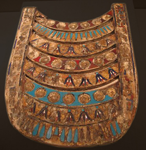
Pectoral of Ptolemy VThe votive pectoral of Ptolemy V (right) is more what I had in mind, but it was never worn by the living pharaoh. Rather it was placed on his corpse, and its shape mimicked the shape of a beb-collar, that hung from the prow of a sacred boat, protecting both boat and the image of the god carried within.

Additionally, the Eyptian pectorals were held in place by gravity. One worn in the sea would move around too much, unless fastened around the torso as well as the neck.

By adjusting historical precedent to conform with the demands of practicality, I arrived at my ideal for a sea numen’s pectoral: a decorative panel, made of varying materials, secured behind the neck and around the ribs or waist.

The warriors would need garments of sturdier stuffs, perhaps links of bronze to form a mesh, or chitin harvested from the shells of giant crabs and reinforced by a coating of bronze.

I discovered a Dutch gorget (below left) from the 1600’s that matched quite well with the picture in my mind. Perhaps the sea warrior would need more room about the neck, but his arms would have plenty of freedom for swimming strokes as well as thrusting with a spear or trident.
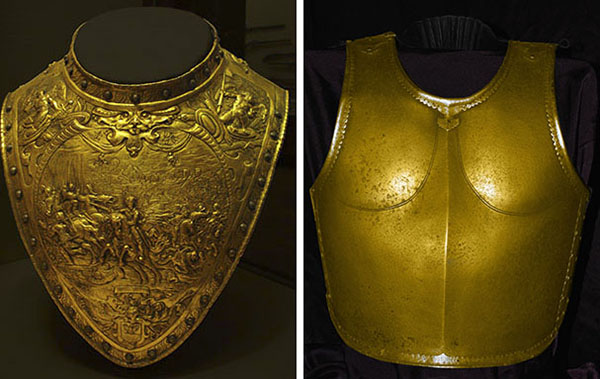
Brass gorget and steel cuirass, 600 pixels

I envisioned Nerine’s father, the king, wearing something that covered a bit more of his person, something like this Indian cuirass from the 17th or 18th century (above right), but with more room for the arms.

swim trunks DHAnd just to be clear that a sea person’s ‘belt’ coveres rather more than one might initially expect, I decided I’d better find a photo – somewhere – giving an indication of what I meant.

I imagine something similar could be devised of crab chitin or bronze chainmail for the warriors. Although the sea people know the technology of nålbindning, single-needle knitting, which goes back to the earliest of times.
 

Indeed, most of the servants in the reef palace would wear pectorals and belts knitted from sea jute, thin strands of chitin or urchin spines, or even their own hair (which is not itchy the way a land-dweller’s hair is). The lighter materials delivered more comfort than the heavier ones required by the warriors.

bicycle shortsNerine’s Nurse wears a snuggly fitting top and hose of white nålbindning knitting. And Nerine’s first clothes – worn at a formal banquet with her parents, the king and queen, as well as some of their courtiers and ministers – is an aqua nålbindning top and belt. For the children of the sea people do swim bare, donning clothes when they reach the age of thirteen or so.
 

The royal children receive more ornate garments, usually adorned with jewels, and fashioned of a light bronze or gold mesh. Nerine’s favorite pectoral and belt were gold with green beryls that flashed gold in strong sunlight. They complimented her green-gold hair and hazel-green eyes nicely.

chainmail top by kerosaThe belts of the ladies, like those of the men, covered more than the term ‘belt’ might lead you to believe. Not all of them would resemble bikini bottoms, however. Nerine’s first ‘belt’ was merely a very long sash of aqua nålbindning that wrapped around her waist and passed between her legs, being secured in elaborate knots on the waistband.

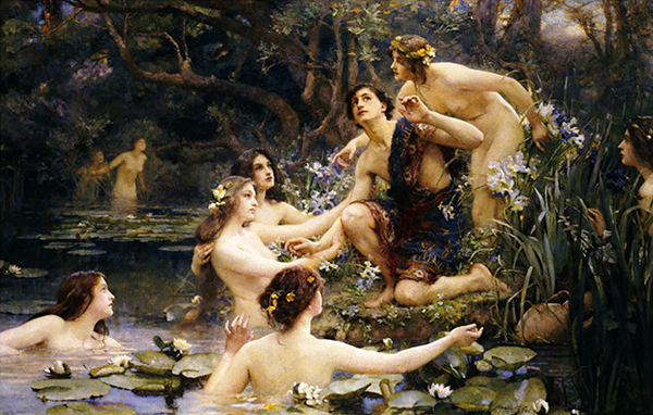
bikini beltNearly every painting I’ve seen depicting water nymphs shows them naked, but I suspect that the real intent of the painter was the celebration of the beauty of the nude form. The nymphs are certainly lovely.

But all the statuary showing land dwellers in the nude doesn’t mean that they went about their lives unclothed. Supposing sea numeni were real (as my novel, Fate’s Door pretends), I doubt they would live always in the nude either.
 

Rae_-_Water_Nymphs_(color)

For more about Nerine’s world, see:
Knossos, Model for Altairos’ Home
Horse Sandals and the 4th Century BC
Measurement in Ancient Greece
Merchant Ships of the Ancient Mediterranean
Lapadoússa, an Isle of Pelagie
Ground Looms
Calendar of the Ancient Mediterranean
Warships of the Ancient Mediterranean


Share

Measurement in Ancient Greece

When Nerine, the heroine of Fate’s Door, set off on a journey across Európi in 334 BC, I needed to know the units of measurement that her guides – the Poniró Peltastés of Hermes – would speak of.

ruler

Sure I could have them talking of miles and leagues. After all, any civilization in which people travel will have the equivalents of those distances. Why not just use terms that many readers will be familiar with?

I could have. Indeed, I would have to, if the ancient terms proved too difficult or obscure. But I dove into research first.

Along the way, I became sidetracked by smaller units of measurement used by the ancient Greeks and, indeed, the entire Hellenistic world.

The translations of the ancient Greek terms charmed me. There is something so practical and sensible in units such as a ‘finger’ or a ‘palm.’

Before I tell you about my decision regarding miles and leagues, I’m going to take you with me to look at the smaller units. Not all of them. There are too many for that. But a few of those that interested me most. 😀

The smallest is indeed the ‘finger’ or daktylos. In modern terms, that’s .76 inches or 19.3 millimeters. I suppose it was used as I might use an inch.

daktylos - index finger by michiel1972 at nl.wikipedia 

The palaiste or doron is four ‘fingers’ or a ‘palm.’ Which makes me think of the ‘hands’ used to indicate the size of a horse. In ordinary modern units, that’s 3.04 inches or 77.1 millimeters.

doron 

Then there’s the dichas or hemipodion, which is the ‘half foot’ – 6.07 inches or 154.1 millimeters – no doubt a handy unit. But the unit that absolutely beguiles me is the spithame, the ‘span of all fingers.’ I’d love to speak of a loaf of bread as long as a spithame! I might one day, even though it will get me strange looks.

The spithame is 9.1 inches or 231.2 millimeters.

spithame 

The pous or ‘foot’ is 12.13 inches, quite close to the foot that I am used to. Or, with less immediate correspondence in metric: 308.2 millimeters.

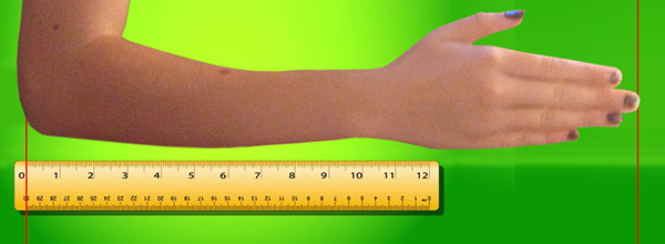
The pygme or ‘forearm’ is amazingly close to the pous. Did the ancients really need both units? 13.65 inches or 346.8 millimeters for the pygme.

The last of the smaller units of length is the pechys or, as the ancient Romans would say, the cubit. Which approximates the length from the fingertips to the elbow. That is, 18.2 inches or 462.3 millimeters.

cubit 

Of course, as fascinating as I found these ancient units, the shorter ones were not what I needed for my story.

The so-called ‘longer’ units start at the pous or ‘foot’ and go on up through various numbers of paces. But what I wanted were the units with which one might measure a journey. Something equivalent to miles or kilometers.

There were two sorts of ‘leagues’ that seemed promising. The parasanges was adopted from Persia and measured 3.447 miles (or 5.5 kilometers). Or I could choose the ‘league’ adopted from the Egyptians, the schoinos which was 4.596 miles (or 7.4 kilometers) long.

After all that research, I decided that both the parasanges and the schoinos were too difficult and obscure to use. I settled for the familiar league, and started writing Nerine’s journey north from the Aegean Sea to the Baltic Sea.

And guess what happened?

I mentioned the unit of a league once! Maybe twice. Because Nerine’s attention was not on how far she traveled. She was interested in the people she met, the strange cultures she encountered, and the startling things she was learning about herself.

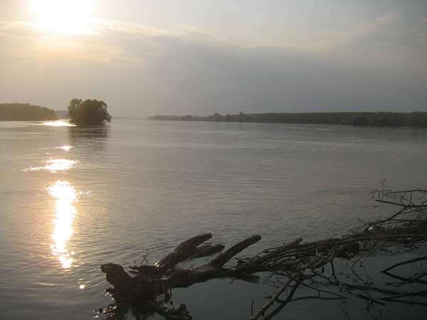
I did require a unit of measurement when she gazed across the river Moirios (the Great Morava), near its mouth, and marveled that it must be a full stadion across. And again, when she worried about how they would cross the river Danouvios (the Danube), because it was more than four stadia wide.

Danube_in_Ilok-Apr09 

But I’d already determined that the stadion was the unit I needed when a much-younger Nerine first looked at a map of Lapadoússa (the modern Lampedusa), the isle where her land-dwelling friend Altairos lived. (Nerine is a sea nymph and lives in a reef palace under the water.)

The young Altairos proudly told Nerine that Lapadoússa was 17 stadia wide and 70 stadia long. For us moderns, that’s: 2 miles wide (3.2 km) and 8 miles (12.9 km) long.

A stadion is 202.2 yards or 184.9 meters. 😀

Lampedusa_island 

For more about the world of Fate’s Door, see:
Horse Sandals and the 4th Century BC
Knossos, Model for Altairos’ Home


Share

Horse Sandals and the 4th Century BC

I started writing Fate’s Door at the beginning of January, thinking that it would be a novella, maybe 25,000 words long.

Fate’s Door tells the story of a sea nymph from the Middle Sea (the Mediterranean) who has taken a post as handmaiden to the three fates in the farthest north of Scandia (Scandinavia).

hipposandal 0

I envisioned my story telling of the heartbreaking dilemma she faces while fulfilling the duties of her post.

It’s her job to set out the materials the fates need for each day’s weaving. But on the terrible day that begins my story, she must set out the threads that will kill someone she loves very much, when the fates weave the threads into their tapestry fabric.

Must she do it? Or is there some way to subvert fate?

It turned out there was more to my story than I’d envisioned. A lot more! I’m closing toward the finish now, in July, but my word count is 115,000 words. Many more than the 25,000 I first thought would be enough. I expect to write another 30,000 words and complete the manuscript in early August.

My heroine has just finished crossing Európi (Europe) on horseback. In order to write about her journey, I did a lot of research about horses and, especially, horse gear.

In the 4th century BC, riders didn’t have the benefit of saddles or stirrups, but they did have the cushioning of a thick, felted blanket that was wrapped around the horse and secured snugly under its barrel.

Horseshoes were not invented until 500 AD, more than 800 years after my tale. But charioteers, cavalrymen, and traders were well aware that their horses needed hoof protection on paved roads and rough rocky ground. The hoof of a horse is made of keratin, the same stuff that composes hair and toenails. It wears down quickly on rough ground, and a horse without protection will quickly go lame.

So what did the ancients do?

hipposandal 3

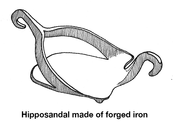
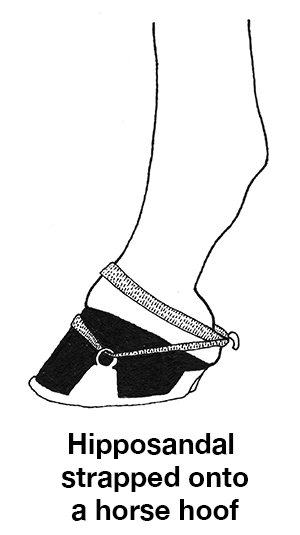
They devised the hipposandal. The earliest soles were made of plaited straw or broom and strapped onto the horse’s hooves. They could only be used once, and for a short time, before they wore out. The ancient Romans later termed them Soleae Sparteae, but my tale takes place when the ancient Greeks were the dominant culture in the Mediterranean, so I do not use the Roman term.

hipposandal 1

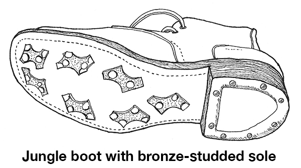
The horse “sandal” was improved to become a thick leather sole, studded with bronze cleats. The bronze cleats would protect the leather from wearing down so quickly and could be replaced when the bronze wore thin. The cleats presumably also gave better traction.

This is the form of horse sandal protecting the hooves of my heroine’s horse.

One source I read compared them to the jungle boots worn by US soldiers in World war II in places such as New Guinea, the Philipines, and Burma. I could not find any illustrations or diagrams of these leather and bronze horse sandals, but I did locate a photograph of the sole of a bronze-studded jungle boot, which I used to make a drawing of same. The horse sandal would, of course be shaped to fit a horse hoof, not a human foot, but I think you get the idea.

hipposandal 2

The ancient Romans made more improvements, creating the official hipposandal or Soleae Ferreae made of forged iron, but still attached to the hoof with straps wrapped around the horse’s hoof and pastern. But evidence for this improvement does not appear until the 1st century AD, long after the events in Fate’s Door.

hipposandal 4The actual horseshoe, nailed to the horse’s hooves, does not appear until the 5th century AD amongst the Gauls.

Although Fate’s Door is fantasy – with sea nymphs and fates as characters – my conceit is that it occurs in the 4th century BC of our world, but our world as it might have been if the ancient gods and goddesses of Greek and Norse mythology were real. So I want the historical aspects to be as close as I can make them to accurate. Which means a lot of research into things like harbor building techniques, the “Amber Road” used by traders to bring amber from the Baltic Sea to the Aegean, and hipposandals.

I find it all fascinating and hope to share more of my findings with you. 😀

For the opening to Fate’s Door, see:
Fate’s Door: The Well of Destiny

For more about Nerine’s world, see:
Knossos, Center of Minoan Culture
Measurement in Ancient Greece
Garb of the Sea People


Share

5 Titles Aimed for September

When I visit the blogs of my favorite living authors – Lois McMaster Bujold and Robin McKinley – the number one thing I’m looking for is news of their next books.

Is she working on one? What is it about? When will it be in stores so that I can buy it? And read it!

5 new titles banner with Fate's Door

I don’t know if any of my readers feel as passionately about my stories as I do about Bujold’s stories and McKinley’s. Comparing feelings doesn’t really lead far, does it?

It’s sort of like the children’s book Guess How Much I Love You.

I love this book more than the distance to the moon. I love it more than the distance to the moon . . . and back! No, Pluto! Alpha Centauri! And so on.

But I know I do have a few fans who are probably wondering when my next title will appear. It’s been nearly a year since I’ve released anything new.

To those of you wondering and waiting, rest assured that I have been writing. A lot! And all this writing has been piling up into books.

Where are the books?

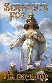
I have two that are ready to release. I always intended to release Serpent’s Foe, which appeared in Quantum Zoo, solo – for readers who don’t care for anthologies.

Serpent’s Foe is ready for release: cover complete, story file formatted.

Winter Glory is also ready for release: cover complete and story file formatted for upload.

In fact, not only are the ebook editions ready, but the trade paperback editions are also ready.

What am I waiting for?

I’d really like to increase my visibility. A number of readers have contacted me or written reviews saying they were delighted to have found my books. A recurring phrase is: “hidden gem.”

Naturally I love the idea that my books are gems. But I’m not so keen about the “hidden” part. I’d like to have more readers.

Almost a year ago, I read about something called the “Liliana Nirvana technique” on a blog written by SF author Hugh Howey.

The technique is simple: release five books on the same day.

Why? Because your visibility will soar. With five titles appearing on the “New Releases” lists, browsing readers will see your name more than once and be more likely to remember you, to check out your books, and to consider reading them.

If this were just a theory, I’d be skeptical. But quite a few writers have tried the technique with excellent results.

Honestly, I’m still skeptical.

But I’ve not gotten to where I am by staying with the tried and true. New ideas and new ways – and sometimes old ways that are so old they’re new – have always attracted me.

So I’m going to give the Liliana Nirvana technique a try.

Sept 2015However, the wait for my five new titles shouldn’t be much longer. September is looking good for their publication.

Hunting Wild is with my proofreader. When it comes back from her, I’ll correct the typos and format the file. It’s a few hours work at most. And the cover is already complete.

Caught in Amber is with my third beta reader. Normally, my books go through only two beta readers, but I made so many revisions to Amber I wanted a third reader’s eyes on it to be sure I got it right. The cover for Caught in Amber is already complete.

I’m still writing the fifth book – Fate’s Door – but I’m closing in on the end. The last fifth of the novel, in fact. The word count currently stands at 80,000!

I’m a writer who picks up steam through a book. I start out slow, achieve a respectable speed through the middle, and then barrel through the end like an express train.

I expect to finish Fate’s Door by the end of May. Then the manuscript goes to my first reader, then my second reader, and then (after my revisions) to my proofreader.

So what exactly will come your way in September? Here’s the list:

Amber web cov 200Caught in Amber • When young Fae awakens in a locked and deserted castle, she remembers nothing. Who she is, where she comes from, none of it.

Beauty from all the ages – medieval, renaissance, and gothic – graces her surroundings, but underneath the loveliness a lurking evil stirs.

Fae must recover her memories and discern the true nature of the challenge before her, while she confronts the castle’s dangers – both subtle and not so subtle.

Somewhere in her forgotten past lies the key to her freedom.


Serpent’s Foe • Bastet, divine protectress of the gods themselves, lies defeated in a cage.

Trapped in beast form, imprisoned behind bars, and confused by nightmares, she struggles to regain her sanity.

Yet clarity of mind is only the beginning of her fight for freedom. In the dimness of the ancient Egyptian duat – where Ra journeys from sundown to sunup – a potent enemy lurks.

When strength battles compassion, what guise must victory assume?


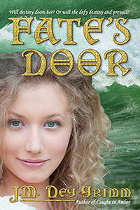
Fate's Door, web cover 200Fate’s Door • Secrets, like troubles, come in threes. When you possess one of either, two more arrive to keep it company. Nerine, a sea nymph of the ancient world, knows too much about both.

Each morning, in the chill before the sun’s rising, Nerine and the three Fates stand under the mighty branches of the World Tree, gazing into the depths of the root-girdled Well of Destiny, watching the dooms that must come to pass that day.

But when the dawn’s visions show Nerine’s lover, shipwrecked and drowning, all her renounced yearning for him rises anew.

Somehow – this day, this morning, this time – Nerine must subvert destiny or lose the companion of her heart forever.


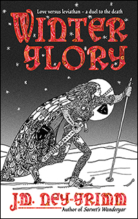
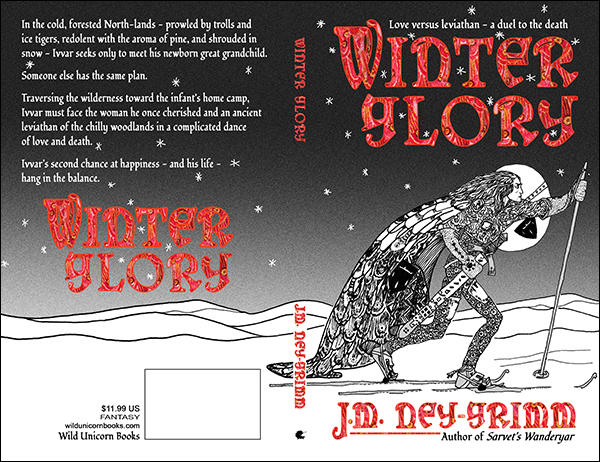
Glory web cover 200Winter Glory • In the cold, forested North-lands – prowled by trolls and ice tigers, redolent with the aroma of pine, and shrouded in snow – Ivvar seeks only to meet his newborn great granddaughter.

Someone else has the same plan.

Traversing the wilderness toward the infant’s home camp, Ivvar must face the woman he once cherished and an ancient leviathan of the chilly woodlands in a complicated dance of love and death.

Ivvar’s second chance at happiness – and his life – hang in the balance.


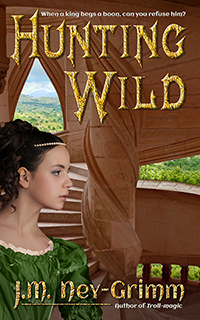
Hunting Wild200 pxHunting Wild • When a king begs a boon, can you refuse him? Young Remeya – fosterling and maid-in-waiting to King Xavo’s sister – thinks you cannot.

Her king requests that she retrieve a dread secret from the well on the grassy hillside of his castle’s outer bailey, and she complies. From the moment her sovereign grips the unwholesome treasure in his hand, the coherence of his mind, his court, and his kingdom start to unravel.


* * *

So…get ready to binge on a handful of new stories in the fall! 😀


Share

Building Amber

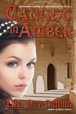
Amber web cov 200I always have fun sharing the process of creating a book cover. My latest is the cover for Caught in Amber, a soon-to-be-released novel in my Mythic Tales series.

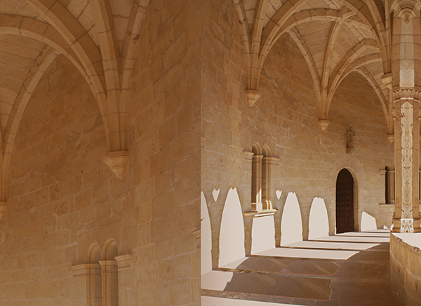
As always, the first step was finding images that work. My initial idea was to show my protagonist – Fae – with a fabulous castle in the background. An outside view of the castle.

In the story, the castle is located on relatively level ground amidst rolling hills. I wasn’t going to demand absolute fidelity in the landscape. Finding the right castle in terrain that wasn’t too different would be fine.

But I couldn’t find the right castle. At all.

The castle in Caught in Amber is embarrassingly similar to the Disney castle in Florida. But bigger. Much bigger. With wings constructed in all the architectural styles imaginable. And the real world doesn’t have anything like it. Or, at least, doesn’t have any photos of such a castle available.

Caught in Amber, build 1As is necessary in cover composition, I developed another idea. I would show Fae inside the castle. Which was probably a better idea anyway. Most of the book takes place inside the castle, not outside.

There were more interior photos of castles than I would ever need. Even if I wrote nothing but castle stories for the next ten years! I couldn’t decide amongst them. So I bookmarked several that I liked and moved on.

Time to find Fae!

She’s a gray-eyed girl in her mid-teens with curly brown hair. Surely she wouldn’t be too difficult to match.

But she was.

The brunettes with the right face didn’t have the right hair. The brunettes with the right hair were too old. Or else they they wore big grins on their faces. Fae doesn’t do much grinning in Caught in Amber. Her situation is too scary and dangerous.

Finally I decided to combine two photos: one with the right face and one with the right hair. I did a quick mock-up using comp images, and my idea definitely worked. Both the face model and the hair model had widow’s peaks, so the two images could be combined comfortably.

Once I’d chosen Fae, it was easy to select a castle interior. There was one that complemented her particularly well. I pasted it into my mock-up. It looked good!

Then I went back to revising the manuscript. Sent it out to my second reader. Got her feedback. And revised again.

I save designing the cover as a reward for after the manuscript is complete and close to its final form. Also the blurb. I really need a treat after blurb writing, which doesn’t come easily for me.

More than a month elapsed.

As I arranged to purchase the right to use the photos I’d chosen for the cover, I had second thoughts about my choices. The model looked a little too pugnacious. She just wasn’t the right one after all.

I reviewed all the photos I’d bookmarked and discovered a model who was perfect. I’d rejected her initially, because she looked a little too cheerful. But part of her cheerful aspect was her bridal gown and her studio setting. One of the things I’d learned from my mock-up was that the castle setting caused a really serious model to look too serious. Perhaps a mildly serious model would look exactly right.

I tried the new Fae in my mock-up. She was indeed perfect. This was Fae. I would need to change her brown eyes to gray, but that was an easy fix.

However, the castle scene for the first Fae wasn’t quite right for the second Fae.

I returned to all the castles I’d bookmarked. With such a wide selection to choose from, finding the right castle interior was easy. I was ready to start!

Caught in Amber, cover build 2

I purchased the right to use the two photos, set up my book cover file in Photoshop, and pasted in the castle photo. I extended the right side almost immediately. I knew I would need that extra for the cover bleed.

Then I looked at what I had. The photo was a little overexposed for my purpose. It would undoubtedly be fine as a framed photo on a wall. But as the backdrop on a cover, the brightest parts of the photo – where the sun shone through the arched windows – needed to be less bright.

Caught in Amber, build 3

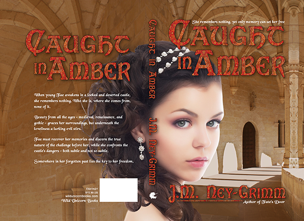
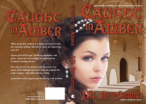
I selected a portion of the photo that would work well on the back cover (the top left) and pasted it into the file. Then I set about correcting the overexposure as well as changing the color balance to a more saturated hue that would give the castle more density.

I put a translucent screen over the back cover to make it a suitably smooth background for the back cover copy. I lightened the shadows in the wall niches on the back cover for the same reason. The image behind text musn’t vary from light to dark too much.

The odd seam between the front cover and back cover in the lower half did not need to be addressed. Fae would cover it, once she arrived.

Caught in Amber, build 4

With Fae in her castle, I could see that I had a problem with her shoulder. As it wrapped across the spine of the book and then onto the back cover, it would look odd appearing in isolation as it would with all of Fae excepting her hair on the front cover. I followed a shadow line in the photo to reshape her shoulder. That was better, but not quite what I wanted.

I tried adding a few extra curls of her hair. Perfect!

Amber build 5-1

I created the title and my byline. I added the tag lines and the back cover text. It was definitely coming together nicely.

But there were two problem areas.

Fae’s pearly head dress interfered with the title on the spine, making it hard to read.

And the small strands of Fae’s hair that stood away from the main mass of her hair were too bright, making it hard to read the back cover copy.

On the spine I placed some carefully selected and feathered pieces of Fae’s hair under the spine title and over that portion of the pearl head dress. It worked beautifully. Now you could read the title without strain.

I placed a translucent and feathered shadow over the ends of Fae’s hair on the back cover and under the text. That worked well also.

My cover was finished!

I got that fun frisson of “This is real!” when I looked at the composed image. Even though I am the one who worked to put the two photos together, in my heart of hearts I believe that I am looking at Fae as she explores the deserted castle where she awakens without her memories. 😀

Amber build 6-1

For more cover builds:
Building Wild’s Cover
Building Glory’s Cover
Cover Creation: Perilous Chance


Share

What is the Worst Thing?

One of the writers I respect most – and whose stories I love the most – asks herself this question: what is the worst thing I can do to my protagonist?

She poses that question, answers it, and then does that very thing in her story.

Shark by Umair Mohsin

She’s not the only writer who uses that question to guide her stories. Many do.

But it never worked for me. When I asked myself, “What is the worst thing that might happen to my heroine?” the answers were distinctly not helpful.

Answer the first: kill her off. In which case, there is no story.

Answer the second: take away the thing that makes life worth living, with no hope of replacement or redemption. In which case, I’m writing a tragedy, and I don’t want to write a tragedy.

Many of my stories are born from a setting that has inherent problems.

For example, Livli’s Gift was sparked from an incident that happens in Troll-magic.

When Lorelin travels north on skis, she encounters a Hammarleeding woman in the woodland edging the tundra. We learn that the woman is returning from a journey to visit her new grandchild, and that her daughter had left the Hammarleeding enclaves entirely, because she wouldn’t be allowed to keep her young son if she stayed. Hammarleeding boy children go to live in the father-lodge, apart from their mothers, when they are two-and-a-half years old.

My story question was: how would a woman who couldn’t bear to follow that societal norm manage when she gave birth to a boy?

Livli’s Gift explored that question, starting with pregnant Livli worrying that her baby might be a boy.

Knife-weilding ElfI’ve generally relied on the inherent dangers and risks in my story setting to drive the story forward.

But, in one of my recently written novels, that method wasn’t working. At least, it seemed not to be working. Both of my first readers told me that the first third of my story wasn’t holding their interest. Both loved the middle and the end. But not the beginning.

So I had some thinking to do. Where exactly had I gone wrong?

The situation my protagonist found herself in was dangerous and scary. If I were in that situation – utterly alone, trapped in a deserted castle with no food or water and no way to get out – I’d be pretty scared.

So why were my readers not gripped by it?

The answer, when I discovered it, was quite obvious. (Although it took me two hours of discussion before I stumbled on it. 😉 )

My protagonist dove into solving her problems too quickly. No sooner did we realize that there was no water than she scrounged up water. Same with the food. That took all the tension out of the story.

I needed to let her encounter the full dangers of her situation before I allowed her to devise solutions.

Epiphany!

Tiger Face Portrait by Gavin BellUnconsciously, I’d followed that guideline – show the dangers fully – in most of my stories.

In Livli’s Gift, Livli arrives on the scene worrying about being forced to give up her baby, if he is a boy.

In Perilous Chance, young Clary immediately must cope with her wailing baby brother, because her father is absent and her mother incapacitated.

In Troll-magic, Kellor struggles with the throes of troll-disease: its physical discomfort and its mental confusion.

In the novel where I failed to follow that excellent precept – allow your protagonist to wrestle with the difficulties inherent in the situation – why had I failed?

It was because I, the writer, was too scared!

I was writing my personal nightmare, and I couldn’t bear to experience it in all its horror. I needed those solutions. With the result that I let my heroine have it too easy.

But don’t worry, she now has a perfectly dreadful time!

That’s why most writers have trusted first readers: to find the places where the story isn’t working so that the writer can fix any writing mistakes and make the story work.

Not only have I fixed the mistake in this particular story, but I now have my own question to ensure I don’t make the same mistake in future stories.

Colorado National Monument

“What is dangerous and risky about this situation? How can I present those dangers most powerfully to the reader?”

It was exciting to develop my own twist on, “What is the worst that can happen?”

I was in the middle of writing a novel at the time, but I can’t wait to see how my touchstone question guides me at the start of my next story. 😀

More writing tips:
The First Lines
Where Should a Paragraph End?


Share

Cover Reveal: Caught in Amber

Caught in Amber is getting ever closer to its release!

Amber feature cov 300When young Fae awakens in a locked and deserted castle, she remembers nothing. Who she is, where she comes from, none of it.

Beauty from all the ages – medieval, renaissance, and gothic – graces her surroundings, but underneath the loveliness a lurking evil stirs.

Fae must recover her memories and discern the true nature of the challenge before her, while she confronts the castle’s dangers – both subtle and not so subtle.

Somewhere in her forgotten past lies the key to her freedom.

Coming soon!

Share

What Happens After the Manuscript is Complete?

Once you have a complete manuscript – ready for publication, ready for readers to enjoy – what happens next?

workflow ms

Several of you have asked me this question, and it is well worth considering.

Writing has a natural flow. When you finish one scene, you write the next. When you complete the first draft, you send the story to your trusted first reader. When you’ve fixed the errors pointed out by your first reader (or readers), you send the manuscript to your proofreader. Step three cannot be performed until steps one and two are complete.

workflow: too muchBut once the manuscript is completely finished, the next step is less obvious. Especially if you prefer to do the work yourself, as I do.

Do you create the cover?

Do you write the cover copy? (Sometimes called a “blurb,” just because “blurb” is one syllable, while “cover copy” is four!)

Or do you format the file for uploading to the different etailer sites?

It can feel like all of these tasks are rushing you in a group. But they aren’t. You pick one and work on it. Then you pick another and work on that one.

I have published fourteen ebooks so far, and I have another five underway. Somewhere between the first book and the fourteenth, I arrived at a workflow that feels comfortable for me and that allows me to do my best work.

I’ll outline it below.

workflow: early blurbThe Blurb

I always tackle the cover copy (or blurb) first, because I find it to be the most challenging piece of publishing a book. I have to take multiple passes at it to get it right.

How I feel about my first attempt at a blurb varies wildly!

Sometimes I’ll write it and think: I nailed it! This is it! Woot, woot!

More often, I’ll struggle and groan and feel as though someone is driving spikes through my head, and think that whatever I’ve created for cover copy is awful! Blurb writing does not come easily to me.

But once I’ve put in solid, committed effort and have a complete blurb, I move on.

If you’d like to see the principles I follow when writing blurbs, I have two posts about blurbs on my website: one here and one here.

workflow: cover artCover Design

I tackle the cover design next. Finding the right art for the cover can be very challenging, but usually I’ve started looking for art while my first reader is reading my story. Often I’ve found the art and purchased the right to use it before the manuscript is back from my proofreader.

For me, cover creation is like playing. All my stress melts away, and I’m just having fun creating a beautiful and compelling visual that fits my story. It’s a good chaser to the agony of blurb writing. 😉

For guidelines on cover design, see my Cover Design Primer.

workflow: second blurbBlurb, Round 2

Then I look at the blurb again.

Inevitably – whether I loved my blurb or hated it – I see that it’s not good enough. It conveys a false idea of the story or it fails to ground the reader in the setting or it doesn’t include any hint of the lyricism that is part of my writing.

A blurb can fail in so many ways, and I think I am slowly discovering them all. 😉

But usually there is some portion (or portions) of my blurb that is useable. I build on that for another draft. And see what my husband thinks about it. And then use his feedback to create yet another draft.

Then I return to my cover.

workflow: tweaking the cover design

Cover Design, Round 2

When I create my covers, I start with the cover for the paperback. I’ve learned that it is much harder to add a spine and back cover to an ebook cover than it is to extract the front cover from a paperback cover and use it for the ebook.

So I pour the blurb into my paperback cover file.

When I do so, I inevitably see that the cover needs some adjustment.

Maybe the font I chose requires that the tail of the “J” in my byline be a little longer. Or a little shorter. Maybe the position of the skier’s cloak (in the art) is too close to the spine. There is always something.

So I tweak the cover.

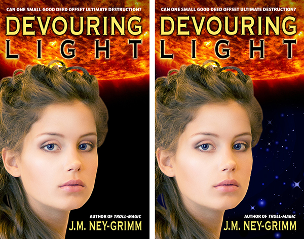
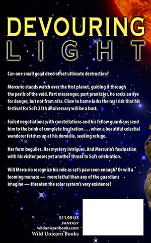
(The left version of Devouring Light above shows only the harsh black of outer space behind the goddess. It directly contradicted the playful undercurrent of my story. The right tweaked version of the cover has a soft starfield in the background.)

workflow: third blurbBlurb, Round 3

Pouring the blurb into my cover file helps me to see the blurb as a reader, rather than as a writer. That fresh perspective often clarifies where to go next with the blurb. By this time, my blurb should be approaching its final form. A little more massaging will get it to where I am satisfied.

Now, don’t get me wrong. I am far from a master blurb writer. Marketing gurus have many years of schooling in the discipline behind them plus years of experience. That’s not me! I suspect I will continue to learn about blurbs and how to write them for as long as I’m publishing books. But I am better at it than I used to be.

Format the Ebook File

I leave formatting the file for last.

I believe that ebook files need to be as simply formatted as is possible. You never know what kind of a device your reader will be reading on. It could be a Kindle or a Nook or a Kobo. More likely, he or she will be using a smartphone and some sort of ereading app.

The more bells and whistles you include, the more likely that something will go wrong. And then your reader won’t be reading at all. Or, if she is, it won’t be your book.

So I make the formatting very, very minimal.

Which means that it doesn’t take me much time. Half an hour at most.

workflow: keywords

Keywords

Not all etailers allow the publisher to attach keywords to a book. But Amazon and Nook Press do. You want to choose your keywords carefully. I choose mine to position my book in as many of the suitable categories as possible.

I use Amazon’s keyword guide for fantasy and science fiction to help me choose. I only aim for categories where my book genuinely belongs. But often there are quite a few that fit. I want my book to appear in as many of those as I can manage. 😀

I make a list of the keywords for this book and keep a record of them in my computer folder for that title.

workflow: final blurbBlurb, Round 4

Sometimes I don’t need this final stab at the blurb. But, often I do.

Just before I upload the ebook file and the cover file, I look at the blurb again. And tweak it just a little more.

Uploading

I double check to be sure I have everything I need. Is the file formatted and ready to upload? Check.

Is the cover file correctly formatted and correctly sized for uploading? Check.

Is the blurb ready to copy-and-paste into the blurb box on the etailer site? Check.

Do I have my keywords chosen and ready? Check.

I log into my account, type in the requisite information, upload the files, type in my price in US dollars, and round the international prices so that they are not a weird number like £3.16.

Then I wait the 12 hours it takes (sometimes less on Amazon, usually more on the other sites) to go live.

Author Central

Once the book is live on Amazon, I visit my Author Central account and “claim” the book as mine.

This will cause the book to appear on my author page on the Amazon site. Whenever a reader clicks my name on the book’s page, he or she will arrive at my author page. I want all my books to appear on that page. I want it to be easy for a reader who loved one of my books to find another.

The other benefit of my Author Central account is that I can format the blurb.

The KDP desktop where you upload the book does not permit any formating. No italics. No bolding. Nothing. The result can look unprofessional and messy. The desktop at Author Central lets me make my blurb look nice.

And – guess what? – when I see the blurb correctly formatted, I often make yet one more tweak! That final blurb often has ten or more drafts that preceded it!

workflow: Author Central blurb

Quality Assurance

When I upload a book, Smashwords and Amazon both have a step that allows me to preview the ebook. I look through every page of it to be sure that a glitch has not crept in unbeknownst to me. I don’t read. What I’m primarily checking for are: odd page breaks, weird formatting, or formatting that appears as text instead of invisibly guiding the text of the story.

My workflow tends to generate odd page breaks from time to time. Not always. Not often. But sometimes. If I find any, then I have to fix the problem and re-upload the file before I click the publish button.

But I like to take one final QA step on Amazon after the ebook is available for purchase. I buy the ebook and look at it on my Kindle. And give a huge sigh of relief when I see that the formatting is indeed fine.

Devouring Light on the Amazon siteDone!

Writing out my entire process makes it sound like a lot. But I move through it fairly quickly these days. Practice!

Of course, this is the workflow for an ebook. Paperbacks use some of the same elements – but they have their own unique workflow. Perhaps, if I hear interest, I’ll blog about it sometime.

Edited to Add

All of the above could be summarized much more tidily.

1 – The blurb: write it.
2 – The cover: create it.
3 – Format the ebook file.
4 – Choose your keywords.
5 – Review steps 1 and 2, repeatedly, and tweak both, repeatedly. 😉
6 – Upload the files.
7 – Visit Author Central and format the blurb.
8 – Buy a copy of the ebook and look at it on your Kindle.
9 – Done!

My hope is that the more detailed narrative will be useful to those who are actually in the throes of the work between completed manuscript and published ebook.

The middle of the real process is a lot messier than nice, neat check lists. Many of us (myself included) find value in an accurate (if complex) roadmap. 😀

The links mentioned above:
Cover Copy Primer
Eyes Glaze Over? Never!
Cover Design Primer
Amazon’s Keyword Guide
Amazon’s SFF Keyword List


Share

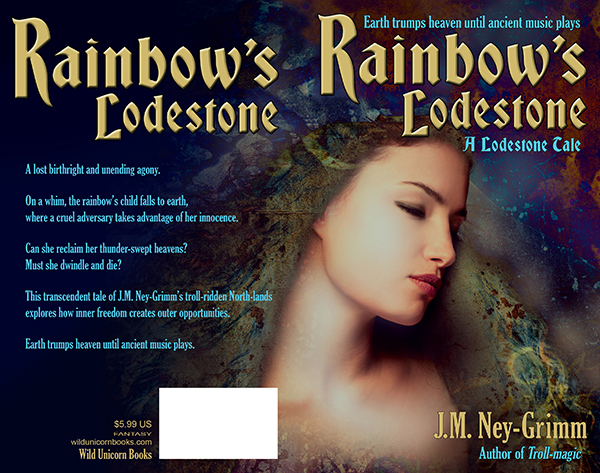
Building Rainbow’s Cover

art for Rainbow's Lodestone

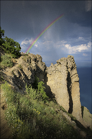
The first time I created a book cover for Rainbow’s Lodestone, I couldn’t find any art that looked like my spirit of the rainbow. So I settled for a landscape. It was a dramatic landscape – beautiful – and it had a rainbow against a looming cloudy sky. But I didn’t think it conveyed the essence of my story well.

art for original Rainbow's Lodestone coverSo, when I was ready to create the paperback edition of Rainbow’s Lodestone, I went looking for more suitable art. And I found exactly what I was looking for. The instant I set eyes on the image, I said to myself, “That’s her!”

It was exciting. I purchased the right to use the image on my cover.

The first thing to do was flip the image. I wanted the spirit of light looking to the right, supporting the eye’s natural tendency to move from the top left corner of an image to the bottom right.

The next adjustment needed was creating room for a title. As you can see (above), the art didn’t have room at the top. Nor did it have much room at the bottom for my author byline. I had some work to do. I started to “paint” the extra margins I needed.

I’ve talked before about this “painting” I do in Photoshop. You might be wondering what I mean since that’s not very specific.

This is what I do to extend the background: I take the “lasso” tool and draw a rough shape around a suitable piece of the background. Then I “feather” the edge of my selection, essentially creating a fuzzy edge instead of a crisp one. Next I copy my selection and paste it on a new layer in my file. I move it around until it looks good. Then I merge it back onto the main layer.

That’s it in a nutshell.

But I do it over and over again to fill in the area I need.

modified art for Rainbow's Lodetone

The next steps were less time intensive.

I assessed the back cover area to discern whether type would be easily read atop it. Rarely is it just fine as is. Usually I must either lighten it to receive dark type or darken it to receive light type. Additionally, if there is a lot of variation in lightness and darkness, I must even it out.

Type needs a fairly bland background behind it in order to be easy on the reading eyes.

The art for Rainbow’s Lodestone didn’t extend far enough to the left after I’d added to the top. I could have “painted” yet more background, but I had a better plan in mind.

I sampled three colors from the back ground: a dark blue, a dark aqua, and a black. I selected large irregular triangles in the area that needed to be filled – feathered the edges a lot – and filled them with these three colors. The result was a varying wash of color that blended with the art and also yielded a good background for the back cover text.

Rainbow art with title

The Lodestone Tales follow the lodestones created by Zandro Mytris through the history of my North-lands. Which means I want the covers for all of the stories to look like they belong together.

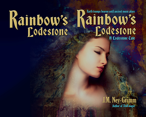
I’d already chosen the font Bradley Gratis for the titles of the books and the font Gloucester for the tag lines and the back cover text. Working with those choices, I placed the title on the front cover so that it lined up with one edge of the cover and framed the art. Adding my byline and the tag lines was a straight forward matter.

Rainbow’s Lodestone is a short story, which means that its “blurb” is fairly short. I wouldn’t want to plump up the blurb with a lot of spoilers! I had to play with the best size for the text and line spacing, as well as seeking the best way to break the text into paragraphs. It was a matter of trying different arrangements until I got one that looked good.

I submitted this cover to a design contest held every month by Joel Friedlander. He’s a publishing and design professional active in the indie publishing world, and his good opinion is very worth having. I was delighted when Rainbow’s Lodestone won a rare and coveted gold star award!

(Rainbow’s Lodestone is the 30th in the long column of covers shown. Joel doesn’t list them by rank, but randomly.)

Paperback cover for Rainbow's Lodestone

To see more cover builds:
Building Star-drake’s Cover
Building Wild’s Cover
Cover Creation: Perilous Chance

For the basic principles of cover design:
Cover Design Primer


Share

Building Glory’s Cover

y Magnus Sjöberg (Larsson), photo used under a Creative Commons license, FlickrI was so lucky finding images that were perfect for the covers of Fate’s Door and Caught in Amber, I hoped I might be equally lucky with photos for Winter Glory.

I found a gorgeous northern landscape: a snow-covered pine forest with the sun setting through the tree trunks. (Similar to the photo at left.) But I couldn’t find anyone who looked like Ivvar.

This didn’t truly surprise me. Ivvar’s a tall fellow with shoulder-length gray dreadlocks and tan skin. Not tanned by sunlight, but naturally tan, the way my Hammarleedings are.

I searched for a photo of Ivvar last October when I finished writing Winter Glory. I searched in November when I got feedback from my first reader and started revisions. I searched in January when I received feedback from my second reader and made more revisions. I searched in February when the file came back from my proofreader with typos corrected.

I searched one last time when it was time to create the cover.

illustration for East of the Sun and West of the MoonThen I had to face the fact that I simply was not going to find Ivvar photographed by chance by a modern photographer. 😀

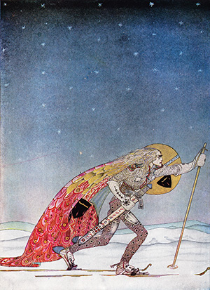
I wasn’t panicked. I had a plan B. I would use the illustration by Kay Nielsen for “So the man gave him a pair of snow-shoes” in East of the Sun and West of the Moon. It’s a gorgeous piece of art. It was probably for the best that I’d failed to find a good photo.

As I scanned the Nielsen art, I talked with my husband about my plan for the cover. He was in the other room, so he was not looking at the piece of art concerned. He said: “Oh, yeah! You’ll make one of those black & white covers, like the ones for Troll-magic and Sarvet’s Wanderyar. Great! They’re really your trademark look.”

Right then and there I had an epiphany.

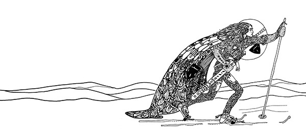
The art showing a man on skies is a color piece. But in the time it took my husband to speak, I’d envisioned it rendered in black & white, and I loved it.

Plus my husband’s suggestion made so much sense. A color painting would be a whole new look for one of my books. But a black & white Kay Nielsen piece would fit right in with the other North-lands and Hammarleeding books.

And I was sure I could do it. The print quality on the black & white illustrations of my 1914 edition of East of the Sun and West of the Moon is very poor. In order to get a clean image for my covers with Kay Nielsen art – crisp lines without inkblots, black blacks, and white whites – I’d always placed the art on a light table and traced it.

I was certain I could do the same for a color illustration. It would be trickier. I’d be making value judgements all the way through about how to render shades of color as either shades of gray or patterns of black & white lines. But Nielsen’s work lends itself to black & white interpretation. Even his color work has interesting line and texture present.

I scrutinized the piece of art depicting the skier. Yes! I could see in my mind’s eye exactly how I would do it.

So I set to work.

black & white sketch for Winter Glory

I was nervous at first. So nervous that my hand kept shaking. I had to talk myself down. “Jessica, any small mistakes can be corrected in Photoshop. And if you make a big mistake, it won’t be the worst thing if you have to start over. Relax. Relax. Relax.”

My hand was still not steady with that first line of ink on paper. I got a fresh sheet of paper. And started on the skier’s hair, which was supposed to be squiggley. By the time I finished the hair, my hand was steady. I’d forgotten my nerves and was enjoying the drawing.

I was almost sad when I finished, except that there was more fun ahead.

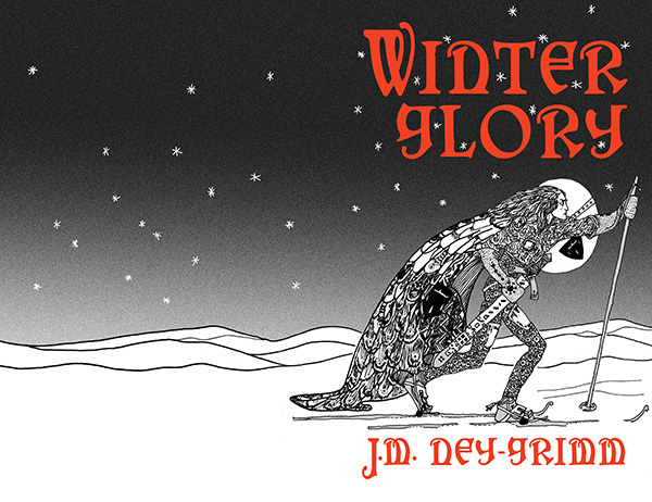
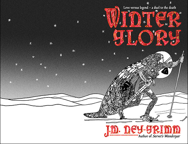
I scanned my black & white drawing into my computer and started building the cover for Winter Glory.

The first step was to select the stars and turn them from black to white. Then I put a gradient screen from the top of the cover to the bottom, thus creating the sky. I loved how that made the skier pop!

Adding the sky to the cover for Winter Glory

Next step? The title.

I already knew I wanted to use the cloak texture from the original color illustration, but I wanted to get the title’s size and placement settled using Photoshop’s type managing tools. I would turn the layer from a type layer to an image layer after I got the type exactly the way I wanted it. So I used a bright red to help me visualize the final result.

Adding title and byline to the cover for Winter Glory

The cloak in the original illustration was a lovely patch of color. It was big enough that I could have just selected it and “pasted it inside” of the letters of the title and my author byline. But it would have been a lot of pasting.

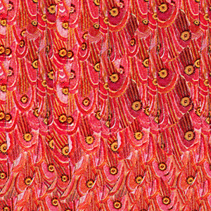
cloak textureSo I made a square of the texture first – pasting and pasting and pasting that cloak patch into a separate file. I increased the saturation, and heightened the reds and yellows to achieve the effect I wanted.

Once the cloak texture file was ready, I selected the whole square and pasted that inside the letters of my cover file. It took four pastes to fill them all. Instead of ten or more!

The textured title softened the overall effect of the art. The black & white art with the solid red title has a crisp and definite look that I like. But it’s a little too hard-edged for the story, which blends life-threatening action with romance.

Winter Glory cover with textured title

Then I was closing in on the finish line.

I added the tag lines – one above the title, one below my author byline. And my trademark line, connecting the big “J” to “Author of Sarvet’s Wanderyar.”

I placed the back cover copy. I placed the title on the back cover. Next came the spine: title, byline, and Wild Unicorn logo.

And finally the publisher info and the box for the barcode.

I was done! It’s ready to be placed in an InDesign file for the paperback cover, and to be windowed for the ebook cover. 😀

Glory cov build 7

For more cover builds:
Cover Creation: Perilous Chance
Building Star-drake’s Cover
Creating Livli’s Cover

For the principles of cover design:
Cover Design Primer


Share