How I Rehabilitated My Sleep

My torn retina in January devastated my sleep. When the ophthalmologist completed his repair of the tear, he injected a gas bubble into my eye and informed me that I would need keep my head upright, but with a slight tilt (which tilt he demonstrated by moving my head into the correct position), 24/7 for the next 10 days.

digital clock

As it turned out, that first 10-day interval was just for starters. I had several check-ups during the 10 days – with favorable reports on my eye’s progress – and then was told I must keep that head angle for another 2 or 3 weeks. All told, I think I kept that head angle for nearly 2 months.

Which meant I had to sleep sitting up!

Which meant I mostly dozed, and only for about 5 hours per night, when I was exhausted enough to do so.

By the time I was cleared to lie down again, both of my hip joints ached, most of the rest of my body was sore, I was seriously sleep deprived, and I was accustomed to starting my doze somewhere between 2 AM and 4 AM.

With permission to lie down, I thought, “Now I can sleep!”

I could not have been more mistaken. I hadn’t realized how much I tended to lie on my back while I slept, and I didn’t have permission for that position until the gas bubble was entirely dissipated. Lying on my back would cause the bubble to float up to my cornea and abrade it. Not good! So no lying on my back!

Lying on my side at night, the ache in my hip joints grew worse. I’d stay on the right side until I could not bear it. Then I’d flip to my left side. The relief to my right hip was wonderful…until roughly 40 minutes passed, and then the ache in my left hip was equally bad.

I did sleep. Some.

But when I was finally clear to sleep however I wanted, including on my back, normal sleep was so far in my past that I couldn’t remember how to do it.

I made efforts to return to a reasonable sleeping schedule with little success.

Sleep SmarterWhich meant that when I spotted an advertisement on June 2 for a book titled Sleep Smarter, I was ripe for checking it out. It sounded good, with information based solidly on sleep research and pleased readers who had tried its methods.

I purchased the book and read it. I liked what I was learning. I’d thought I knew a lot about sleep, but in fact there was more I didn’t know than I did. The author’s tone is clearly geared toward a pop audience, and I’m not convinced that every last one of his recommendations is backed by solid research. But he referred to many studies that I do have some familiarity with and that are valid. In any case, I figured that the proof would be in the pudding. All of his action-steps were easily implemented and inexpensive. I’d try them and see how they worked.

Here’s a list of many (but not all) of his suggestions:

• exercise for 10 minutes first thing in the morning
• get 10 minutes of sunlight first thing in the morning
• turn off all screens 60 – 90 minutes before you want to be asleep
   (to limit blue light, which depresses melatonin production)
• during that hour, do something pleasurable and low key
   (read, listen to relaxing music or an audiobook, converse, meditate,    journal, take a bath)
• rub topical magnesium onto your legs
   (many westerners are magnesium deficient, and the mineral is
   necessary in many processes, including relaxing tense muscles,    reducing pain, and calming the nervous systems)
• drink no caffeine after noon
• get 30 minutes of sunlight during the day
• remove electronics from the bedroom
• keep the thermostat between 62°F and 68°F at bedtime
• use blackout curtains in the bedroom
• place a spider plant or a snakeroot plant in the bedroom
   (to clean the air)
• meditate for 5 – 10 minutes first thing in the morning
• move bedtime and wake time by only 15 minutes at a time,
   when you need to move them
• use low-blue light bulbs in the bedroom
• get glasses that block blue light for use when you choose to look at
   your computer, your phone, or the television late at night
• download apps that block blue light for your phone and computer
• wear loose clothes to sleep in
• do self-massage as part of your bedtime ritual

Not all of these recs appealed to me. Some were irrelevant: I don’t drink either coffee or tea or soda. My husband’s allergies meant that having a plant indoors was unwise. I didn’t feel ready to invest in blackout curtains right off the bat. But getting some sunlight immediately upon waking sounded excellent, as did turning off my computer by 9 pm.

Sleep Smarter included a plan for implementing the various strategies over the course of 2 weeks, but some of the easiest tips weren’t added until the second week. And some were those that weren’t going to work for me.

I decided to take what I’d learned and put it together with what I know of myself (I’m a night owl, not a lark, for example) and create a customized morning routine. One thing that was clear to me was that I’d always approached changing my sleep schedule with a focus on my evening routine. That’s important, of course, but it was never going to do what I wanted, if it was unsupported by an effective morning routine. In fact, for me, the morning routine needed to be the main focus. The evening would fall into place, if I got the morning right.

This is the morning routine that I developed:

• immediately upon waking, do 20 minutes of core exercises
   that prevent pain in my back
• the instant I am done with those exercises, go sit outside
   for 30 minutes on either my front porch or my back deck
   (bring my journal, if desired – which it generally is)
• walk barefoot on the lawn for 5 – 10 minutes
• come in and cook breakfast
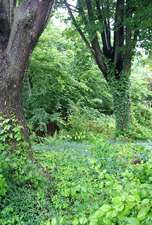
maple trees from the back deckEven though my sleep schedule was a mess when I decided to try this, I’d been waking at 7:30 am. But I’d been so tired that I always went back to sleep. So my first morning, I went outside, instead of diving under my pillow.

And it was glorious! The air was cool and fresh. The sun through the tree leaves was beautiful, as were the fluting calls of the birds. When I walked on the grass, the earth under my bare feet just felt good. And I didn’t feel sleepy at all by the time 30 minutes had passed.

That was already a success, as far as I was concerned.

This is the evening routine I developed:

• turn off all screens at 9 pm
• spend the time reading or journaling or drawing
   or chatting with my husband
• at 10 PM, wash my face, smooth a coconut-based lotion on my face,
   and spray a magnesium oil on my legs
• turn out the light the instant I feel sleepy

It was a little hard finding quiet things to do after I turned off my computer. I tried coloring an adult coloring book that featured butterflies, but that didn’t hold my interest sufficiently. So I purchased a book that explained a pattern-drawing method called Zentangle® and discovered that drawing designs in this way is a perfect evening activity. Between reading, journaling, drawing, and conversing, I have enough possibilities.

So how did it work?

It worked wonderfully well for me! The first night I was sleepy by 1 AM, so that’s when I turned off the light and fell easily and swiftly asleep. An incredible improvement over my then-typical 4 AM! By the end of my first week, I was sleepy by 11 PM. I occasionally have nights when I’m sleepy soon after 10 PM, but I am a night owl. I suspect 10 PM would be my ideal bedtime, but I am happy with 11 PM. And I am thoroughly delighted with how pleasant I find the morning routine and how quickly it returned my sleep schedule to something that meshes well with the rest of the world around me.

Total success, as far as I am concerned! 😀

ETA: Keep in mind that none of the above is intended to address an actual sleeping disorder. If you’ve just gotten off track – as night owls like me do from time to time – then ordinary sleep hygiene, applied intelligently, can make a huge difference quite rapidly. But for certain types of sleeping disorders, some of the listed strategies could actually make things worse. So get help from an expert in sleep medicine, if you think you may have a sleeping disorder.


Share

Cover Copy for Troll-magic . . . One. More. Time!

There’s a promotional opportunity for my novel Troll-magic coming soon, so I reviewed its marketing copy to be sure everything was ready. Most promo newsletters require a considerably shorter story description than the one present on the web page of retailers such as Amazon, Kobo, Apple, etc.

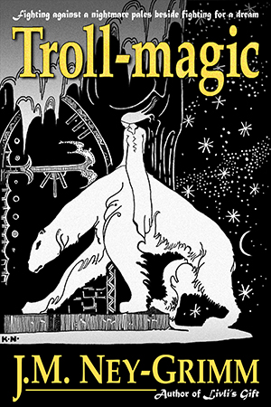
cover image for Troll-magicSince Troll-magic released way back in 2011, when promotional opportunities were much scarcer on the ground than today, I suspected the marketing copy was not ready to go, and I was right.

Oh, I’d created a version for the “short blurb” that Smashwords requires. But – upon review – I didn’t like it much. Worse, I found that as I studied the full-length version, I had some problems with it as well.

None of this surprised me. Or even dismayed me. (Even though I’d revised that blurb extensively not too many months ago.) I’d expected that I had some work to do. That’s why I was reviewing the material.

Here’s the marketing copy I was reading:

Prince Kellor, cursed by the troll-witch Mandine to live as a north-bear, wrestles with the challenges of his beast form. Pain wracks his body. Unpredictable rages blur his mind. And his thoughts spin out of all sense, confusing his search for the loopholes that every curse possesses.

His curse turns on the choices of his childhood friend Elle. She once shared Kellor’s idyllic rambles through the wilderlands. She now loves all things musical. Might Kellor persuade her to neglect her own life and save his? Should he?

But no troll-witch permits her prey to escape with ease. The illusory loopholes in Mandine’s curse all twist back to its entombing heart.

Troll-magic tells a lyrical Beauty and the Beast tale, rife with moments of shining glory and dark magnificence, tumbling toward a lethal battle of wills and the impossible choices forced by clashing loyalties.

There was a lot to like there. I still felt it was a huge improvement over what it replaced. But several phrases bugged me. I’m going to show which ones and why.

north-bear banner

First Paragraph

Most of the first paragraph works well. The mention of a curse and a troll-witch lets the browsing reader know right away that the book is fantasy. The protagonist and his interesting problem are introduced. His goal – finding loopholes in the curse – is also presented. All good.

But “And his thoughts spin out of all sense” didn’t sit right with me. It was a little too vague and, even though I like archaic phrasing, this was a little too archaic. I thought about eliminating the entire sentence, but I needed “confusing his search for the loopholes that every curse possesses.”

So I worked to develop a better phrase. And got one after a little wrestling.

And straight thinking proves elusive, confusing his search for the loopholes that every curse possesses.

Second Paragraph

I liked most of what I had here also. Elle and her critically important role are introduced, along with Kellor’s moral dilemma: should he yank his old friend out of her own vital concerns to minister to him, thus exposing her to considerable danger?

But I didn’t like the phrasing I used to state Kellor’s dilemma.

Might Kellor persuade her to neglect her own life and save his?

It’s true that it’s a life-or-death situation for him. And it’s true that he would be asking Elle to neglect her own concerns. But this phrasing makes it all seem rather black and white, maybe even straight forward. And it is not straight forward at all. Nor is it clear what his best move is. Kellor has to do a lot of heroic inner work before he develops a cogent plan.

Also, I really regretted that my latest revision of the cover copy had removed the front cover tag line from the blurb: “Fighting against a nightmare pales beside fighting for a dream.” I wondered if I could bring back some of those concepts. And – with a bit more wrestling – I did!

Might Kellor persuade her to neglect her own dreams to confront his lethal nightmare?”

Third Paragraph

I had qualms about the simple “But” that I used to introduce a further complication: the loopholes in Mandine’s curse are not really loopholes. It’s a little bald. On the other hand, cover copy needs to be relatively spare. And the alternatives I came up with to replace it were overly ornate. I decided to keep it. For now. 😀

star banner

Last Paragraph

Okay, this was the paragraph with the most serious problems. Yes, Troll-magic is a Beauty and the Beast tale. But it is also so much more than that. How on earth was I going to convey its “more-ness” without diminishing its “Beauty-and-the-Beast-ness”?

I felt like I was Sisyphus pushing the proverbial boulder up the hill. Everything I tried was totally not what I was looking for. Finally I resorted to my most effective hack for when I’m stuck. I write about my stuckness in my journal, as though I were telling a dear friend all about it.

This is what I wrote:

Beauty and the Beast at heart, but the story of how the fate of one young man, one couple, affects the fate of everyone in the world.

But it’s not just one person. Three people develop solutions: Kellor, Helaina, Gabris. The point isn’t that one person does it. The point is that an individual triumph can affect the larger world. The outcome of a private struggle or battle can guide the turn of events in the larger world.

The outcome of Kellor’s struggle will shape the history of the North-lands. The turn of events in the North-lands will echo the outcome of Kellor’s struggle.

Kellor’s curse reflects the curse of the world. I’m having a hard time getting this into words that work in a blurb.

The fate of a world and a people…

I need to let the reader know that the book is Kellor’s story, but it’s also the story of an empire, a people, and a world.

J.M. Ney-Grimm tells a lyrical Beauty and the Beast tale…

…that opens out from its Beauty and Beast heart into an epic steering the fate of an empire, a people, and a world.

lyrical telling
Beauty and the Beast tale
rife with glory and dark magnificence
fate of an empire, a people, and a world
epic

The lyrical telling of an epic with Beauty and the Beast at its heart.

Troll-magic is an epic of…

After all that, my journaling yielded the result I was looking for: something clicked, and I wrote the paragraph I wanted.

J.M. Ney Grimm tells a lyrical Beauty and the Beast tale, rife with moments of shining glory, dark magnificence, and unexpected significance. The fate of an empire, a people, and a world unfurls from Kellor’s deeds and Elle’s choices.

snow and stars

The New Marketing Copy

Putting all the revisions together gives us:

Prince Kellor, cursed by the troll-witch Mandine to live as a north-bear, wrestles with the challenges of his beast form. Pain wracks his body. Unpredictable rages blur his mind. And straight thinking proves elusive, confusing his search for the loopholes that every curse possesses.

His curse turns on the choices of his childhood friend Elle. She once shared Kellor’s idyllic rambles through the wilderlands. She now loves all things musical. Might Kellor persuade her to neglect her own dreams to confront his lethal nightmare? Should he?

But no troll-witch permits her prey to escape with ease. The illusory loopholes in Mandine’s curse all twist back to its entombing heart.

J.M. Ney Grimm tells a lyrical Beauty and the Beast tale, rife with moments of shining glory, dark magnificence, and unexpected significance. The fate of an empire, a people, and a world unfurls from Kellor’s deeds and Elle’s choices.

Of course, I still need to create the short version. But at least I’ll be working from a solid foundation! 😀

Troll-magic Amazon I B&N I iTunes I Kobo I Smashwords


Share

How Long Should My Story Be?

Open book on stack of closed books

What’s the right length for a story?

One way to answer to that question is to categorize the story by type. If it’s a short story, then it’s under 7,500 words. If it’s a novelette, it’s between 7,500 and 17,500 words. Novellas fall in the 17,500-to-40,000 range. And novels are anything over 40,000 words.

I’m very fond of the novella length. There’s enough room to fully develop characters and setting, enough room to allow for more than one event in the story. I have 5 novellas currently published (plus 2 novellettes that are barely short of novellas), and I’ll undoubtedly write more.

But right now I’m working on a novel. How long should it be?

In traditional publishing, YA novels are usually 80,000 words. But Tally the Betrayals is not a YA story. Its protagonist is a 38-year-old suffering from troll-disease who controls the supplies of copper, tin, and bronze in the “dark tower” of my North-lands. I expect that teens will enjoy Tally, but no more so than adults.

Traditionally published mainstream fiction often goes for about 100,000 words. And doorstopper fantasy novels can hit 200,000 or even 300,000 words apiece.

By now, some of you may be longing to tell me that my question is a trick question. And you’d be right, because indie writers like myself have much more freedom in choosing the length of our stories.

Traditionally published writers have to hit the word-count specified in their contracts. If a story is coming in long, the writer must chop it until it fits, never mind what that does to the quality of the work. If the story is coming up short, then a loop must be added in order to fill the word quota.

Dean Wesley Smith, a talented and experienced writer from whom I’ve taken many workshops, and from whom I’ve learned an incredible amount, has been known to say that a story should be exactly as long as it needs to be. I agree with him!

So why is this topic on my mind?

I noticed that when I reached 40,000 words on Tally the Betrayals, I’d just started the 7th chapter of the book. My outline possesses 19 chapters. So, if the chapter lengths are not too disimilar, 6 chapters should equal roughly one-third of the book.

Tally outline scrap

(No spoilers in the screen shot above. All the good stuff is in my head and on the manuscript page. I was lucky in that this bit of the outline possesses merely some notes on where and when the revelations take place, so I could show it here. Other pieces of the outline are much less circumspect!)

I’d estimated that Tally would be 160,000 words, because it’s got a lot going on in it. There’s a redemption story mingled with a mystery mingled with . . . well, that third element would be a spoiler, so I won’t say. But I felt like I might need 160,000 words to tell it all.

But if the first third is comprised of 40,000 words, then perhaps the total for the story will be closer to 120,000 words.

Of course, I can’t really know at this stage. My novel Troll-magic has 169,000 words, but only 10 chapters. And each succeeding chapter is a little longer than the one before it, which means that the first chapter is much shorter than the tenth.

For a short interval, I let my math convince me that Tally the Betrayals would be 120,000 words when I reached the end. Now I’m approaching 50,000 words, and I’m halfway through Chapter 8. Math would put me on track for that 120,000 words at completion. But I’m skeptical. I just have a feeling . . . that the chapters may get longer as I go along. Or that I’ll realize that a few of those chapters should really be divided to become two chapters.

Luckily, it doesn’t really matter. I’m indie. Which means the story can be exactly as long as is right for it! 😀


Share

Fate’s Door in Paperback!

I’m enjoying this moment. Just for now, every single one of my published stories is available both as an ebook and as a trade paperback.

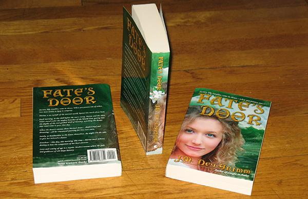
Fate's Door paperback edition

For the last 6 months, every title except one could be obtained in either format. But now Fate’s Door has joined the pack.

I keep aiming to close the gap of time that typically opens between the release of an ebook and its release in paperback. I’ve made some progress. Troll-magic was published as an ebook in December 2011, but its paperback edition didn’t arrive until December 2012.

Four of my latest books – Caught in Amber, Winter Glory, Hunting Wild, and Serpent’s Foe – were actually released with the paperback edition preceding the ebook edition by 3 days! I’d intended Fate’s Door to enjoy a similar dual release, but it was not to be. You’ll know why, if you’ve read the saga of its cover. 😀

Over the last 4 years, it seems I’ve always had one or two books that were not available as paperbacks, so it feels great to see all of them in that format today.

Fate's Door cover 300 pxSecrets, like troubles, come in threes. When you possess one of either, two more arrive to keep it company. Nerine, a sea nymph of the ancient world, knows too much about both. Love and coming of age in a mythic Mediterranean where the gods and goddesses of old shape history.

Fate’s Door as a trade paperback: Amazon I B&N I Book Depository
Fishpond I Mysterious Galaxy Books

Fate’s Door as an ebook: Amazon


Share

Sunlight as a Source of Vitamin D

Vitamin D has been in the news a fair bit lately. It’s an essential nutrient that keeps our bones strong and our immune systems functioning well. And – apparently – most modern people don’t get enough of it.

beach fun

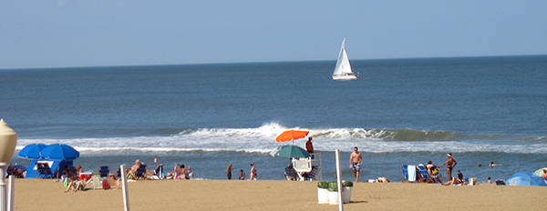
I’d read that it’s very difficult to get enough vitamin D from sunlight. Since I’ve had a melanoma (the most dangerous kind of skin cancer), I don’t dare even try to get my vitamin D from the sun. But I was curious about the claims that it is possible. And about the claims that it is not possible.

So I went hunting online to see what I could find.

First off: how much vitamin D does an adult need?

The standard these days is quoted as 5,000 IUs a day, although I also found a mention that it may not be enough. Different people at different ages metabolize D with varying efficiency. The experts seem in agreement that the only way to know for sure that you’re getting enough D is be tested for your blood levels. One study that tested D supplements found that 8,000 IU was needed to produce the correct D blood levels.

But let’s say the commonly cited 5,000 IUs is enough. How long would I need to soak up rays?

beach sun

The angle of the sun in the sky is critical to determining the answer. Human skin makes vitamin D when exposed to UVB radiation. When the sun is below 50 degrees in the sky, all of the UVB rays are filtered out by earth’s atmosphere. There are many locations where there are no UVB rays to be had for some portion of the year. Mine is one of them.

I live at latitude 38°2′ and the first day of the year when the sun reaches 50 degrees is March 15. Between 1:10 pm and 1:40 pm on March 15, UVB rays reach my patch of the planet.

The last day of the year when this happens is September 27, between 1:00 pm and 1:10 pm. Only 10 minutes!

From September 28 through March 14, there are no UVB rays and thus no vitamin D to be garnered in the garden at Casa Ney-Grimm.

How did I find out this sun angle information? The United States Naval Observatory makes a sun calculator page available at http://aa.usno.navy.mil/data/docs/AltAz.php. If you live in the US, you can just type in your city and state and the date to get the sun angles for your spot on earth. If you live elsewhere, you’ll need to know your latitude and longitude. A simple online search should produce them.

The next step in calculating my vitamin D production would ordinarily be a visit to the page created by the Norwegian Institute for Air Research. Every expert I could find referenced this page as difficult-to-use, but accurate. But I could not get the page to load. Maybe, with summer right around the corner in the northern hemisphere, too many people like me are checking their vitamin D production. 😀

(Maybe you will have more luck than I did in getting the page to load. Here is the URL: http://nadir.nilu.no/~olaeng/fastrt/VitD-ez_quartMED.html.)

I was not ready to give up, however.

beach wave

With yet more searching around, I discovered that there was a consensus that light-skinned individuals (which I am) produce 1,000 IUs after 4 minutes of UVB exposure, while wearing shorts and a t-shirt. So, to get my 5,000 daily IUs I would need 20 minutes in the sun, at a time when UVB rays were getting through the atmosphere. If I needed 8,000 IUs, then I would need 32 minutes in the sun at the right time.

I suspect this general consensus probably refers to vitamin D production when the angle of the sun is at its steepest, well over 50 degrees. Which means that the spring months and fall months, when the sun barely reaches the minimum angle, would produce considerably less than 1,000 IUs in 4 minutes. But I won’t be able to check this until I can get that Norwegian page to load for me.

There are two problems, then, with getting vitamin D from sunlight.

One: In my locality, there are no UVB rays for nearly 6 months of the year.

Two: Light-skinned individuals will start to burn after 16 minutes in the sun. If I wear sunscreen, then it will block the UVB rays, and my skin won’t make any vitamin D. If I don’t wear sunscreen, then I must get out of the sun after 16 minutes, which limits my vitamin D to 4,000 IUs.

I could strip down to a swimsuit. According to the Vitamin D Wiki, wearing shorts and a t-shirt yields 32% of the skin exposed, while a one-piece swimsuit yields 73% of the skin exposed. Doing the math, in a one-piece swimsuit, I’d make 2,281 IUs in 4 minutes. Thus, 9 minutes would get me 5,000 units. And 14 minutes would get me 8,000 IUs. Possible, in the summer.

beach sceneOf course, due to my melanoma history, I would be unwise to spend 9 – 14 minutes in the noonday sun every day. And even if I were to pursue that course, I still couldn’t get my vitamin D from sunlight from September through mid-March.

I think I must conclude that it is, indeed, not possible to get enough vitamin D from the sun. Fortunately, there is another way. But that’s another blog post. Yes, I will write it. But no promises as to when. Tally the Betrayals, my work in progress, continues to call. 😀


Share

Slow Blogging and Other Variations

Backlit keyboardSeveral years ago I read a humorous blog post by comedic mystery writer Anne R. Allen about “slow blogging.” I laughed and enjoyed it, but I was also relieved. Back in 2012, most successful bloggers were recommending that anyone who wrote a blog should post something new every day.

I’d never attempted that schedule. I knew I’d spend all my creative energy on my blog and have nothing left for writing my novels. But I worried about my choice to post something new only once a week.

Ms. Allen’s thoughts on slow blogging reassured me.

She listed eight benefits to less frequent blogging, some more serious than others, but the gist of it was that you’d probably have an active blog for many more years if you paced yourself, you wouldn’t overwhelm your blog readers, you’d enjoy it more, you’d have time and energy for writing novels, and that quality over quantity would draw an audience.

With Ms. Allen’s bolstering behind me, I carried on posting once a week, missing only a few times when a cold virus laid me low or a family emergency pulled me away.

Then, in the spring of 2015, I found myself head down in my doorstopper novel Fate’s Door. I had four other stories that I planned to publish on the same day that I released Fate, and it had been over a year since I released anything new.

I didn’t want to take any time away from the novel.

So I didn’t. My blog languished while I wrote 2,000 – 3,000 words a day of fiction. And I refused to feel guilty. Surely, when you were on a hot deadline, skipping the weekly blog post was the very essence of slow blogging.

I finished the novel at the end of July and sent it off to my first reader.

Then I returned to writing blog posts with what seemed pent up ideas and vigor. Not only did I write that week’s post, but I wrote extras to have ready when my first reader gave me her feedback and I dove back into the novel to revise it. I ended up with more than a dozen blog posts “in the bank” by the time I’d completed two revision passes on Fate, prepped all five books for release, and then clicked the publish buttons on Amazon.

I envisioned those extra blog posts as lasting through a good portion of the time it took me to get well started on my next novel. Especially since I felt moved to write a new addition to my banked posts every now and then.

We all know what happens when plans meet reality.

In my case, the retina of my left eye tore, taking me out of the writing game completely for a while. Then I discovered that my next novel required a lot more research and world building than I’d realized. And here I am, nearly 40,000 words into that novel (which feels great, btw) and every single one of those banked blog posts is up and live for you to read. 😀

(Except the one announcing the paperback edition of Fate’s Door, which (a) can’t be posted until that paperback is available – soon, and (b) probably won’t ever be posted, because I’d written of the the newly released novellas making good stocking stuffers and the new novels being great for under the tree. Yes, it was December then, while the Fate paperback will be released this June. I’ll need to draft a new announcement.)

My deadline for Tally the Betrayals is not nearly so pressing as the the one for Fate’s Door. But I’m totally immersed in the world – the Bronze Age of my North-lands – and I don’t want to take time away from Tally to research the blog posts I have swirling in the back of my mind.

Summer Landscape Telemark

I’ve already been a bit erratic in posting my last few posts, waiting until Saturday, or even the next Monday, before I clicked the “go live” button. I thought about skipping this week’s post altogether.
But then I realized I could give you all a head’s up. Tell you that I’m head down in Tally and that blog posts may be sporadic for a bit. I enjoy blogging a lot. But right now, Tally has me in its grip. 😀

ETA: In the comments below, Anne R. Allen – author of the post on slow blogging that I mention above – said: “I guess maybe it’s time I blog about blogging again.” While I was reading her blog a few days ago, I discovered that she’d made good on that promise. As usual, the post was excellent, I’ll share the link: What Should an Author Blog About?

For more about blogging from me:
Copyright Statement for My Website
Why Create a Site Map?
SPAM Deluge
New Home Page


Share

Book Cover for Fate’s Door

Last month, when I shared my step-by-step process for creating the book cover for my novel Fate’s Door, I concluded by saying that I was not quite satisfied with the gold texture that appeared in the title and byline.

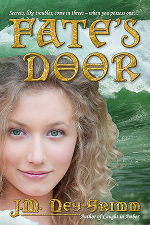
Since that post, I’ve found a texture I love. Take a look!

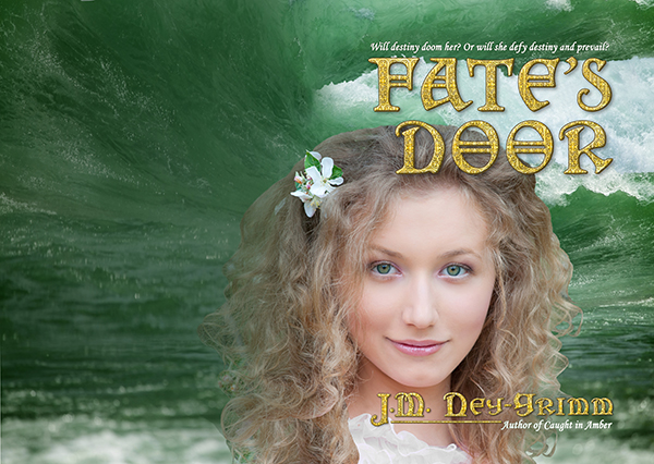
Fate ebook cover 600 px

If you’d like to see the full account of my search for the right gold, read the Edited to Add section at the very bottom of the post: Building Fate’s Cover.
Fate’s Door is available as an ebook. Amazon

Fate’s Door is available as trade paperback.
Amazon I B&N I Fishpond I Mysterious Galaxy Books


Share

Gael’s Tally Chamber in Belzetarn

The protagonist of my work in progress, Tally the Betrayals, monitors and controls the copper and tin used to forge bronze swords for the warriors that defend his home, the tower Belzetarn.

In my North-lands, mages who reach too greedily for power in their magery succumb to troll-disease. This affliction ravages their bodies and – eventually – destroys their sanity. My protagonist – Gael – is a troll, and Belzetarn is a troll stronghold.

I’m having a lot of fun telling Gael’s story!

I’ve done research on Bronze Age technologies, the mining methods used to obtain tin and copper, and the differing qualities of those metals when heated. I’ve watched videos of modern-day smiths creating authentic replicas of ancient bronze swords. I’ve watched videos of a re-enactor testing the strength and durability of one of those replicas. It was a little scary to see what that sword could do!

I’ve also done a lot of world building.

Gael’s assistant comes from Fiorish. I know what the island nation of Fiorish is like in the Steam Age of my North-lands. What was it like in the Bronze Age? What sorts of names did the people have then?

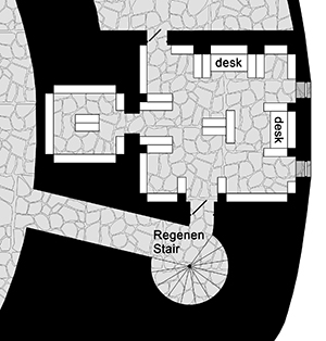
tally chamber, 300 pxI drew floor plans for the entire tower of Belzetarn, from the smithies in its foundations to its lofty top battlements. A very important place in the tower is the tally room, where my protagonist keeps his records and reconciles the tallies from the notaries working in the smithies with his own tallies of metal ingots released to the smiths for their work.

Metals, especially tin, which is rare, are very precious. Every ounce must be accounted for. 😀

Gael marks his tallies on parchments using a quill pen and ink. He stores the scrolls in pigeonhole cabinets, lining the walls of his tally room.

The tally room is located within the thick wall of the tower, about a third of the way up.

The world of Tally the Betrayals fascinates me, and you know what I do with things of that nature. I share them! I hope to post more about Belzetarn as I write, so long as I can avoid spoilers. Watch this space! 😀

For more about The Tally Master, see:
Mapping Ancient Rome onto Belzetarn
What Does the Tally Master Tally?
Map of the North-lands in the Bronze Age
The Fortress of Belzetarn
The Dark Tower
Belzetarn’s Smithies and Cellars
Belzetarn’s Formidable Entrance Gate
Belzetarn’s Treasures
Belzetarn’s Great Halls
Bronze Age Swords
Brother Kings


Share

Getting Started with a Bullet Journal

I’ve kept a journal since 1980, and I’ve used to-do lists for longer. But both of those tools have evolved considerably over time.

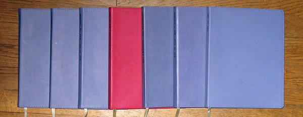
row of journals

The journal was originally a way to think about my feelings, so that I could try to make sense of them. The to-do lists were written on loose scraps of paper, with the various items being crossed off as I did them or being transferred to fresh scraps of paper when the original one grew too crowded.

Those simple systems worked, although I always had a feeling that there might be a better way. (But not one of the myriad organizers available for purchase, which were far more complex than I needed.)

My two systems started to merge about 9 years ago. I’d scribble short lists on the edges of my journal pages, drawing a box around the list to make it easier to find when I needed to refer to it. I still wrote my feelings out – a good tool – but I didn’t need to do it as often. The contents of my journal tended to be ideas for my future combined with brainstorming and notes on whatever novel I was writing at the time.

When I wanted to refer to either my plans for the future or my story notes, it was a real pain to locate the right page with the right information. Often, I couldn’t find the information at all.

bullet journal, page label, 600 px

I started labeling pages that I knew I would want to refer to again, and drawing a box around the label, so that it didn’t fade into the wall of writing.

That helped a lot. I still had to flip through the pages, and sometimes I missed the label and had to flip through repeatedly. But generally I could find what I needed.

But I wished I could find it more efficiently.

(In the image above, the ideas for the Devouring Light sequels were farther down the page. That’s why the label does not match the text. I didn’t need to label my plans for the Fate’s Door cover, because I won’t need to refer to those thoughts later. I’m working on the cover revision right now!)

Then a friend suggested I type up a table of contents whenever I filled a blank book. I liked that idea and tried it, gluing the TOC into the flyleaf of the journal.

It was awesome! I could check the TOC and flip right to the pertinent info.

Except, it was a pain numbering all 254 pages in one go. Plus I had to actually create that TOC.

I learned to number the pages as I went, but I tended to drag my feet in typing up the TOC. It was such an unappealing chore. And then I needed to make sure I hadn’t run out of rubber cement to glue the dang thing in.

I loved the results of the TOC, but I often had two journals lingering without them. And, of course, it was the more recent journals – the ones missing TOCs – that I needed to access the most.

Such was the state of things when I stumbled across the concept of a “bullet journal”- so named for the bulleted lists that appear within it.

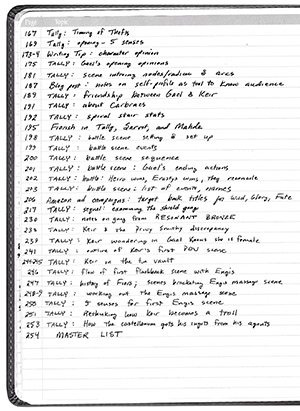
bullet journal, table of contents, 300 pxOne important element of a bullet journal is that the first few pages are left blank!

Why?

So that, as you write in your journal and realize you are writing something you’ll need to refer to again, you can write the page number (or numbers) and the topic on a line in those deliberately available first pages. You create the TOC as you go!

It seems like a perfectly obvious solution to my TOC problems, but I don’t know when (or if) I would have thought of it myself.

I jumped on it, even going so far as to type a TOC for the first 77 pages of the current journal and then add blank lines for future entries, so that I could start with the create-as-you-go TOC immediately. I didn’t want to wait until I started a fresh blank book. I’m glad I didn’t wait. It has been marvelous. I can find everything I need with no trouble, and jotting down the page number and topic is easy peasy.

The sample page above (that I scanned from my February – April, 2016 journal) has mostly entries for my novel-in-progress, Tally the Betrayals. Yes, I’m a little obsessed. 😀

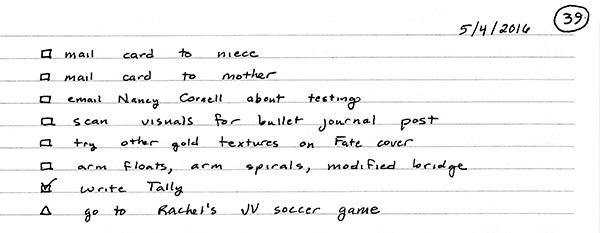
It was the method of handling the TOC that thrilled me, but I’ve found some of the other bullet journal tools to be useful as well. Instead of scribbling my to-do lists in the margins, I allow them a more generous space. But I don’t feel compelled to set them at the beginning of an entry. Nor do I create one every day.

As I read what various bloggers had to say about bullet journals, it seemed clear that their number-one feature was their customizability. Everyone recommended using only those bullet journal tools that suited you.

bullet journal, to-do list, 600 px

So I adore the TOC, and I use it. I like to-do lists on busy days, but I don’t need them on days when all I do is write.

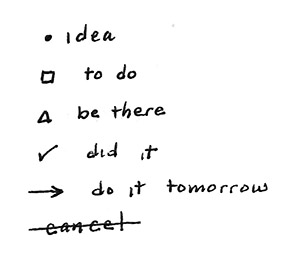
bullet journal symbols, 300 pxI like a small subset of the symbols developed for use in bullet journals. The empty box = something to do. The empty triangle = somewhere to be. The check mark means I got there or did it. A bullet = an idea, such as a new recipe I want to try. A line through an item means I decided I didn’t need (or want) to do it after all. And – my favorite – an arrow through a triangle or a box means I moved the task or the appointment to another day.

The fact is that some things are best done later or skipped altogether, and the bullet journal system plans for it. I love that! I might think I need to do laundry today, and sometimes I do. But if I’m exhausted when laundry time rolls around and everybody has clean clothes to wear tomorrow, it’s fine to push laundry until later.

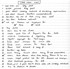
bullet journal, future list, 300 pxThe other item I find helpful is the “future list” or “master list.” This consists of tasks and ideas that I’ll need or want to do in the future, but that are not right for today. For example, I write down ideas for blog posts on my list, as well as things such as a note to purchase Jutoh (software for creating epub ebook files).

If I eventually decide I don’t want to purchase and learn Jutoh after all, I can simply draw a line through it on my “long view” list, before it ever migrates to a to-do list.

Many bullet journalers suggest putting the master list immediately after the TOC. I knew I would hate that. I allow 3 pages for my TOC. Flipping through them to get to the 4th page every time I want to check my master list would make me crazy. I put it on the very last page of the blank book. No flipping needed at all. I just open up the back cover.

Some bullet journalers create really decorative journals that rival scrapbooks. They use washi tape, draw sketches, and include photos. And I gather there are many more tools and systems than those I’ve discussed here. But simple, practical, and functional is what works for me.

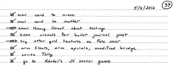
About that to-do list I shared above…?

Here it is at the end of the day: a bunch of stuff done and checked off; two items moved to tomorrow. 😀

bullet journal, checked to-do list, 600 px

The bloggers whose info on bullet journals I found most helpful:
The Art of Simple
Carrie Willard
The Lazy Genius Collective


Share

Building Fate’s Cover

Fate web cov 200Usually I don’t think about a book’s cover until I’m close to completing the manuscript, but the cover concept for Fate’s Door leaped into my mind fully formed as soon as I started writing of Nerine in the Mediterranean Sea.

I could see her so clearly on my mind’s eye, emerging from the water, with her blond hair and hazel green eyes, and a wave crashing behind her. That vision stayed with me all through the writing of the novel, and I began the search for the right photographs much earlier than usual.

After several separate tours through the Dreamstime site, I thought I’d found the right model. She looked like a sea nymph to me. Finding the right wave was even easier. I wanted one that was still rolling along part of its length, while crashing into white foam on another part.

2 The wave

I downloaded comp copies of both photos to see if they would work together the way I thought they would. And they did! I was pleased.

However, I did not immediately purchase the files and set to work on building the cover. I was still in the middle of writing the book, and it was important that I not distract myself from that task. It’s a good thing I made the prudent decision.

I remember Lois McMaster Bujold mentioning on her blog, some years ago, that a certain novel of hers remained just three chapters from the end for a good half of the book.

(Unless my memory is utterly wrong. Which it could be. I have a terrible memory.)

But Fate’s Door was like that book of Bujold’s. Once I’d written 100,000 words (roughly 300 pages), I was just 15,000 words from the end. For the next two months! At 160,000 words (roughly 400 pages), Fate’s Door had finally reached “The End.”

After I readied the manuscript for my first reader and sent it to her, I turned my attention to the cover. And decided that I didn’t like my choice of photo representing my heroine. She was too serious. Just as important, she simply wasn’t Nerine.

This same thing had happened to me when I designed the cover for Caught in Amber. I had to go photo-hunting again, and discovered exactly what I wanted among the dozen or more models I’d originally considered. That was Nerine!

1 Nerine

Once I’d purchased the right to use the photos on my cover, I downloaded the files. Then I isolated the wave from the sky over it, and clipped Nerine out from her background of tree leaves. I’ve shown the clipping required in the images above.

3 Wave on coverThe next step was building the progression of waves in my cover file. I’d already done this in the test comp file, so I followed it as a guide. The waves flowed together very nicely, creating a marvelous sense of the sea’s power. I was pleased.

The next step was to place Nerine. Again, I followed what I’d done in the comp cover, but using the newly chosen photo of a different model. I discovered that the green of the tree leaves shining through her hair was very close to the green of the sea. A stroke of pure luck!

4 Nerine on coverI carried on with placing the title and the tagline that goes above it. Next came my byline and the tagline that goes below it, as well as the underline that visually connects the descending letter “J” to the tagline “Author of Caught in Amber.”

At this stage in building a cover, I can see whether or not the design is coming together. The design for Fate’s Door was definitely coming together, but like every other cover I’ve created, some problem areas remained which would require tweaking.

The first correction I made was to place a translucent green screen over all of the water. It’s fully 70% opacity, but with the light quality set for “soft light” rather than the more usual “normal.” I did this, because I really liked the color quality of the water in my test comp, and the full resolution photograph had a darker, more blue quality. My green screen gave the water a more inviting hue and restored it to that of the comp image.

5 first conceptionHowever, the most obvious problem area was the back cover. While I really liked the scene I’d created – Nerine rising from ocean waves – the back cover was not going to provide the even color tone required for cover copy. In fact, the alternating white of sea foam and dark green of the waves would provide the very worst possible background for text.

The dark green would call for white text, while the white foam would need black text. And alternating black and white text would look awful, as well as being hard on a reader’s eyes. Something would need to be done. That something felt rather obvious to me. I’d had doubts about the layers of waves from the beginning, but been beguiled by the scene I was “painting.”

6 Adjust the backThe solution was to stretch the dark green portion of the wave to cover the entire back cover and feather it to gently transition into the foaming wave on the front cover.

Fixing the most egregious problem caused the next worst one to leap to my eye. The title was hard to read, because its first word – Fate’s – was neatly bisected by where the white foam of the frontmost wave gives way to the green of the next wave rolling in. I tried moving the frontmost wave down, so that the color change occurred between the two words of the title. The golden color showed up equally well on the two colors – white and green – so it worked, in that sense. But I didn’t like it.

I didn’t like splitting the title. And I didn’t like how the overall composition looked with the white sea foam positioned at that lower level. I decided to try something else. What if I left the sea foam essentially in place, but stretched it vertically, so that the upper edge fell near the top of the first word?

I tried it.

And I liked it. Very much.

7A Move wave

I considered Nerine’s dress. I’d already changed it from pale pink to white. I’d hoped it might look like sea foam, but it didn’t. And Nerine doesn’t wear dresses in the sea. But I had a plan. I selected a section of sea foam with the right shape, copied it, and placed it over her dress.

It needed a little stretching to make it right, but Photoshop’s warp tool is a handy thing for just these situations. The foam was a little too white, as well, since it was out from behind that “soft light” green screen that I’d placed over all the water. Another easy fix: place a similar screen over just this front portion of sea foam.

Next I poured in the back cover copy.

Still looking very good.

Now it was time for the final tweaks, mainly placing translucent screens with softly feathered edges behind some of the text. The tagline above the title got a 20% screen of wave green behind it. My byline received two screens, a hair-colored one at 30% behind “Ney-G” and a 20% wave screen behind “rimm.” I made both large enough to also fall behind “Author of Caught in Amber.”

8 final Fate cover

A few more similar screens went on the back cover behind “Wild Unicorn Books” and the price and genre. I decided to remove a small awkward piece of Nerine’s hair, where it protruded from behind the ISBN box and simply looked odd, separated from Nerine herself as it was.

My cover was nearly finished. The spine needed all three of the usual elements: title, byline, and Wild Unicorn logo. The elements themselves are simple, but I expected to have trouble with them because of the pesky flower in Nerine’s hair.

Now, I love the flower. I can just imagine it plucked from a blooming tree by a lover, and cast on the waves as a wish, to alight in Nerine’s hair as she surfaces. But its location on the spine is problematic, because it might all-to-easily interfere with the title – either crowding the title or making it hard to read by peering out from behind the letters.

This proved to be the case when I first placed the title. The flower was located behind it. Not good.

However, I usually start with the title larger than I need it, because making it smaller is always an option. Whereas, if I decide I need it larger, I must start over with the larger image again. Each time I shrink an image, some of the data is discarded. Taking the small image and enlarging it does not restore the lost data.

As I made the title smaller and smaller, I could see that it would probably fit very nicely between the top of the spine and the flower. There is even a little room (considering aesthetics) to make it smaller yet, if required. But I’ll need to see an actual physical book – the proof copy – before I decide. On my computer screen, the title looks a little crowded by the flower.

But the only place the spine will be seen is when a reader holds the trade paperback in his or her hands. And I’ve learned that the size of type on a screen appears very different from its appearance on a physical book. This post will likely go live on my blog before I’m working on the paper edition, but I’ll add a note to tell you how the title issue turns out.

Once I placed my byline on the spine, I saw that the flower was not the only constraint. The title has essentially 9 “letters” in it, when you include the space between the two words. My byline has 12 “letters.” I like the letters of title and byline to be the same size on the spine. Which meant, in this case, that the letters had to be small enough for both title and byline to fit, along with the unicorn profile which is my imprint’s logo.

All of the elements required translucent screens behind them to make them easily readable – hair-colored for most of the type and the logo, water-colored for the “E” and the “S” in “Fate’s.”

And here it is, with the spine complete. For now. 😀

9 cover spine

Edited to Add April 2016

My first reader gave me excellent feedback on Fate’s Door. I made revisions to correct the issues she found, and then sent the manuscript off to my second reader. My second reader gave me equally good feedback, and I made yet more revisions.

All in all, three-and-a-half months passed while my readers read and while I wrote revisions.

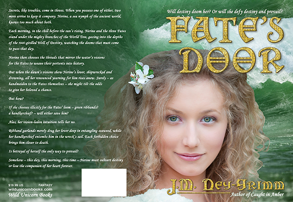
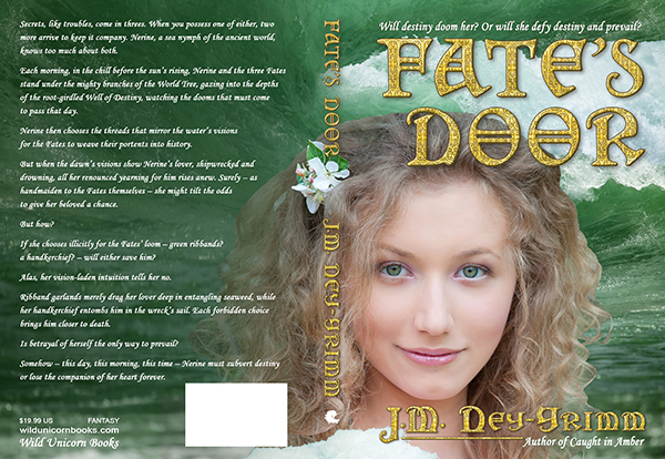
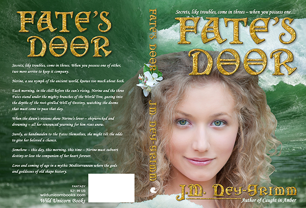
During that time, I also revised the copy that appears on the back cover of the paperback. Below is the corrected version of the cover.

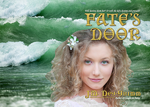
Fate's Door, final cover, 600 px

Given that the cover for the paperback is complete, where – you may be wondering – is said paperback? Why can it not be ordered on Amazon or anywhere else?

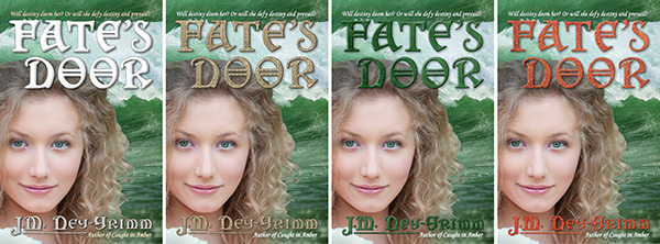
Here’s my problem: the metallic gold title looks good at full size on the paperback. But it’s not quite right at thumbnail size on a website page. I’ve tried many variations to see if I could improve it: metallic brass, jade green, copper orange, and more. All of the variants looked worse than the metallic gold. Much worse.

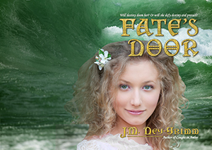
Fate's Door, cover variations

I’m not quite ready to throw in the towel and go with the gold filigree.

And thus the paperback still waits on my hope that I can figure out a solution to my title quandary. Cross your fingers for me – and for my readers who prefer paper to digital – that I dream up my solution soon! 😀

Edited to Add May 2016

In the comments below, my friend Alicia suggested that I try a different gold texture for the title treatment. Her suggestion stuck with me all week after I read it. I’d already tried five alternate gold textures, and none of them worked. But I had a feeling she was onto something.

I searched for yet more gold patterns and found half a dozen possibilities. None of them worked either, but I still felt that Alicia was right. I took a week’s break and then searched again. This time I found one, but I hoped it just might be the one.

When I tried it…I liked it! A lot! Alicia was right when she said, “You’ll know the minute you find the right combination…”

Thank you, Alicia! I doubt I would have persevered so long and so successfully without your suggestion and your encouragement.

Fate tapestry cover

I saw one more problem after I created the new title treatment. It’s a little crazy that I hadn’t noticed it sooner. I did my first work on the cover when I was still writing the book’s manuscript draft, and when I returned to the cover (many months later) I’d forgotten that the tag line above the title was originally a placeholder.

I’m still shaking my head at myself. Really, J.M.? Really?!

Alas, really. It’s fixed now. 😀

Secrets, like troubles, come in threes – when you possess one…

Fate’s Door is available as an ebook. Amazon

Fate’s Door is available as trade paperback.
Amazon I B&N I Fishpond I Mysterious Galaxy Books

For more cover builds, see:
Building Wild’s Cover
Building Glory’s Cover
Cover Creation: Perilous Chance


Share