 I’m imagining that some of you might say: “That J.M. Ney-Grimm! She has too much fun creating the covers for her books.” And you’d be quite right. It even seems a trifle unreasonable to me that I enjoy cover design as much as I do.
Not only do I love designing covers, I also like showing you how I did it. Today I’m going to pull back the curtain on the creation of the cover for Serpent’s Foe.
I found art that I adored long before I needed it, so I posted the art on the story’s “coming soon” page on my website. I wasn’t sure I’d be able to make it work on a cover, because the art has no space for the book title near the top. And the image at the bottom is too variegated for my byline to show well there.
 When it was time for me to decide what I would do, I searched for another alternative. One that wouldn’t require as much Photoshop “painting” as I guessed this image would need. But I couldn’t find anything I liked better. Probably because I liked this image so very much.
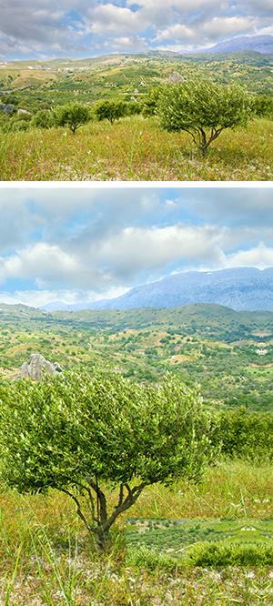
So I committed to the painting “Egypt Personified” by Farid Fidel and started thinking about how I could make it work. The first thing to do was find a photo of clouds and sky that matched the clouds and sky in the painting. There must be a bajillion such photos, and with so many to choose from, I was able to find one that looked really close.
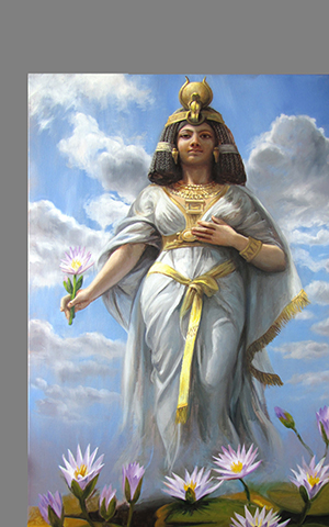 To begin, I placed “Egypt Personified” into my file. As you can see, when room is made for a title, there’s a lot of space that needs art behind it and doesn’t have it. The next step was to place the clouds-and-sky photo behind the painting. The edge between the photo and the painting was very sharp, as I expected. I had a lot of Photoshop work to do, so I dove into it.
The sky in the photo is a more yellow blue than the sky in the painting, and it’s a harder, more saturated hue. The clouds in the photo are also yellower than the clouds in the painting.
I color corrected the photo’s sky, shifting the blue away from yellow and toward magenta, also desaturating it to get a softer blue. That helped the clouds match better as well, but I needed to pump up the brightness to get the clouds fully white.
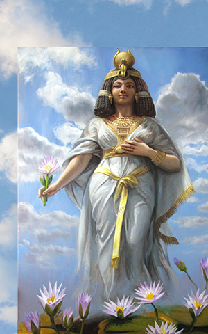 Once the colors matched fairly well, I stretched the photo to get its clouds close to where there were clouds in the painting.
Then I put copies of both stretched photo and painting on the same layer in my Photoshop file, so that I could start obscuring that edge by “painting” over it and blending the areas of the two images that were close to one another.
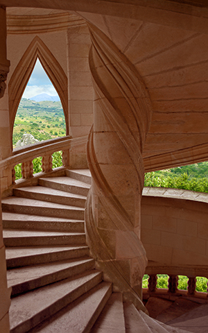
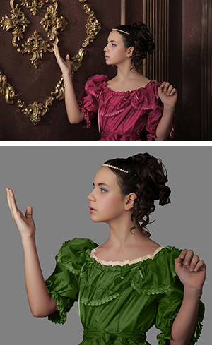
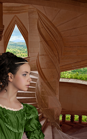
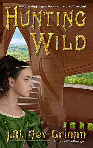
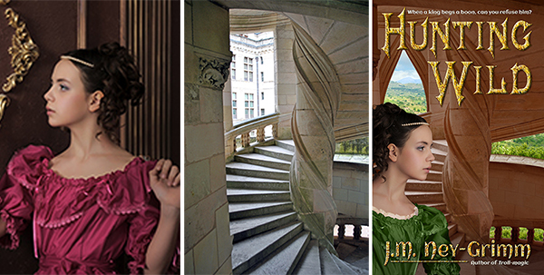
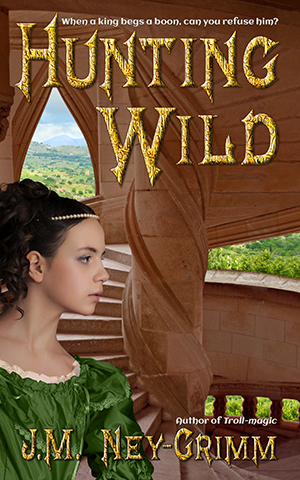
I’ve gotten a lot of practice at this sort of “painting” lately. (Yes, I’m grinning and thinking of the cover for Hunting Wild.) Because of all that practice, this sky “painting” felt fairly straight forward.
I’d paint a bit with the screen magnifying that portion so I could see exactly what I was doing. Then I’d zoom out to see what the whole looked like. And then I’d zoom in to do some more. Back and forth until, several hours later, I’d gotten it all done, and I was satisfied with the result.
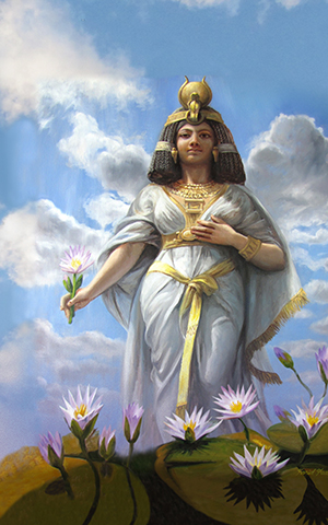 The sky wasn’t the only item that needed adjustment. I tried my byline against the bottom of the painting, hoping it might work. Not only was it impossible to read, but it was hard on the eyes.
Potential readers would be clicking away from the web page with my book on it just to save their eyes from the “ouch” that my byline generated – half on the water lilies and half on Egypt’s gown.
Once more I set to work. This time I selected the lilies and pasted them into another layer where I could expand them. Egypt would be up to her knees in lilies, rather than just ankle deep.
I created a lavender mist to match the one rising off the Nile River in the painting. And I added a translucent shadow across the lily leaves to make a better background for my byline.
Since I’d already created the byline, and seen that it needed a different background than the one originally there, I made it invisible while I “painted,” but clicked it visible to check my progress.
Had I placed the higher lilies in the right place? Was the translucent shadow in the right place? Was it deep enough? Again, there was a lot of back and forth, zoom in, zoom out.
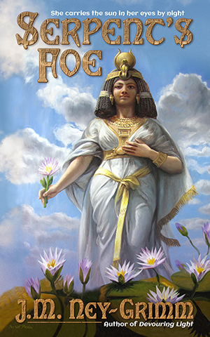 Finally, the blended images blended well enough to seem all of one piece. And then I was nearly done.
When I first placed the painting in my file, I’d done a mock-up of the title to be sure Egypt was standing in the right place. But now it was time to finalize the title.
I wanted it to pick up the different shades of gold in the painting and to harmonize with Egypt’s skin, so I color corrected the title, deepening its hue, saturating it, and reducing its brightness.
It still didn’t pop as much as I wanted it to, so I painted over one of the clouds (in the photo part of the image) with blue sky. That was much better, but still not quite there. I added a translucent blue shadow behind the title, and then I was satisfied. The cover for Serpent’s Foe was complete!
For more cover builds:
Cover Creation: Perilous Chance
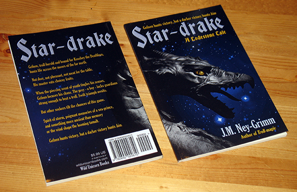
Building Star-drake’s Cover
Cover Makeovers
For the principles of cover design:
Cover Design Primer




 Directions