Back Cover Design: Hunting Wild

Hunting Wild back cover
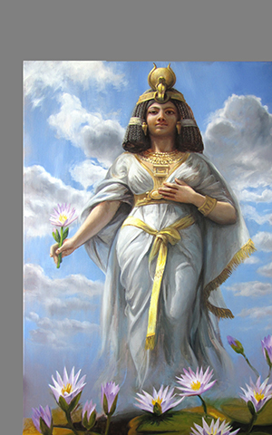
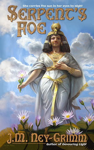
The front cover gets all the love!

I’ve seen a lot of information about designing the front cover for a book, but only a little about the back cover. There’s a reason for that, of course. The front cover sells the book. It catches the eye of a prospective reader and encourages him or her to look inside.

Ebooks don’t even have back covers. And, until recently, none of the online bookstores ever showed the back cover of a paper book. If you wanted to see the back cover, you had to walk into a brick and mortar store. (Or wait until your purchased paperback arrived on your doorstep.)

But any book that has a paper edition needs a back cover for it. That back cover must be attractive and harmonize with the front cover. It needs to have sizzle, as well as the “steak” of the back cover copy. And it needs to have certain information, such as the bar code, the publisher, maybe the price.

I thought it might be interesting if I shared some of my experiences with back covers.

The first thing I learned was that when I create the front cover for the ebook and wait until I start building the paperback to design the back cover, it’s much harder! I did the covers for Troll-magic and Sarvet’s Wanderyar in this piecemeal way. I got them to work, but…hoo boy!

All the books that came after, I created the paperback cover first and simply used the right half for the front cover of the ebook.

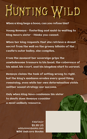
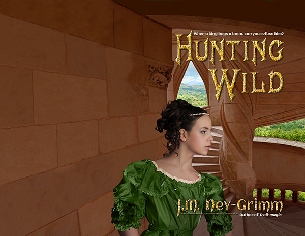
Let me show what the paperback cover of Hunting Wild looked like when I was ready to start finalizing the back cover.

Hunting Wild back cover

One of the things that you’ll notice in the image above is that it’s a whole lot bigger than it needs to be. There are two reasons for that.

1) It has an extra half inch all the way around the edge. That’s because I’ve learned from experience that it is infinitely easier to chop off unneeded edges than it is to add more later if it turns out you miscalculated and need the art a little taller or a little wider. I give myself plenty of wiggle room.

You need only a one-eighth inch bleed when you upload the cover file to CreateSpace. But I have found that when I paste my TIFF file into my InDesign file – I do covers in InDesign – the margins sometime get funky and weird. There have been several times I’ve been very glad of my extra margin.

2) Because I am creating the paperback cover before I create the paperback interior, I don’t know exactly how many pages the book will be. Which means I cannot calculate the precise width of the spine. So I allow an extra inch on the far left of my image, in order to have enough image to go from the bleed on the far right all the way across the front, then around the spine, then across the back, and finish beyond the leftmost bleed.

For Hunting Wild, I had planned to purchase a photo of a stone wall to use as a continuation of the wall coming off the stair tower on the front. However, when I tried a mock-up using a watermarked comp image, I didn’t like the result.

So I decided to “paint” that wall extension by copying and pasting the stone blocks (and smoothing the joins) from the left edge of the stair tower photo. I was very pleased with how that worked. It looks natural to my eye, and it makes a good, even background for the back cover text.

Hunting Wild back with text

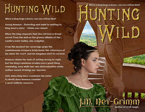
I’ve cropped the cover image above, to the approximate size it will be on the paperback, using an estimate of the spine width. It is easy to move the text and the title on the back cover from side to side. So I will place it more exactly when I know the precise spine width.

My second reader is still reading and generating feedback for Hunting Wild, so I have another round of revisions on the book before I can send it to my proofreader. When I get it back from my proofreader, I will start formatting it for both the ebook edition and the paperback edition.

Only when I have the precise spine width will I place the white box needed for the bar code, as well as placing text indicating my publishing imprint (Wild Unicorn Books), the genre (fantasy), and the price (which is determined by the page count).

I’ll also wait to place the title and my byline on the spine.

There are a lot of elements that must go on the back cover, and it’s important to use some of the same design principles that go into designing the front cover: alignment, grouping, and type fonts that match those used on the front.

I’ll be posting more about back covers. Until then, here’s the link to my Cover Design Primer, so you can bone up on those design principles. 😉

And, if you missed it, here’s the post about designing the front cover for Hunting Wild.


Share

Building Foe’s Cover

Egypt 300 pxI’m imagining that some of you might say: “That J.M. Ney-Grimm! She has too much fun creating the covers for her books.” And you’d be quite right. It even seems a trifle unreasonable to me that I enjoy cover design as much as I do.

Not only do I love designing covers, I also like showing you how I did it. Today I’m going to pull back the curtain on the creation of the cover for Serpent’s Foe.

I found art that I adored long before I needed it, so I posted the art on the story’s “coming soon” page on my website. I wasn’t sure I’d be able to make it work on a cover, because the art has no space for the book title near the top. And the image at the bottom is too variegated for my byline to show well there.

sky 300 pxWhen it was time for me to decide what I would do, I searched for another alternative. One that wouldn’t require as much Photoshop “painting” as I guessed this image would need. But I couldn’t find anything I liked better. Probably because I liked this image so very much.

So I committed to the painting “Egypt Personified” by Farid Fidel and started thinking about how I could make it work. The first thing to do was find a photo of clouds and sky that matched the clouds and sky in the painting. There must be a bajillion such photos, and with so many to choose from, I was able to find one that looked really close.

a lot of empty spaceTo begin, I placed “Egypt Personified” into my file. As you can see, when room is made for a title, there’s a lot of space that needs art behind it and doesn’t have it. The next step was to place the clouds-and-sky photo behind the painting. The edge between the photo and the painting was very sharp, as I expected. I had a lot of Photoshop work to do, so I dove into it.

The sky in the photo is a more yellow blue than the sky in the painting, and it’s a harder, more saturated hue. The clouds in the photo are also yellower than the clouds in the painting.

I color corrected the photo’s sky, shifting the blue away from yellow and toward magenta, also desaturating it to get a softer blue. That helped the clouds match better as well, but I needed to pump up the brightness to get the clouds fully white.

Egypt w-rough skyOnce the colors matched fairly well, I stretched the photo to get its clouds close to where there were clouds in the painting.

Then I put copies of both stretched photo and painting on the same layer in my Photoshop file, so that I could start obscuring that edge by “painting” over it and blending the areas of the two images that were close to one another.

I’ve gotten a lot of practice at this sort of “painting” lately. (Yes, I’m grinning and thinking of the cover for Hunting Wild.) Because of all that practice, this sky “painting” felt fairly straight forward.

I’d paint a bit with the screen magnifying that portion so I could see exactly what I was doing. Then I’d zoom out to see what the whole looked like. And then I’d zoom in to do some more. Back and forth until, several hours later, I’d gotten it all done, and I was satisfied with the result.

Egypt art readyThe sky wasn’t the only item that needed adjustment. I tried my byline against the bottom of the painting, hoping it might work. Not only was it impossible to read, but it was hard on the eyes.

Potential readers would be clicking away from the web page with my book on it just to save their eyes from the “ouch” that my byline generated – half on the water lilies and half on Egypt’s gown.

Once more I set to work. This time I selected the lilies and pasted them into another layer where I could expand them. Egypt would be up to her knees in lilies, rather than just ankle deep.

I created a lavender mist to match the one rising off the Nile River in the painting. And I added a translucent shadow across the lily leaves to make a better background for my byline.

Since I’d already created the byline, and seen that it needed a different background than the one originally there, I made it invisible while I “painted,” but clicked it visible to check my progress.

Had I placed the higher lilies in the right place? Was the translucent shadow in the right place? Was it deep enough? Again, there was a lot of back and forth, zoom in, zoom out.

Serpent feature cover 300Finally, the blended images blended well enough to seem all of one piece. And then I was nearly done.

When I first placed the painting in my file, I’d done a mock-up of the title to be sure Egypt was standing in the right place. But now it was time to finalize the title.

I wanted it to pick up the different shades of gold in the painting and to harmonize with Egypt’s skin, so I color corrected the title, deepening its hue, saturating it, and reducing its brightness.

It still didn’t pop as much as I wanted it to, so I painted over one of the clouds (in the photo part of the image) with blue sky. That was much better, but still not quite there. I added a translucent blue shadow behind the title, and then I was satisfied. The cover for Serpent’s Foe was complete!

For more cover builds:
Cover Creation: Perilous Chance
Building Star-drake’s Cover
Cover Makeovers

For the principles of cover design:
Cover Design Primer


Share

Cover Preview: Serpent’s Foe

200x300For those of you who just couldn’t wait to read Serpent’s Foe, there’s Quantum Zoo. My story is the very last one in the anthology. Plus you get 11 other sci-fi and fantasy stories by some superb indie storytellers. It’s a great deal!

But for those readers who want their Ney-Grimm stories straight up and undiluted (wink), Serpent’s Foe will be releasing solo in the late summer.

I’ve been writing a lot over the last few weeks, but I’ve also been getting several finished stories ready for their upcoming release. Serpent’s Foe is among them, and I’d like to show you the cover. I’m super pleased with it.

Serpent feature cover 300Here’s a little bit about the story.

A lioness of ancient Egypt lies caged in a dim underground menagerie. She possesses unique powers and freedoms. Yet – inexplicably – these gifts elude her in her captivity.

Tormented by confusion and her own fury, she longs to regain her memory of who she is and all that rightfully belongs to her.

The mysterious enemy who holds her prisoner – a god of chaos and destruction – has seized a moment in history to throw down Egypt’s traditional protectors and cast her people into war.

The lioness must confront both the serpentine god of chaos and the wrongs of her own heart. Within that crucible of revelation lie the keys to her escape.

If she fails the test, the Egyptian people relying on her protection must submit to the rule of cruel foreign invaders, while she herself suffers eternal anguish.

Coming soon!


Share