Locked in Mortal Combat

Today was supposed to feature an “inquiring mind” post. Not only that; I’d planned to tell you about my favorite non-fiction read.

But I’ve been wrestling with InDesign, the go-to application for designing print books. Wrestling with the electrons on my computer and, because I’m losing, wrestling in spirit and in heart. InDesign – thus far – has trounced me, toppled me, stomped and stumped me, and kicked me to the curb.

I hope to rise from my ashes.

In the meantime . . . draw close, my readers, and I shall tell of my midnight tussle and abrupt defeat! (That is, today’s blog is a “behind the scenes” post.)

First, a little background. I used to design books in PageMaker. I liked Pagemaker. It was straightforward, moved type and images around the way I wanted, and, in the immortal words describing Bilbo Baggins before his adventure, “never did anything unexpected.”

But PageMaker wasn’t so handy for designing book covers. In the fullness of time, another computer application arrived on the scene to handle color and permit the complicated wrapping of text around illustrations. I learned Quark. It never became so intuitive as Pagemaker (for me), but I could make it do what I needed.

Fast forward 20 years. InDesign is the book designer’s app and has been for some while, but this is my first time using it. I’ve heard it is remarkably similar to PageMaker. If you know the one, you know the other. Or can figure it out.

Well, okay then!
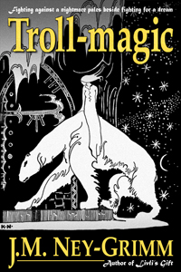
Kay Nielsen art depicting a lassie aback a north-bearI dive in, eager to turn the ebook Troll-magic into an ink-on-paper book. Trusting in InDesign’s kindly reputation, I don’t even bother to acquire a copy of InDesign For Dummies or some such title.

Mistake!

When I attempt to place the text of my story, InDesign cannot see my OpenOffice (Oo3) file where the text resides. I check the Adobe online help page.

Ah! Save the Oo3 file as a Word file and I’ll be good to go.

I do it, and now I can place the text. But, oh, what ugly ugly print! Some of it is tiny at 4 points, and some of it is huge at 18 points. Some of it overlaps, and some has 4 inches between lines. Plus all the italics – which my story uses to indicate thought versus the spoken word – have disappeared.

I return to the help page.

This time I save my Oo3 file in rich text format. This will – I’m told – retain things like type size and spacing. And italics.

W-e-l-l. It does look better than the Word file version, but all of the italics remain missing.

Hmm. What to do?

I decide that this is as good as it gets and wade in. Three days and 626 pages later, I have a book! Or the computer file for a book. (And, yes, I neglected my family: those were 16-hour days. Mea culpa!)

But the book is beautiful! Each page begins and ends cleanly, features lovely Palatino type plus elegant embellishments between scenes. I am thrilled. (Although my thrill has one buzzing and annoying fly: my InDesign file tells me it cannot find the font I’m using for those embellishments. But I feel sure I’ll sort it out.)

Flush with success, I decide to do a little tidying. Let’s sweep that useless Word file and the rich text format file into a folder along with the original Oo3 one.

Alas! There is the moment of my downfall.

Back in my PageMaker days, the illustrations in a book were not actually inside the PageMaker file. When I sent a book to the printer, I sent the PageMaker file and the TIFF files that were the illustrations. There was a link between the Pagemaker file and each of the TIFF files.

Now, in that era, the tidying of files also occurred. And the links were broken. Reforging them was not really a problem. I just had to be sure I did it (with the click of a few buttons) before sending the file to press.

But the text of the book was actually inside the PageMaker file itself. No links. The original Word file became an archived irrelevancy.

Not so for InDesign!

When my InDesign file and my rich text format file parted ways to different folders, I broke the essential link between them. (Apparently.) And restoring it was . . . well, it seemed simple until I looked at what I had wrought.

All my formatting had disappeared.

The paragraphs had lost their indents. The chapter headings looked just like the rest of the text, not big and bold. The page breaks, carefully crafted, were no longer present. And all the italics, lovingly reapplied word by word by word, were gone.

If I were the crying sort, I’d have sobbed. As it was, I merely sat stunned. Then closed the file without saving.

Is there a way to restore what I have lost?

Must I begin again from the foundations?

I don’t have those answers, but I do have a vision: the vision of the beautiful book I’d created before the tidying impulse took me. Rest assured, I will bring that vision to paper and ink, whether it can be done easily or only after great labor! Rise, my phoenix, oh rise!

Share

Creating Livli’s Cover

I want to take you with me as I build a book cover. It’ll be fun and interesting, so let’s go! My second novel, Livli’s Gift, will be released soon; watch as I put together its cover.

from art to complete coverThe first step is selecting art. I could commission an artist to create something new. But my North-lands were inspired by the folk tales in the collection East of the Sun and West of the Moon, and I adore the work of Kay Nielsen (who illustrated the stories). So I choose one of his pieces. It was published in 1914 and is in the public domain. It depicts a queen tending two magical plants under cloches in her garden and fits well with the events in Livli’s Gift, as you’ll see when you read it.

I’m not expert at working the scanner, so the color balance of the scanned art is wrong. Luckily I know my way around Photoshop well enough to fix the problem. I bring the art back to black and white, then drop the image into my cover file.


I leave room under the art for my name and an author tagline, but the area needs to be something other than a rectangle of paleness. This piece of art calls for a dark foundation, so I fill it with black. I also remove the black frame line at the top of the art, creating a smooth expanse for the title.


I know I want the color of the title to match the color of the author name: a bright blue. I’ll need a dark ground for the title to show well, so I create a translucent shadow at the top of the cover.


I type in the the title and the author. The J.M. Ney-Grimm looks great (grin!), but the title is not “popping” enough.


I add a drop shadow behind the letters of the title. That’s better! All that remains to be done is type in the title tagline and the author tagline.


:: Typing, typing, typing ::


And there we have it: Livli’s Gift.

 
Note: The design shown here was created for the first edition of Livli’s Gift. The second edition possesses a different cover.

More posts about book covers:
Eyes Glaze Over? Never!
Building Star-drake’s Cover
Choosing a Tagline Font


Share

Grass Green

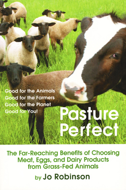
cover of the book Pasture PerfectJo Robinson’s Pasture Perfect is an accessible, entertaining introduction to the concepts underpinning “grassfarming.” She starts with an amusing anecdote from her first talk given in front of 500 ranchers. At the close of her presentation, before the questions, she announced that she’d put together a little book titled Why Grassfed Is Best! (the precursor to Pasture Perfect). The auditorium emptied rapidly. She carried on, answering questions gamely, and wondering. Did her audience want to be first in line at the buffet dinner? Nope.

There’d been a stampede on the table where her little book was stacked for sale. Literally. Impatient with a line of 50-plus, ranchers began grabbing books, tossing their money down, making their own change. They were that eager for her information. And she’d not brought enough books!

Ms. Robinson takes us on a tour of a pasture-based farm. The air smells of grass and green. A ring of habitat for wildlife encircles the fields. The grass is lush and mixed with clover, alfalfa, and wild plants. The cattle are peaceful, moving slowly within their generous enclosure. Chickens share the paddock. It’s a pleasant spot, nourishing to the animals, welcoming to humans.

Then the author gets down to the nitty gritty: the health benefits of grass-fed meats.

Less fat. Animals eating grain get fat. Grass-fed meat has the same amount of fat as wild game or chicken breast without skin.

Fewer calories. If you eat a 6-ounce beef loin from a grass-fed cow, you’ll consume 92 fewer calories than if you eat one from a feedlot cow. That adds up over time.

More omega-3’s. People low on omega-3’s are more vulnerable to cancer, depression, obesity, diabetes, arthritis, asthma, and dementia. Grass-fed meats have 2 to 10 times more omega-3’s than feedlot meats.

Omega-3’s and omega-6’s in balance. Both these fatty acids are essential, but we need the right blend. Omega-6’s encourage blood to clot. Omega-3’s cause it to flow easily and smoothly. What’s the right ratio of 6’s to 3’s? There’s some debate about it. Probably no more than 4:1, possibly as low as 1:1. Grass-fed beef has ratios between 1:1 and 3:1. Feedlot beef ranges from 5:1 to 14:1. ‘Nuff said!

Conjugated linoleic acid (CLA). The research is preliminary, but CLA may help us resist cancer and heart disease. Grass-fed ruminants have 2 to 5 times as much CLA in their meat as feedlot ruminants.

Vitamin E. It’s an important anti-oxidant, protecting us from free radicals, boosting immunity, preventing heart disease. Grass-fed beef has 3 to 6 times more than feedlot beef.

Carotenoids. Fresh pasture provides hundreds of times more of these anti-oxidants than does feedlot mush, with the result that beta carotene and other carotenoids show up in quantity in grass-fed meat. The benefits of eating carotenoids include lower risk of cataracts and macular degeneration (a leading cause of blindness).

Ms. Robinson also gives us the scoop on milk and eggs.

The milk from grazing cows has 5 times the CLA of conventionally fed dairy cows. The ratio of omega-6’s to omega-3’s is 1:1. The levels of beta carotene, vitamin A, and vitamin E are all much higher.

The eggs from pasture-raised chickens (who eat grass, wild greens, and insects) show similar benefits. A ratio of 6’s to 3’s of 1:1, instead of 20:1. More vitamin A. But you don’t need a chemistry set to analyze the health of an egg. Conventional eggs have lemony pale yolks, while those from pastured hens show a deep, orangey yellow.

Best of all: pastured meat, milk, and eggs just taste better. The New York Times food editors reported free-range poultry as “flavorful and juicy” and that it “had a tender but meaty texture.”

Corby Krummer in The Atlantic Monthly said, “Grass-fed beef tastes better than corn-fed beef; meatier, purer, far less fatty.”

And Sam Guigino in Wine Spectator declares a grass-based strip steak “delicious, rich and full-flavored.”

The last chapter in Pasture Perfect tells us how and where to acquire these healthy and delicious pasture-raised foods. And 60 pages of recipes cap things off.

This was a life-changer for me. The nutritional differences between feedlot meat and grass-fed meat are not trivial. Good health versus poor may well lie in the balance. I had already connected with a local dairy farmer. I wanted nourishing milk for my 2-year-old twins! Now it was time to locate healthy meat and healthy eggs.

I’m lucky, because Virginia has a long tradition of family farms. My region is a focal point for the growing movement toward local food. Once I opened my eyes, there were dozens of neighboring farms that could supply my table. Like some of the people quoted in Pasture Perfect, I’m a bit spoiled now. Conventionally raised just doesn’t taste right!

Pasture Perfect at Amazon

Pasture Perfect at B&N

For more about nutrition, see:
Test first, then conclude!
Yogurt & Kefir & Koumiss, Oh My!

For more on green living, see:
Permaculture Gardening
Running Mushrooms
Going Up in Smoke?


Share

Great Soap & Etcetera Quest

hieroglyph of amcient EgyptQueens of ancient Egypt outlined their eyes with kohl made from sulfide of antimony. Roman matrons rouged their cheeks with cinnabar, red mercury. Elizabethan nobles painted their faces with white lead. Victorian women swallowed arsenic to improve their complexions and drops of belladonna to dilate their eyes.

Learning these facts as a child, I developed considerable scorn for cultures of the past and their use of poisonous substances in the quest for personal beauty and hygiene. “Of course, they didn’t know any better,” I reminded myself.

Who would have dreamed that my attitude would reverse itself? At least the kohl worn by all the Egyptians who were not queens – made with lead sulfide, instead of antimony – actually protected them from eye infections. While modern concoctions . . . are not nearly so safe as we imagine. And we do know better!

Where did my change of attitude start? Strangely, with the flap about bisphenol A. My children were very young at the time, and we had plastics galore in our household. Little ones drop so many things. Surely plastic was safer than risking tender feet cut by broken glass. Well, it wasn’t; not if the plastic contained BPA, or maybe even if it didn’t. I read up on plastic and discovered that the reason it flexes the way it does is because each molecule of plastic physically slides past the others. And in the sliding process, some of the molecules are shed like skin flakes. When we eat foods stored in plastic, we eat a little of the plastic along with the food. Hmm.

I replaced all the plastic juice glasses with glass mugs. (The handles would help small fingers keep a grip.) Our tupperware and rubbermaid received the ax likewise. Canning jars and a few Pyrex containers worked just fine for storing cheese, homemade yogurt, and leftovers. Bed, Bath & Beyond even carried some inexpensive glass pitchers (with covers) for tea and milk. Good. We were set.

Except then I got to wondering . . . what else do I take for granted as safe when it isn’t? What about soap and shampoo and chapstick?

My first forays into research turned up cause for concern, but not much solid information. I decided to try the “organic” products carried by the local health food store. That was a disaster. The soap dried my skin and irritated it. The lotions were no better at moisturizing those dry hands than were conventional ones – that is, no good. And the shampoos resulted in a scalp that actually bled. Hmm again.

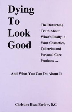
cover image of book about the dangers of conventional toiletriesI returned to conventional products, while I did more thinking. Not much in the way of solutions came to me . . . but, eventually, I stumbled upon a little lilac-colored book: Dying to Look Good by Christine Hoza Farlow. It was still thinner on specific solutions than I wanted, but it sure gave me motivation to try again. My conventional soaps, shampoos, and lip balm were chemical cocktails of carcinogens. And the health food store versions were often little better. They just used a different chemical cocktail!

Besides providing motivation, the book also led me to the Environmental Working Group and their Skin Deep cosmetics database. I was skeptical at first. I’d already been burned by the health food stores. Would this be any better?

It was.

The database lists every single ingredient in each product it includes, and it includes a lot of products, some with ingredient lists so simple that the words are all in English, utterly bare of incomprehensible chemical terms. Those were the products I decided to try.

And I got lucky.

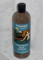
photo of Terressentials hair washTerressentials’ hair wash, made with bentonite clay, was a beautiful thing for my hair and scalp. I’ve always had a twitchy scalp, prone to take offense at the slightest slight and throw out a patch of eczema. Apparently, the vast majority of shampoos – conventional and alternative – have ingredients that were causing my eczema. My longtime favorite also had ingredients that relieved it. But that’s crazy! To have irritant and remedy bundled together. My scalp has been calm over the last two years, ever since I slathered it in coconut oil (to soothe the damage done by the earlier experiments) and adopted the clay hair wash. (It’s not soap, and it doesn’t foam, but it does clean.)

photo of Bubble & Bee lip balmsTerressentials’ lip balm was another success, although it gets a little melty in the summer. But Bubble & Bee’s lip balm tends to be too stiffly solid in the winter. So I use both, the stiff one in hot weather, the melty one in cold.

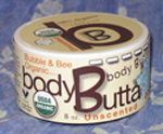
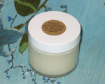
photo of Bubble & Bee's body butterBubble & Bee’s body butter became the first lotion to ever have a lasting effect on dry scaliness of my feet (sorry for the TMI), and it’s pretty nice on hands, elbows, and knees too. Soft, properly moist skin is the result.

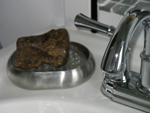
photo of African alata soap by SheAyurvedicsPure castile soap from the Blue Ridge Soap Shed doesn’t undo all the good work of that body butter. And, hey, it’s local too! It’s become my husband’s favorite soap, but I prefer something even more moisturizing: African Alata soap by SheAyurvedics. They’re both good. (ETA 2015: SheAyurvedics appears to have gone out of business, alas.)

photo of Bubble & Bee deodorantI’d had adventures with deodorants and anti-perspirants several decades ago and was leery of re-opening that can of worms. But my success with all the other toiletries, and especially with shampoo (the most unpleasant of all my cosmetic adventures) gave me courage to try again. I ordered up Bubble & Bee’s lemongrass deodorant. That proved a little too lemony for my taste, but it certainly did a fine job without irritating my skin. My husband had decided on their super pit putty, and we ended by swapping. He liked mine better, I liked his. Just recently I decided to branch out a little and purchased some lime geranium. Now my only difficulty is that I can’t decide which I like best. Both smell so nice! It’s a good problem to have.

Two toiletries still remain begging solutions.

I hadn’t used soap on my face for years, but the gentle cleanser resting beside the bathroom sink contained questionable ingredients. My problem: nearly all the alternatives have actual soap in them. And even a mild soap is too strong for my face. The one soap-free alternative I could find also has a questionable ingredient in it: grapefruit seed extract. The extract itself is harmless, but unless it is supplied by Nutribiotics, it may be contaminated by triclosan and methyl paraben or benzethonium chloride (all big baddies).

Since the main ingredient of my one alternative was vegetable glycerin, I decided to buy that one ingredient straight up and try it. I’m finding it acceptable, but still not quite right. I’ll probably start the quest again at some point. Just not yet!

Toothpaste is my other wild child. I’m currently using one of the SLS-free Tom’s of Maine formulations, but I’m not keen on its plastic container! I’ve tried homemade: arrowroot powder mixed with a few drops of food grade mint extract. That actually was very satisfactory, but messy. I may go back to it, now that my children are older. They can handle messy these days!

So why am I telling you all these rather personal details? (Too much information, with a vengeance!) Mainly because I really wanted to find a blog post just like this 3 years ago when I embarked on my great toiletries quest. I would have been spared a bleeding scalp and a lot of aggravation. Since I didn’t find this blog post (paradoxical time travel, anyone?), I’m creating it in the hope of sparing you irritation and aggravation! Luck!

UPDATE April 2015: I discovered a mild facial cleanser that works for me – Nourish Organic Moisturizing Cream Hand Wash – and blogged about it here. I’m currently using JASON toothpaste. The tube is made of plastic (alas), but I feel confidant of the ingredients in the paste.

Dying to Look Good at Amazon

Dying to Look Good at B&N

Hair Wash at Terressentials

Lip Balm at Terressentials

Lip Balm at Bubble&Bee

Body Butter at Bubble&Bee

Deodorant at Bubble&Bee

Castile Soap at the Blue Ridge Soap Shed

For more about safe and effective toiletries, see:
Hair Wash with Rhassoul Clay
Why Add a Lemon Rinse
Facial Soap Eureka

For more on green living, see:
Bandanna Gift Wrap
Waste-Free Lunch
Green Housekeeping


Share