Why Revise a Book’s Cover?

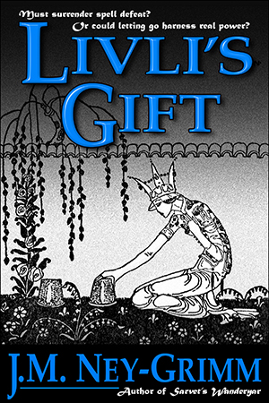
original cover for Livli's GiftI love the illustrations done by Kay Nielsen for the collection of Norse folk tales East of the Sun and West of the Moon. His work inspired the North-lands in which so many of my stories take place. And his drawings appear on the covers of several of my books.

The cover for Livli’s Gift features an illustration of the gardening queen in the folk tale “Prince Lindworm,” a story that is mentioned as part of the folk lore in my novel.

I still love the cover I originally created, but I felt some qualms about it after I submitted it to Joel Friedlander’s monthly cover design contest in March 2014. Joel found the design depressing. I didn’t agree with him at the time, but his opinion introduced a sliver of doubt into my awareness.

What if he were right? Was my cover causing readers who might love the story to click away from the book’s Amazon page without ever checking the “Look Inside”?
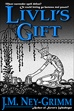
Livli's Gift at thumbnail sizeThat doubt niggled and niggled inside me. Finally I realized what bothered me. At full size, on the paperback or on a Kindle Fire, the cover still looks great to me. But at thumbnail size – the way you initially see it online – it does look gloomy. Or at least somber. Which is all wrong. Livli”s Gift is not a gloomy tale. Honestly, none of my stories are. I infinitely prefer hope and redemption!

I decided my cover needed revision. After all, every indie publisher should revisit the covers of her backlist every 3 to 5 years. Times change, cover styles change, but stories can be forever. Every good story deserves a cover that isn’t dated or stale. And Livli’s Gift deserved a cover that didn’t give a false impression.

But I didn’t want to change the art. I love the line drawing of the queen bending over her cherished plants. Could I achieve my goal by changing the title and byline treatment? That’s what I decided to attempt.

Some thinking was required.

Quantum Zoo thumbnail coverWhat sort of a title treatment should I attempt? Livli is a healer who works with magic, a magical hot spring, massage, and herbal treatments to cure her patients. Perhaps I could give the title a leafy texture to reflect this?

The cover for Quantum Zoo came to mind. I’d given its title a watery texture. Perhaps the same font, Orial, might even work well for Livli’s Gift. The curling ornaments of Orial had the right feeling for Livli, and the broader letters would provide a little more space to give the plant texture visibility.

I put all those elements together.
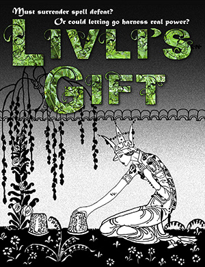
Livli's Gift cover with Orial titleAnd I didn’t like it. The colors were dull. The letters were too blocky. They’d looked graceful on the Quantum Zoo cover, but they seemed clunky on the Livli cover. I didn’t even bother to test the byline with the Orial-leaf treatment.

I was going to have to try something else.

But I still liked the idea of a leafy texture. Maybe I just needed to find leaves with a brighter green. I remembered a walk I’d taken through my neighborhood, photographing spring flowers and bright green foliage. I checked my files of photos and found the very thing!

But what font should I use?
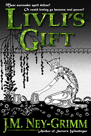
Livli's Gift, Palatino with leaf textureMaybe I didn’t need to change the original font. Maybe the Palatino on the original cover would work just fine when a texture was added to it. Excited, I put all of these elements together.

Okay!

Now I felt like I was getting somewhere. I liked the brightness and the warmth of the green. I liked the allusion to life and growing things. It still wasn’t quite right, but I could work with this. Where would I go with it next? How might I manipulate it to make it fully right?

I looked at what I had, and looked at it some more. And then one of those inspirations that every artist loves struck me. What if I gave the Palatino font some of the curlicues that were part of the Orial font?

Perfect! It would be perfect!

I set to work again, slicing and dicing, moving this piece here, that piece there. I was knitting or crocheting with Photoshop, and it was fun!
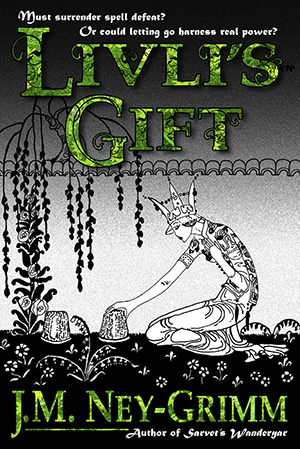
Livli's Gift, lacy green titleWould this be it? Would this be the cover I was longing for?

Yes! It totally rocked! I was so excited. I’d done it!

With the peak so high, you know the fall would be low. And it was. As I looked at my work, I realized that despite the bright warmth of the green, combining it with black yielded the feel of the horror genre.

Oh, no!

Livli’s Gift hasn’t even one speck of horror. Readers who like horror would purchase the book and be disappointed and feel cheated. Readers who like warm and human fantasy with streamers of hope and joy – the perfect audience for Livli’s Gift – would never give it a chance.

Gloom buried me.

I recovered, naturally. But I let the whole project rest. I’d reached the “I got nothing” stage.

So Livli’s Gift kept its old cover for another year.

Then, just last week, I had another idea. The lacy version of Palatino I’d created really was perfect for Livli’s Gift. What if I filled it with a different texture? What if I filled it with a water texture? Livli worked with water far more extenisvely than she did with plants anyway!

With trepidation, I opened that year-old file to see what I could do.
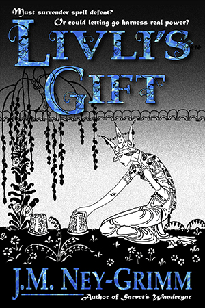
Livli's Gift, water texture titleFilling the title with water was actually quite easy. The challenging work of creating a lacy Palatino was already done. I pasted in the water texture and looked at what I had.

Hmm. It was a nice idea, but it just wasn’t working. For whatever reason, the green leafy texture held together and didn’t confuse the eye. But the water texture didn’t behave similarly. It was too variegated, acting almost as a camouflage pattern, breaking up the edges of the letters and making the title hard to read.

I decided I would search for a better water texture.

After a night of sleep.

When I awoke in the morning, I had another idea. The original blue in the original cover had the bright, warm hue that I wanted. What if I simply used that, instead of pouring in a texture on the already complex lace of the altered font?
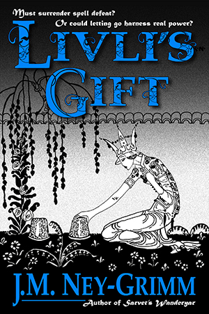
Livli's Gift, revised coverI selected the title, filled it with blue, deselected it, and took a look.

I noticed the byline was wider than the title. For no good reason. I modified it, so that the edges of the byline on the right and the left matched up precisely with the edges of the title. Much better!

I liked it.

The lacy Palatino has a pleasant liveliness to it. That particular hue of blue is indeed warm and bright. I hadn’t realized how much the unmodified Palatino creates a somber mood. Somber enough to overpower even the brightness of the warm blue.

Had I achieved my aim?
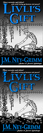
Livli's Gift, revised versus original coverI reduced the cover down to the tiny size of a thumbnail and studied the result.

Well, first off, on my computer screen, looking at the image in Photoshop, and looking at it on my own website, the original cover looks much more cheerful than it did on either Joel’s website or the Amazon site. That’s because both the other sites don’t render the blue accurately. Different sites really do render colors differently, unfortunately.

On the Kobo site, the cover for Perilous Chance suffers the most of all my covers. Instead of a clear and luminous indigo for the sky, it becomes a dingy purple. Ugh!

And even beyond the alterations caused by the hosting website, there are also all the variations caused by how each individual computer monitor is set. Each reader browsing online will see a slightly different view of each book cover in existence.

In fact, if we want to be through and precise, each reader’s brain and eyes will be calibrated slightly differently from every other reader’s. That way – considering every individual viewer – lies madness.

So, back to Livli’s Gift and how the thumbnail looks on my computer through my eyes. And it looks good. Not quite as nice as at the larger size, but still more cheerful than the original.

I double checked my assessment after I uploaded the new cover file on Amazon. There, the improvement was marked. At both the thumbnail size (which turns up in searches) and the slightly larger size that appears on the product page, the new version is much better than the old one. I’d say it’s a keeper.

Until I decide – in 5 years or so – that it’s time to revise the covers on my backlist again. 😀

To see the original building process for Livli’s cover:
Creating Livli’s Cover

For more about Kay Nielsen:
Kay Nielsen

And for more cover builds:
Building Star-drake’s Cover
Building Glory’s Cover
Building Wild’s Cover


Share

Hera’s Handmaidens

Hera Borrowing the Girdle of Aphrodite by Guy HeadIn Greek mythology, Hera was the queen of the gods and the wife of Zeus, the king of the gods. She championed the well-being of women and the sacred essence of marriage.

Her own daughters – Eileithyia (goddess of childbirth) and Hebe (goddess of youth) – are listed as members of her retinue. Iris (the goddess of the rainbow), the nymphs of the clouds, and the nymphs of the seasons also attended her.

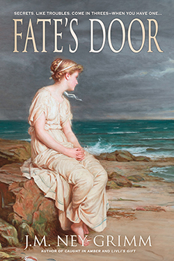
In my novel, Fate’s Door, I envisioned her entourage as a less static group, drawn from the offspring of royalty among the myriad nature spirits associated with all the features of the world, and changing over time.

Nymphe by Gaston Bussière_Thus does Eilidh, eldest sister of my heroine Nerine, join Hera’s cortege.

When Nerine visits her sister on Mount Olympus, Eilidh greets her warmly, entertains her during her stay, and gives a party on the eve of Nerine’s departure. I suspect that Hera herself would not have approved of the course that farewell celebration took, had she been present, but the nymphs of ancient Greece did have a reputation for wildness. 😀

The scene with the party was cut from the final version of Fate’s Door, but I share it here for those of us who wish we could visit the Mount Olympus of mythology.

20 ~ Eilidh’s Farewell

That evening Nerine saw a part of Olympus new to her, when Eilidh and the handmaidens gave a party in honor of Nerine’s departure.

The festivity took place in and around an oval pool of clear water emerging from a grotto in the mountainside. Unlike Agnippe’s sacred spring or the many streams of the area, this body of water had not been left in its natural state. The pool itself was scooped from grooved white granite and surrounded by a broad terrace of the same material, even within the grotto. Fluted white columns and a balustrade edged the outside terrace, but within the grotto a wall of rose marble had been carved, depicting a scene of merfolk celebrating.

Only the handmaidens attended, none of the greater gods, which was a relief.

Eilidh donned the pectoral and belt in which she’d left home, platinum with clear yellow topazes. She was as beautiful now at twenty-three as she’d been at eighteen, maybe more so, because her pride had mellowed into confidence. Nerine chose to swim bare, since the handmaidens did so. If you could call it swimming. Mostly they splashed and shrieked and laughed.

Nerine raced Eilidh to the grotto end of the pool and back, discovering that she was quite a bit faster than her sister.

The handmaidens laid bets on the race, with the losers drinking goblets of mead, while the winners quaffed nectar.

Then the winners decided this wasn’t quite fair and begged Eilidh and Nerine to race again, so that the winners would receive the mead. The party grew far from decorous after that.

Nerine gave several races away, not wanting to make her sister feel bad.

But Eilidh didn’t seem to mind when she lost, joining the handmaidens in drinking mead whenever the round called for the losers to drink.

Nerine stayed away from the mead altogether. It was too sweet for her taste. And when she saw the drunkenness it induced in the handmaidens, she was doubly glad for her choice. Five of them sat on the steps down into the water and sang off key, while another group retired to the grotto to – apparently – hold an orgy.

Eilidh, hiccuping, dragged Nerine over to the balustrade and began sobbing, saying that she had never appreciated her sister properly and now it was too late, because Nerine was going away.

“Oh, oh, oh!” wailed Eilidh. “Shay you forgive me, do!” she slurred.

Nerine couldn’t help laughing. It was all so ridiculous.

She reassured her sister, and then put her to bed in the shrine with all the divans.

As she checked her pouch of toiletries and the satchel with her writing supplies, Galena entered. She had not attended the party, and was garbed for her repose, although not in the usual sleeping gown. Instead she wore garments similar to Nerine’s travel costume, tunic and trews, but woven of a linen so fine it was translucent.

“I am come to offer you more restful quarters for the night, as I must suppose this location will be quite insupportable when the handmaidens eventually arrive.” A smile was strongly present in the tone of Galena’s voice. Nerine was beginning to love that smile sound already for the way it lifted her spirits.

She accepted Galena’s offer gratefully. She did not indeed want to remain to witness the handmaidens’ drunken return, whenever that might be.

The more restful quarters turned out to be a tapestry pavilion or tent – Nerine wasn’t quite sure what to call it – with blankets and sheets laid upon fleeces on the tapestry floor. She found them more comfortable than her divan and fell asleep quickly, despite her excitement about the morrow.

*     *     *

Galena awoke Nerine at dawn.

They visited the shrine of the fountain to perform their morning ablutions and then dressed in their travelling clothes.

The weight of the garments felt unfamiliar and strangely sumptuous, as though they meant she were to participate in a mysterious rite. Perhaps she was. The journey across Európi would require nearly ninety days. She would be travelling so many stadia that the distance was measured in leagues – three hundred and seventy some leagues. She would see lands and peoples utterly strange to her, and she would not rest more than a night or two in any one place. If that were not a rite of passage, what was?

*     *     *

For the first three extra chapters from Fate’s Door, see:
Update on Fate’s Door (Eilidh and Mount Olympus)
Nerine’s Youngest Sister (Agnippe and Mount Helicon)
The Nine Muses of Antiquity (Agnippe and the Muses)

To purchase and read Fate’s Door: Amazon I B&N I iTunes I Kobo I Smashwords


Share

Kobo Knows How to Do Ebook Links Right!

In November, I decided it was time to update the links on my site that point to my books’ Amazon pages.

When I first started my blog, in February 2012, I included links to Amazon.com and Amazon UK, figuring that since I write in English, the residents of the UK were in my potential audience.

Then I had my first sale in Germany. Another in Spain. One in Italy.

Continental_models-Australia

It became obvious that there are English speakers, or readers, all over the globe. So whenever a new country showed up in my sales, I’d add that Amazon to the links.

That method brought the number of Amazon links up to 10 out of the 13 Amazon stores this year. Since most of my books are also available at B&N, Smashwords, Apple, and Kobo, the list of links after each title was 14 stores long. Too long, especially for my readers who shop at one of the stores in the middle of the alphabet.

So I found a source for a global Amazon link. All thirteen Amazon stores are accessed from one link that directs the browsing reader to the Amazon store serving his or her country.

I asked my international visitors to test these new global links and let me know if the links worked. My visitors tested. Thank you! The links worked. Yay!

I celebrated my link success for all of a day, before it occurred to me that B&N also has separate websites in different countries, and Kobo as well. The links on my site led only to the US B&N website and the US Kobo website. That was a serious problem.

I tackled B&N first, with absolutely no luck. If there is a way to make my B&N links global, I can’t find it.

Kobo log in window

I moved on to Kobo, and what I found impressed the heck out of me. Not only is there a way to make Kobo links global, but that way is native to the Kobo’s own set-up. For the Amazon links, I have to rely on an outside provider. If that provider ever goes out of business, I’ll have redo all my links. But the Kobo links are likely to be good for as long as there is a Kobo.

Kobo has a user guide, which I’ll link to here.

And on page 36 of that user guide are instructions for creating global links. Page 36 says:

A big part of promoting your Kobo ebooks is making sure your readers can easily find them. If you give readers a direct link to your ebooks’ item pages, readers can easily access your Kobo ebooks from your website or blog. The creation of links to product pages is fairly simple. To direct readers to a particular ebook on Kobo, you drop your ebook’s ISBN into the following formula:

http://www.kobobooks.com/search/search.html?q=[eISBN-13]

I visited the Kobo web page for each of my books to get the eISBN-13 number assigned by Kobo and pasted it into the given formula. Easy peasy! Did I say I was impressed by Kobo?

thumbnail imageThus my link for Troll-magic became http://www.kobobooks.com/search/search.html?q=1230000222926.

My link for Sarvet’s Wanderyar became http://www.kobobooks.com/search/search.html?q=1230000118098. And so on.

Of course, I tidied up the links so that they look neater: Troll-magic and Sarvet’s Wanderyar. Or Kobo and Kobo.

So, readers who favor Kobo, my site is ready for you! 😀


Share

Brocade and Drawlooms

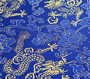
Brocade sampleBefore I learned about yunjin brocade, I’d assumed that my norns in Fate’s Door would weave upon a floor loom, something like the weaver I saw working in historic Williamsburg.

I hadn’t really thought through the process of weaving and the type of weaving necessary to the norns, creating the destiny of the world on their loom.

Floor looms can create beautiful cloth with some wonderful patterns. But the pattern has a limit to its complexity, and that pattern is repeated over and over again.

floor loom diagramThat would never work for the norns. While a larger theme or pattern might repeat through an era of history – the age of classical Greece or the time of republic Rome – the detail within that pattern would vary considerably. And when the world moved on, from ancient times to the Middle Ages, for example, the old pattern would vanish entirely, with a new one springing up.

A floor loom might have an array of heddles (which control the pattern of the weave), but once those heddles were threaded, the pattern for the fabric is unvarying.

My norns would need something more complex than a floor loom.

I read about dobby looms and jacquard looms and even modern power looms, but none of them possessed the kind of flexibility required.

Then I encountered yunjin brocade, woven in Nanjing, China for over 2,000 years. As I studied the textile samples, I saw that the patterns produced were more complex than anything I’d seen thus far.

Dragon robe of the Chinese emperor QianlongMore interesting still were examples of emperor’s robes woven by the piece on the yunjin looms and then assembled from those pieces. They were not cut from the woven silk. Rather each piece was woven to the correct shape and size, ready to be sewn to the other pieces after each came off the loom.

Even more important, the patterns in these pieces changed throughout each piece. The hem of the sleeve might have one pattern, the length of the sleeve another, and the shoulder yet another.

Essentially, an ever-changing tapestry could be created by this ancient and intricate method of weaving.

I had found the loom my norns would weave at.

But, wow, was that loom a monster!

It measured 18 feet long, 4.5 feet wide, 13 feet tall (5.6 meters long, 1.4 meters wide, and 4 meters tall). It takes at least two people to use it. The weaver sits before the loom on a bench, passing the weft threads through the long warp threads. The picker sits aloft, picking different patterns of draw strings to create the openings in the warp threads (called “sheds”) for the weaver to pass the weft threads through.

Yunjin brocade loom

Because the norns must weave a wider cloth – they have the whole world to include – a third person is needed: someone to throw the shuttle when a thread must pass the whole width of the cloth. The weaver’s arms are not long enough to both toss the shuttle at one side and catch it at the other.

But the need for three was perfect for my story. The fates – whether they be the Greek moirai or the Roman parcae or the Norse norns – are always three.

I would have my weaver, my patterner (the picker), and my shuttle-catcher.

And it was appropriate that the loom of fate – the loom that wove the births and deaths and deeds of all alive – should be a “monster.” Any device with so much power should have something monstrous about it.

The video below shows a yunjin drawloom in action, as well as explaining some of the other intricacies of the ancient craft of yunjin brocade.

I found it fascinating! (But you probably already knew that I would. 😀 )

For more about the world of Fate’s Door, see:
Cottage of the Norns
The Norns of Fate’s Door
The Baltic Sea
The Ancient Goths
Lugh and the Lunasad
Crossing the Danube
The Keltoi of Európi
Vertical Looms
Names in Ancient Greece

For more about brocade and looms, see:
About Looms
About Brocade
About Yunjin
Saving Yunjin


Share