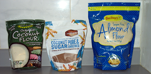
 I’ve wanted to try baking cookies using alternative flours for a while now. My body seems to tolerate wheat less and less well as the years go by. I was hoping that coconut flour and almond flour would be friendlier choices for me.
Lately I’ve been inspired by the dinner recipes of Danielle Walker. I’m sure her recipes work perfectly without any tinkering – she seems to test them thoroughly. But somehow I have not yet managed to follow any of them exactly. My inner cook comes out, and I make a few changes. 😉
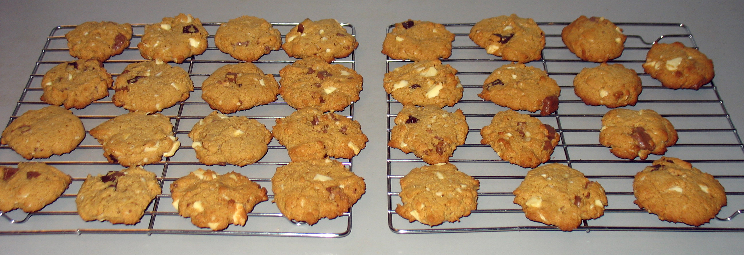
I decided to see what Danielle had to offer for cookies. You can find her recipe here. I stuck pretty closely to it, but not exactly. However, I was delighted by my results. These cookies are super delicious – delicate and yet slightly chewy, and they don’t upset my tummy!
Ingredients
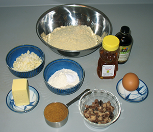 1/4 cup butter
1/4 cup coconut palm sugar
1 teaspoon cane sugar
2 tablespoons honey
1 large egg
2 teaspoons vanilla
1-1/2 cups almond flour
2 tablespoons + 1 teaspoon coconut flour
1/2 teaspoon baking soda
1/2 teaspoon Celtic sea salt
1/2 chocolate chips
Directions
In a food processor, cream together the butter, coconut sugar, cane sugar, honey, egg, and vanilla until well mixed, about 15 seconds.
(Creaming the butter and sugar the old-fashioned way – with a fork – would likely work equally well. I used the food processor for my first attempt. I may not bother rousting it out on my second.)
Add the almond flour, coconut flour, baking soda, and salt to the processor and process again until well mixed, about 30 seconds. Scrape down the sides of the processor, if needed, to get all the dry ingredients mixed in.
(I tasted my batch at this point and decided that it was not quite sweet enough. That’s where the “extra” teaspoon of cane sugar – listed above in the ingredients – came from. I also assessed the dough and felt that it was a little too liquid. So I added the “extra” teaspoon of coconut flour – also listed above in ingredients.)
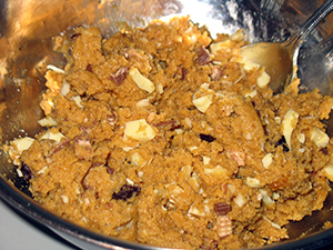 Turn the dough out into a mixing bowl, add the chocolate chips, and stir by hand until they are well mixed in.
(My batch in the photos likely looks a little strange to you. That’s because we had no chocolate chips in the house, and my husband and my daughter were out with car, shopping. So I improvised. I dug through the Halloween candy in the freezer and pulled out a mini chocolate bar, two kitkat bars, and a bar of white chocolate. I chopped them up and used them in place of the chocolate chips.)
Preheat the oven to 350°F.
Line two baking sheets with baking parchment.
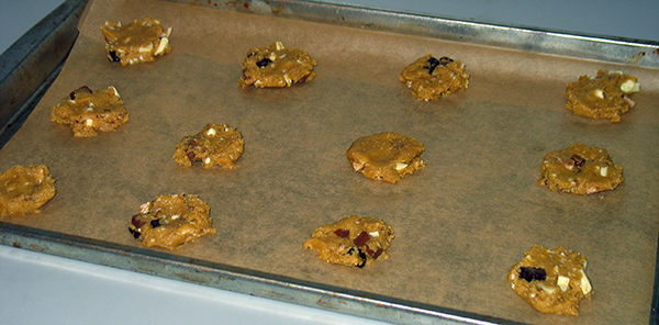
Drop the cookie dough by spoonfuls on the baking sheets. Flatten the cookies, because they will not change shape much while baking.
Bake 9 minutes and then cool on a rack. Makes 29 cookies.
More recipes:
Arugula Beef
Butternut Soup
Baked Apples
Coconut Chocolates
I had a lot of trouble getting CreateSpace to honor the margins specified in my files for the paperback editions of Rainbow’s Lodestone and Star-drake. Then – margins sorted – the next proof copies featured the colors all wrong. It was all so discouraging, that I allowed months to elapse between wrestling bouts with the two books. Finally, in November 2014, nearly nine months after I started, the two books were ready to be approved and released!
Take a look!
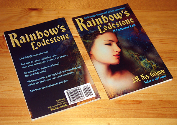
A lost birthright and unending agony.
On a whim, the rainbow’s child falls to earth, where a cruel adversary takes advantage of her innocence. Can she reclaim her thunder-swept heavens? Must she dwindle and die?
This transcendent short story set in the troll-ridden North-lands explores how inner freedom creates outer opportunities.
Earth trumps heaven until ancient music plays.
Rainbow’s Lodestone as a paperback:
Amazon.com I Amazon DE I Amazon ES I Amazon UK I CreateSpace
PRAISE FOR RAINBOW’S LODESTONE AND STAR-DRAKE
“…almost “Tolkienesque”…the stories feel like they’re happening on the Earth we know, but long before our recorded history… Despite the fact that it deals with a grim act of mischief, [Rainbow’s Lodestone is] a delightful read. The enchanting thing about it is the personification of the Rainbow, and the general attitude she has towards her fate in the story… All in all, these are wonderful stories… Ney-Grimm’s unique blend of Nordic fantasy and fairy tale mentality is a refreshing take on the genre, and [her] poetic style of writing (whichever tone she uses) adds a special sheen to the work. I read a lot of fiction, and I can honestly say I’ve not come across anything quite like this.” – James J. Parsons, Speaking to the Eyes
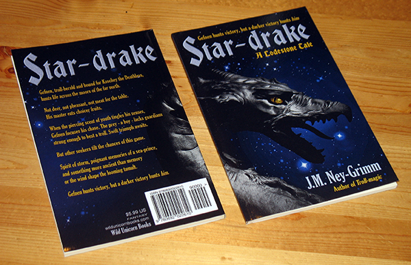
Gefnen – troll-herald and hound for Koschey the Deathless – hunts life across the moors of the far north.
Not deer, not pheasant, not meat for the table. His master eats choicer fruits.
When the piercing scent of youth tingles his senses, Gefnen focuses his chase. The prey – a boy – lacks guardians strong enough to best a troll. Swift triumph awaits.
But other seekers tilt the chances of this game. Spirit of storm, poignant memories of a sea-prince, and something more ancient than memory or the wind shape the looming tumult.
Gefnen hunts victory, but a darker victory hunts him.
Star-drake as a paperback:
Amazon.com I Amazon DE I Amazon ES I Amazon UK I CreateSpace
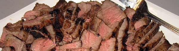 I adore the savor of London broil, but for decades I didn’t realize how easy it is to make at home. Now that I prefer to serve grassfed meat to my family, I’ve discovered that London broil is one of the easiest to find and most reasonably priced cuts of grassfed beef available. Here’s how I make it.
Ingredients
 2 to 2-1/2 pounds London broil beef
Marinade
4 garlic cloves, minced or put through a garlic press
4 tablespoons balsamic vinegar
3 tablespoons brown mustard
1-1/2 tablespoons Worcestershire sauce
1 tablespoon soy sauce
1 teaspoon dried oregano
1 teaspoon dried basil
1 teaspoon dried thyme
1/2 teaspoon dried red pepper flakes
2/3 cup olive oil
 Directions
Whisk the marinade ingredients together in a bowl.
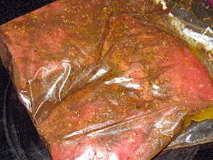
Put the meat in a resealable plastic bag. Pour the marinade into the bag. Seal the bag, pressing out the air.
Put the bag in a shallow dish in the refrigerator. Marinate for 8 hours or over night. Turn the bag twice.
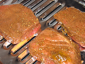
When ready to cook, remove the meat from the marinade and let the liquid drip off it. Discard the marinade.
Place the meat on a broiling pan and set it under the broiler. I use the second rack slot from the broiler coils, about 4 inches away. Broil the first side for 10 minutes. (The meat in my photo was broiled for 11 minutes, which was a bit too long. It was still scrumptious; I just prefer mine more rare.) Flip the meat and broil the second side for 9 minutes.
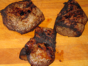 Transfer the meat to a cutting board. Let it rest for 10 minutes. Cut it diagonally across the grain in thin slices. Serve.
More recipes:
Butternut Soup
Apples á la Ney-Grimm
Pie Crust Cookies
As I gain experience with building covers for my books, I find the process growing more and more like painting with Photoshop. All of my covers, even the earliest ones, required some manipulation in Photoshop. Darkening the blacks. Balancing the colors. Adding to the edges of the art when those edges were ragged or simply didn’t give me enough extra for the trimming that occurs when paperback books are made.
But the cover for Hunting Wild required the most “painting” of any cover yet!
I found the process of transformation – from photos purchased on Dreamstime.com to finished cover – fascinating. Naturally I want to share the journey with you. 😀
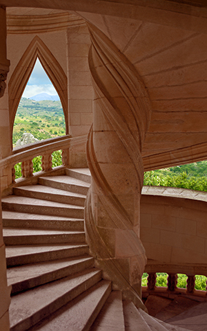
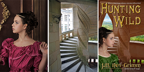
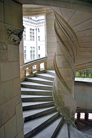 The original photo of the interior of a palace tower depicted one of the stair towers from Chambord, an incredible chateau in the Loire valley of France. The tower was perfect as a rendition of my own Baloron, the castle in which Hunting Wild takes place, except for two things.
One: Baloron is made of reddish stone, not white. And two: the landscape visible through the tower windows should be a dry plain studded with olive trees, not a palace courtyard. Luckily, both were problems I felt confidant I could correct.
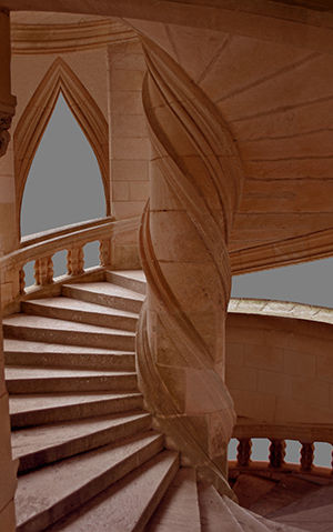 My first step was to cut away the courtyard seen through the openings of the Chambord stair tower. Then I turned the tower stone red. This image shows the arched fill-in I created for the square window at the upper left. In the process of building the cover, the window change came later, when I was trying to fit my title over the art. It was not working well – the title didn’t pop enough where it crossed the open window. I added the arched fill-in to give a better background for the title.
As I worked on the title, I also found I needed a little more tower at the right edge, so I “painted” that in.
I purchased a landscape of olive groves to use for the landscape around Baloron.
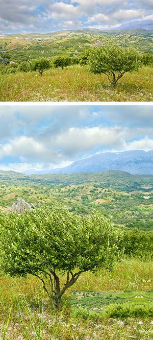 If I were being absolutely strict about Baloron’s landscape, I would have insisted on a grassy plain, perhaps with a lake in the background. I did look for such an image, but couldn’t find anything suitable. Since the region around Baloron includes olive groves (and cork trees), even though its immediate acreage does not, it seemed reasonable to compromise.
I didn’t use the entire photo that I purchased the rights to, just a portion of it. If you look closely at the right edge, you’ll see that I used the mirror image of a portion of the photo to extend the edge with the textures that my “painting” required. It creates a funny Rorshach-like pattern that isn’t visible in the final cover image, but that would be problematic if it were.
There’s another anomaly in the lower right portion of the photo. I pasted a portion of the tree tops into the area behind the right balustrade to achieve a more pleasing effect than what was there without editing. I find it interesting that the backside of this “tapestry” is so messy. 😀
 When I pasted the landscape into my painting, I initially used the photo in its original state. I needed to see what exactly showed through the tower window and the tower balustrade. I moved the landscape around to get the view through the window right. Then I started copying and pasting different pieces of the photo into the landscape that showed through the balustrade. There was a lot of trial and error.
Nope. Nope! No, not that either!
Eventually I achieved a result that I liked. Yay!
Then I noticed that the landscape looked a little too dark for the composition. The landscape photo was taken out of doors, of course. But when you look out at a landscape from indoors, your eyes are adjusted to the light levels indoors, which are much dimmer than outdoors. This makes the outdoors look brighter in comparison. So I adjusted the brightness of the landscape layer in my cover file. Another “yay!” when I nailed it.
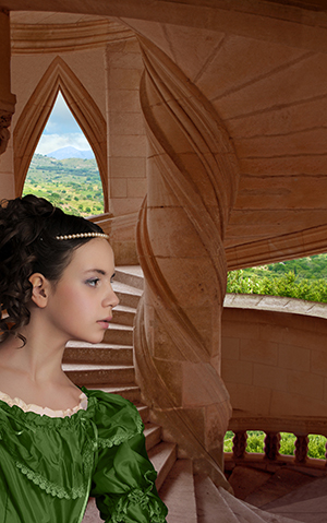
 Now my setting was ready for my heroine! I purchased all three of the photos at the same time. I’d looked at hundreds, and only made my final choices when I was sure they would work well together. Even then, I did not purchase the right to use the photos until I’d downloaded low-resolution (and watermarked) comp images and put them together in a test cover to make sure they would work.
Each of the three photos cost $15 for the right to use it on my cover. Plus there was a fourth $15 image that I’d need for the back cover. I didn’t want to spend $60 until I was sure my selections would go together the way I envisioned them. I have planned compositions that simply didn’t work. This one, I am happy to report, did.
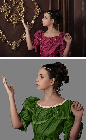
 Finding a young woman gowned in garb suitable to a medieval setting who also looked like my heroine was hard. I searched and searched and searched. Finally I settled on a photo in which the model was perfect, although her clothing was not. There wouldn’t be much of her gown showing, so the style (which is Victorian) was not critical. But the fuchsia color would simply not work in my “painting.” I would need to change it to green. Also, she really needed to have the ruffles of a chemise (an undergarment) showing at the neckline.
Even more difficult, the position of her arms would not work. I felt confidant I could change fuchsia to green. I even felt confidant I could create the chemise ruffle. I’d copy the neckline of her dress and paste it onto another layer of my file. Then turn it to a creamy white. Then set the translucency to 50% or so. As I’d envisioned, those changes were fairly straight forward. But the arms?
In my mock-up test cover, the arms proved to be no trouble. Only her shoulders were showing. Plus I’d tipped her forward to have her gazing out over the tower balustrade (rather than staring at the tower wall). I simply removed her arms from the image! (Ew! Sounds gory, doesn’t it?) In the final draft, I found I needed more room for my author byline, which meant I needed to show more of her upper torso. I had to do a lot of copy-and-paste “painting” to lenghthen her sleeves. But I was pleased with the result.
Next came the title, author byline, and taglines. I’d say this part was easy – and it was, compared to the work required for my heroine – except you know from my account above that I had a lot of trouble placing the title. I found a gorgeous font for the title: Mephisto And I discovered that the font Aclonica – for the tag lines and back cover copy – complemented Mephisto perfectly.
But I had to reposition the tower, which involved extending it at the top and right side. I had to create an arched fill-in for the square window. And I had to reposition my heroine, which involved lengthening her sleeves. Yikes! But I did it!
Then I decided that I wasn’t satisfied with how the author byline looked in the Mephisto font. It just didn’t look right to me. (You can see that version in my earlier post: Cover Preview: Hunting Wild.) Plus the points of the letters extended so far down that I couldn’t make my trademark byline work – underline connecting the “J” and the “Author of Troll-magic.”
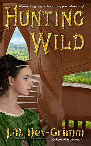 I fretted about the situation for several weeks. I created a cover for another book, on which my trademark author byline worked beautifully. I growled to myself about Hunting Wild. Finally, it occurred to me that I could use Aclonica – the font in the taglines – for my byline as well. I couldn’t just type it in, however. Small caps looked weird. Upper/lower case didn’t match my branding. So I customized: upper/lower for most of it, stretched lower case “M” and “N,” and an upper case “Y.”
There! Finally! I liked it! 😀
Let’s take a quick look at the finished cover side by side with two of the photos that went into creating it. Do you see why I call it “painting” in Photoshop? The transformation is rather dramatic. At least – I think so. 😉
For more cover builds:
Cover Creation: Perilous Chance
Building Star-drake’s Cover
Creating Livli’s Cover
For the principles of cover design:
Cover Design Primer